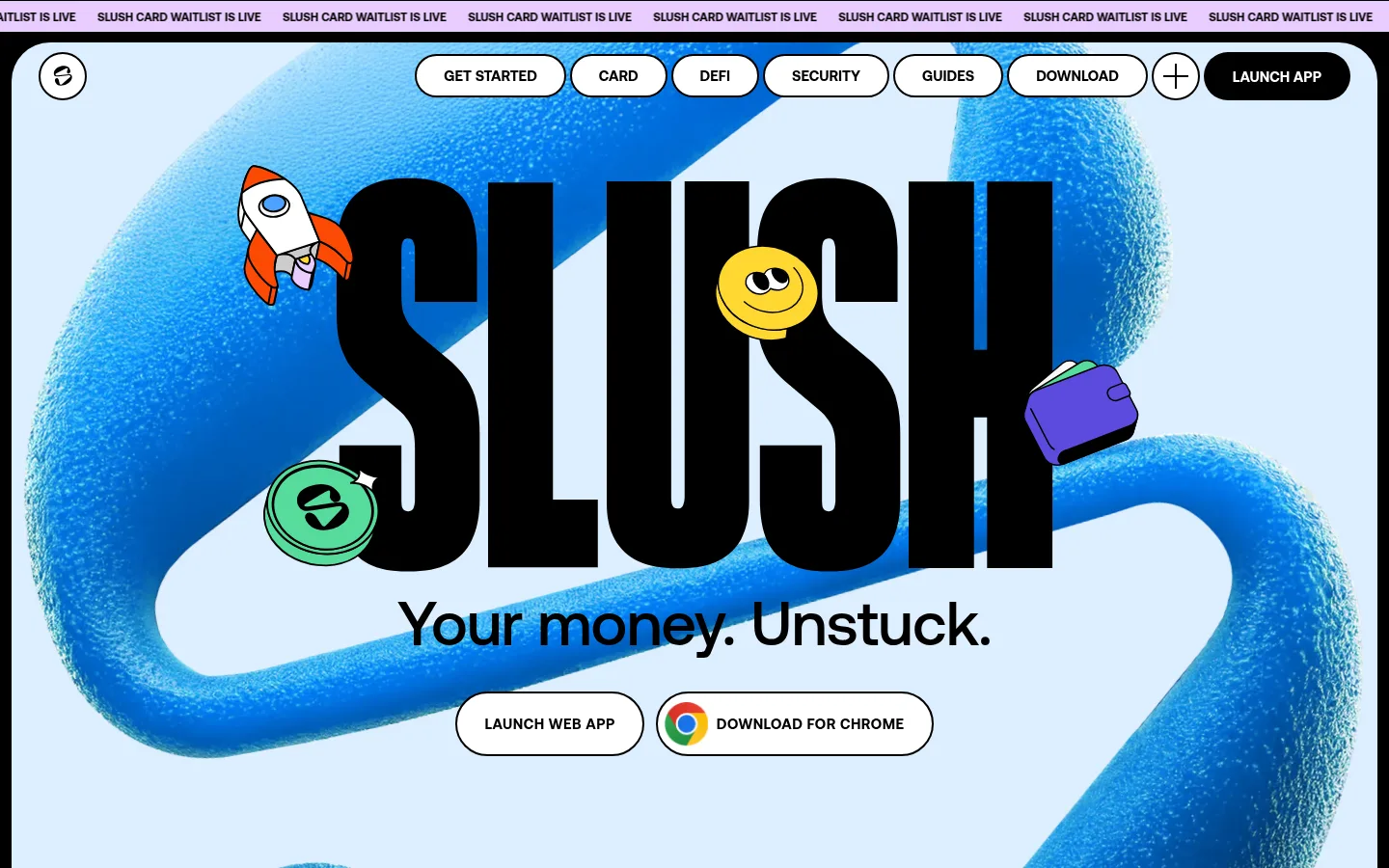
Slush以浅蓝色首屏、超大黑色字标和俏皮的钱包插画,打造鲜明易亲近的加密品牌形象。长页面先展示产品,再用白色内容面板和黑色分区承载功能介绍、用户评价、生态项目与订阅信息。
North star · Pair oversized condensed black headlines and spacious panels with playful, vividly colored wallet illustrations.
The visual system combines a nearly monochrome foundation with bright, flat accents. The opening uses #dceeff as a broad canvas for oversized black display lettering and a textured blue ribbon illustration; later, white feature panels alternate with expansive black sections. #4da2ff, #ffd731, #e9ccff, #fb4903, #55db9c, and #5c4ade appear as strong color blocks, especially on illustrated cards, ecosystem tiles, and repeated promotional graphics rather than as a restrained interface palette. Lateral supplies tightly stacked, uppercase display headlines, while Aeonik Pro handles compact, bold uppercase navigation and interface copy. The layout is spacious and modular, with staggered feature-and-image pairings, pill-shaped controls, and large rounded panel corners. Product screenshots and wallet cartoons add character, but the composition stays graphic and high contrast. Thin black outlines give selected cards and controls definition without relying on shadow-heavy elevation.
配色 点色块复制色值。用途说明来自对页面的实测位置(背景、文字、描边、按钮)与截图判读。
品牌色
Glacier Blue
#dceeff
Large opening hero canvas and the pale blue field behind the oversized Slush wordmark.
强调色
Electric Sky
#4da2ff
Promotional graphics and illustration-led cards; a vivid accent, not a default UI surface.
Coin Yellow
#ffd731
Bright illustrated feature cards, coin motifs, and promotional tiles.
Rocket Orange
#fb4903
Promotional graphics and illustrated cards, including the high-energy trust artwork.
Mint Glow
#55db9c
Illustrated wallet and ecosystem graphics, including mint-colored promotional blocks.
Violet Signal
#5c4ade
Violet illustration and promotional tile color; use as a discrete graphic accent.
表层色
Clean White
#ffffff
Feature and showcase panels, pill controls, and reversed text on dark backgrounds.
Lilac Pop
#e9ccff
Review card and playful illustration backgrounds within feature and testimonial content.
中性色
Slush Ink
#000000
Display and body text, outlined controls, and the extensive dark bands across the lower homepage.
文字 背景 对比度 WCAG #000000 Slush Ink#ffffff Clean White21:1 AAA #000000 Slush Ink#dceeff Glacier Blue17.72:1 AAA #000000 Slush Ink#e9ccff Lilac Pop14.55:1 AAA #4da2ff Electric Sky#ffffff Clean White2.65:1 不达标 #4da2ff Electric Sky#000000 Slush Ink7.93:1 AAA #4da2ff Electric Sky#dceeff Glacier Blue2.23:1 不达标
字体 字号阶梯:Custom(比例约 2.118,正文 15px)。示例用免费替代字体渲染,数值为实测。
Aa 设计
Aeonik Pro 网络字体 · 字重 500 / 700 · 占比 85%
免费替代:Inter
Navigation, body copy, buttons, and compact uppercase interface labels.
Aa 设计
Lateral 网络字体 · 字重 800 · 占比 15%
免费替代:Anton
Oversized display wordmark and large uppercase section headlines.
角色 示例 字号 字重 行高 字距 特大标题 Oversized SLUSH wordmark and prominent campaign lettering.
Slush
640px 800 0.75 0 一级标题 Primary hero headline and major uppercase display statements.
Slush
281.5px 800 0.8 0 二级标题 Large feature-section headlines and bold editorial statements.
Slush
200px 800 0.76 0 三级标题 Secondary feature and promotional block headings.
Slush
160px 800 0.8 0 四级标题 Smaller high-impact card and content headlines.
Slush
110px 800 0.8 0 正文 Compact bold uppercase interface and supporting copy.
The quick brown fox 敏捷的狐狸
15px 700 1 0 辅助文字 Small uppercase supporting labels and footnotes.
The quick brown fox 敏捷的狐狸
12px 700 1.2 0 导航 Bold uppercase header navigation and menu items.
The quick brown fox 敏捷的狐狸
15px 700 1 0 眉题 Letter-spaced uppercase labels above section content.
The quick brown fox 敏捷的狐狸
15px 700 1 0.032em
间距与布局 基准单位 4px · 密度:宽松
48px 版块间距
32px 元素间距
36px 卡片内边距
1416px 内容最大宽度
4px
6px
9px
11px
12px
15px
16px
20px
23px
24px
30px
32px
48px
80px
The measured page uses a spacious modular composition with a 1416px maximum content width and a 4px spacing base. Its sequence moves from a roughly five-column hero to split feature layouts, then into dark, multi-column content bands. Centered display sections contrast with left-aligned feature copy and staggered image pairings. Large section gaps and generous card insets keep the dense, long-form page from feeling like a dashboard. Rounded panels sit within a dark outer canvas, creating clear section boundaries.
圆角与层次 没有测到阴影:页面是扁平的,层次靠底色和描边区分。
The page favors flat color fields and sharp contrast over shadows; the measured shadow list is empty. Thin black outlines define selected cards, buttons, and image panels, while generous corner rounding softens their silhouettes. Layering comes from artwork overlapping the hero lettering and from alternating white panels against black bands, not from raised UI effects.
组件 下面的预览按实测的按钮、输入框、徽标、卡片样式重建(字体用替代字体)。
Pill navigation Uppercase Aeonik Pro links sit in white, black-outlined pill controls; the launch action uses an inverse dark pill.
Hero action buttons Paired white pill CTAs use black text and outlines, including a Chrome download action with its browser icon.
Illustrated feature cards Rounded, black-outlined cards use bright yellow or lilac surfaces with bold copy and playful wallet-related artwork.
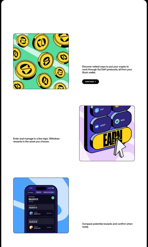
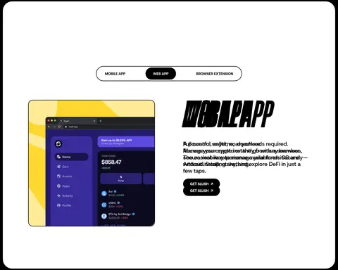
Feature split Alternate product screenshots and colorful illustrations with concise copy and a small dark CTA across white panels.
Promotional ticker Repeated GET SLUSH graphics form colorful outlined tiles and oversized lettering against a black band.
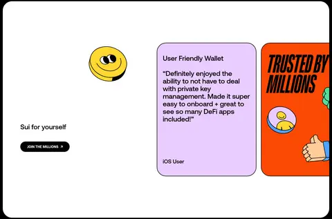
Review card A lilac rounded card with black outline presents a user quote and compact attribution.
Newsletter form The footer includes a subscription form with rounded, black-outlined inputs and compact uppercase labels.
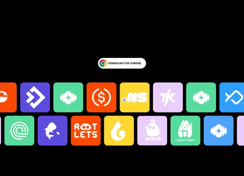
Imagery · The hero centers an oversized wordmark over a textured, looping blue 3D-like form, surrounded by outlined cartoon coins, a rocket, and a wallet. Lower sections mix product interface screenshots with flat, colorful coin and DeFi illustrations. Ecosystem marks appear as repeated bright tiles against black. Images are framed in rounded panels or used as oversized decorative artwork; the overall treatment is graphic rather than photographic.
页面版块 共 11 个版块,按页面从上到下排列,每个都标了类型、布局和交互套路。
该做与不该做 ✓ 该做 Use Lateral-style heavy condensed lettering for display headlines. Keep navigation and button labels bold and uppercase. Set the opening canvas in Glacier Blue (#dceeff). Alternate spacious white panels with broad black section bands. Use vivid accents in illustration-led cards and promotional tiles. Give major panels and controls strongly rounded silhouettes. Let product art overlap or enliven the typography. ✕ 不该做 Do not replace the bold display face with a delicate serif. Do not introduce gradients as a defining interface treatment. Do not use shadows to create a layered dashboard look. Do not apply every accent color to ordinary navigation and body text. Do not compress the page into a uniform card grid. Do not make the hero artwork photographic or visually restrained. 给 AI 的提示词 想快速出一个同风格的新页面,把这段话连同 DESIGN.md 一起发给 AI。
复制 Build a new Slush-style crypto page with a light opening canvas in Glacier Blue (#dceeff), followed by spacious white panels and strong black section bands. Use Slush Ink (#000000) for large, heavy, condensed uppercase display headlines and outlines; use a clean sans-serif like Inter for compact bold interface copy. Create rounded pill navigation and CTAs with white fills, black outlines, and selective inverse black actions. Pair product screenshots with playful wallet, coin, and DeFi illustrations. Reserve Electric Sky (#4da2ff), Coin Yellow (#ffd731), Lilac Pop (#e9ccff), Rocket Orange (#fb4903), Mint Glow (#55db9c), and Violet Signal (#5c4ade) for graphic accents and illustration surfaces. Keep the layout spacious and modular, with staggered image-and-copy features, rounded panels, and no shadow-heavy elevation.
DESIGN.md Tailwind v4 CSS 变量 Design Tokens
---
title: "Slush design system"
variant: extended
source: https://slush.app/
captured_at: 2026-10-12
theme: light
industry: crypto
generator: Design DNA (https://four.wiralomi.com/style/slush-app)
ai_generated: true
ai_label: "本文件由 AI 辅助生成:数值取自公开网页的实测样式,命名、用途说明与建议为模型解读。商标归原所有者。 / AI-assisted content"
---
# Slush · Design System
> Crypto made bright, bold, and human.
**Theme:** light · **Industry:** crypto · **Source:** https://slush.app/ · **Captured:** 2026-10-12 (1440×900 desktop)
_AI-assisted content: values are measured from the public page at capture time; names, roles and guidance are model-written interpretations. Trademarks belong to their owners._
Slush pairs oversized black lettering and a pale blue opening canvas with playful wallet-themed illustrations. Its long homepage moves from a vivid product introduction into white showcase panels, then uses black bands and bright color blocks to frame features, testimonials, ecosystem logos, and signup links.
## North star
Pair oversized condensed black headlines and spacious panels with playful, vividly colored wallet illustrations.
## Overview
The visual system combines a nearly monochrome foundation with bright, flat accents. The opening uses ## Colors
| Name | Hex | Token | Group | Role |
|---|---|---|---|---|
| Slush Ink | ` | `--color-slush-ink` | neutral | Display and body text, outlined controls, and the extensive dark bands across the lower homepage. |
| Clean White | ` | `--color-clean-white` | surface | Feature and showcase panels, pill controls, and reversed text on dark backgrounds. |
| Glacier Blue | ` | `--color-glacier-blue` | brand | Large opening hero canvas and the pale blue field behind the oversized Slush wordmark. |
| Electric Sky | ` | `--color-electric-sky` | accent | Promotional graphics and illustration-led cards; a vivid accent, not a default UI surface. |
| Coin Yellow | ` | `--color-coin-yellow` | accent | Bright illustrated feature cards, coin motifs, and promotional tiles. |
| Lilac Pop | ` | `--color-lilac-pop` | surface | Review card and playful illustration backgrounds within feature and testimonial content. |
| Rocket Orange | ` | `--color-rocket-orange` | accent | Promotional graphics and illustrated cards, including the high-energy trust artwork. |
| Mint Glow | ` | `--color-mint-glow` | accent | Illustrated wallet and ecosystem graphics, including mint-colored promotional blocks. |
| Violet Signal | ` | `--color-violet-signal` | accent | Violet illustration and promotional tile color; use as a discrete graphic accent. |
### Semantic aliases
`--color-canvas` → ` (Clean White) · `--color-surface` → ` (Slush Ink) · `--color-surface-2` → ` (Glacier Blue) · `--color-surface-3` → ` (Lilac Pop) · `--color-text` → ` (Slush Ink) · `--color-border` → ` (Slush Ink) · `--color-accent` → ` (Electric Sky) · `--color-accent-2` → ` (Coin Yellow) · `--color-accent-3` → ` (Lilac Pop)
### Contrast (WCAG 2.x)
| Text | Background | Ratio | Level |
|---|---|---|---|
| ` | ` | 21:1 | AAA |
| ` | ` | 17.72:1 | AAA |
| ` | ` | 14.55:1 | AAA |
| ` | ` | 2.65:1 | fail |
| ` | ` | 7.93:1 | AAA |
| ` | ` | 2.23:1 | fail |
| ` | ` | 1.83:1 | fail |
## Typography
| Family | Token | Source | Weights | Role | Free substitute |
|---|---|---|---|---|---|
| Aeonik Pro | `--font-body` | webfont | 500, 700 | Navigation, body copy, buttons, and compact uppercase interface labels. | Inter |
| Lateral | `--font-display` | webfont | 800 | Oversized display wordmark and large uppercase section headlines. | Anton |
- **Aeonik Pro:** Measured weights 500 and 700. Interface text commonly uses bold uppercase styling; keep copy compact and direct.
- **Lateral:** Measured at weight 800. Use very heavy, condensed uppercase forms with tight line stacking.
### Type scale — Custom (ratio ≈ 2.118, base 15px)
| Role | Size | Weight | Line height | Letter spacing | Case | Family | Used for |
|---|---|---|---|---|---|---|---|
| display | 640px | 800 | 0.75 | 0 | uppercase | Lateral | Oversized SLUSH wordmark and prominent campaign lettering. |
| h1 | 281.5px | 800 | 0.8 | 0 | uppercase | Lateral | Primary hero headline and major uppercase display statements. |
| h2 | 200px | 800 | 0.76 | 0 | uppercase | Lateral | Large feature-section headlines and bold editorial statements. |
| h3 | 160px | 800 | 0.8 | 0 | uppercase | Lateral | Secondary feature and promotional block headings. |
| h4 | 110px | 800 | 0.8 | 0 | uppercase | Lateral | Smaller high-impact card and content headlines. |
| body | 15px | 700 | 1 | 0 | uppercase | Aeonik Pro | Compact bold uppercase interface and supporting copy. |
| caption | 12px | 700 | 1.2 | 0 | uppercase | Aeonik Pro | Small uppercase supporting labels and footnotes. |
| nav | 15px | 700 | 1 | 0 | uppercase | Aeonik Pro | Bold uppercase header navigation and menu items. |
| eyebrow | 15px | 700 | 1 | 0.032em | uppercase | Aeonik Pro | Letter-spaced uppercase labels above section content. |
## Spacing & layout
- Base unit **4px**, density **spacious**.
- Scale (most used values): 4, 6, 9, 11, 12, 15, 16, 20, 23, 24, 30, 32, 48, 80 px.
- Section rhythm 48px · element gap 32px · card padding 36px · max content width 1416px.
The measured page uses a spacious modular composition with a 1416px maximum content width and a 4px spacing base. Its sequence moves from a roughly five-column hero to split feature layouts, then into dark, multi-column content bands. Centered display sections contrast with left-aligned feature copy and staggered image pairings. Large section gaps and generous card insets keep the dense, long-form page from feeling like a dashboard. Rounded panels sit within a dark outer canvas, creating clear section boundaries.
## Shape & elevation
- Radius: button `50%` · input `9999px` · card `40px` · nav `9999px` · link `9999px` · xs `20px` · sm `30px` · md `40px` · pill `9999px`
- No box shadows measured: the page is flat.
- Motion: standard transition `0.5s` on interactive elements.
The page favors flat color fields and sharp contrast over shadows; the measured shadow list is empty. Thin black outlines define selected cards, buttons, and image panels, while generous corner rounding softens their silhouettes. Layering comes from artwork overlapping the hero lettering and from alternating white panels against black bands, not from raised UI effects.
## Imagery
The hero centers an oversized wordmark over a textured, looping blue 3D-like form, surrounded by outlined cartoon coins, a rocket, and a wallet. Lower sections mix product interface screenshots with flat, colorful coin and DeFi illustrations. Ecosystem marks appear as repeated bright tiles against black. Images are framed in rounded panels or used as oversized decorative artwork; the overall treatment is graphic rather than photographic.
## Components
### Pill navigation
Uppercase Aeonik Pro links sit in white, black-outlined pill controls; the launch action uses an inverse dark pill.
### Hero action buttons
Paired white pill CTAs use black text and outlines, including a Chrome download action with its browser icon.
### Illustrated feature cards
Rounded, black-outlined cards use bright yellow or lilac surfaces with bold copy and playful wallet-related artwork.
### Feature split
Alternate product screenshots and colorful illustrations with concise copy and a small dark CTA across white panels.
### Promotional ticker
Repeated GET SLUSH graphics form colorful outlined tiles and oversized lettering against a black band.
### Review card
A lilac rounded card with black outline presents a user quote and compact attribution.
### Newsletter form
The footer includes a subscription form with rounded, black-outlined inputs and compact uppercase labels.
### Measured component styles
- **Primary button**: background ## Do
- Use Lateral-style heavy condensed lettering for display headlines.
- Keep navigation and button labels bold and uppercase.
- Set the opening canvas in Glacier Blue (## Don't
- Do not replace the bold display face with a delicate serif.
- Do not introduce gradients as a defining interface treatment.
- Do not use shadows to create a layered dashboard look.
- Do not apply every accent color to ordinary navigation and body text.
- Do not compress the page into a uniform card grid.
- Do not make the hero artwork photographic or visually restrained.
## Agent prompt
Build a new Slush-style crypto page with a light opening canvas in Glacier Blue (## Page sections (top to bottom)
| # | Type | Layout | UX patterns | UI patterns |
|---|---|---|---|---|
| 1 | hero | Pale blue, multi-column hero with oversized centered wordmark and paired actions. | Launch web app, Download for Chrome | Marquee strip, Pill navigation, Overlapping hero artwork |
| 2 | video | Single-column media section on the continuing pale blue field. | Ambient product motion | Wide embedded video |
| 3 | feature-split | Two-column feature panel pairing a promotional image with product copy. | Download action | Colorful coin artwork, Split image and text |
| 4 | feature-split | White section with staggered image-and-copy rows. | Start now CTA, DeFi discovery | Rounded product illustrations, Alternating alignment |
| 5 | feature-grid | Dark band with centered intro and a four-column feature arrangement. | Launch web app, Chrome download | Bright feature cards, High-contrast copy |
| 6 | gallery | Full-width black band filled with repeated promotional tiles. | Repeated brand reminder | Color-blocked ticker, Oversized condensed lettering |
| 7 | product-showcase | Dark page band containing a rounded light product panel and three-column content. | Switch app type, Get Slush links | Segmented pill selector, Product screenshot |
| 8 | testimonials | Wide testimonial area with multiple columns and oversized cards. | Join the millions CTA | Quote card, Illustrated trust panel |
| 9 | feature-grid | Centered headline above three feature categories on a dark background. | Learn more, Developer community link | Three-column categories, Compact uppercase labels |
| 10 | integrations | Centered heading and download action above a broad field of ecosystem tiles. | Chrome download | Logo tile wall, Bright square color blocks |
| 11 | footer | Dark multi-column footer combining a newsletter form, support links, and site navigation. | Newsletter signup, Support access, Download prompt | Outlined form controls, Compact link lists, Branded footer block |
## Source CSS custom properties (selected)
```css
--color--dark: black;
--color--light: white;
--gap-l: 2em;
--gap-xxl: 4em;
--radius-container: 2.5em;
--gap-m: 1.25em;
--color--blue-100: