North star · Use warm, spacious section bands and deep green typography to keep product-led layouts calm, legible, and unmistakably Workable.
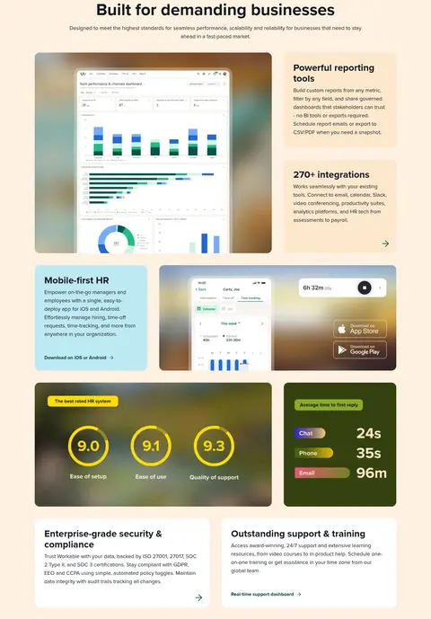
The visual strategy balances a soft, editorial canvas with high-contrast product messaging. White and warm off-white sections alternate with a single deep charcoal platform section and a pale peach business-proof section, giving the long page a readable rhythm. Deep green anchors the brand in the wordmark, headings, links and primary actions; muted charcoal supports body copy. Proxima Nova carries the system throughout, with bold, large headlines set against calm, readable body text. The layout uses a spacious centered content frame, left-aligned hero copy, and repeated modular grids that pair concise copy cards with large product interface captures. Interface imagery is framed in softly rounded panels and often sits over blurred, multicolour backdrops; these colours belong to the product visuals, not the core brand palette. Pale lavender and peach cards provide subtle variation, while a vivid cyan-to-lime-to-violet gradient is a limited accent. Keep surfaces mostly flat, using rounded corners and clear spacing instead of heavy shadows.
All interface typography, from headlines and body copy to navigation, links, and buttons.
角色
示例
字号
字重
行高
字距
特大标题
Oversized hero and major campaign headlines.
Workable
72px
700
1.22
0
一级标题
Primary page headline and prominent section titles.
Workable
56px
700
1.14
0
二级标题
Section headings and feature-group titles.
Workable
32px
700
1.13
0
三级标题
Supporting feature-card headings and subheads.
The quick brown fox 敏捷的狐狸
24px
400
1.5
0
正文
Explanatory paragraphs and product feature descriptions.
The quick brown fox 敏捷的狐狸
18px
400
1.56
0
辅助文字
Compact bold labels and eyebrow text.
The quick brown fox 敏捷的狐狸
16px
700
1
0
按钮
Small bold announcement and compact action labels.
The quick brown fox 敏捷的狐狸
12px
700
1.67
0
导航
Primary navigation items.
The quick brown fox 敏捷的狐狸
16px
500
1
0
链接
Text links and secondary calls to action.
The quick brown fox 敏捷的狐狸
16px
700
1
0
间距与布局
基准单位 8px · 密度:宽松
64px版块间距
40px元素间距
32px卡片内边距
1208px内容最大宽度
8px
16px
24px
32px
40px
64px
Use a centered content frame capped at the measured 1208px, with a spacious density and a 64px section rhythm. The hero is a two-column composition: left-aligned messaging beside a large product visual. Below it, alternate centered section introductions with three-column feature grids, split layouts, and broad product showcases. Maintain generous internal card padding and even gutters; keep text blocks short and align cards consistently. Distinguish content groups through background bands rather than dense dividers.
圆角与层次
按钮 · 16px
卡片 · 16px
图片 · 16px
导航 · 8px
链接 · 8px
没有测到阴影:页面是扁平的,层次靠底色和描边区分。
The interface is predominantly flat, with separation coming from white, warm neutral, peach, and lavender surface changes. Cards use measured 16px rounding and generous padding; navigation uses a smaller measured 8px radius. No consistent shadow system is measured, so do not introduce heavy shadows. Product artwork may layer panels within its own image frame.
组件
下面的预览按实测的按钮、输入框、徽标、卡片样式重建(字体用替代字体)。
Announcement bar
Slim pale lavender strip above the navigation with a small launch icon, bold release message, compact indigo “Check it out” button, and close control.
Navigation
White horizontal header with Workable wordmark, simple text links, login, outlined trial action, and deep green filled demo action.
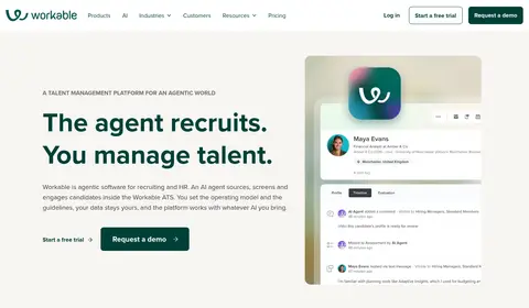
Hero
Warm off-white, two-column introduction with eyebrow label, large bold green headline, supporting copy, paired trial and demo calls to action, and prominent product UI.
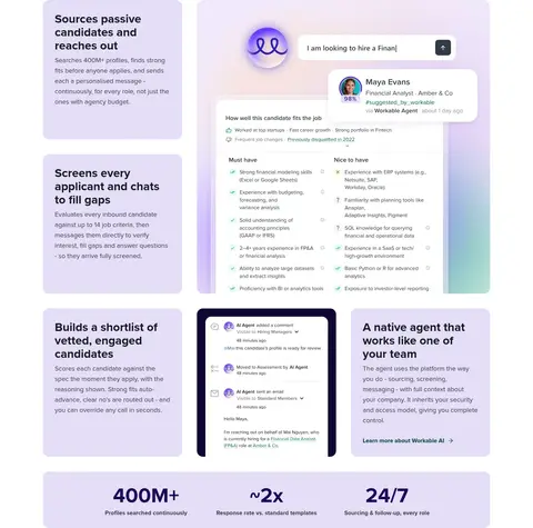
Feature card
Rounded 16px card with 32px measured padding, charcoal title and copy, using white or lavender surfaces; selected feature cards use pale peach or butter accents.
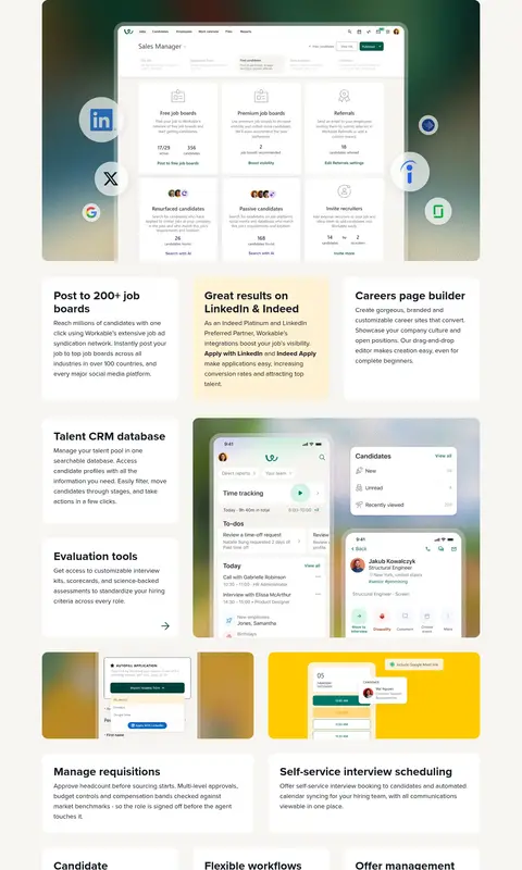
Product showcase
Large rounded product-interface image set beside or above feature copy, often with a muted multicolour backdrop and surrounding smaller cards.
Stats strip
Wide pale lavender rounded panel with three evenly spaced numeric proof points and compact supporting labels.
Primary action
Deep green filled CTA with white bold label and arrow; pair with an unfilled green text link or an outlined trial action where appropriate.
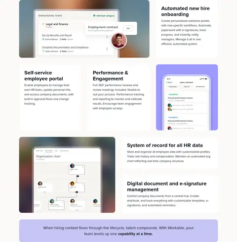
Imagery · Use product UI as the primary visual language: hiring dashboards, candidate profiles, mobile HR screens, and workflow views. Show interface captures in large, softly rounded frames, often over muted blurred gradients that belong to the media rather than the site canvas. Avoid relying on lifestyle photography; screenshots and interface mockups should explain the product and provide visual weight.
Use warm off-white and white as the main section surfaces.
Reserve Workable Green for branding, key text, links, and primary actions.
Pair concise feature copy with real-looking product interface visuals.
Build long pages from clearly differentiated background bands.
Keep cards rounded and generously padded.
Use lavender, peach, and gradients as controlled accents.
✕ 不该做
Do not make the whole page dark or heavily saturated.
Do not treat illustration-only colours as core brand colours.
Do not add heavy shadows or unnecessary borders.
Do not crowd the page with dense text or tight card spacing.
Do not replace product UI with generic lifestyle photography.
Do not use bright gradients as a default section background.
给 AI 的提示词
想快速出一个同风格的新页面,把这段话连同 DESIGN.md 一起发给 AI。
Build a new Workable-style SaaS page with a calm, product-led visual system. Use Canvas White (#ffffff) and Warm Gallery (#f7f5f1) as the primary surfaces, with Workable Green (#004038) for the wordmark, key headings, links, and main actions; use Platform Charcoal (#151a21) for a single dark section and body text. Set all type in Proxima Nova or a close sans-serif substitute, using bold, prominent headings and readable body copy. Keep the layout spacious within a centered 1208px maximum frame, with clear background bands, split product showcases, and modular rounded cards. Show interface mockups as the main imagery in soft rounded frames. Use Lavender Panel (#e5def8), Peach Proof (#fef1e1), and the mint-lime-violet gradient sparingly. Prefer flat surfaces and whitespace over shadows or decorative borders.