North star · Keep the interface stark and legible, then let immersive mobility photography and targeted purple blocks carry the brand’s energy.
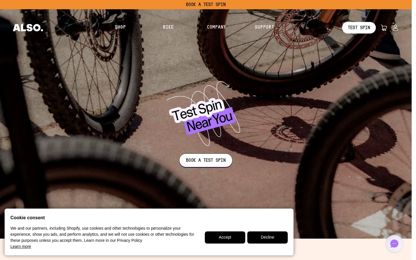
The visual identity balances restrained interface colours with expressive photography and a bold purple accent. White provides the main canvas; black and near-black define navigation, labels, CTA surfaces, and dark content bands. Purple marks key promotional moments, press content, and the newsletter, while the deep violet footer gives the page a distinct ending. Typography contrasts a light, tightly tracked display sans with a heavy, uppercase utility face for navigation and eyebrow labels. The layout shifts between expansive hero media, a compact three-card entry point, horizontal content rails, and broad feature imagery rather than repeating one rigid grid. Rounded buttons and cards soften the otherwise high-contrast composition. Product and lifestyle photos supply most of the colour and texture; interface chrome stays simple, allowing bikes, riders, and real-world settings to remain the focus.
Display headings, editorial copy, and uppercase links.
Aa 设计
Serial C
网络字体 · 字重 900 · 占比 48%
免费替代:Barlow Condensed
Body emphasis, navigation, and eyebrow labels.
角色
示例
字号
字重
行高
字距
特大标题
Oversized hero and brand statements.
ALSO
72px
400
0.94
-0.055em
一级标题
Primary hero headline and major campaign message.
ALSO
60px
400
0.93
-0.05em
二级标题
Section headings such as Stories or feature titles.
ALSO
44px
400
1.09
-0.045em
三级标题
Card and editorial feature headings.
ALSO
32px
400
1.12
-0.047em
四级标题
Smaller supporting headings and card titles.
The quick brown fox 敏捷的狐狸
24px
400
1.16
-0.042em
正文
Bold utility copy and compact supporting text.
The quick brown fox 敏捷的狐狸
16px
900
1.5
0
导航
Uppercase primary navigation labels.
The quick brown fox 敏捷的狐狸
16px
900
1.25
0.063em
链接
Uppercase action links and compact calls to action.
The quick brown fox 敏捷的狐狸
16px
400
1.5
-0.016em
眉题
Tracked uppercase labels above or beside section content.
The quick brown fox 敏捷的狐狸
16px
900
1.5
0.063em
间距与布局
基准单位 4px · 密度:紧凑
40px版块间距
12px元素间距
20px卡片内边距
—内容最大宽度
4px
8px
12px
15px
16px
20px
24px
32px
40px
56px
62px
80px
The page spans a broad desktop canvas, with measured content arranged in fluid columns rather than a fixed max-width container. A full-bleed hero leads into a three-card entry row, then horizontal image and press rails, a large product feature, story cards, newsletter, and footer. Alignment alternates between centered hero messaging and left-aligned editorial sections. Section changes are carried by imagery and background bands, not excessive separators. Keep internal spacing compact and purposeful, with larger breathing room around major media.
圆角与层次
按钮 · 9999px
卡片 · 16px
图片 · 8px
导航 · 9999px
链接 · 9999px
hairline · button, link
hairline · card
hairline · button
The page is mostly flat, relying on full-width colour bands and image contrast to separate sections. Cards use restrained, subtle shadows, while buttons have compact hard-edged shadow lines. Borders are sparse and dark where functional controls need definition; rounded pills and cards provide the main component layering.
组件
下面的预览按实测的按钮、输入框、徽标、卡片样式重建(字体用替代字体)。
Announcement strip
A narrow, high-contrast booking prompt sits above the main navigation, with centered uppercase copy and a warm orange appearance in the screenshot.
Pill CTA
Use rounded pill buttons. Primary SHOP GEAR and BUILD YOUR TM-B actions use #ac74fc with dark text and a violet hard shadow; READ MORE uses black with white uppercase text.
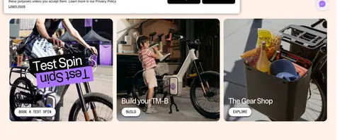
Entry card row
Three image-led destinations introduce test rides, bike building, and gear shopping; place concise labels and small pill actions over or near the photographs.
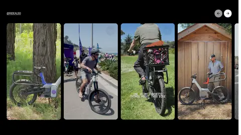
Community media rail
A dark band holds a horizontal series of tall rider and bike clips, with compact controls and a small uppercase social label.
Press quote tiles
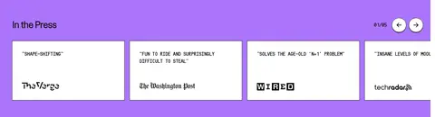
A vivid purple section groups white rectangular quote cards with short uppercase headlines and publication marks.
Story cards
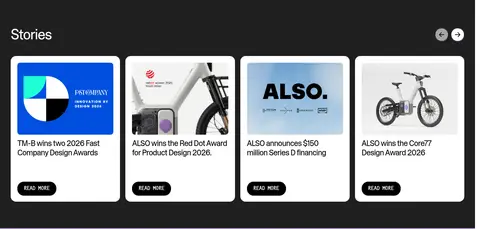
White, rounded cards combine a press or product image, concise headline, and black pill READ MORE action on a dark field.
Newsletter block
A purple band introduces mailing-list signup with prominent heading, short prompt, email field, and a contrasting submit action.
Brand footer
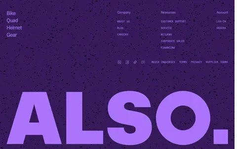
A deep violet footer organizes link columns and social links, finished with an oversized violet ALSO wordmark.
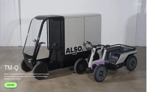
Imagery · Use real-world bike, rider, and cargo photography as the primary visual material, with occasional product-focused scenes and embedded social clips. Hero media is full-bleed and atmospheric; card imagery is tightly framed with rounded corners. Preserve natural settings and photographic colour rather than applying heavy brand filters. Purple appears as a graphic overlay or supporting interface colour, not as a replacement for the photography.
Use full-bleed photography for the hero and major product moments.
Reserve #ac74fc for prominent accents and clear calls to action.
Keep navigation and utility labels uppercase and strongly weighted.
Use rounded pills for buttons and rounded corners for image cards.
Alternate dark media bands with light editorial sections.
Let product and rider photography provide most of the visual texture.
✕ 不该做
Do not turn every section into a purple block.
Do not overlay dense interface chrome on full-bleed imagery.
Do not replace real-world product photography with generic illustrations.
Do not use soft gradients; the measured page has none.
Do not make cards feel heavily elevated or outlined.
Do not use widely spaced, delicate text for functional labels.
给 AI 的提示词
想快速出一个同风格的新页面,把这段话连同 DESIGN.md 一起发给 AI。
Build a new ALSO page with a light, uncluttered canvas and bold mobility photography. Use Gallery White (#ffffff) for primary surfaces, Absolute Ink (#000000) and Graphite (#1f1f1f) for text and dark bands, and Electric Orchid (#ac74fc) for key buttons and selective section accents. Keep the display sans light and tightly tracked; use a heavy, uppercase utility face for navigation and eyebrow labels. Structure the page as broad media-led sections, alternating full-bleed imagery, compact rounded-card groups, and horizontal editorial rails. Make CTAs pill-shaped with concise uppercase labels and restrained hard shadows. Keep borders and elevation minimal. Let real bikes, riders, and cargo scenes dominate the visual storytelling, and finish with a deep violet footer and oversized brand typography.