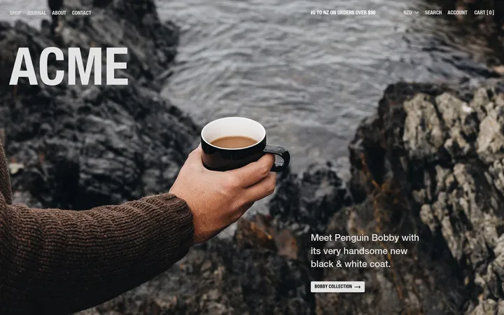
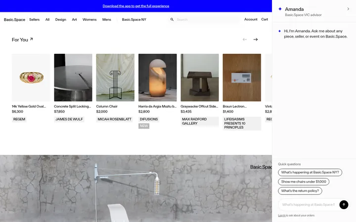
North star · Keep the interface quiet and legible so vivid, real product photography supplies the personality.
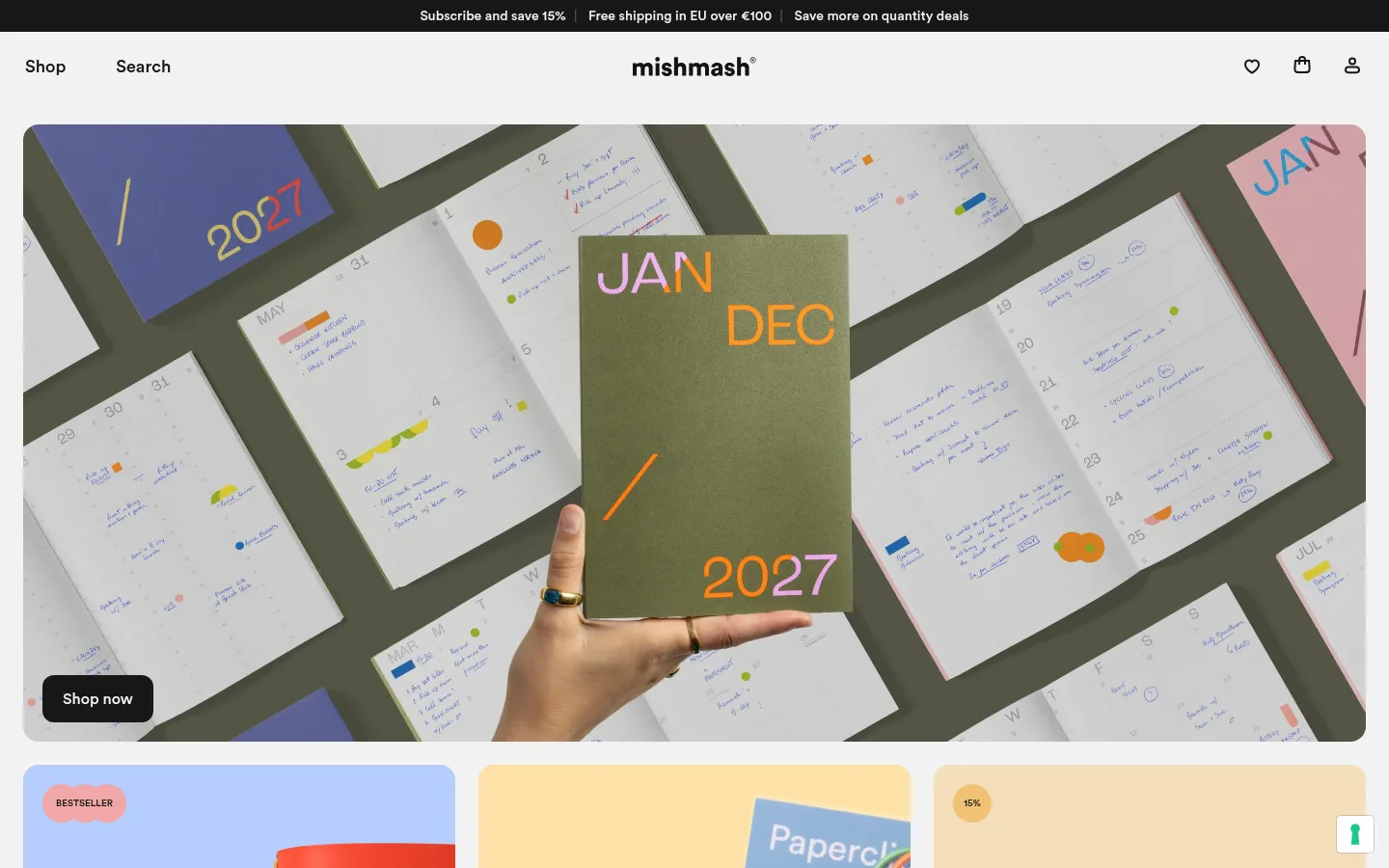
The visual system pairs a pale grey canvas with near-black typography and a small set of warm, muted card surfaces. Product photography supplies the vivid colour: planners, notebooks, pens and accessories sit in bright, tactile scenes, while the interface itself stays quiet. Circular is the defining typeface, used in clear medium-to-semibold weights with natural case and compact line spacing; headings are confident but not decorative. The homepage moves from a slim black promotion strip and understated navigation into a broad rounded hero image, then a row of category cards, editorial copy, social content and product-led sections. Consistent alignment and generous pauses separate dense shopping information from imagery. Cards are mostly flat, with rounded corners and little or no shadow; fine grey borders distinguish secondary controls. Black pill-like CTAs provide the strongest interface contrast, leaving colourful merchandise to carry the energy.
Primary interface and content typeface across headings, body copy, navigation, buttons, and commerce cards.
Aa 设计
-apple-system
系统字体 · 字重 700 · 占比 5%
免费替代:Inter
Small utility or consent-interface text; a minor system-font exception.
角色
示例
字号
字重
行高
字距
一级标题
Primary hero or lead statement, set prominently in Circular.
mishmash
45.5px
500
1.04
0
二级标题
Major section headings, including product and editorial introductions.
mishmash
37.5px
600
1.2
0
三级标题
Subsection titles and secondary content headings.
mishmash
29.5px
600
1.2
0
正文
Product descriptions, supporting copy, and editorial text.
The quick brown fox 敏捷的狐狸
18px
500
1.12
0
辅助文字
Compact labels and secondary card or media information.
The quick brown fox 敏捷的狐狸
16px
600
1.2
0
按钮
Shopping calls to action and product controls.
The quick brown fox 敏捷的狐狸
18px
600
1.12
0
链接
Small utility or footer links.
The quick brown fox 敏捷的狐狸
16px
700
1
0
间距与布局
基准单位 8px · 密度:适中
48px版块间距
8px元素间距
20px卡片内边距
—内容最大宽度
2px
4px
6px
8px
12px
14px
16px
20px
24px
48px
The page uses a wide desktop composition with content aligned to consistent outer margins; no measured maximum width is available. A shallow announcement strip and centered-brand navigation precede a nearly full-width hero. Below, three category cards form a row, followed by full-width editorial content and horizontally arranged social and product modules. Sections breathe between content clusters, while product details and review cards use denser internal layouts. The overall rhythm alternates broad imagery with compact shopping information.
圆角与层次
按钮 · 12px
卡片 · 16px
导航 · 4px
链接 · 12px
hairline · button
The interface is mostly flat, with cards differentiated through white or softly tinted surfaces rather than pronounced shadows. Rounded corners soften the hero, category panels, and product imagery. Secondary controls use delicate grey hairlines; the measured button shadow is only a subtle one-pixel outline. Dark buttons sit clearly above the light canvas through contrast, not heavy elevation.
组件
下面的预览按实测的按钮、输入框、徽标、卡片样式重建(字体用替代字体)。
Announcement strip
A narrow near-black band with compact light promotional messages separated inline above the main navigation.
Centered-brand navigation
Shop and Search sit to the left, the wordmark is centered, and simple account, bag, and favourite icons align on the right.
Hero campaign
A wide, rounded product photograph anchors the first viewport, with a compact black Shop now button placed over its lower-left corner.
Category cards
Three side-by-side image-led panels mix brief product/category copy with dark rounded shopping buttons and soft tinted surfaces.
Product card
A clean merchandise image and concise name and price are paired with a small Add control; secondary controls use a light hairline.
Review panels
White, flat cards arrange star ratings, compact customer quotes, names, and dates in a horizontally browsable row.
Imagery · Photography is the dominant visual asset: stationery appears in use, arranged on desks, held in hands, or presented in colourful product groupings. The hero crops close around a planner and surrounding pages, while category and product cards keep merchandise immediately recognizable. Social content includes portrait video and candid user-created scenes. Interface surfaces remain understated so the real product colours and textures stand out.
Let vivid stationery photography provide the strongest colour.
Set primary copy in Circular or a close rounded sans-serif.
Use #171717 for high-contrast shopping calls to action.
Separate content with generous, consistent whitespace.
Keep cards flat and use soft rounded corners.
✕ 不该做
Do not introduce saturated interface colours absent from the measured palette.
Do not add heavy shadows or layered effects.
Do not use decorative display fonts or all-caps styling throughout.
Do not crowd the hero with competing text or controls.
Do not make product cards visually louder than their photography.
Do not invent unmeasured dimensions, spacing, or corner radii.
给 AI 的提示词
想快速出一个同风格的新页面,把这段话连同 DESIGN.md 一起发给 AI。
Build a new stationery-commerce page in the mishmash visual style. Use Gallery Mist (#f2f2f2) as the light canvas, Soft Ink (#171717) for typography and primary CTAs, Paper White (#ffffff) for clean cards, and restrained Warm Pulp (#dfded6) or Vanilla Stock (#f4debb) for occasional tinted surfaces. Use Circular, or a close rounded sans-serif substitute, with clear medium-to-semibold headings and compact readable copy. Arrange a simple header, broad image-led feature, and orderly product or editorial modules with consistent alignment and comfortable whitespace. Keep merchandise photography natural, colourful, and tactile; do not add decorative UI colour to compete with it. Favor flat surfaces, soft rounded corners, fine Quiet Rule (#e3e3e3) borders, and compact dark shopping buttons. Preserve a calm, product-first hierarchy.