North star · Balance a pale, compact storefront layout with oversized slot artwork, dark burgundy content bands, and clearly prioritized account actions.
The page contrasts a charcoal-navy storefront header and deep burgundy FAQ band against a pale blush-white main canvas. The measured neutral canvas is #f4f4f5, while the screenshot renders it with a pink cast; preserve the measured value and let imagery and nearby red accents supply warmth. Near-black #151523 carries headings and utility text. Red gradients, luminous zigzag motifs, and vivid blue account controls give the interface its gaming character. A large, highly detailed slot-game promotional image dominates the left side of the hero, with a narrow text column to its right. Bold, compact headings sit above tightly set body copy; Roobert is the main sans voice, with Sharp Grotesk used for display headings and Inter for emphatic actions. The FAQ and review section switches to a burgundy field with stacked bordered cards. Spacing is compact and content-heavy, while rounded buttons and cards soften the otherwise assertive, high-contrast treatment.
配色
点色块复制色值。用途说明来自对页面的实测位置(背景、文字、描边、按钮)与截图判读。
品牌色
强调色
表层色
中性色
功能色
页面底色 · Pale Canvas表层 · Casino Burgundy表层 2 · Soft Silver表层 3 · Midnight Ink主文字 · Midnight Ink次要文字 · Blush Lettering弱文字 · Clean White描边 · Periwinkle Edge强调 · Account Blue强调 2 · Hot Signal Red强调 3 · Brick Link
Primary body copy, product labels, and search text.
Aa 设计
Inter
系统字体 · 字重 400 / 900 / 800 · 占比 29%
免费替代:Inter
Uppercase CTA and link labels, plus review and FAQ copy.
Aa 设计
Arial
系统字体 · 字重 700 / 400 · 占比 9%
免费替代:Arial
Small bold captions and secondary utility button text.
Aa 设计
SharpGrotesk-Bold
网络字体 · 字重 700 / 400 · 占比 7%
免费替代:Space Grotesk
Display title and prominent page headings.
Aa 设计
Roobert-Bold
网络字体 · 字重 400 / 700 / 500 · 占比 6%
免费替代:Inter
Section headings and secondary headline hierarchy.
Aa 设计
Roobert-SemiBold
网络字体 · 字重 600 / 700 · 占比 4%
免费替代:Inter
Navigation labels and account-related controls.
角色
示例
字号
字重
行高
字距
一级标题
Main product-page title in the hero text column.
VEGAS123
32px
400
1
0
二级标题
Hero section heading and FAQ or review section titles.
VEGAS123
28px
400
1
0
三级标题
Subsection headings within the product description.
The quick brown fox 敏捷的狐狸
24px
700
1.15
0
正文
Compact explanatory copy beside the promotional image.
The quick brown fox 敏捷的狐狸
16px
400
normal
0
辅助文字
Small supporting labels and short utility captions.
The quick brown fox 敏捷的狐狸
13.5px
700
normal
0
按钮
Prominent uppercase login and registration actions.
The quick brown fox 敏捷的狐狸
16px
900
normal
0.05em
导航
Storefront account, cart, and category navigation.
The quick brown fox 敏捷的狐狸
16px
700
1.25
0
链接
Uppercase login links and emphasized actions.
The quick brown fox 敏捷的狐狸
16px
900
normal
0.053em
眉题
Short uppercase labels introducing action or content groups.
The quick brown fox 敏捷的狐狸
16px
900
normal
0.053em
间距与布局
基准单位 2px · 密度:紧凑
32px版块间距
4px元素间距
14px卡片内边距
1230px内容最大宽度
2px
3px
4px
5px
6px
8px
9px
10px
11px
12px
13px
14px
15px
16px
17px
20px
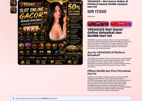
The measured content max width is 1230px, with compact spacing and a small base unit. The first section uses a two-column product-detail composition: a large media area on the left and a narrower, left-aligned text stack on the right. A dark, full-width navigation sits above the content, followed by paired login and registration strips. The FAQ and reviews switch to a single-column burgundy band; the closing tag area returns to the pale canvas. Keep section transitions distinct and vertical gaps restrained.
圆角与层次
按钮 · 9999px
输入框 · 12px
卡片 · 10px
图片 · 20px
导航 · 12px
链接 · 8px
inset · button
inset · card
sm · link, button
inset · link, button
The page mixes flat section bands with rounded, outlined cards. FAQ and testimonial panels use thin borders and dark burgundy fills; the measured testimonial outline is slate. Buttons and cards use layered shadows, including red glows on promotional actions. Keep shadows concentrated on interactive elements and let the major image provide most of the visual depth.
组件
下面的预览按实测的按钮、输入框、徽标、卡片样式重建(字体用替代字体)。
Storefront header
Dark horizontal header with a logo, wide search field, account and cart utilities, and a blue registration action.
Category navigation
Compact row of category links with small promotional icons beneath the main header.
Login and registration strips
Two side-by-side red-gradient actions spanning the content width, with luminous decorative zigzags.
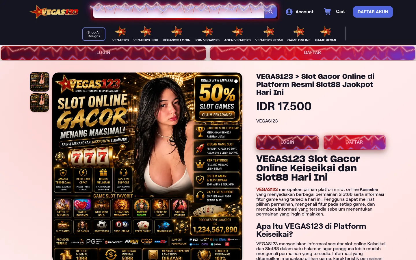
Product-detail hero
Large slot-game artwork and thumbnails on the left; product title, price, copy, and paired actions on the right.
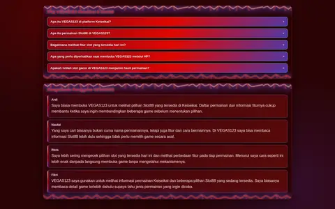
FAQ accordion
Stacked question rows inside the full-width burgundy section, using rounded red-gradient controls.
Testimonial cards
A vertical stack of dark cards with pale text, thin slate outlines, and subtle inset glow.
Trending tags
Closing light section with red title, compact outlined pill links, and sharing utilities.
Imagery · The hero is led by a large, static promotional slot-game graphic: gold-on-black casino motifs, game tiles, prize messaging, and a portrait are combined into one dense media panel. Small thumbnails sit beside it. The image is high contrast and richly detailed, so keep surrounding text and layout relatively clean. No video is measured; supporting sections rely on text, gradient treatments, and compact controls rather than new photography.
Keep the navigation dark and visually separate from the pale content canvas.
Give the promotional slot artwork the strongest visual emphasis in the hero.
Use burgundy section bands to group FAQ and review content.
Reserve Account Blue #4e64df for the primary registration action.
Use Hot Signal Red #e10600 for restrained link and glow accents.
Keep headings bold, compact, and clearly separated from body copy.
✕ 不该做
Do not replace the measured pale canvas with a dark page-wide background.
Do not let small interface accents compete with the hero artwork.
Do not use blue as the dominant section or background color.
Do not spread the dense content into oversized, airy editorial layouts.
Do not flatten every action; preserve rounded controls and selective glow.
Do not treat colors inside the promotional graphic as core interface palette.
给 AI 的提示词
想快速出一个同风格的新页面,把这段话连同 DESIGN.md 一起发给 AI。
Build a new page in the VEGAS123 visual style using a pale #f4f4f5 canvas, a #151523 storefront header, and a deep #2a0406 content band for dense supporting modules. Use Hot Signal Red #e10600 for small emphatic accents and red glow effects; use Account Blue #4e64df for the primary account action with white text. Create a compact two-column hero with a large, detailed gaming promotion image beside a narrow text stack. Use bold geometric display headings, Roobert-like sans body copy, and heavy uppercase action labels. Keep the layout dense, left-aligned, and restrained in spacing. Round buttons and cards, outline secondary panels, and apply shadows selectively. Finish with a light tag-link area rather than extending the dark section across the whole page.