North star · Keep the page quiet and spacious, then let editorial serif headlines, vivid client imagery and a few blue accents create the emphasis.
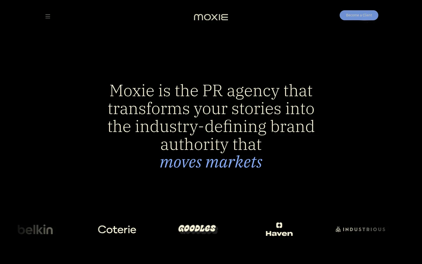
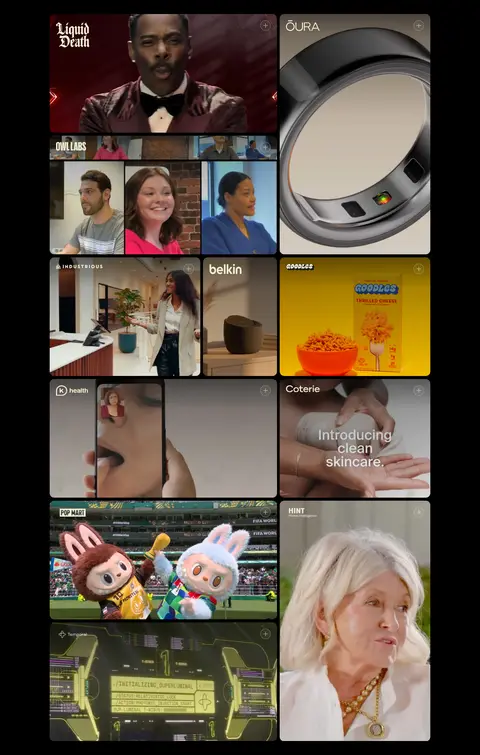
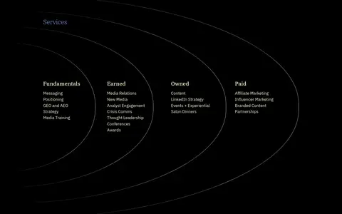
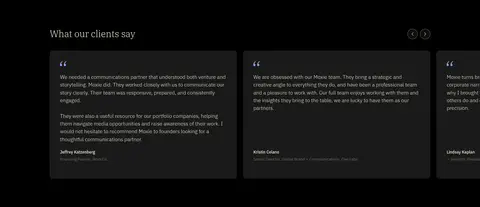
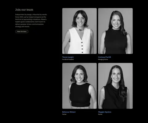
The page is anchored by a predominantly black canvas (#000000), letting warm ivory (#f4efd4) typography carry the visual identity. Periwinkle blue (#84acfb) is a deliberate signal rather than a broad surface colour: it picks out the final phrase in the hero and the primary client CTA. IBM Plex Serif supplies the lightweight, editorial headline voice, while IBM Plex Sans keeps navigation, service lists, captions and supporting copy direct and compact. The centered hero has generous breathing room; below it, client logos and case-study media introduce denser visual sequences. The case-study gallery uses an asymmetric mosaic of colorful photography and video, with dark gutters and rounded image corners. Service information shifts to a multi-column arrangement with fine, low-contrast curved linework. Testimonials use charcoal panels against black, while team portraits are presented as grayscale cards. Keep section backgrounds mostly continuous and use hairlines and restrained contrast instead of heavy elevation.
Navigation, body copy, service lists, captions, buttons and supporting text.
Aa 设计
IBM Plex Serif
网络字体 · 字重 300 / 500 / 400 · 占比 10%
免费替代:Lora
Large editorial hero and section headlines.
角色
示例
字号
字重
行高
字距
一级标题
Centered, multi-line hero statement with an italic blue closing phrase.
Moxie
55.5px
300
1.1
0
二级标题
Large editorial section titles, including services and client feedback.
Moxie
43.5px
300
1.1
0
三级标题
Secondary feature or team headings.
The quick brown fox 敏捷的狐狸
27.5px
300
1.1
0
四级标题
Smaller service and content subsection headings.
The quick brown fox 敏捷的狐狸
26px
300
1.1
0
正文
Light supporting copy, testimonials, service details and team introduction.
The quick brown fox 敏捷的狐狸
15.5px
300
1.5
0
辅助文字
Compact names, roles and media labels.
The quick brown fox 敏捷的狐狸
14px
400
1.2
0
导航
Small, understated menu and header navigation text.
The quick brown fox 敏捷的狐狸
14px
300
1.5
0
间距与布局
基准单位 1px · 密度:适中
35px版块间距
21px元素间距
—卡片内边距
1142px内容最大宽度
7px
9px
14px
17px
19px
21px
28px
31px
35px
48px
52px
76px
87px
93px
Use a centered content frame with a measured maximum width of 1142px, while preserving broad black margins and generous open space. The hero is centered and narrow in feel; client marks form a horizontal band beneath it. Case-study media uses a three-column, asymmetric mosaic rather than uniform tiles. Services spread across four columns, testimonials form a horizontal card rail, and the team section pairs introductory copy with portrait cards. Keep section transitions spacious and alignment deliberate.
圆角与层次
按钮 · 50%
导航 · 9999px
没有测到阴影:页面是扁平的,层次靠底色和描边区分。
The design is mostly flat: black sections flow together without visible elevation or drop shadows. Use charcoal panels to distinguish testimonial cards and fine olive-gray borders for outlined pill controls. Image tiles provide their own depth through photography, rounded corners and close dark gutters; keep overlays and layered effects minimal.
组件
下面的预览按实测的按钮、输入框、徽标、卡片样式重建(字体用替代字体)。
Header
Sparse black header with a small menu icon at left, centered Moxie wordmark, and a right-aligned periwinkle pill CTA.
Hero statement
Centered IBM Plex Serif headline in warm ivory, broken into short lines and finished with italic periwinkle emphasis.
Client logo band
Horizontal row of client marks beneath the hero; logos retain their individual treatments against the black background.
Case-study mosaic
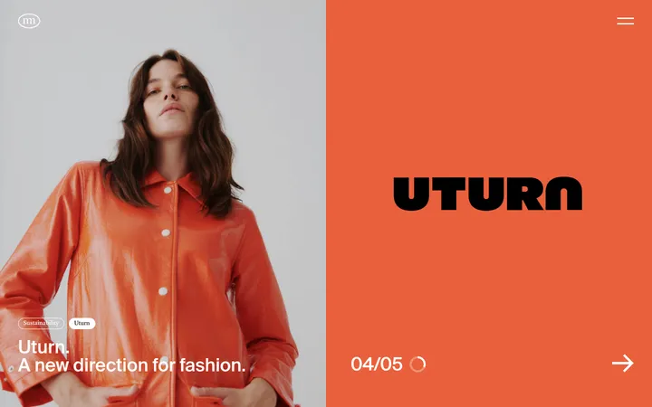
Asymmetric three-column media collage combining varied tile widths, campaign stills, video previews and rounded corners.
Service framework
Four-column service content framed by subtle curved hairlines; use ivory headings and compact supporting lists.
Testimonial rail
Horizontal row of dark charcoal quote cards with small ivory copy, restrained blue quotation marks and compact attribution.
Team portrait cards
Editorial team section pairing introductory copy with grayscale portrait cards and small name-and-role captions.
Footer
Compact black footer with the Moxie wordmark and understated location, contact, social and legal links.
Imagery · Client logos appear as a restrained horizontal proof strip. The case-study gallery is the most image-rich area: mix portrait and landscape campaign stills, product imagery and video thumbnails in an asymmetric collage. Preserve the original media’s color rather than adding a uniform filter. Team portraits are monochrome, tightly framed cards; avoid decorative illustration outside the fine service-section linework.
Reserve #84acfb for decisive emphasis and the primary CTA.
Let colorful client media supply most of the image-led contrast.
Keep navigation and supporting copy compact and understated.
Use asymmetric media tiles and generous negative space.
Keep borders and section linework subtle.
✕ 不该做
Do not introduce broad bright section backgrounds.
Do not use heavy shadows or conspicuous gradients.
Do not make every headline blue or italic.
Do not force campaign imagery into uniform square tiles.
Do not crowd the hero with supporting controls.
Do not replace fine linework with bold dividers.
给 AI 的提示词
想快速出一个同风格的新页面,把这段话连同 DESIGN.md 一起发给 AI。
Build a new agency page in Moxie’s editorial visual language. Use Stage Black (#000000) as the continuous canvas and Warm Ivory (#f4efd4) for most text. Set large statements in a light IBM Plex Serif style, with IBM Plex Sans for navigation, body copy, labels and controls. Introduce Periwinkle Signal (#84acfb) sparingly for a primary pill CTA and short headline emphasis. Keep the header sparse, the hero centered with ample negative space, and content inside a measured 1142px maximum frame. Use an asymmetric media mosaic that preserves the imagery’s own colors, then organize service details into columns and testimonials into charcoal cards. Use Muted Olive (#626055) only for subtle outlines or hairlines. Avoid shadows, bright section bands and excessive decoration.