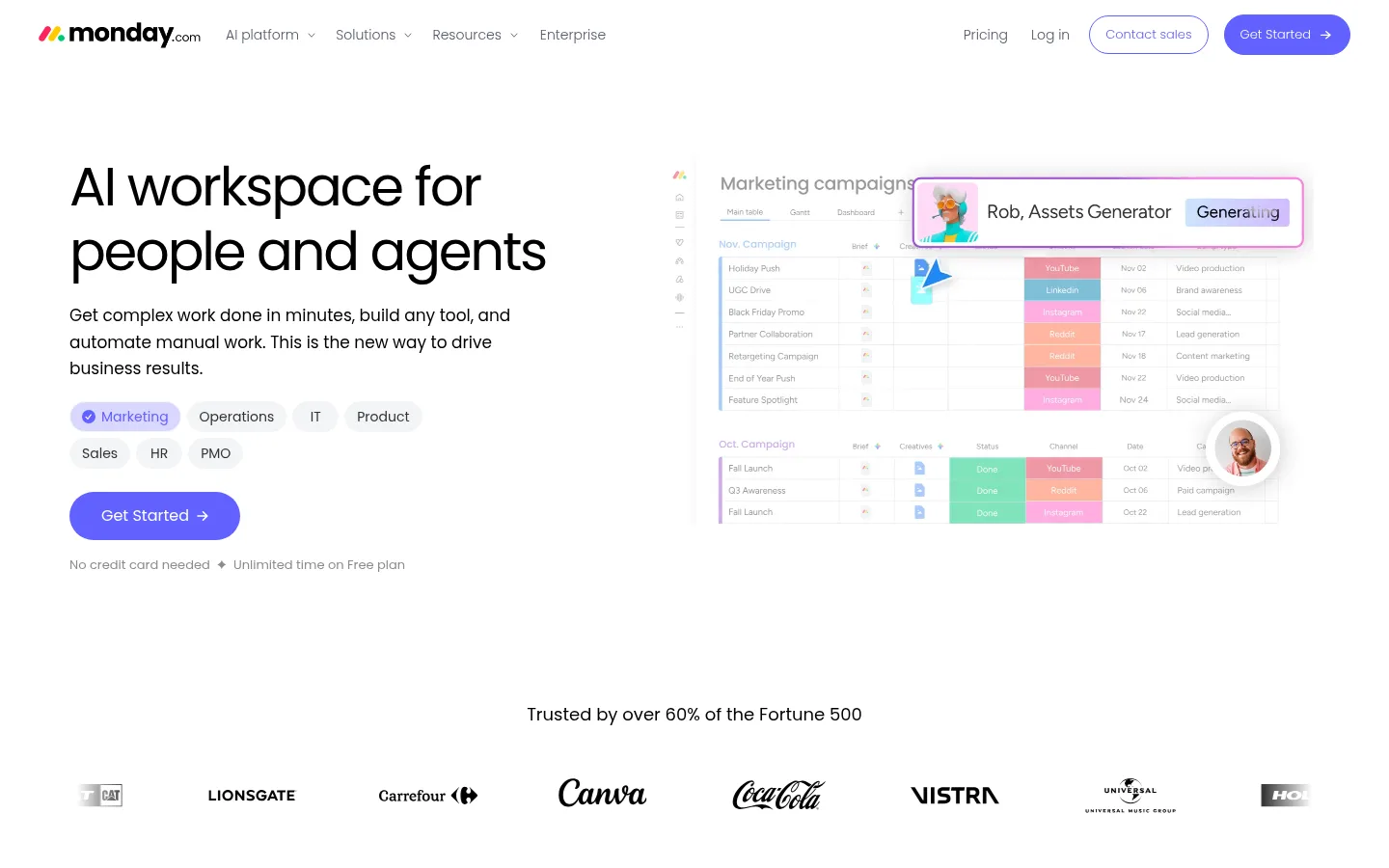
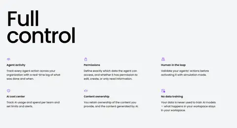
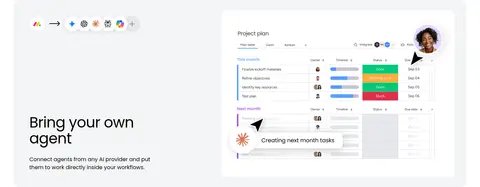
首页以大面积白色留白呈现 monday.com 的 AI 工作平台,并通过醒目的 Poppins 标题和紫色行动按钮建立视觉主线。产品界面展示、客户案例与企业安全内容层层展开,讲述从 AI 功能到可信赖协作的完整故事。
North star · Keep the canvas bright and spacious, use black Poppins for confident hierarchy, and save vivid violet for clear actions.
The page uses a predominantly white canvas, with occasional pale-gray bands to distinguish selected sections without breaking the continuous scroll. Black Poppins headlines provide strong contrast and a rounded, contemporary character; large display lines are often left-aligned or centered according to the section. Body copy and navigation stay restrained in muted gray. A saturated violet is reserved for primary calls to action and select interface accents, while pink, lavender, and warm yellow appear sparingly in badges, gradients, and product visuals. The layout alternates between broad two-column storytelling and centered showcases, with generous vertical breathing room and a compact, disciplined content density inside each block. Product screenshots, workflow diagrams, customer proof, and colorful agent illustrations make the page feel tangible. Rounded cards, pill-shaped buttons, and light media shadows soften the crisp typography and keep the interface approachable.
Used throughout for navigation, headings, body copy, buttons, and captions.
角色
示例
字号
字重
行高
字距
特大标题
Oversized campaign-style display headlines in prominent storytelling moments.
monday.com
128px
500
1.3
-0.04em
一级标题
Primary page and hero headline.
monday.com
56px
400
1.2
-0.03em
二级标题
Major section headlines, often centered or left-aligned.
monday.com
52px
500
1.1
-0.04em
三级标题
Subsection and feature headlines.
monday.com
44px
400
1.1
-0.02em
四级标题
Supporting feature titles and card headings.
The quick brown fox 敏捷的狐狸
24px
400
1.4
-0.02em
正文
Explanatory copy, product descriptions, and customer stories.
The quick brown fox 敏捷的狐狸
14px
400
1.6
0
辅助文字
Compact supporting labels and secondary explanatory text.
The quick brown fox 敏捷的狐狸
13px
300
3.08
0
按钮
Text inside primary and secondary action buttons.
The quick brown fox 敏捷的狐狸
13px
400
1
0
导航
Top-level navigation labels and menu items.
The quick brown fox 敏捷的狐狸
14px
300
1
0
链接
Inline links and lightweight secondary actions.
The quick brown fox 敏捷的狐狸
13px
300
3.08
0
间距与布局
基准单位 4px · 密度:紧凑
40px版块间距
8px元素间距
12px卡片内边距
1360px内容最大宽度
3px
4px
8px
12px
16px
20px
24px
32px
40px
48px
64px
A centered page frame reaches a measured maximum width of 1360px, with the opening hero and several feature stories arranged in two columns. Other sections shift to centered headings, multi-column feature grids, or wide product showcases. Measured section spacing uses a 40px section gap and a compact 4px-based spacing system; keep internal content orderly while allowing broad vertical breathing room between stories. Most sections remain white, with selected full-width pale-gray bands. Align text to the story: left for split features, centered for showcase and proof sections.
圆角与层次
按钮 · 9999px
卡片 · 24px
图片 · 16px
徽标 · 4px
导航 · 8px
链接 · 9999px
sm · media
sm · media
md · other
lg · card
The overall treatment is mostly flat, with section bands and clean whitespace doing most of the separation. Product media receives subtle shadows, and some feature cards use soft elevation. Hairline borders define selected controls and card edges. Rounded media frames and cards create depth without heavy outlines or strong drop shadows.
组件
下面的预览按实测的按钮、输入框、徽标、卡片样式重建(字体用替代字体)。
Primary CTA
Violet #6161ff pill button with white text; the measured Get Started variants use rounded ends and compact Poppins labels.
Top navigation
Lightweight horizontal header on white, with black navigation text, muted links, and right-aligned contact and signup actions.
Hero split
Large left-aligned headline and concise copy sit beside a layered marketing-workspace product visual.
Feature showcase
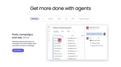
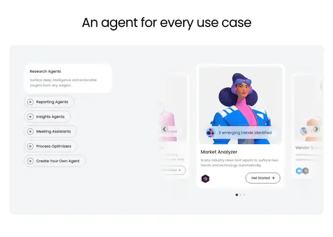
Centered section titles introduce product media, agent cards, and interface examples, often with supporting feature text.
Pale section band
Full-width #f3f4f5 background distinguishes control, integration, and customer-proof sections.
Product card
Rounded UI panels and cards present agent capabilities or workflows; cards may use white or pale-gray surfaces and gentle shadows.
Customer proof card
A broad pale-gray story area contains colorful customer evidence, metrics, quotation text, and navigation controls.
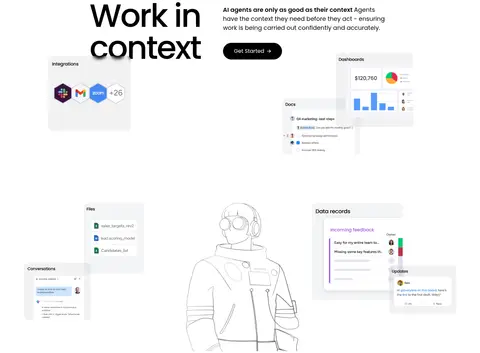
Imagery · Product UI screenshots and interface mockups dominate, showing boards, task views, agent interactions, dashboards, and workflow diagrams. They are arranged as floating or layered panels, with small human portraits and bright category colors appearing inside the mockups. The page also uses customer and compliance visuals, plus occasional illustrated agent artwork. Keep visuals crisp and lightly framed; colorful details inside mockups should not overwhelm the white canvas.
Set headings and body copy in Poppins or a close substitute.
Reserve #6161ff for primary actions and selected accents.
Use #f3f4f5 bands to separate key content chapters.
Pair large headlines with concise supporting copy.
Present product UI in rounded, clearly layered panels.
✕ 不该做
Do not fill every section with saturated color.
Do not use heavy shadows as the main source of hierarchy.
Do not make every heading centered; follow the section story.
Do not let decorative mockup colors define the page palette.
Do not crowd the broad section transitions with extra content.
Do not style secondary navigation as primary CTAs.
给 AI 的提示词
想快速出一个同风格的新页面,把这段话连同 DESIGN.md 一起发给 AI。
Build a new page in the monday.com homepage style: use a bright #ffffff canvas and Poppins throughout, with oversized black #000000 headlines and restrained gray supporting text. Use #6161ff for the primary CTA, keeping other bright colors limited to accents inside product visuals. Separate selected chapters with pale #f3f4f5 bands. Compose a clear editorial rhythm: split text-and-product layouts, centered showcase headings, and occasional multi-column proof or feature grids. Show the product through crisp interface panels, workflow diagrams, and layered screenshots rather than generic decoration. Use rounded cards and pill actions, fine #cacbcd borders where needed, and subtle shadows only on media. Preserve generous whitespace between sections while keeping copy and controls compact.