浅色主题AIAI research and models homepage编辑感极简暖中性色衬线字体等宽字体原网页 microsoft.ai ↗ · 2026-10-12 采集 · 1440×900 桌面端
Microsoft AI 以克制的编辑式设计搭配桃色笔触背景,呈现兼具人文气息与科技感的品牌形象。暖象牙色留白、文学感衬线标题和紧凑等宽导航,让模型与理念显得从容而易读。
North star · Use warm, spacious editorial typography as the interface; reserve saturated color for expressive artwork.
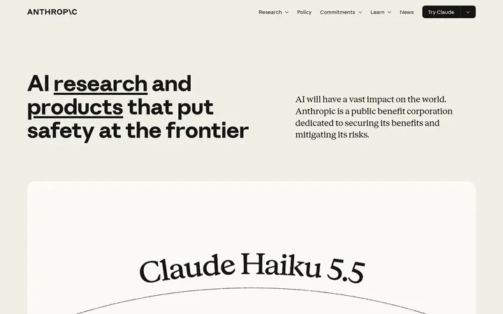
The page builds its identity around a warm ivory canvas (#fef9ed) and dark, muted brown text (#5d524b), with near-white and pale cream surfaces creating subtle shifts between content areas. A peach surface appears as a supporting section color, while the opening viewport is defined by a much more vivid peach-and-terracotta painted image; treat those saturated colors as hero artwork, not as the general interface palette. Bradford LL supplies large, high-contrast serif headlines and product names, balanced by Red Hat Mono for navigation, labels, metadata, and buttons. The composition favors narrow, centered editorial content and generous vertical breathing room. Model news appears as image-led cards, followed by a quiet, structured model list. Rounded pill actions are small punctuation in an otherwise largely flat, borderless interface. Keep text tones warm and avoid introducing unmeasured colors.
Editorial display and heading type, used for hero messaging, section titles, and model names.
Aa 设计
Red Hat Mono
网络字体 · 字重 500 / 400 · 占比 25%
免费替代:Red Hat Mono
Navigation, buttons, captions, metadata, and compact supporting text.
角色
示例
字号
字重
行高
字距
特大标题
Large hero-scale serif statement.
Microsoft AI
125px
450
1
-0.04em
一级标题
Primary page or feature headline.
Microsoft AI
57px
400
1
-0.004em
二级标题
Major section heading and prominent editorial statement.
Microsoft AI
48px
450
1.2
-0.03em
三级标题
Secondary feature and content-card heading.
Microsoft AI
42.5px
450
1.12
-0.02em
四级标题
Smaller model and subsection heading.
Microsoft AI
37.5px
450
1
-0.02em
正文
Compact monospace body and interface copy.
The quick brown fox 敏捷的狐狸
13.5px
500
1
-0.016em
辅助文字
Reading time, model labels, and small metadata.
The quick brown fox 敏捷的狐狸
11.5px
500
1.6
-0.018em
按钮
Monospace text on pill-shaped actions.
The quick brown fox 敏捷的狐狸
14px
500
1
-0.015em
导航
Compact monospace navigation links.
The quick brown fox 敏捷的狐狸
13.5px
500
1
-0.016em
链接
Large serif editorial links and model titles.
Microsoft AI
48px
450
1.2
-0.03em
代码
Small monospace technical or metadata text.
const style = 1;
11.5px
500
1.6
-0.018em
间距与布局
基准单位 1px · 密度:宽松
120px版块间距
12px元素间距
13px卡片内边距
683px内容最大宽度
5px
8px
9px
10px
12px
13px
14px
15px
17px
22px
25px
30px
33px
43px
117px
A long, vertically paced page keeps the canvas mostly uninterrupted and uses centered editorial blocks among left-aligned news and model content. The measured content max width is 683px; preserve narrow reading widths inside broad page margins. News cards form a three-column band, while the model area uses two columns and repeated rows. Large section gaps create a spacious, low-density rhythm. Center the hero statement and values content; align card copy and model details to the start.
圆角与层次
按钮 · 9999px
卡片 · 4px
导航 · 2px
链接 · 2px
lg · other
The interface is largely flat, with no prominent borders or divider rules. Separate areas through canvas and cream-surface contrast, generous whitespace, and occasional inset cards. The measured shadow is a soft, diffuse umber cast; reserve it for subtle emphasis rather than applying elevation broadly. Pill buttons are the main rounded UI element.
组件
下面的预览按实测的按钮、输入框、徽标、卡片样式重建(字体用替代字体)。
Inset navigation
A light, softly rounded horizontal bar over the hero, with a compact brand mark, centered monospace links, and a right-aligned editorial destination.
Hero statement
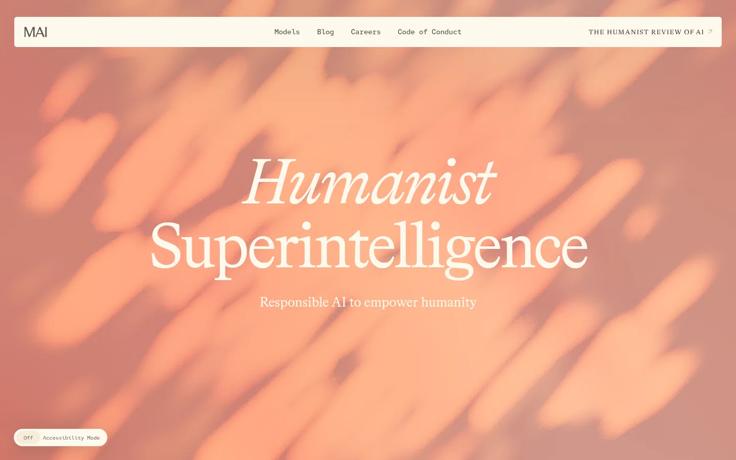
Full-bleed painterly artwork supports a centered, oversized Bradford LL serif headline and a short supporting line.
Featured news card
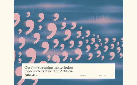
Large image-led card with an inset light caption panel, serif story title, and small monospace category and reading-time metadata.
News card rail
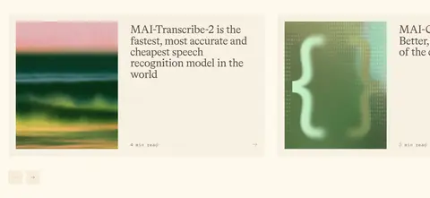
Three-column band of model and research stories, using image-and-copy cards with subdued cream surfaces and small metadata.
Model list
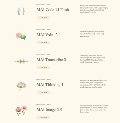
A spacious two-column presentation of model rows, combining small illustrative marks, serif model names, compact descriptions, and pill-shaped Learn more actions.
Pill actions
Monospace button labels on rounded pills; use pale cream for secondary actions and Soft Umber (#5d524b) with a light label for the primary action.
Values list
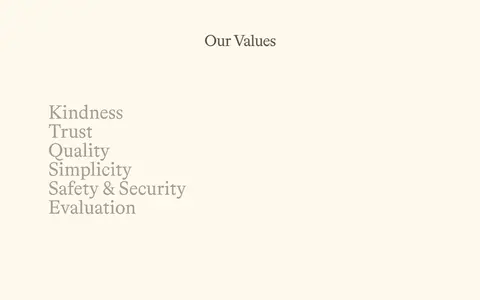
A centered serif section heading introduces a vertically arranged list of values, surrounded by ample Warm Ivory (#fef9ed) space.
Imagery · The hero is dominated by full-bleed painterly peach and terracotta strokes, with centered light serif text over the image. Below it, news cards use cropped, colorful editorial imagery, including a blue field with oversized punctuation and abstract model visuals. Small model illustrations sit beside product names. Use imagery as expressive content, not as a source for interface colors; keep crops deliberate and layouts calm.
Use Soft Umber (#5d524b) for interface text and links.
Pair expressive Bradford-style serifs with compact monospace utility text.
Give headlines and section transitions generous breathing room.
Use hero artwork for vivid peach and terracotta color.
Keep cards quiet, image-led, and lightly surfaced.
✕ 不该做
Do not spread saturated hero-art colors across the interface.
Do not add strong borders or heavy card shadows.
Do not replace the editorial serif with a generic geometric sans.
Do not make navigation or metadata oversized.
Do not pack the page into dense dashboards or tight grids.
Do not invent additional palette colors.
给 AI 的提示词
想快速出一个同风格的新页面,把这段话连同 DESIGN.md 一起发给 AI。
Build a new page in Microsoft AI’s warm editorial style. Use Warm Ivory (#fef9ed) as the main canvas and Soft Umber (#5d524b) for text, links, and primary actions. Set display headlines and model names in a Bradford LL-like literary serif, with Red Hat Mono-style monospace for navigation, metadata, captions, and buttons. Use Paper White (#ffffff) and Oat Cream (#f7f1e3) as restrained surface changes; Peach Tint (#fbd3be) is a limited accent, not a substitute for the vivid painted hero artwork. Compose a centered, image-led opening, narrow readable content blocks, quiet story cards, and spacious model rows. Favor flat surfaces, soft pill actions, and generous vertical whitespace. Keep the layout calm and editorial; avoid decorative borders, dense panels, and invented colors.