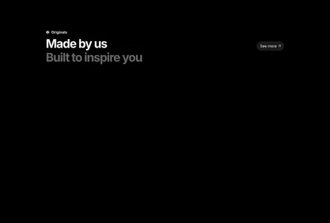
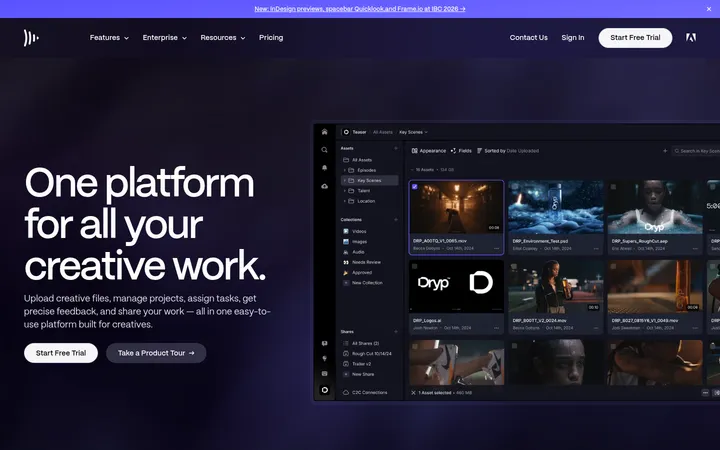
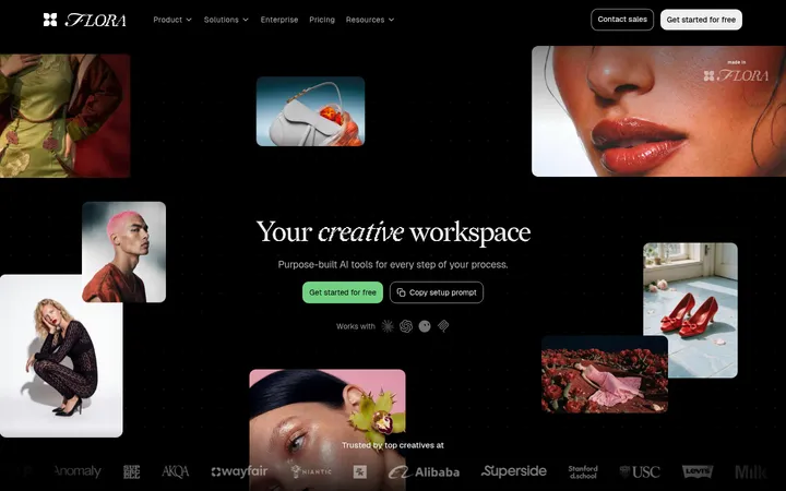
North star · Keep the page quiet and dark so vivid creative media and a few clear blue actions provide the visual focus.
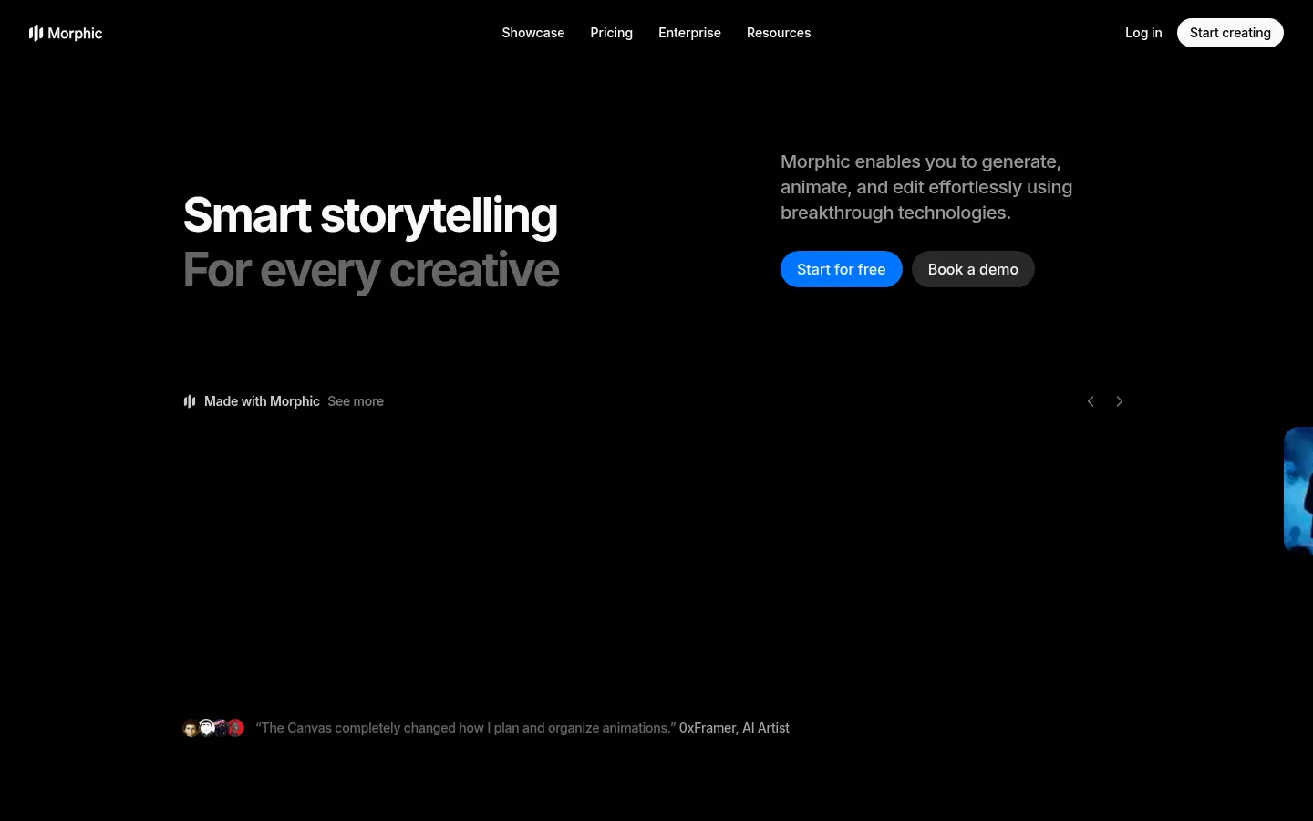
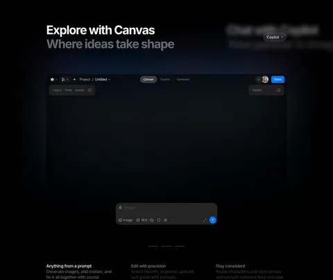
The page is built on a near-pure black canvas (#000000), with low-contrast dark surfaces separating cards and interface previews without turning the page into a stack of obvious panels. Off-white headings establish hierarchy, while muted grays carry supporting copy; vivid blue (#0075ff) is reserved for primary actions and small interface accents. Inter supplies a compact, contemporary voice: large bold headings use tight negative tracking, and body text stays measured and restrained. The layout alternates concise editorial headings with broad product demonstrations, workflow cards, use-case content, and original media. Generous vertical intervals let each showcase read as a distinct chapter, while aligned content blocks keep the long page coherent. Media is allowed to carry color and atmosphere against the dark field; soft fades and edge shading help it recede into the canvas. Rounded controls and restrained card treatments preserve a polished product feel without competing with the work.
配色
点色块复制色值。用途说明来自对页面的实测位置(背景、文字、描边、按钮)与截图判读。
品牌色
强调色
表层色
中性色
功能色
页面底色 · Deep Canvas表层 · Charcoal Panel表层 2 · Shadow Surface主文字 · Soft Chalk次要文字 · Muted Silver弱文字 · Deep Canvas描边 · Shadow Surface强调 · Signal Blue
All page typography, from navigation and large editorial headings to body copy, captions, and controls.
角色
示例
字号
字重
行高
字距
一级标题
Hero headline, with the second phrase visually muted.
Morphic
52px
700
1.15
-0.048em
二级标题
Major section headings and editorial statements.
Morphic
40px
700
1.2
-0.062em
三级标题
Feature and product showcase titles.
The quick brown fox 敏捷的狐狸
20px
500
1.4
-0.02em
四级标题
Smaller feature headings and supporting content titles.
The quick brown fox 敏捷的狐狸
18px
500
1.33
-0.022em
正文
Descriptions, supporting paragraphs, and use-case copy.
The quick brown fox 敏捷的狐狸
14px
500
1.44
0
辅助文字
Compact labels and metadata within cards or interface previews.
The quick brown fox 敏捷的狐狸
12px
600
1.48
0
按钮
Primary and secondary action labels.
The quick brown fox 敏捷的狐狸
12px
500
1.48
0
导航
Header navigation links.
The quick brown fox 敏捷的狐狸
14px
500
1.44
0
间距与布局
基准单位 4px · 密度:宽松
140px版块间距
24px元素间距
—卡片内边距
1040px内容最大宽度
2px
4px
5px
6px
8px
10px
12px
14px
16px
20px
24px
The long homepage uses a spacious, mostly centered composition with content constrained to a measured maximum width of 1040px. Headings and copy often align to the start of their content block, while team and closing calls to action center their content. Showcase sections use wide media and multi-column card arrangements, including full-bleed product moments. A section gap of 140px and element gap of 24px support a deliberate, low-density rhythm. The page remains visually continuous through its shared black canvas rather than alternating colored bands.
圆角与层次
按钮 · 9999px
卡片 · 32px
图片 · 16px
导航 · 9999px
链接 · 16px
lg · media
Elevation is subtle: the measured media shadow is a soft black shadow, while cards rely more on tonal separation than prominent outlines. Dark panels and thin, nearly invisible borders distinguish interfaces from the canvas. Layered gradients fade showcase media into surrounding black, maintaining a flat overall presentation.
组件
下面的预览按实测的按钮、输入框、徽标、卡片样式重建(字体用替代字体)。
Primary action
Signal Blue (#0075ff) pill-shaped signup action with Soft Chalk (#f5f5f5) label; a smaller workflow action uses a compact rounded treatment.
Secondary action
Dark charcoal or near-black button with a restrained light label, paired beside primary actions rather than competing with them.
Navigation
Minimal header with the brand mark at left, centered links, and login plus a bright rounded creation action at right.
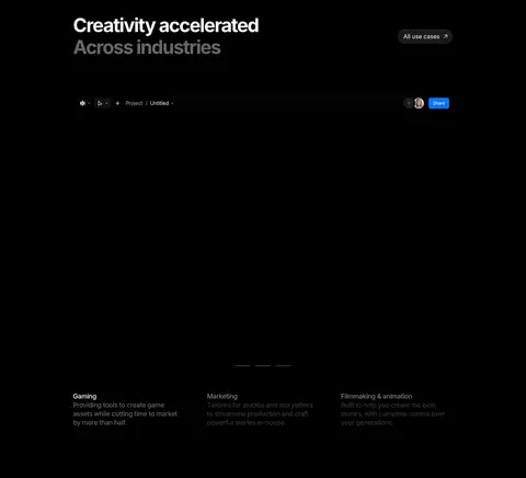
Showcase media
Wide product and creative previews sit directly on the black canvas, with dark gradients and soft shading at media edges.
Workflow cards
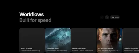
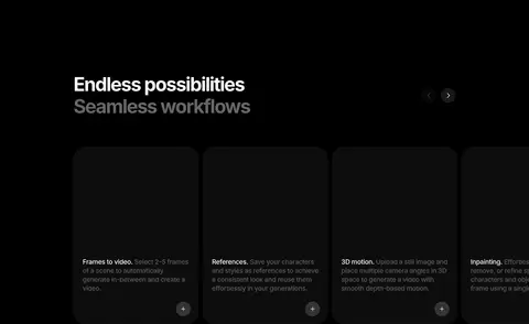
Horizontal row of media-led cards with concise titles and descriptions, using dark surfaces and muted text.
Feature card
Near-black rounded panel with low-contrast border treatment, short feature copy, and an unobtrusive circular action affordance.
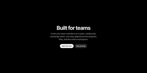
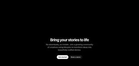
Centered CTA
Centered heading and brief supporting paragraph followed by a bright primary action and a subdued secondary action.
Imagery · Product-interface previews, generated creative examples, workflow cards, and original media are the main visual content. Showcase frames sit against black, sometimes emerging from dark fades and edge shading. The imagery supplies most of the page's saturated color and cinematic atmosphere; keep overlays restrained and let media remain the focal point rather than adding decorative illustration.
Reserve #0075ff for clear primary actions and small product-interface accents.
Set primary headings in bold Inter with tight tracking.
Use muted gray for supporting copy and secondary headline phrases.
Give showcase sections generous separation from neighboring content.
Let vivid media provide contrast against the dark interface.
Use rounded controls and restrained dark surfaces.
✕ 不该做
Do not introduce bright section backgrounds or large colored panels.
Do not use blue as a general decorative color.
Do not make every card equally prominent or heavily bordered.
Do not crowd the showcase media with extra UI decoration.
Do not use oversized shadows to create depth.
Do not set all supporting text in bright white.
Do not break the spacious vertical rhythm with dense content blocks.
给 AI 的提示词
想快速出一个同风格的新页面,把这段话连同 DESIGN.md 一起发给 AI。
Build a new page in Morphic’s visual language: use a continuous Deep Canvas (#000000) background, crisp Inter typography, and spacious editorial pacing. Set major headings in bold, tightly tracked type; use Soft Chalk (#f5f5f5) for primary text and Muted Silver (#a6a6a6) or Ash Gray (#999999) for secondary copy. Keep Signal Blue (#0075ff) for primary actions and restrained interface accents only. Present product functionality through broad, immersive previews and concise feature cards, letting colorful creative media contrast with the dark canvas. Separate sections generously, align content cleanly, and alternate left-aligned showcases with occasional centered calls to action. Use Charcoal Panel (#212121) and Shadow Surface (#0d0d0d) for quiet depth, subtle fades around media, rounded controls, and minimal borders. Avoid bright bands, dense layouts, and decorative effects that compete with the content.