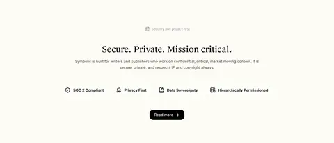
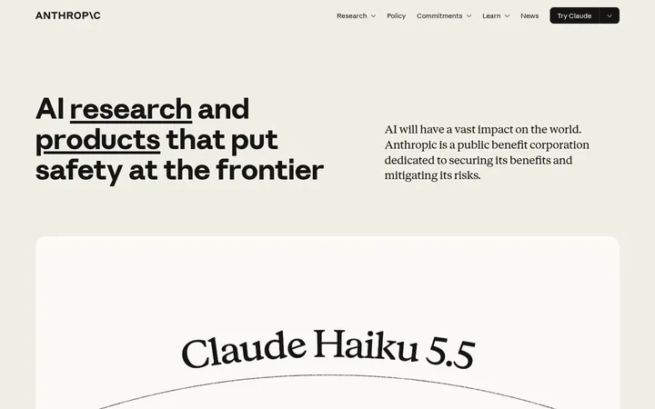
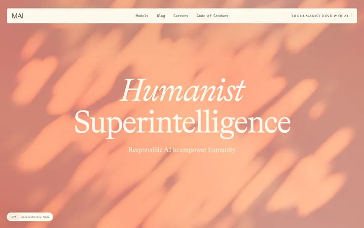
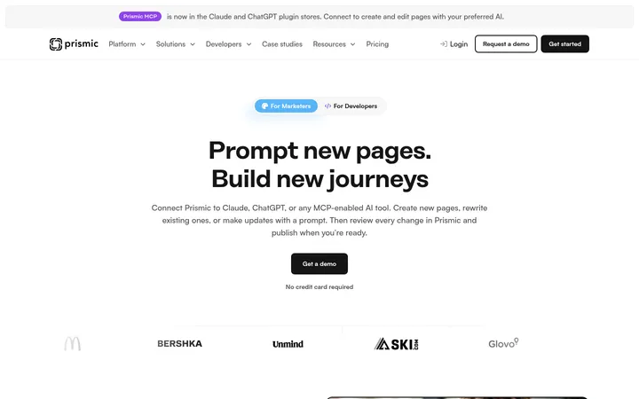
North star · Keep the page calm and editorial: warm near-white space, literary centered headlines, restrained black actions, and product evidence that never overwhelms the content.
The page is anchored by a creamy off-white canvas (#fdfcf5), used consistently from the opening hero through the feature sections, so the long homepage reads as one continuous editorial surface. Black (#000000) gives headlines and primary buttons crisp contrast; muted charcoal (#333231) and softer gray (#656562) carry navigation, body copy, and supporting labels. Suisse Works brings a literary, publication-like character to large centered headings, while Open Runde keeps navigation, descriptions, and interface text approachable. The layout alternates centered introductions with broad product imagery, editorial document mockups, and compact metric cards. Wide vertical pauses separate major ideas rather than relying on strong background bands. Cards remain light and gently lifted by subtle shadows; fine cream hairlines define navigation and footer boundaries. A vivid red accent appears sparingly in a small announcement-card detail, not as a dominant interface color.
Navigation, body copy, links, captions, and buttons.
Aa 设计
Suisse Works
网络字体 · 字重 450 / 400 · 占比 13%
免费替代:Source Serif 4
Display headlines and section headings.
角色
示例
字号
字重
行高
字距
特大标题
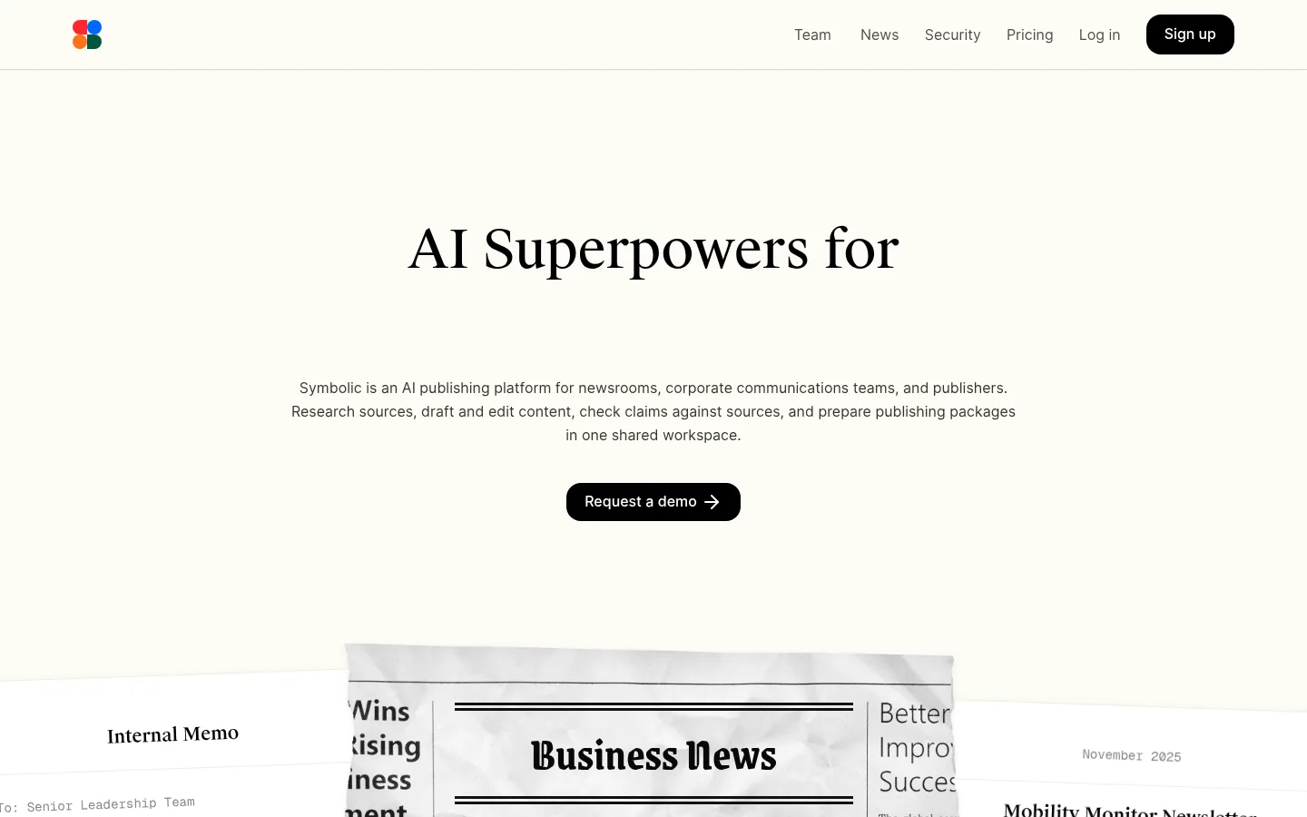
Large editorial hero headline, centered above supporting copy.
Symbolic
58px
450
1.31
0
一级标题
Primary page and major section headlines.
Symbolic
36px
450
1.5
0
二级标题
Secondary section titles and feature headings.
Symbolic
28px
450
1.5
0
正文
Explanatory paragraphs and standard content.
The quick brown fox 敏捷的狐狸
16px
400
1.63
0
辅助文字
Small labels, notes, and supporting metadata.
The quick brown fox 敏捷的狐狸
14px
400
1.71
0
按钮
Primary CTA and compact action labels.
The quick brown fox 敏捷的狐狸
16px
500
1.6
0
导航
Header navigation links.
The quick brown fox 敏捷的狐狸
16px
400
1.63
0
链接
Inline and footer links.
The quick brown fox 敏捷的狐狸
16px
400
1.63
0
间距与布局
基准单位 4px · 密度:适中
50px版块间距
8px元素间距
21px卡片内边距
800px内容最大宽度
4px
8px
10px
12px
15px
16px
19px
20px
24px
40px
50px
80px
100px
A centered, single-page flow uses a measured maximum content width of 800px, with wider media allowed to create visual impact. The header spans the viewport; the hero and most section introductions are centered. Later sections mix three-column metrics and process cards with full-width video or product-showcase areas. Sections are separated by generous vertical pauses, while text and controls remain comfortably spaced rather than dense. The footer shifts to a two-column, left-aligned link layout.
圆角与层次
按钮 · 16px
卡片 · 24px
导航 · 8px
sm · card
hairline · nav
Most sections sit flat on the shared canvas, with fine cream-toned hairlines instead of strong outlines. Metric and content cards use a soft, low-contrast shadow; document mockups create depth through overlap and paper framing. Keep the header shadow barely perceptible and avoid pronounced elevation or dark card fills.
组件
下面的预览按实测的按钮、输入框、徽标、卡片样式重建(字体用替代字体)。
Header navigation
Full-width header with a small multicolor mark, compact Open Runde links, a faint bottom hairline, and a black rounded Sign up button.
Primary CTA
Black button with white medium-weight Open Runde text, measured 16px type, and 16px corner radius.
Hero introduction
Centered Suisse Works headline, concise centered supporting copy, and a single black demo-request action above the document showcase.
Editorial mockup stack
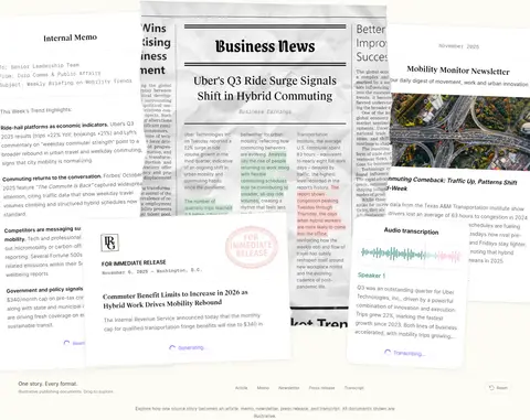
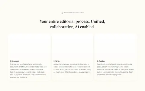
Overlapping memo, newspaper, newsletter, and publishing-package sheets that demonstrate one story adapted to several formats.
Metric cards
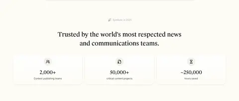
Three compact proof-point cards on the cream canvas, using restrained iconography, black figures, and subtle shadows.
Feature cards
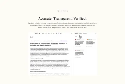
Light, rounded content cards with modest padding and soft shadows; use product UI or concise process copy as evidence.
Footer columns
Quiet, subtly differentiated footer with two left-aligned link groups, compact Open Runde text, and a restrained brand sign-off.
Imagery · Use large editorial document mockups to show the same source story transformed into multiple publishing formats, with overlapping sheets and subtle paper-like edges. Place real team photography in a wide rounded frame and product UI screenshots within feature sections. Keep imagery natural and legible against the cream canvas; do not add decorative gradients or heavy image treatments. A few diagrams or interface illustrations can explain workflows.
Keep navigation, body copy, and controls in a clean sans serif.
Center section introductions and preserve generous vertical pauses.
Use #000000 for primary actions and strong text contrast.
Show publishing workflows through realistic document and product imagery.
Reserve #ff282d for a small illustrative accent.
✕ 不该做
Do not introduce saturated color bands across sections.
Do not replace the warm canvas with stark white or dark backgrounds.
Do not make every section a bordered card.
Do not crowd headings, copy, and media together.
Do not use heavy shadows or thick outlines.
Do not use the red accent as a default button color.
Do not let product imagery overpower the editorial hierarchy.
给 AI 的提示词
想快速出一个同风格的新页面,把这段话连同 DESIGN.md 一起发给 AI。
Build a new Symbolic-style page as a calm editorial experience for a professional AI publishing product. Use Gallery Cream (#fdfcf5) as the continuous canvas, Editorial Ink (#000000) for headings and primary CTA fills, Soft Charcoal (#333231) and Quiet Graphite (#656562) for navigation and supporting copy, and Linen Hairline (#f5f3e9) for subtle dividers. Use a Suisse Works-like serif for centered, sentence-case headlines and an Open Runde-like sans serif for interface text. Keep the page centered and spacious, with a restrained full-width header, clear section introductions, occasional three-column proof points, and realistic publishing mockups or product UI. Add gentle shadows only to selected cards. Use Signal Vermilion (#ff282d) only as a small decorative detail. Avoid loud backgrounds, dense layouts, and heavy effects.