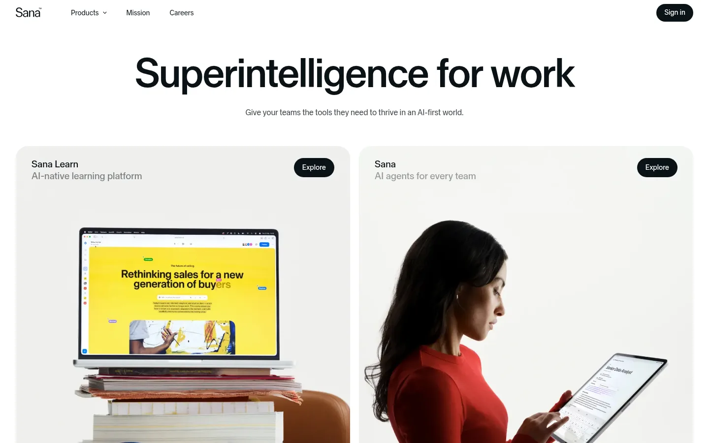
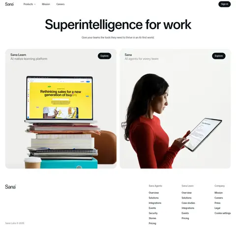
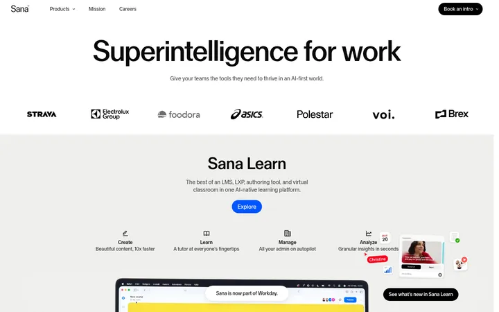
Sana 首页以克制的编辑式排版和充足留白,呈现其 AI 产品。居中的主标题引出两个圆角产品大图区域,让学习平台与 AI 智能体并列成为视觉焦点。
North star · Keep the interface restrained and spacious so that one strong headline and large, authentic product imagery do the work.
The page uses a white canvas and a compact ink-colored interface, letting content and product imagery carry the visual interest. The main heading is oversized, centered, and tightly tracked; supporting copy and navigation remain much smaller and subdued. The product area is arranged as two broad, side-by-side panels with soft pale backgrounds and generous image space. Photography and device imagery bring in color—the red clothing, warm skin tones, and vivid yellow learning content—but these colors belong to the showcased products, not the core brand palette. Rounded black pill buttons provide the strongest interface contrast and clearly mark exploration actions. The overall composition is deliberately sparse: a thin, quiet navigation row, a focused hero, then a substantial visual product showcase. Below, the footer returns to small, understated text and grouped links rather than introducing a new decorative system.
配色
点色块复制色值。用途说明来自对页面的实测位置(背景、文字、描边、按钮)与截图判读。
品牌色
表层色
中性色
页面底色 · Gallery White主文字 · Deep Ink次要文字 · Quiet Slate弱文字 · Gallery White
文字
背景
对比度
WCAG
#0a1217 Deep Ink
#ffffff Gallery White
18.89:1
AAA
#6c7174 Quiet Slate
#ffffff Gallery White
4.94:1
AA
字体
字号阶梯:Custom(比例约 2.278,正文 16px)。示例用免费替代字体渲染,数值为实测。
Aa 设计
Sana Sans
网络字体 · 字重 450 / 400 / 500 · 占比 100%
免费替代:Inter
Used throughout for display headline, navigation, product labels, body copy, buttons, and footer.
角色
示例
字号
字重
行高
字距
特大标题
Oversized centered homepage headline.
Sana
83px
400
0.95
-0.03em
一级标题
Compact heading role for secondary section or product titles.
The quick brown fox 敏捷的狐狸
20px
450
1.2
0
正文
Hero subtitle and standard descriptive copy.
The quick brown fox 敏捷的狐狸
16px
400
1.4
-0.01em
辅助文字
Small supporting labels and footer details.
The quick brown fox 敏捷的狐狸
14px
450
1.5
0
按钮
Explore and Sign in pill-button labels.
The quick brown fox 敏捷的狐狸
14px
450
1.5
0
导航
Primary navigation links and compact header items.
The quick brown fox 敏捷的狐狸
14px
450
1.5
0
间距与布局
基准单位 4px · 密度:紧凑
32px版块间距
10px元素间距
—卡片内边距
1376px内容最大宽度
2px
4px
8px
10px
12px
16px
18px
20px
24px
30px
32px
46px
52px
56px
109px
A compact horizontal header sits above a centered hero, followed by a two-column product showcase. The measured page max width is 1376px; at the 1440px reference viewport, the paired panels nearly span the available content area with a narrow central gutter. Keep the main headline centered and the product-card content aligned to each panel’s upper edge. The rhythm moves from open hero space to dense, image-led panels, then to a small multi-column footer. Overall density is compact in controls but airy around major content.
圆角与层次
按钮 · 9999px
导航 · 6px
没有测到阴影:页面是扁平的,层次靠底色和描边区分。
The page is largely flat, with no measured shadow system. Large pale product panels separate themselves from the white canvas through subtle tonal contrast and rounded corners, not visible borders. Black pill buttons sit directly within the layout without added depth effects. Keep layering simple and let image crops create the primary sense of depth.
组件
下面的预览按实测的按钮、输入框、徽标、卡片样式重建(字体用替代字体)。
Header navigation
A sparse top row with the Sana wordmark, Products dropdown, Mission, Careers, and a dark pill-shaped Sign in action.
Hero
Centered oversized display headline with a smaller muted sentence beneath it.
Product showcase panels
Two broad side-by-side pale panels introduce Sana Learn and Sana AI agents with imagery, short subtitles, and Explore buttons.
Explore button
Dark filled pill with white Sana Sans text; measured button typography is 14px, weight 450.
Footer
Sana wordmark at left, compact grouped product and company links, and quiet legal text.
Imagery · The main showcase uses large photographic and product imagery: a laptop displaying a bright learning page on stacked books, alongside a person using a tablet. Images fill broad pale panels and remain prominent beneath small product labels. Their red, yellow, and warm neutral tones are image content, not additional interface colors. The visual treatment is natural and editorial rather than illustrative or heavily stylized.
Use a white canvas and reserve Deep Ink for primary interface text.
Center the hero headline and keep its supporting sentence understated.
Give product imagery most of the visual area in showcase panels.
Use dark pill buttons with white labels for key actions.
Keep navigation and footer typography compact and low-key.
Let photographed product colors remain inside their image frames.
✕ 不该做
Do not add bright colors to the core interface palette.
Do not crowd the hero with extra badges or decorative copy.
Do not replace the paired showcase panels with a dense card grid.
Do not add strong shadows or ornamental borders.
Do not let footer links compete with the hero or product imagery.
Do not treat yellow or red image content as brand UI colors.
给 AI 的提示词
想快速出一个同风格的新页面,把这段话连同 DESIGN.md 一起发给 AI。
Build a new page in Sana’s restrained editorial style. Use Gallery White (#ffffff) as the canvas and Deep Ink (#0a1217) for headings, navigation, body text, and filled pill actions; use Quiet Slate (#6c7174) and Footer Ash (#84888b) only for secondary text. Set the page in Sana Sans or a close sans-serif substitute such as Inter. Create a sparse header, a centered oversized headline with a short muted subheading, and a broad, image-led product area with pale rounded panels. Keep buttons compact, dark, and pill-shaped. Use generous space around the main heading, but keep navigation and footer details discreet. Product photography may carry richer colors, but do not echo those colors in interface controls. Avoid decorative shadows, gradients, and unnecessary card chrome.