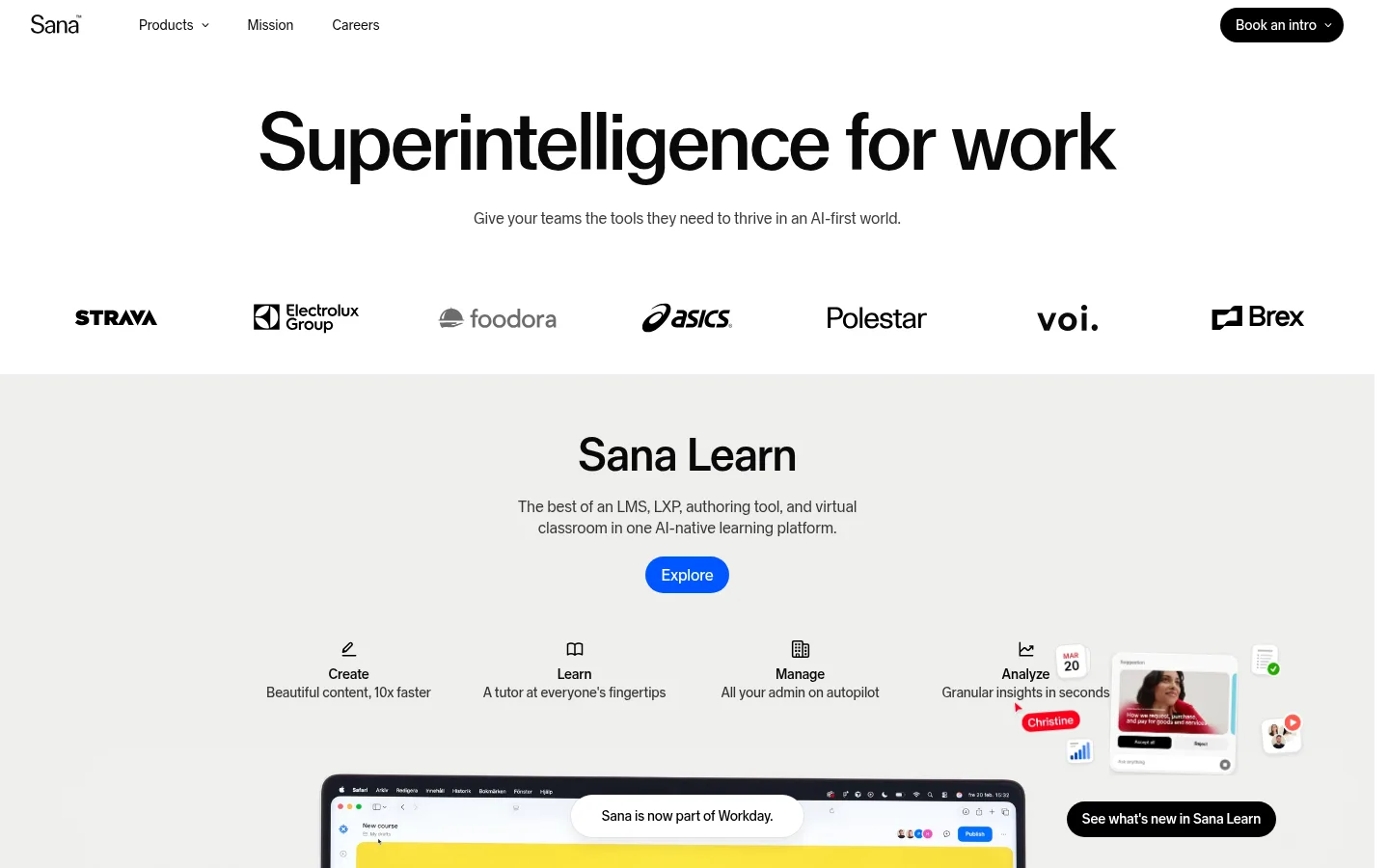
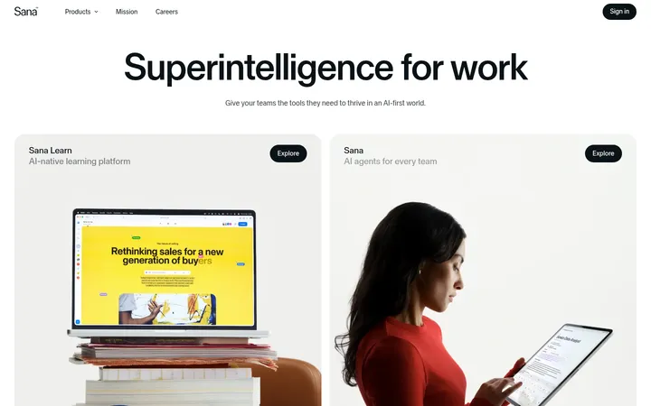
Sana 首页以克制的字体和宽松的黑白灰版块,搭配醒目的产品场景图片。亮蓝与橙色 CTA 数量很少,却能形成清晰的视觉重点。
North star · Keep the interface quiet and spacious so that oversized product imagery and a few precise CTA accents do the talking.
The page builds its identity from a mostly white and soft-gray canvas, with near-black text carrying the navigation, headings, and most copy. Pale gray and faint green-gray section bands distinguish product stories without relying on heavy outlines. Blue and orange appear as sparing CTA accents; warm or saturated colors inside photographs and product mockups belong to the imagery, not the core brand palette. Sana Sans is used throughout, from a very large, centered hero headline to compact navigation and body copy. Tight tracking and restrained weights keep the type clean and composed. The composition alternates open text-led introductions with broad product showcases, customer proof, and an event collage. Large photographic scenes give the page its emotional and material texture, while generous gaps keep each section distinct. Rounded pill buttons and mostly flat surfaces preserve a friendly, contemporary finish.
配色
点色块复制色值。用途说明来自对页面的实测位置(背景、文字、描边、按钮)与截图判读。
品牌色
强调色
表层色
中性色
功能色
页面底色 · Gallery White表层 · Soft Stone表层 2 · Quiet Sage主文字 · Near Ink次要文字 · Gallery White弱文字 · Pure Black描边 · Fine Silver强调 · Signal Blue强调 2 · Signal Orange
文字
背景
对比度
WCAG
#090909 Near Ink
#ffffff Gallery White
19.91:1
AAA
#090909 Near Ink
#efefed Soft Stone
17.29:1
AAA
#090909 Near Ink
#f3f6f2 Quiet Sage
18.28:1
AAA
#ffffff Gallery White
#efefed Soft Stone
1.15:1
不达标
#ffffff Gallery White
#f3f6f2 Quiet Sage
1.09:1
不达标
#000000 Pure Black
#ffffff Gallery White
21:1
AAA
字体
字号阶梯:Custom(比例约 1.81,正文 14px)。示例用免费替代字体渲染,数值为实测。
Aa 设计
Sana Sans
网络字体 · 字重 450 / 400 / 500 · 占比 100%
免费替代:Inter
Used across display headlines, headings, navigation, body copy, links, and buttons.
角色
示例
字号
字重
行高
字距
特大标题
Oversized hero headline introducing the company.
Sana
83px
400
0.95
-0.01em
一级标题
Primary section headlines, including product and event titles.
Sana
48px
500
1
-0.02em
二级标题
Secondary feature and testimonial headings.
Sana
32px
500
1.1
-0.01em
正文
Supporting product descriptions and explanatory copy.
The quick brown fox 敏捷的狐狸
14px
450
1.4
-0.011em
按钮
CTA labels such as Explore and video actions.
The quick brown fox 敏捷的狐狸
16px
400
1.4
-0.01em
导航
Top navigation labels and footer navigation.
The quick brown fox 敏捷的狐狸
14px
400
1.4
0
链接
Inline actions and supporting navigation links.
The quick brown fox 敏捷的狐狸
14px
450
1.4
-0.011em
间距与布局
基准单位 8px · 密度:适中
32px版块间距
20px元素间距
—卡片内边距
—内容最大宽度
4px
7px
8px
10px
12px
16px
20px
24px
32px
40px
43px
48px
64px
75px
96px
The page uses broad, mostly single-column section compositions, with centered alignment for the hero and product introductions. A seven-logo client strip creates a compact bridge from the opening message into the product showcase. Product sections alternate expansive media with concise copy and feature groupings; the later event collage and footer introduce more varied alignment and columns. The measured data does not specify a maximum page width, so preserve the screenshot’s broad canvas and generous side breathing room without assuming a fixed container dimension. The overall density is comfortable, with clear vertical separation between major bands.
圆角与层次
按钮 · 9999px
徽标 · 9999px
导航 · 6px
链接 · 9999px
md · link
Most sections are flat, defined by background bands and open spacing rather than card shadows. Hairline borders use #e5e5e5, with #d9d9d9 appearing as a quiet footer detail. Rounded buttons and badges provide the main shape language. A single measured link uses a subtle shadow, so keep elevation rare and low-contrast rather than applying it across cards.
组件
下面的预览按实测的按钮、输入框、徽标、卡片样式重建(字体用替代字体)。
Top navigation
Minimal text-led navigation on white, with Sana branding at left and a black pill-shaped Book an intro action at right.
Hero
Centered, oversized near-black headline with a short muted supporting sentence and ample white space.
Customer logo strip
A horizontal row of customer marks placed between the hero and the first pale-gray product band.
Explore CTA
Pill button with white text; the learning section uses #0055ff and the enterprise AI section uses #ff6400.
Product showcase
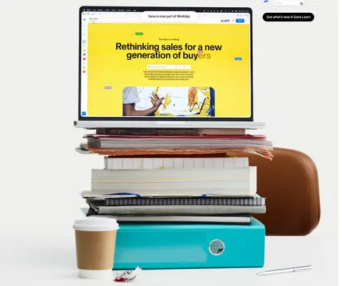
Large product-led visual paired with concise feature descriptions and a small action link or pill.
Testimonial feature
Wide photographic customer quote with attribution and a compact Watch video action.
Footer
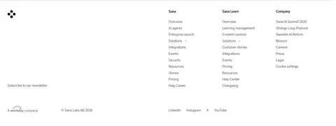
Three-column link directory with newsletter entry, company mark, and restrained lower utility links.
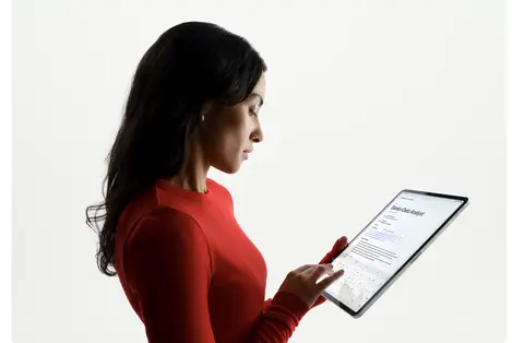
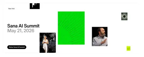
Imagery · Large, realistic product scenes carry much of the visual storytelling: a laptop atop books in the learning section, a customer portrait in the testimonial, and a person using a tablet in the enterprise section. The event area mixes portraits with vivid graphic tiles. Keep imagery broad and editorially composed, with UI visible as part of photographed or rendered scenes. Strong colors within those scenes are illustrative content, not replacements for the restrained interface palette.
Use Sana Sans or a close clean sans-serif throughout.
Keep the canvas white and use pale bands to separate product stories.
Give the hero headline strong scale and centered alignment.
Use near-black for the primary text hierarchy.
Reserve blue and orange for isolated CTA emphasis.
Let large product imagery carry visual weight.
Keep borders subtle and elevation uncommon.
✕ 不该做
Do not turn every section into a bordered card.
Do not use bright accents as large page backgrounds.
Do not crowd the hero with extra labels or controls.
Do not treat colors inside product imagery as core UI palette.
Do not use heavy shadows to separate ordinary content.
Do not force a fixed maximum width absent measured evidence.
给 AI 的提示词
想快速出一个同风格的新页面,把这段话连同 DESIGN.md 一起发给 AI。
Build a new page in Sana’s restrained AI-company style. Use #ffffff as the main canvas, #090909 for headings and copy, and broad section bands in #efefed or #f3f6f2. Set all text in Sana Sans, or Inter as a free substitute, with clean sans-serif forms, tight tracking, and regular-to-medium weights. Start with a spacious, centered display headline and short supporting copy; then alternate concise product introductions with expansive, realistic product imagery and compact feature groupings. Use #0055ff or #ff6400 only for selective pill-shaped CTA buttons with white text. Keep navigation minimal, borders in #e5e5e5 restrained, and shadows rare. Favor flat surfaces, generous separation, and editorial image compositions; keep photographic colors inside the imagery rather than extending them into the interface palette.