North star · Let calm monochrome commerce UI frame warm, credible home photography, using violet only as a precise accent.
The visual system is anchored by white canvas (#ffffff), near-black text (#1d1d1f), and soft gray surfaces, letting product and home photography provide most of the color. A saturated violet is reserved for small badges and interactive accents rather than broad backgrounds. Poppins is used consistently, with substantial, semibold headlines and compact regular-weight supporting copy; headings remain sentence case and left aligned in most sections. The homepage alternates open white and pale-gray commerce areas with occasional full-bleed photographic or near-black feature panels. Product cards are clean, centered, and rounded, while editorial and scenario imagery uses varied crops to make the page feel lived-in rather than catalog-only. Comfortable spacing separates distinct stories, and a restrained border and shadow vocabulary keeps cards legible without making the interface feel heavy. Dark navigation and footer treatments invert the otherwise light storefront.
Site-wide navigation, headings, body copy, labels, and buttons.
角色
示例
字号
字重
行高
字距
一级标题
Primary product hero title.
Narwal Robotics
48px
600
1.2
0
二级标题
Section titles for discovery, stories, blog, and benefits.
Narwal Robotics
40px
600
1.2
0
三级标题
Product-card and feature headings.
Narwal Robotics
36px
600
1.2
0
四级标题
Secondary feature or content headings.
Narwal Robotics
28px
400
1.4
0
正文
Product descriptions, explanatory copy, and editorial summaries.
The quick brown fox 敏捷的狐狸
16px
400
1.4
0
辅助文字
Dates, badges, metadata, and compact supporting labels.
The quick brown fox 敏捷的狐狸
14px
400
1.4
0
按钮
Purchase and other primary action labels.
The quick brown fox 敏捷的狐狸
16px
500
1.2
0
导航
Header navigation and utility links.
The quick brown fox 敏捷的狐狸
14px
400
1.4
0
间距与布局
基准单位 8px · 密度:适中
48px版块间距
8px元素间距
24px卡片内边距
1224px内容最大宽度
4px
8px
9px
12px
16px
18px
20px
24px
32px
48px
64px
The homepage is a long, vertically sequenced storefront with full-bleed hero and benefit imagery alternating with contained shopping and editorial areas. A measured page max width of 1224px supports product rows and multi-column content; section spacing is comfortable, with a measured 48px section gap and 8px element gap. Most titles align left, while selected brand and trust moments center their heading. Product discovery uses a multi-column card row, testimonials use a horizontally browsable carousel, and the footer packs links into dense columns.
圆角与层次
按钮 · 9999px
卡片 · 16px
图片 · 50%
徽标 · 2px
导航 · 8px
链接 · 16px
lg · media
md · card
md · card
md · card
The layout is mostly flat, relying on white space and changes between white, pale gray, and dark image-backed bands to define sections. Product and editorial cards use softly rounded corners, fine neutral borders, or subtle shadows rather than pronounced elevation. Layer white text and translucent benefit cards over photography, and use dark gradients to protect contrast.
组件
下面的预览按实测的按钮、输入框、徽标、卡片样式重建(字体用替代字体)。
Header navigation
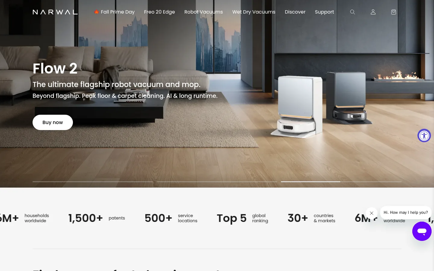
Overlay a full-width hero image with a restrained navigation row: white wordmark and links, plus search, account, and bag icons.
Hero purchase CTA
Place a bold white product headline and concise supporting lines over lifestyle photography; use a white pill-shaped “Buy now” button.
Product cards
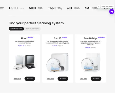
Present centered product imagery, compact Poppins titles and descriptions, violet badges, pricing, and paired learn-more and purchase actions on white cards.
Stats strip
Arrange large dark numeric proof points with smaller explanatory labels in a horizontal row on a light background.
Scenario tiles
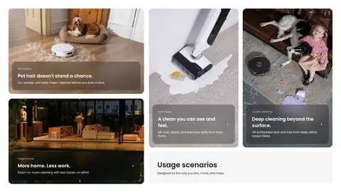
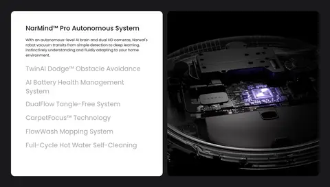
Use varied image crops and dark translucent text overlays to show distinct cleaning situations and link-like discovery content.
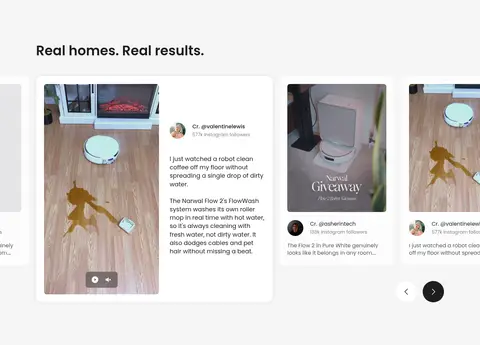
Testimonial carousel
Show review cards with user attribution, short copy, portrait or video imagery, and simple previous/next controls.
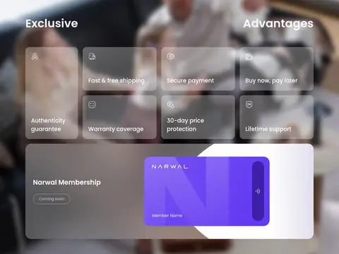
Benefit and membership panel
Layer translucent rounded benefit tiles and a wide membership card over blurred lifestyle photography, with white text and subtle borders.
Footer
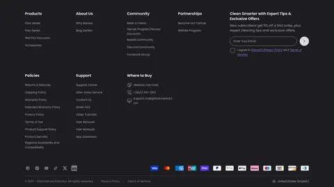
Use a near-black background, grouped compact link columns, newsletter input, social icons, and payment marks.
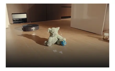
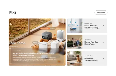
Imagery · Use polished, realistic product photography and cinematic home scenes as the primary visual storytelling. Show robot vacuums and mops in warm, modern interiors, with close-ups or full product views on clean backgrounds for shopping cards. Scenario and testimonial areas favor varied crops and real-life messes, pets, and household activity. Use dark overlays and gradients over images when necessary for legible white copy; avoid decorative illustration as the main visual language.
Keep the main canvas white and use pale gray to separate shopping sections.
Use Poppins consistently, with clear weight contrast between titles and supporting copy.
Choose warm, credible household photography for hero and scenario storytelling.
Reserve violet for small badges and focused interactive emphasis.
Use rounded product cards and pill-shaped purchase actions.
Overlay white copy on imagery only when a dark overlay preserves legibility.
✕ 不该做
Do not turn the restrained storefront into a colorful gradient-heavy interface.
Do not use violet as a large background field.
Do not crowd product cards with decorative UI or dense copy.
Do not replace real home imagery with playful illustration.
Do not apply heavy shadows to every card or section.
Do not use all-caps headings or excessive letter spacing.
给 AI 的提示词
想快速出一个同风格的新页面,把这段话连同 DESIGN.md 一起发给 AI。
Build a new Narwal-style consumer electronics storefront page with a calm, premium feel. Use Gallery White (#ffffff) as the canvas, Soft Ink (#1d1d1f) for primary copy and purchase actions, and Cloud Gray (#f5f5f5) for quiet section bands. Keep Electric Violet (#683df5) and Narwal Violet (#574cd5) to small badges or focused accents. Use Poppins throughout with semibold, sentence-case headings and readable regular copy. Organize content into spacious, clearly separated blocks: cinematic product hero, centered product cards, real-home scenario imagery, customer proof, and a compact dark footer. Favor warm, realistic photography, rounded cards and pill CTAs, subtle borders, and limited shadow. Keep shopping information clear and let product imagery carry the visual impact.