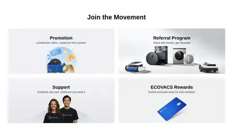
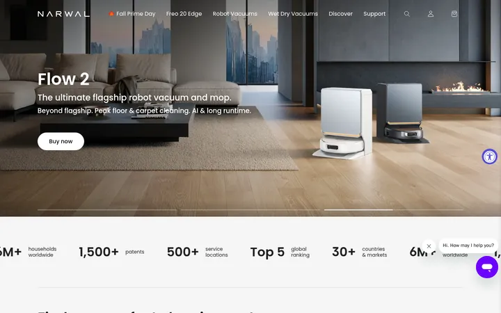
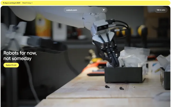
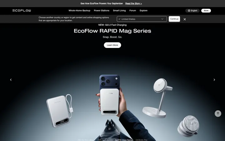
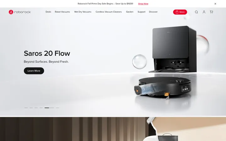
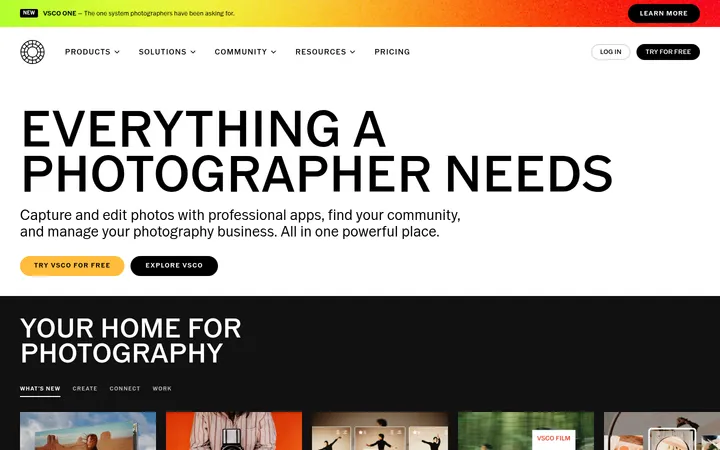
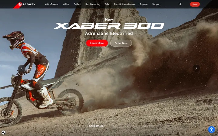
North star · Let cinematic, context-rich product imagery lead, while a quiet white interface and precise blue actions keep navigation effortless.
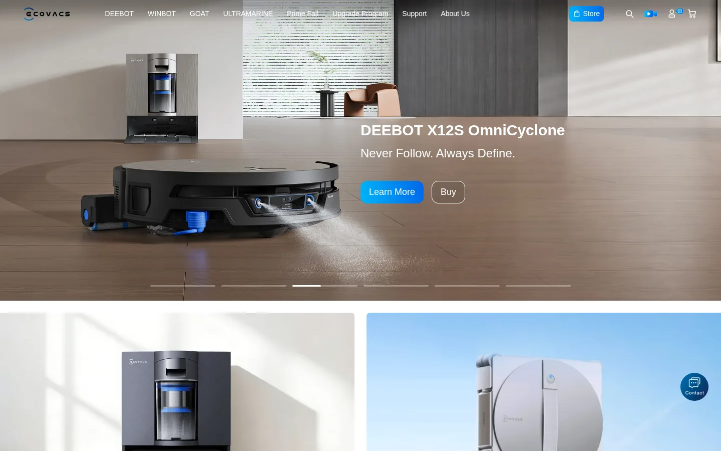
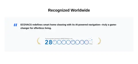
The page uses a clean white canvas for product categories, recognition content, and footer information, punctuated by expansive black sections for brand films and technology stories. Black and charcoal image bands create contrast rather than a permanently dark interface. Bright blue marks the most actionable controls and selected highlights; the cyan-to-blue gradient is a restrained secondary flourish. SF Pro supplies a neutral, contemporary voice, with centered bold headings for campaign sections and compact, readable supporting copy. The layout alternates full-bleed hero photography with a two-column category presentation, centered video and innovation areas, and a subdued newsletter strip. Images carry much of the visual identity: polished robots appear in believable homes, outdoors, and pools, while close-up technology footage gives darker sections depth. Comfortable spacing, simple separators, and modest rounded controls keep the experience premium and approachable without decorative clutter.
Primary family for navigation, headings, body copy, links, and buttons.
Aa 设计
Arial
系统字体 · 字重 500 / 510 · 占比 6%
免费替代:Arial
Measured in the small newsletter email input.
角色
示例
字号
字重
行高
字距
一级标题
Large hero or campaign headline over full-bleed product imagery.
ECOVACS
48px
600
1.63
0
二级标题
Centered campaign, recognition, and major section headings.
ECOVACS
40px
700
1.33
0
三级标题
Product and technology feature titles within showcase sections.
ECOVACS
30px
700
1.3
0
四级标题
Secondary feature or supporting content headings.
ECOVACS
28px
600
1.33
0
正文
Product descriptions, campaign summaries, and supporting copy.
The quick brown fox 敏捷的狐狸
14px
400
1.86
0
辅助文字
Compact image captions, legal notes, and fine-print details.
The quick brown fox 敏捷的狐狸
12px
400
2
0
按钮
Short action labels including Buy, Submit, and Learn More.
The quick brown fox 敏捷的狐狸
14px
400
1.6
0
导航
Top-level product, support, and company navigation.
The quick brown fox 敏捷的狐狸
14px
400
3.93
0
链接
Product-card actions and footer navigation links.
The quick brown fox 敏捷的狐狸
14px
400
1.6
0
间距与布局
基准单位 4px · 密度:适中
80px版块间距
15px元素间距
—卡片内边距
1184px内容最大宽度
1px
2px
4px
6px
8px
10px
11px
12px
13px
15px
16px
17px
20px
22px
24px
28px
A comfortable, wide desktop layout uses a measured 1184px maximum content width, with several full-bleed campaign sections extending beyond it. The page alternates a cinematic hero, centered product-category tiles, dark video and innovation bands, a two-column promotional area, and compact closing content. Center alignment is common for section headings; product imagery remains the main anchor within cards. Section transitions are clear and spacious, with a denser multi-column footer and newsletter strip at the end.
圆角与层次
按钮 · 13px
输入框 · 8px
图片 · 8px
导航 · 7px
链接 · 13px
没有测到阴影:页面是扁平的,层次靠底色和描边区分。
The visual system is mostly flat: strong photography and alternating black or white section bands provide hierarchy instead of prominent shadows. Use subtle borders for inputs and compact controls. Rounded buttons and media frames soften the interface, while image overlays and dark gradients separate white copy from busy scenes. Avoid adding card shadows not evidenced by the page.
组件
下面的预览按实测的按钮、输入框、徽标、卡片样式重建(字体用替代字体)。
Transparent campaign navigation
Compact SF Pro navigation sits over the hero image, with white text and a bright blue Store action.
Full-bleed product hero
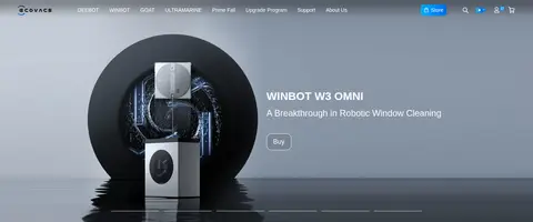
Wide lifestyle product image with white headline and supporting copy, a blue Learn More action, outlined Buy control, and slide indicators.
Category tiles
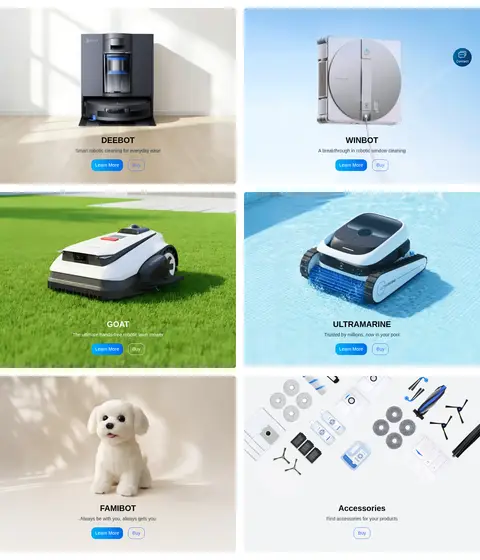
Centered product categories use large contextual imagery, a concise title, short description, and compact action links.
Video story carousel
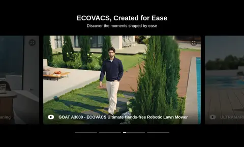
Dark campaign area centers a featured video tile with captioning and adjacent story previews.
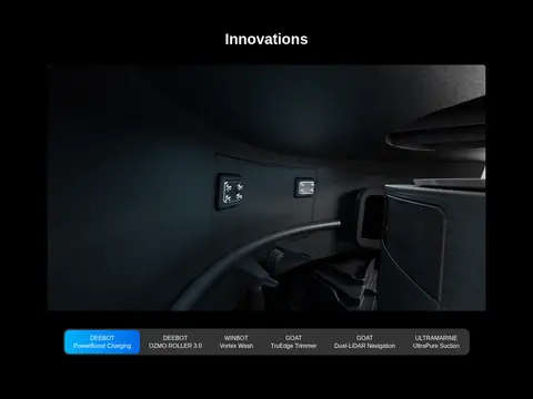
Innovation selector
Dark technology showcase pairs close-up media with a horizontal row of selectable product-innovation labels.
Newsletter signup
Pale gray strip combines a short signup prompt, restrained bordered email field, and blue submit button.
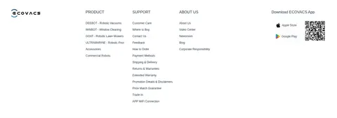
Multi-column footer
White footer organizes product, support, and company links, with app download assets and a compact legal row.
Imagery · Use polished product photography and video as the primary visual material: robots in lived-in interiors, lawns, pools, and clean studio-like technology scenes. Hero imagery spans the viewport and supports white overlay copy with a dark gradient where needed. Category panels pair isolated products with contextual environments. Innovation content uses dark, close-cropped technical footage; illustrations and awards remain supporting details rather than brand-defining color sources.
Use full-bleed lifestyle photography for the lead product story.
Alternate white information areas with deliberate black campaign bands.
Reserve bright blue for actions and selected highlights.
Keep headings centered in campaign and feature sections.
Use product-specific imagery across category cards.
Keep borders and interface decoration subtle.
✕ 不该做
Do not turn the whole page into a dark theme.
Do not use gradients as a dominant page background.
Do not add heavy shadows to cards or controls.
Do not let decorative colors from product imagery define the UI palette.
Do not overcrowd product panels with long copy.
Do not replace the photographic storytelling with generic illustrations.
给 AI 的提示词
想快速出一个同风格的新页面,把这段话连同 DESIGN.md 一起发给 AI。
Build a polished consumer-robotics page in the ECOVACS visual style. Use Gallery White (#ffffff) as the main canvas and Campaign Black (#000000) for selected cinematic feature bands; Graphite Stage (#3c3e40) can support a secondary dark section. Use Action Blue (#3877f5) for primary actions and the Laser Cyan (#00c0fa) to Electric Blue (#015eea) gradient only as a restrained accent. Set type in a clean SF Pro-like sans serif, using Inter as a practical substitute, with bold centered section headings and readable compact body copy. Lead with full-width lifestyle product photography and white overlay text, then alternate product-category imagery, video stories, innovation features, and useful support content. Keep spacing comfortable, borders fine, controls modestly rounded, and shadows absent or very subtle. Make the desktop content broad but organized, and finish with a quiet newsletter strip and structured footer.