North star · Keep the interface quiet and spacious so precise product imagery leads, while red appears only where it helps shoppers act or notice.
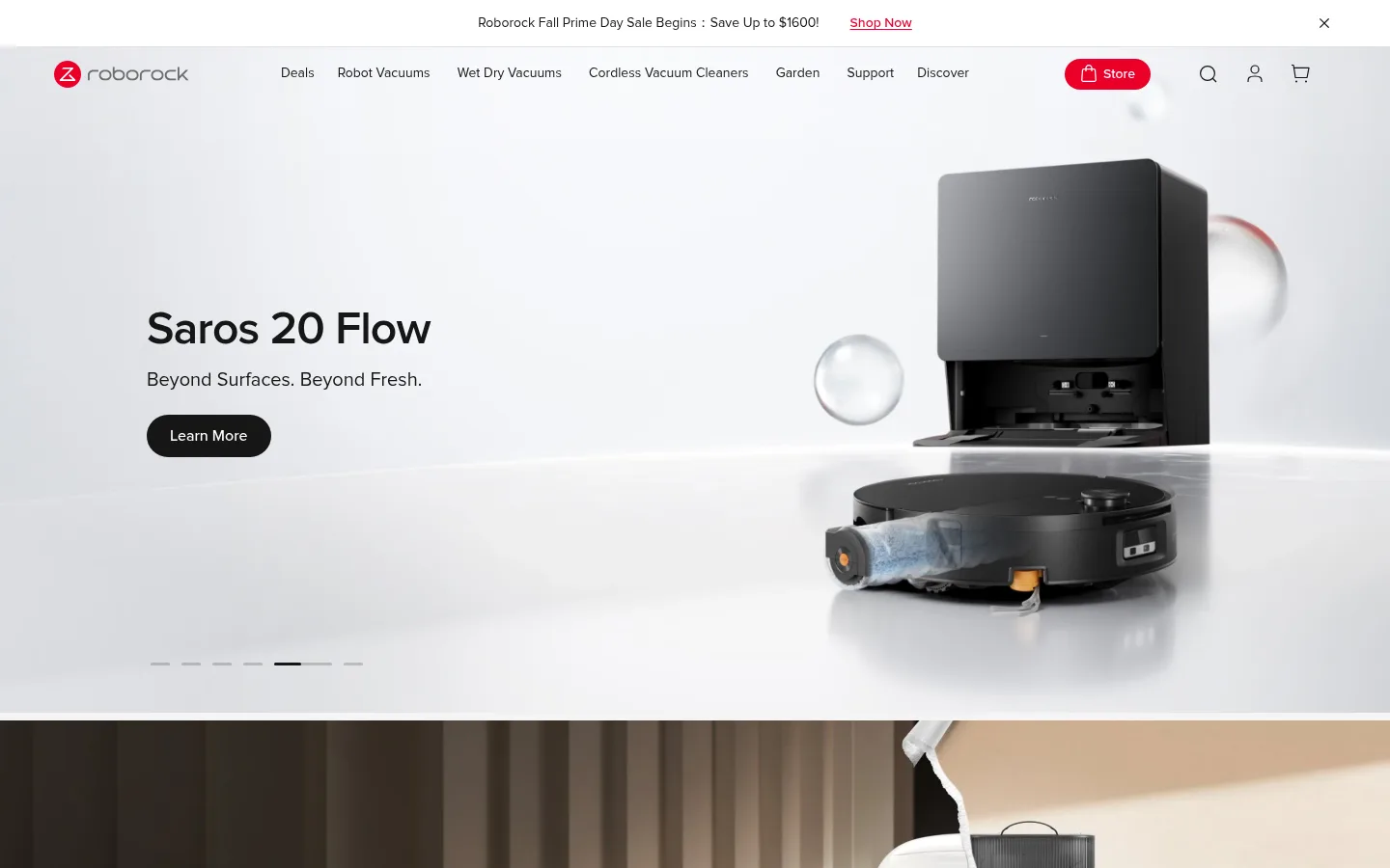
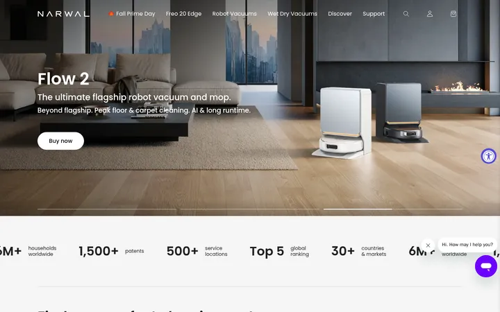
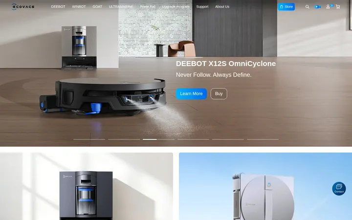
The visual strategy keeps the interface quiet so the products and their environments carry the story. White and pale gray establish a clean canvas across the page, with black and charcoal text providing crisp hierarchy; Roborock red is reserved for high-value accents such as the store button, promotional links, and selected emphasis. Proxima Nova is used throughout, pairing large, compactly tracked headings with readable body copy and small, unobtrusive navigation labels. The first viewport uses a wide, pale product hero with left-aligned copy and a dramatic robot-and-dock composition on the right. Below, full-width promotional photography gives way to a centered product grid, editorial product feature panels, and a split advantage section. Generous gaps separate these blocks, while restrained gray hairlines mark service and footer divisions. Rounded pill controls contrast with mostly flat, square-edged content areas. Photography is polished, tonal, and product-led rather than decorative.
Site-wide typeface for navigation, headings, body copy, labels, links, and buttons.
Aa 设计
ProximaNova-Semibold
网络字体 · 字重 400 · 占比 1%
免费替代:Inter
Semibold variant detected in a small share of page text.
角色
示例
字号
字重
行高
字距
一级标题
Primary hero headline and strongest page-level product statement.
Roborock
48px
600
1.08
-0.02em
二级标题
Major section titles, centered above product and brand-story areas.
Roborock
44px
500
1.23
0
三级标题
Product names and prominent feature headings within content sections.
Roborock
40px
600
1.1
-0.02em
四级标题
Supporting feature or subsection headings in product storytelling.
Roborock
34px
500
1.53
0
正文
Descriptive product copy, benefit explanations, and newsletter text.
The quick brown fox 敏捷的狐狸
18px
400
1.44
0
辅助文字
Compact legal, utility, and low-priority supporting labels.
The quick brown fox 敏捷的狐狸
12px
400
1.33
0
按钮
Short action labels inside rounded pill controls.
The quick brown fox 敏捷的狐狸
14px
500
1.43
0
导航
Compact header and footer navigation labels.
The quick brown fox 敏捷的狐狸
12px
400
1.33
0
链接
Secondary actions and footer links.
The quick brown fox 敏捷的狐狸
16px
500
1.25
0
间距与布局
基准单位 4px · 密度:适中
40px版块间距
24px元素间距
—卡片内边距
1136px内容最大宽度
1px
4px
6px
8px
9px
10px
12px
16px
20px
24px
32px
35px
48px
70px
The page uses full-width bands for campaigns and brand stories, with product content contained in a centered maximum width of 1136px. The desktop product listing uses four measured columns, while the visible assortment reads as a centered three-item row; feature storytelling alternates media and copy in two-column compositions. Major headings are centered except for hero messaging and newsletter copy. Section gaps are generous, with comfortable density and recurring whitespace between distinct shopping tasks.
圆角与层次
按钮 · 9999px
输入框 · 9999px
链接 · 9999px
没有测到阴影:页面是扁平的,层次靠底色和描边区分。
The interface is predominantly flat, with no measured shadow system. Separate pale sections through background shifts and use fine #e1e1e1 hairlines for service blocks and footer divisions. Most cards have square edges, while action controls use pill-shaped silhouettes; imagery itself provides the strongest sense of depth.
组件
下面的预览按实测的按钮、输入框、徽标、卡片样式重建(字体用替代字体)。
Announcement bar
Slim centered sale message above the main navigation, with a small red shopping link and a close control.
Primary navigation
Horizontal logo, compact category links, red Store pill, and search, account, and cart utility icons.
Campaign hero
Wide pale product-image carousel with left-aligned headline and subline, dark Learn More pill, and discreet slide indicators.
Product card
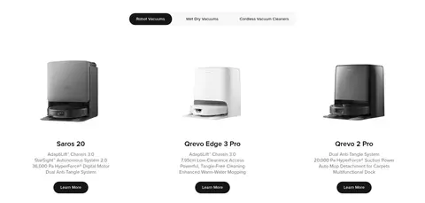
Centered product image, product name, compact feature copy, and dark rounded Learn More action on a clean light background.
Editorial product feature
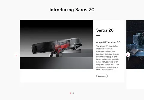
Large product or technology visual paired with product heading, feature title, explanatory paragraph, and a restrained action.
Service benefits
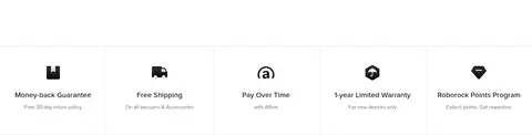
Evenly distributed reassurance items for returns, shipping, payment, warranty, and points, separated with subtle hairlines.
Newsletter signup
Compact heading and supporting offer copy beside a rounded email field and dark Subscribe control.
Footer directory
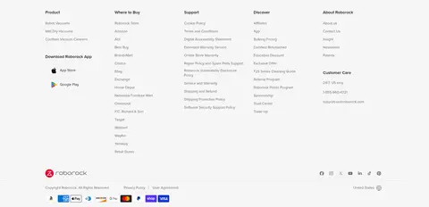
Multi-column link groups for products, shopping, support, discovery, and company information, followed by social and payment marks.
Imagery · Use polished product photography and rendered product scenes, especially robot vacuums and docking stations in clean domestic environments. Hero imagery is wide and atmospheric, with copy kept clear of the main product silhouette. Product cards use isolated, legible product views; feature sections pair large close-ups or demonstrations with explanatory copy. The warm and dark tones visible in some campaign imagery belong to the photography, not the core interface palette.
Use white and pale gray as the dominant page surfaces.
Reserve Roborock Red for focused brand and shopping emphasis.
Give product photography broad, uncluttered space.
Use Proxima Nova or a close clean sans-serif substitute consistently.
Build major product stories as spacious image-and-copy compositions.
Use rounded pill shapes for prominent actions.
Separate lower-page utilities with subtle hairlines.
✕ 不该做
Do not turn the page into a dense dashboard or compact catalog.
Do not use red as a large continuous background.
Do not add heavy shadows to otherwise flat content blocks.
Do not crowd hero copy against product imagery.
Do not introduce decorative colors unsupported by the interface palette.
Do not apply rounded corners to every image or content panel.
Do not make secondary navigation compete with product headlines.
给 AI 的提示词
想快速出一个同风格的新页面,把这段话连同 DESIGN.md 一起发给 AI。
Build a new Roborock-style ecommerce page with a quiet, product-first visual hierarchy. Use Gallery White (#ffffff) and Mist Gray (#f4f4f4) for broad surfaces, Pure Ink (#000000) and Soft Charcoal (#161616) for text and dark pill actions, Quiet Gray (#6c6d6e) for secondary copy, and Roborock Red (#eb0029) sparingly for key actions and emphasis. Use Proxima Nova, or Inter if unavailable, with compact navigation, confident headings, and readable body copy. Give product photography generous space and keep hero copy clear of the focal product. Alternate centered product grids with spacious editorial image-and-copy sections. Favor flat surfaces, subtle Divider Gray (#e1e1e1) hairlines, and pill-shaped controls; avoid heavy shadows, excessive decoration, and dense layouts.