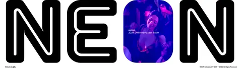
North star · Keep the interface quiet, typographic, and monochrome so cinematic imagery and condensed film titles command attention.
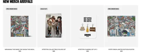
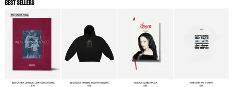
The page uses a restrained neutral interface so film stills carry most of the colour and emotional weight. Black (#000000) and white (#ffffff) define the hero overlay, wordmark, headings, and footer, while the soft grey canvas (#f3f3f3) appears on merchandise cards and subtle interface areas. Focal handles small uppercase navigation, labels, and product copy; Girott gives film titles and section headings their tall, compressed display character. A full-bleed cinematic hero opens the page, followed by white-background sections for theatrical releases, coming-soon titles, watch-now films, merchandise, and award winners. The content stays aligned to a shared wide page frame and is arranged in horizontal image-led rows or compact product grids. Large gaps between sections keep this dense catalogue from feeling crowded. Borders are faint, surfaces mostly flat, and dark gradients are reserved for readability over photography.
Navigation, labels, body copy, captions, and merchandise information.
Aa 设计
Girott
网络字体 · 字重 700 / 400 · 占比 16%
免费替代:Oswald
Oversized film titles and prominent section headings.
角色
示例
字号
字重
行高
字距
特大标题
Oversized film title over the full-bleed hero image.
NEON
160px
700
0.9
-0.03em
一级标题
Primary film or feature title in condensed uppercase.
NEON
42px
400
0.8
-0.03em
二级标题
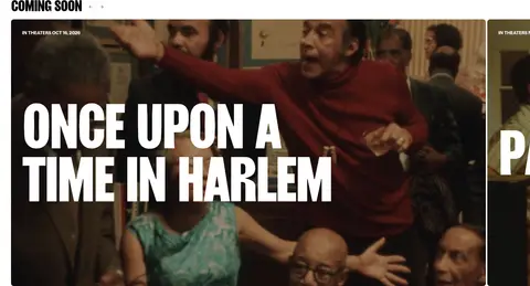
Prominent section headings such as Coming Soon.
NEON
41px
700
0.8
-0.031em
三级标题
Secondary film titles and smaller feature headings.
NEON
36px
400
0.8
-0.03em
正文
Uppercase navigation, film labels, descriptions, and product details.
The quick brown fox 敏捷的狐狸
14px
400
1
-0.01em
辅助文字
Small bold uppercase metadata and compact image captions.
The quick brown fox 敏捷的狐狸
12px
700
1.17
-0.01em
间距与布局
基准单位 2px · 密度:宽松
140px版块间距
10px元素间距
—卡片内边距
1290px内容最大宽度
2px
3px
4px
7px
8px
10px
15px
16px
20px
30px
31px
A wide, spacious page frame supports a full-bleed hero followed by stacked white catalogue sections. The measured maximum content width is 1290px; headings align to the start of each content region. Sections mix horizontal film carousels, multi-column poster rows, and merchandise grids, with a spacious measured section rhythm. Dense imagery is balanced by generous white space. The compact centered header overlays the hero, while footer navigation and social links resolve into grouped columns.
圆角与层次
按钮 · 4px
卡片 · 8px
导航 · 4px
链接 · 4px
hairline · link, other
The interface is predominantly flat: white sections and pale product cards sit without noticeable drop shadows. Use thin light-grey separators in the footer and subtle outlines for compact controls. Layer the hero title and navigation over photography, relying on the measured dark image gradient for contrast rather than floating panels.
组件
下面的预览按实测的按钮、输入框、徽标、卡片样式重建(字体用替代字体)。
Compact floating header
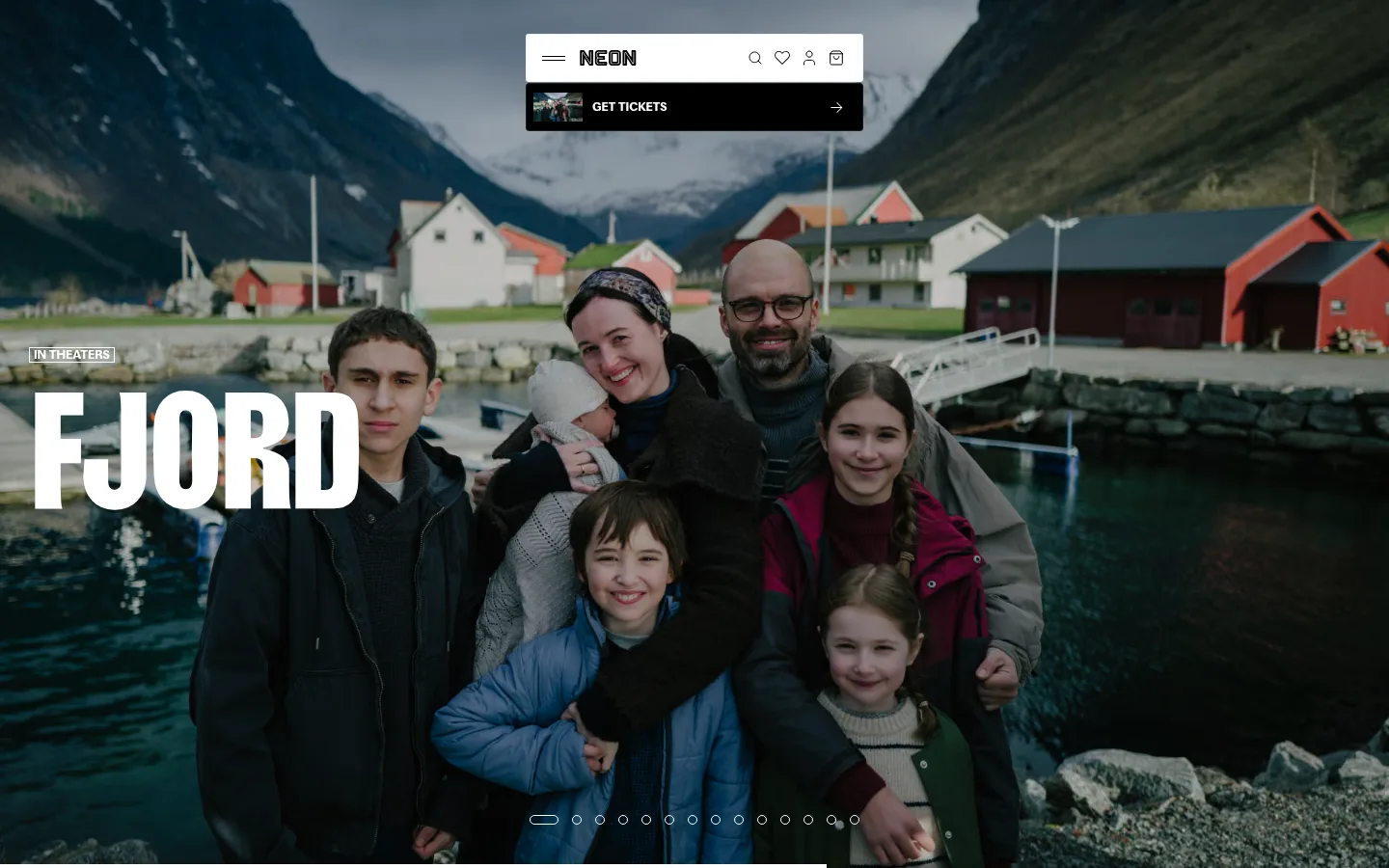
Centered white navigation bar over the hero, with a NEON wordmark and simple utility icons; a black ticket strip sits directly beneath it.
Full-bleed film hero
Large cinematic image with a small uppercase release label, oversized white condensed title, dark lower-image treatment, and carousel indicators.
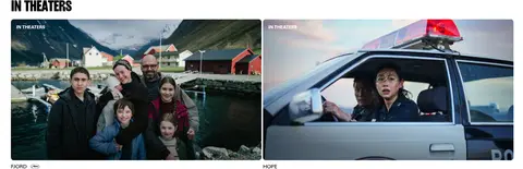
Film carousel cards
Wide image-led film cards grouped under uppercase section headings, with compact title and release metadata.
Merchandise grid
Four-column product presentation with pale grey card fields, product imagery, and concise uppercase availability, name, and price labels.
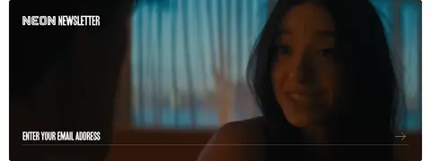
Newsletter banner
Wide, dark cinematic image panel with a white condensed heading and a bottom-aligned email entry prompt and arrow.
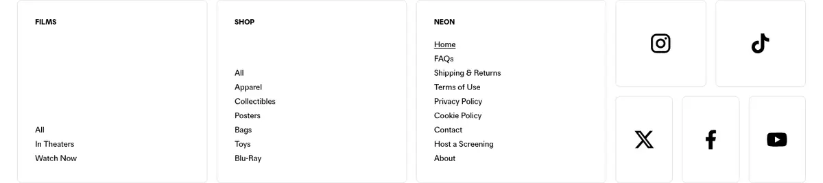
Grouped footer navigation
White footer organized into film, shop, and NEON link columns alongside a compact social icon grid and oversized brand imagery.
Imagery · Use cinematic film stills and release artwork as the primary visual material, not decorative illustration. The hero fills the viewport with a family portrait and dark readability treatment; title cards and carousels use wide or poster-like crops. Merchandise photography sits on pale grey or white product fields. Keep imagery edge-to-edge where it introduces a film, then use orderly crops and restrained captions in catalogue rows.
Let film photography dominate the hero and release features.
Use Girott-style condensed uppercase display titles.
Keep interface chrome black, white, and soft grey.
Align catalogue headings and cards consistently.
Use Focal-style uppercase labels for navigation and metadata.
Preserve generous gaps between content bands.
✕ 不该做
Do not introduce bright interface accents without measured evidence.
Do not place heavy cards or shadows around film artwork.
Do not shrink the hero title into ordinary body typography.
Do not crowd merchandise cards with extra copy.
Do not use gradients as a substitute for cinematic imagery.
Do not apply display type to every small label.
给 AI 的提示词
想快速出一个同风格的新页面,把这段话连同 DESIGN.md 一起发给 AI。
Build a new entertainment homepage in NEON’s restrained cinematic style. Use Cinema Ink (#000000), Screen White (#ffffff), and Gallery Grey (#f3f3f3) for the interface; keep other colour largely inside film photography. Start with a full-bleed image feature, overlaying a small uppercase release label and a very large condensed title. Use Girott or a close condensed display substitute for titles and Focal or a compact sans-serif for navigation, captions, and product details. Below the hero, create spacious white catalogue bands with image-led horizontal film rows and orderly merchandise grids. Keep card treatment flat, corners restrained, and dividers faint. Use a compact centered header and finish with grouped footer links. Make imagery, not decoration, supply the page’s mood.