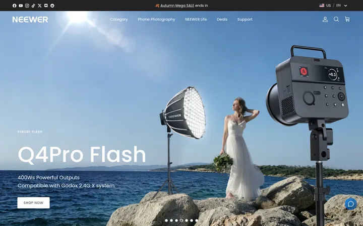
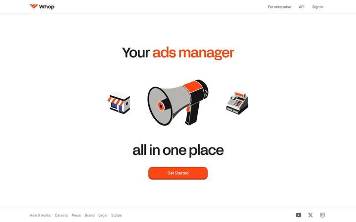
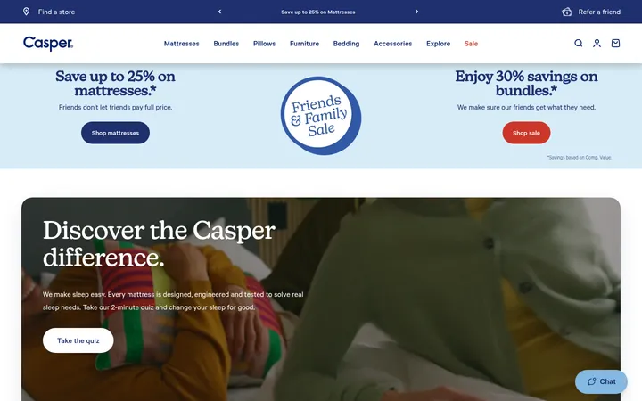
North star · Let high-impact outdoor product imagery lead, then surround it with a spacious white canvas and restrained cyan-to-violet accents.
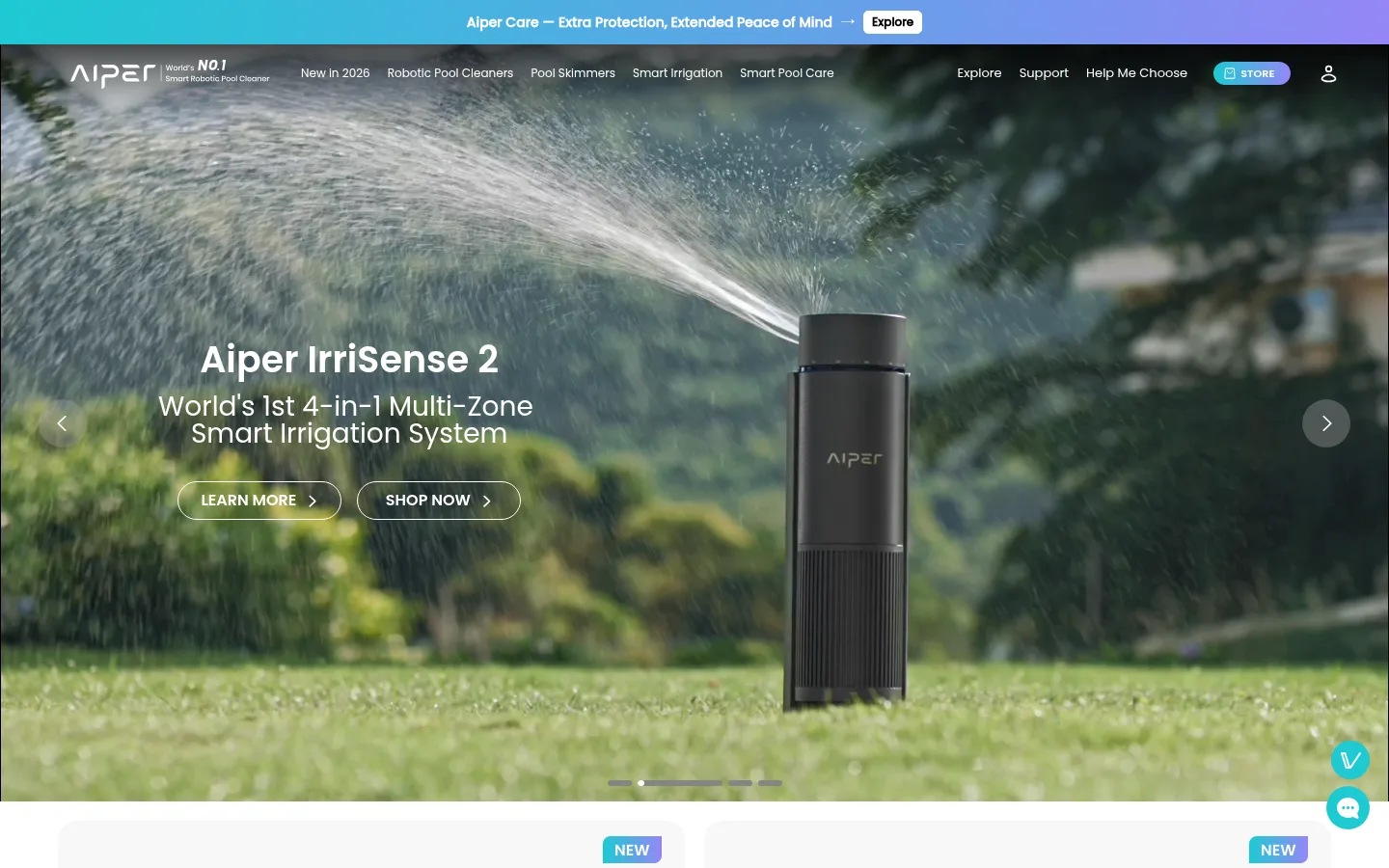
The visual strategy balances cinematic outdoor scenes with a predominantly white, uncluttered canvas. Full-bleed hero and campaign media provide the page’s strongest color and atmosphere; product and editorial content returns to pale neutral cards and generous white space. Poppins is used throughout, with bold, compact headlines and calm regular-weight supporting copy. The measured hierarchy moves from a 38px semibold hero heading to lighter 28px section titles, with body text at 16px. Cyan #1ecad3 and violet #9486f7 appear as a signature gradient in the announcement bar, small highlights, and campaign elements rather than as broad solid-color blocks. Rounded cards and pill-shaped controls soften the interface, while shadows remain subtle. The page shifts to near-black #151515 for its dense footer, creating a clear endpoint and contrast against the airy shopping and storytelling sections.
Body copy, captions, links, and regular section headings.
Aa 设计
poppins-bold
网络字体 · 字重 600 / 700 · 占比 24%
免费替代:Poppins
Primary hero and product headings, plus emphatic section titles.
Aa 设计
poppins-medium
网络字体 · 字重 500 / 700 · 占比 6%
免费替代:Poppins
Medium-weight controls and emphasized interface labels.
Aa 设计
poppins-heavy
网络字体 · 字重 800 · 占比 2%
免费替代:Poppins
Rare extra-bold display emphasis.
角色
示例
字号
字重
行高
字距
一级标题
Main hero product name and prominent launch headline.
Aiper
38px
600
1
0
二级标题
Section-level titles and lighter editorial headings.
Aiper
28px
400
1
0
三级标题
Product names and feature block headlines.
The quick brown fox 敏捷的狐狸
24px
600
1.5
0
四级标题
Card headings, product labels, and subsection titles.
The quick brown fox 敏捷的狐狸
20px
600
1.5
0
正文
Product descriptions, testimonials, and general supporting copy.
The quick brown fox 敏捷的狐狸
16px
400
1.5
0
辅助文字
Small card metadata, event details, and image captions.
The quick brown fox 敏捷的狐狸
12px
400
1.5
0
链接
Compact navigation, card, and footer links.
The quick brown fox 敏捷的狐狸
12px
400
1
0
间距与布局
基准单位 4px · 密度:适中
48px版块间距
4px元素间距
—卡片内边距
840px内容最大宽度
1px
2px
4px
8px
10px
12px
14px
16px
18px
20px
23px
24px
30px
40px
48px
60px
The homepage uses a wide, responsive canvas with full-bleed hero and campaign media broken up by centered content groups. Product listings form a two-column card grid; reviews, partner stories, customer stories, and event updates use horizontal multi-card rows. Headings align to the left for most content, while the awards block centers its title and badges. Section spacing feels comfortable, with clear white gaps between modules. The long page ends in a two-part dark footer with newsletter content and multiple link columns.
圆角与层次
按钮 · 9999px
卡片 · 12px
图片 · 12px
链接 · 9999px
xl · card
xl · other
Most sections feel flat against the white canvas, with spacing rather than borders defining their boundaries. Cards use pale neutral fills and rounded corners; shadows are soft and most visible on raised card or promotional surfaces. The hero’s layered text and navigation sit over photography with a dark overlay, while footer content is grouped on a solid near-black panel.
组件
下面的预览按实测的按钮、输入框、徽标、卡片样式重建(字体用替代字体)。
Announcement strip
A slim cyan-to-violet gradient band at the top, with centered offer copy and a compact contrasting Explore control.
Hero carousel
Full-width outdoor media with overlaid white product heading, supporting copy, outlined pill CTAs, side arrows, and bottom slide indicators.
Product cards
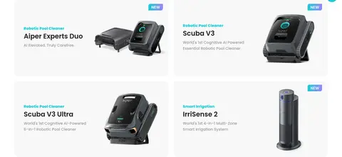
Pale #f8f8f9 cards with rounded corners, concise product labels, a small accent category line, and a product render.
Editorial carousels
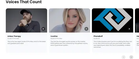
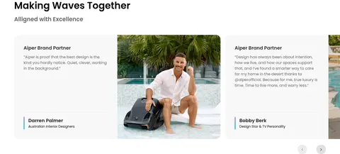
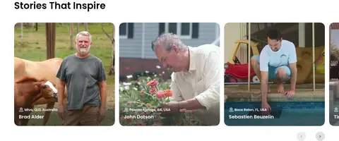
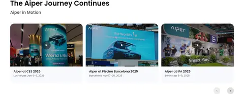
Horizontal cards for reviews, partner voices, customer stories, and event updates, combining image, brief copy, and compact metadata.
Awards gallery
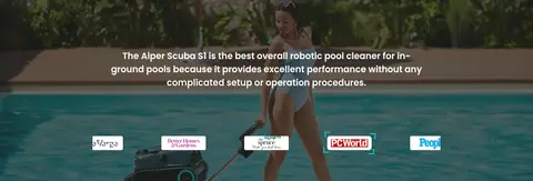
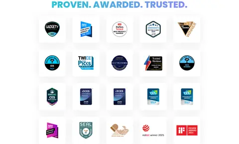
A centered title above a regular grid of award badge images on a bright background.
Service benefits row
Four evenly distributed service promises with small cyan-toned icons and short labels.
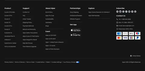
Dark footer
Near-black footer grouping a newsletter signup and membership perks above multiple compact link columns.
Imagery · Large photographic and video scenes dominate the hero and campaign blocks, showing products in gardens, pools, and real outdoor settings. Product renders sit beside concise copy in pale cards, while customer and partner sections use portraits and lived-in settings. Image corners are rounded in card layouts; full-bleed media uses a dark overlay where white copy needs contrast. Awards appear as a grid of compact badge images.
Keep the default content canvas white and spacious.
Use full-bleed outdoor photography for the hero and campaign moments.
Use Poppins consistently for headings, body copy, and links.
Reserve the cyan-to-violet gradient for small brand accents and banners.
Use rounded pale cards for products and editorial content.
Switch to a near-black surface for the dense footer.
✕ 不该做
Do not turn the whole page into saturated color blocks.
Do not let card copy compete with product imagery.
Do not use heavy borders to separate every section.
Do not apply the accent gradient to long paragraphs.
Do not use oversized, tightly packed navigation or body copy.
Do not omit contrast overlays when white text sits on photography.
给 AI 的提示词
想快速出一个同风格的新页面,把这段话连同 DESIGN.md 一起发给 AI。
Build a new Aiper-style ecommerce page on a Gallery White (#ffffff) canvas. Use Poppins for every text role, with bold concise headings, regular supporting copy, and restrained small labels. Lead with a full-width outdoor product photo or video; overlay white copy and pill-shaped outlined controls, ensuring legibility with a dark image treatment when needed. Use Frosted Pearl (#f8f8f9) rounded cards for product and editorial modules, arranged in clean grids or horizontal carousels with generous white gaps. Apply Pool Cyan (#1ecad3) and Iris Violet (#9486f7) as a limited gradient accent, not a dominant background. Keep the main content visually airy and image-led, then end with a structured Midnight Panel (#151515) footer containing newsletter signup, benefits, and compact link columns.