North star · Treat the page as a single printed editorial spread: let oversized type, warm paper, and an asymmetric grid do the work.
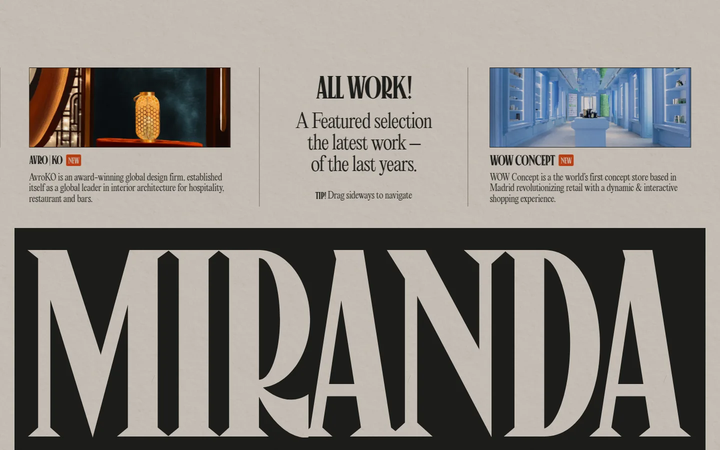
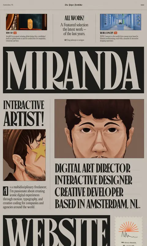
The page is built around a warm, uninterrupted paper-colored canvas (#cdc6be) and near-black ink (#1d1d1b), with black hairlines and restrained gray dividers organizing the spread rather than creating decorative UI. Canopee supplies the oversized, tightly tracked, uppercase display voice; Editorial New provides lighter, readable supporting copy and navigation. The typography is the dominant graphic device: words become blocks, captions sit close to imagery, and large display panels alternate with compact editorial details. A broad, asymmetrical grid brings project thumbnails, short descriptions, portraits, awards, testimonials, and calls to action into a continuous horizontal-print sensibility. Portraits and project artwork add richer colors, but those colors belong to the media, not the core palette. Generous canvas around dense content preserves the feel of a considered magazine layout. Borders remain crisp and mostly flat, with only subtle card shadows.
配色
点色块复制色值。用途说明来自对页面的实测位置(背景、文字、描边、按钮)与截图判读。
品牌色
表层色
中性色
功能色
页面底色 · Warm Paper表层 · Deep Ink表层 2 · Soft Stock主文字 · Deep Ink描边 · Print Black
Light body copy, captions, navigation, and conversational text.
Aa 设计
Canopee
网络字体 · 字重 400 · 占比 10%
免费替代:Bodoni Moda
Oversized display lettering, section headlines, and uppercase text links.
角色
示例
字号
字重
行高
字距
特大标题
Oversized uppercase wordmarks and full-width typographic panels.
Niccolò Miranda
446.5px
400
0.65
-0.05em
一级标题
Primary portfolio identity and the most prominent display heading.
Niccolò Miranda
122.5px
400
0.78
-0.05em
二级标题
Large, lighter editorial statements and supporting section introductions.
Niccolò Miranda
86.5px
300
1.33
-0.04em
三级标题
Uppercase section headlines and prominent project or service labels.
Niccolò Miranda
72px
400
1
-0.045em
四级标题
Smaller uppercase subheads and editorial callouts.
Niccolò Miranda
65px
400
1
-0.05em
正文
Project descriptions, biography, and portfolio narrative.
The quick brown fox 敏捷的狐狸
17.5px
300
1.25
-0.01em
辅助文字
Compact image notes, award labels, and supporting metadata.
The quick brown fox 敏捷的狐狸
16px
300
1.11
0
导航
Light-weight site navigation and project text links.
The quick brown fox 敏捷的狐狸
17.5px
300
1.25
-0.01em
链接
Uppercase social and action links in the display face.
The quick brown fox 敏捷的狐狸
21.5px
400
1
-0.029em
间距与布局
基准单位 1px · 密度:宽松
43px版块间距
43px元素间距
41px卡片内边距
1382px内容最大宽度
1px
3px
4px
7px
10px
12px
14px
17px
29px
36px
43px
65px
115px
Use a broad, centered editorial canvas with a measured maximum width of 1382px. Arrange content in an asymmetric multi-column grid, mixing full-width typographic panels with narrow copy columns, image blocks, and compact metadata. Align thin vertical and horizontal rules to the grid. The page feels spacious overall, but individual spreads can be dense: keep captions close to images and let large display text provide visual pauses. Maintain a measured 43px section and element rhythm where applicable.
圆角与层次
卡片 · 12px
导航 · 3px
链接 · 9999px
sm · card
sm · card
The visual system is mostly flat, like printed matter. Use thin, dark rules to divide columns and define media edges; selected quote cards have a measured 12px corner radius and subtle near-black shadows. Keep layering restrained, letting image crops and oversized type establish hierarchy instead of floating panels.
组件
下面的预览按实测的按钮、输入框、徽标、卡片样式重建(字体用替代字体)。
Editorial project preview
A rectangular project image sits beside or above a compact uppercase title and short Editorial New description, separated from neighboring content by fine rules.
Display wordmark panel
A wide near-black rectangle carries enormous Canopee uppercase lettering, creating a high-impact typographic break in the paper-colored page.
Portrait feature
Large illustrated portrait crops pair with bold uppercase role statements and smaller biography copy in an asymmetric editorial arrangement.
Circular work link
A rounded all-work link uses dark type, a muted gray outline, and a restrained outline treatment rather than a filled button.
Testimonial cards
Compact quote cards use near-black copy, dark borders, measured 12px rounding, and subtle shadows while staying visually integrated with the page.
Awards strip
A horizontal row of award labels and prominent counts is organized by fine rules and strong typographic contrast.
Footer contact line
A large editorial contact statement pairs with a dark Email Me treatment and a compact utility-link row.
Imagery · Use project previews and illustrated self-portraits as editorial content, not as generic decorative backgrounds. Crop images into clear rectangular frames and let their color and subject matter contrast with the restrained paper-and-ink palette. Artwork may be vivid or richly shaded; keep surrounding interface colors quiet. The page mixes artwork, project imagery, and image-led portfolio previews.
Keep the warm paper canvas and near-black ink as the dominant palette.
Let oversized, tightly tracked serif display type lead the hierarchy.
Build content as an asymmetric editorial grid with visible alignment.
Use fine rules to separate columns and content blocks.
Keep prose light, readable, and close to its related imagery.
Treat vivid artwork colors as image content, not interface colors.
✕ 不该做
Do not introduce gradients or bright interface accent colors.
Do not turn the editorial grid into generic rounded dashboard cards.
Do not center every block or make the layout uniformly symmetrical.
Do not use heavy shadows as the main source of hierarchy.
Do not set all supporting copy in oversized display typography.
Do not isolate project imagery from its captions and editorial context.
给 AI 的提示词
想快速出一个同风格的新页面,把这段话连同 DESIGN.md 一起发给 AI。
Build a new portfolio page as a continuous printed editorial spread. Use Warm Paper (#cdc6be) for the canvas and Deep Ink (#1d1d1b) for primary text, navigation, and display panels. Reserve Print Black (#000000) for crisp outlines and use Muted Graphite (#75726d) only for subdued details; Soft Stock (#e2dedb) is a secondary inset surface, not a new section theme. Use a high-contrast serif display face similar to Canopee for huge, tightly tracked uppercase headlines, and a light editorial serif like Editorial New for prose, captions, and navigation. Compose an asymmetric multi-column grid with thin dividers, image-led project blocks, portrait artwork, and compact metadata. Keep most surfaces flat, use rounded shadowed cards sparingly, and let typography and alignment establish hierarchy.