Patrick Miller 的作品集以醒目的大字开场,随后通过连续的影像画廊呈现摄影作品。克制的网格与反复出现的纯色色块,为不同主题和图片提供变化空间。
North star · Let oversized editorial typography introduce the work, then keep gallery framing flat and quiet so photography and broad color fields lead.
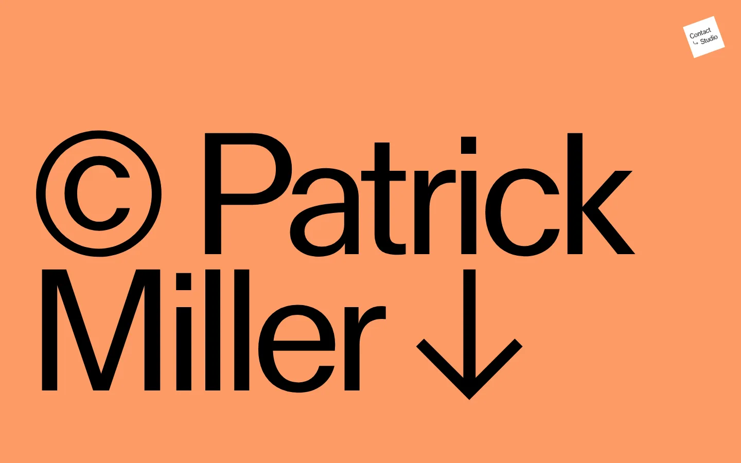
The page opens with a vivid orange field and enormous black custom lettering, establishing a confident editorial identity before transitioning into a long, modular portfolio. White canvas is the constant; muted blue-gray, wine red, pale pink, cream, and deep blue appear as broad section or gallery-panel colors. Treat these as deliberate framing for the work, not as a conventional interface palette. MlrStandard carries the small captions and navigation, while a very light system sans handles the large display-adjacent interface labels and arrow controls. Galleries are assembled from unequal and equal-width image areas, with small counters and directional arrows kept near the edges. The imagery itself supplies much of the page’s color and texture. Sections remain flat and spacious, with sharp corners and no visible shadow system; the effect comes from scale, contrast, image selection, and the rhythm of changing color blocks.
配色
点色块复制色值。用途说明来自对页面的实测位置(背景、文字、描边、按钮)与截图判读。
品牌色
强调色
表层色
中性色
页面底色 · Open Canvas表层 · Mist Blue表层 2 · Gallery Ink表层 3 · Studio Wine表层 4 · Blush Paper主文字 · Gallery Ink次要文字 · Open Canvas强调 · Studio Wine强调 2 · Signal Apricot强调 3 · Deep Cobalt
文字
背景
对比度
WCAG
#000000 Gallery Ink
#ffffff Open Canvas
21:1
AAA
#000000 Gallery Ink
#a4b1b3 Mist Blue
9.52:1
AAA
#000000 Gallery Ink
#6f2c30 Studio Wine
2.08:1
不达标
#ffffff Open Canvas
#a4b1b3 Mist Blue
2.21:1
不达标
#ffffff Open Canvas
#000000 Gallery Ink
21:1
AAA
#ffffff Open Canvas
#6f2c30 Studio Wine
10.1:1
AAA
字体
字号阶梯:Custom(比例约 4.548,正文 16px)。示例用免费替代字体渲染,数值为实测。
Aa 设计
MlrStandard
网络字体 · 字重 400 · 占比 84%
免费替代:Inter
Custom display lettering, body copy, gallery captions, and navigation.
Aa 设计
-apple-system
系统字体 · 字重 200 · 占比 16%
免费替代:Inter
Light headings and oversized arrow controls.
角色
示例
字号
字重
行高
字距
特大标题
Oversized homepage signature lettering and the downward browsing cue.
Patrick Miller
331px
400
0.8
-0.02em
一级标题
Light-weight page or section heading labels.
Patrick Miller
32px
200
normal
0
正文
Gallery captions and supporting copy.
The quick brown fox 敏捷的狐狸
16px
400
normal
0.01em
按钮
Large, minimal previous and next arrow controls.
Patrick Miller
32px
200
normal
0
导航
Compact navigation and gallery labels.
The quick brown fox 敏捷的狐狸
16px
400
1.3
0.02em
间距与布局
基准单位 8px · 密度:适中
72px版块间距
—元素间距
—卡片内边距
—内容最大宽度
16px
32px
48px
72px
The homepage uses a full-width sequence of tall, image-led sections with no measured maximum content width. The opening signature sits toward the left, while a small contact/studio control occupies the upper-right corner. Gallery regions alternate between multi-column arrangements and simpler full-panel color fields; image counts and column counts vary by section. Keep alignment deliberate but not rigidly uniform, with captions and counters near gallery edges. The measured spacing scale is 16, 32, 48, and 72, with a 72 section gap and comfortable overall density.
圆角与层次
没有测到阴影:页面是扁平的,层次靠底色和描边区分。
The visual system is flat: measured components have square corners, no shadows, and no visible border color. Separate gallery areas through hard-edged color changes, whitespace, and image placement rather than cards floating above the canvas. Small circular-looking controls in the screenshots should not be used to infer a global radius system; preserve the measured square treatment for general components.
组件
下面的预览按实测的按钮、输入框、徽标、卡片样式重建(字体用替代字体)。
Opening signature
A full-bleed apricot hero with enormous black custom lettering and a downward arrow that invites scrolling.
Contact / Studio control
A small, light-colored contact label sits near the upper-right of the opening area.
Editorial gallery
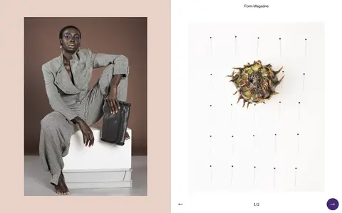
Photographic work arranged in variable column counts, occasionally paired with a broad colored or white panel.
Gallery counter
Small current/total notation such as 1 / 5, positioned close to the lower edge of a gallery.
Gallery navigation
Minimal previous and next arrow controls; measured arrow glyphs use light system sans styling.
Section color field
Flat mist blue, wine, cream, blush, or deep blue panels alternate with white and black areas.
Imagery · Photography is the core content: fashion portraits, editorial still lifes, flowers, and selected portraits appear in gallery sequences. Use real photographic imagery with varied crops and occasional full-height or paired panel framing. Some image areas in the supplied page views appear blank, so do not replace the portfolio’s photographic intent with decorative illustration. Let images retain their own color and texture against quiet, flat surroundings.
Reserve Signal Apricot for a confident opening or deliberate accent.
Make the opening typography dramatically larger than supporting labels.
Use photography as the primary content, not decorative UI imagery.
Vary gallery column counts to suit the image sequence.
Keep counters and arrow controls small and unobtrusive.
✕ 不该做
Do not add shadows, gradients, or decorative borders.
Do not introduce colors outside the measured palette.
Do not force every section into an identical grid.
Do not treat illustration colors as global interface colors.
Do not make captions compete with the photographs.
Do not add rounded-card styling across the page.
给 AI 的提示词
想快速出一个同风格的新页面,把这段话连同 DESIGN.md 一起发给 AI。
Build a new photographer portfolio page in Patrick Miller’s editorial style. Start with a full-bleed Signal Apricot (#fd9b65) hero and exceptionally large Gallery Ink (#000000) custom-feeling lettering; keep contact navigation small and tucked toward the upper-right. Continue into a long sequence of image-led galleries on Open Canvas (#ffffff), mixing variable-column photography with flat panels in Mist Blue (#a4b1b3), Studio Wine (#6f2c30), Blush Paper (#e9d1c7), Pale Custard (#f8f5d1), and Deep Cobalt (#004b82). Use MlrStandard or a close sans substitute for captions and navigation, and a light system sans for arrow controls. Keep counters and arrows discreet, edges sharp, and surfaces unshadowed. Let photographs and broad color blocks create the rhythm; avoid generic cards, gradients, and ornamental UI.