North star · Keep the interface quiet and typographic so a varied, art-directed image mosaic remains the main event.
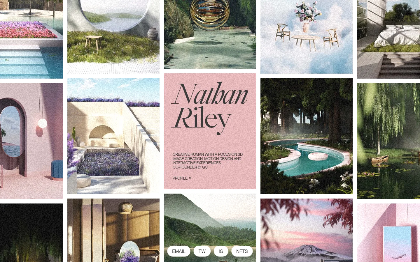
The page uses a white canvas and dark charcoal typography as a quiet frame for a dense, image-led portfolio. A modular mosaic fills the viewport, mixing varied rectangular crops with narrow white gutters; a blush-toned central tile gives the oversized italic name a distinct stage. The measured palette is intentionally spare: #ffffff supports the canvas and #393939 carries the text and inverse surfaces. The varied pinks, greens, stone tones and blues visible in the screenshot belong to the portfolio imagery, not a broader interface palette. Typography contrasts a very large, light display treatment with compact uppercase supporting copy. The layout feels spacious in its overall rhythm despite the packed gallery, with generous separation between major content groups. Small pill-shaped contact and social links sit over a portfolio image near the lower edge, keeping navigation secondary to the work.
Uppercase supporting copy, profile link, and contact or social labels.
Aa 设计
font1
网络字体 · 字重 300 · 占比 5%
免费替代:Cormorant Garamond
Oversized display name on the central identity tile.
角色
示例
字号
字重
行高
字距
特大标题
Large editorial name anchoring the central portfolio tile.
Nathan Riley
237.5px
300
0.8
-0.04em
正文
Uppercase biography, profile link, and compact contact labels.
The quick brown fox 敏捷的狐狸
13.5px
400
1.1
-0.025em
间距与布局
基准单位 2px · 密度:宽松
242px版块间距
—元素间距
—卡片内边距
—内容最大宽度
2px
16px
23px
29px
38px
Build the page around a full-width, multi-column mosaic of rectangular image tiles, with the screenshot’s varied tile widths and heights creating an irregular rhythm rather than a uniform card grid. Place the name and short biography inside a central tile, not in a separate conventional hero band. Keep slim white gutters visible between images. Contact and social links can overlay a lower image tile. The composition is visually dense, while the measured section rhythm is spacious; do not invent a max-width value or fixed spacing system beyond the measured data.
圆角与层次
没有测到阴影:页面是扁平的,层次靠底色和描边区分。
The measured system records no shadows, gradients, or component radii. Keep the interface essentially flat: separate images with white gutters rather than cards, outlines, or drop shadows. Let the mosaic’s crop, contrast, and overlap-like alignment create depth; the rounded contact pills are visible in the screenshot but their measured radius is unavailable.
组件
下面的预览按实测的按钮、输入框、徽标、卡片样式重建(字体用替代字体)。
Portfolio mosaic
A tightly composed field of image tiles with varied rectangular dimensions and thin white gutters; artwork supplies nearly all colour.
Identity tile
A blush-toned image tile featuring the oversized italic Nathan Riley name, compact uppercase introduction, and a profile link.
Contact and social pills
Small white pill-shaped labels placed over a lower portfolio image, including email and social destinations.
Supporting copy
Short uppercase biography text set in compact lines beneath the display name.
Profile link
A concise uppercase profile call-to-action within the identity tile, visually subordinate to the name.
Imagery · Use a varied portfolio of atmospheric interiors, landscapes, architecture, objects, and 3D compositions. Images are presented as edge-to-edge rectangular tiles with differing crop and aspect ratios, separated by white gutters. The screenshot has a soft, textured, slightly grainy finish and subdued natural colours; treat these as artwork-specific, not as required interface colours.
该做与不该做
✓ 该做
Let portfolio imagery dominate the first viewport.
Use #ffffff for the canvas and image gutters.
Use #393939 for clear, restrained interface text.
Reserve oversized type for the identity tile.
Keep supporting copy uppercase and compact.
Vary tile proportions to create an editorial mosaic.
✕ 不该做
Do not turn the mosaic into uniform product cards.
Do not add interface colours beyond the measured palette.
Do not treat artwork colours as brand colours.
Do not add shadows or decorative borders.
Do not let navigation compete with the gallery.
Do not invent unmeasured spacing or radius values.
给 AI 的提示词
想快速出一个同风格的新页面,把这段话连同 DESIGN.md 一起发给 AI。
Create a new creative portfolio page in Nathan Riley’s image-led editorial style. Use #ffffff as the canvas and as the narrow separators between a varied mosaic of rectangular portfolio images; use #393939 for interface typography. Build the page around artwork, not a conventional hero: arrange images in an irregular grid of different widths and heights, with a distinctive identity tile containing a large, light italic display name, compact uppercase introduction, and understated profile link. Use a restrained font pairing: an elegant editorial serif for display and a clean sans serif for small uppercase labels. Keep contact and social links compact and secondary, optionally overlaid on an image. Preserve a flat presentation without measured shadows or gradients, and do not turn the artwork’s colours into new interface tokens.