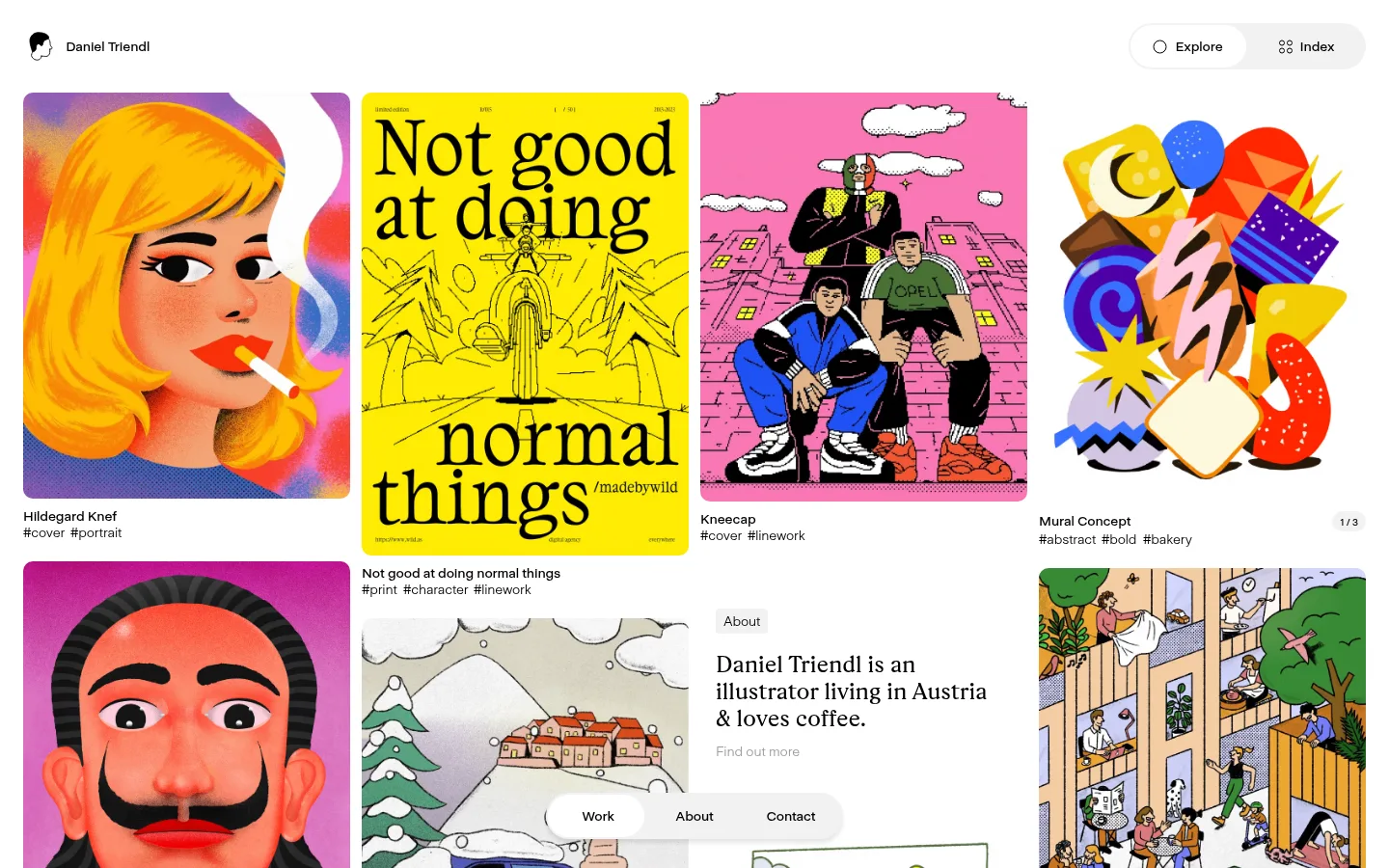
North star · Keep the interface quiet, white, and compact so an irregular, colorful illustration grid remains the unmistakable focus.
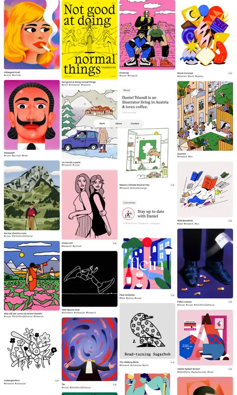
The page keeps its interface nearly colorless: white canvas, black text, and a small amount of soft gray for secondary links and pale UI details. The measured red is a border-color outlier rather than a defining visible brand accent; the vivid yellows, pinks, greens, and blues belong chiefly to the portfolio artwork. A compact sans-serif carries navigation, labels, and project metadata, while a serif display face gives the short introduction a contrasting editorial note. The work is arranged in a long, three-column masonry-like feed whose changing image proportions create rhythm without boxed cards. Small titles and hashtag-like descriptors sit close to each image. Generous page-level breathing room offsets the dense sequence of projects, and rounded floating navigation controls provide the clearest interface layer. The result is quiet and functional around the edges, expressive and varied within the artwork.
配色
点色块复制色值。用途说明来自对页面的实测位置(背景、文字、描边、按钮)与截图判读。
表层色
中性色
功能色
页面底色 · Gallery White主文字 · Ink Black描边 · Signal Coral
文字
背景
对比度
WCAG
#000000 Ink Black
#ffffff Gallery White
21:1
AAA
字体
字号阶梯:Custom(比例约 1.714,正文 14px)。示例用免费替代字体渲染,数值为实测。
Aa 设计
UniversalSans-425
网络字体 · 字重 400 · 占比 60%
免费替代:Inter
Body copy and subdued secondary links
Aa 设计
UniversalSans-625
网络字体 · 字重 500 · 占比 31%
免费替代:Inter
Navigation, captions, and button labels
Aa 设计
Rza
网络字体 · 字重 400 · 占比 9%
免费替代:Cormorant Garamond
Editorial introduction heading
角色
示例
字号
字重
行高
字距
一级标题
Serif-styled introduction heading in the about block.
The quick brown fox 敏捷的狐狸
24px
400
1.17
-0.006em
正文
Compact sans-serif supporting copy and secondary links.
The quick brown fox 敏捷的狐狸
14px
400
1.21
-0.01em
辅助文字
Small, medium-weight project metadata and labels.
The quick brown fox 敏捷的狐狸
10px
500
1
-0.01em
按钮
Medium-weight labels on navigation controls.
The quick brown fox 敏捷的狐狸
14px
500
1.21
-0.01em
导航
Medium-weight Explore, Index, Work, About, and Contact labels.
The quick brown fox 敏捷的狐狸
14px
500
1.21
-0.01em
间距与布局
基准单位 2px · 密度:宽松
96px版块间距
—元素间距
—卡片内边距
1325px内容最大宽度
4px
5px
7px
8px
9px
10px
12px
16px
18px
20px
24px
46px
68px
A long portfolio feed begins below a slim top header, with work arranged in three responsive, staggered columns. The measured page max width is 1325px; preserve broad white margins around the artwork rather than enclosing projects in cards. Image heights and proportions vary, so the grid feels like a curated masonry wall rather than uniform tiles. Place short titles and compact tags directly beneath images. An introduction block and small editorial inserts appear among the work, while a floating pill navigation stays visually distinct from the scrolling gallery.
圆角与层次
导航 · 9999px
sm · other
The page is predominantly flat, with no visible card system or heavy outlines around artwork. A soft shadow supports the floating rounded navigation control, distinguishing it from the white canvas without creating a strong overlay. Keep layering sparse and avoid adding elevation to individual projects.
组件
下面的预览按实测的按钮、输入框、徽标、卡片样式重建(字体用替代字体)。
Top identity header
Small artist mark and Daniel Triendl name sit at the upper left; Explore and Index actions form a pale rounded control at the upper right.
Artwork tile
Individual illustration displayed at its natural visual proportion, with softly rounded image corners and no enclosing card.
Project caption
Compact black project title followed by small hashtag-style descriptors directly below the artwork.
About insert
A brief introduction is embedded within the gallery, pairing a subtle section label with a serif statement and muted follow-up link.
Floating section navigation
Work, About, and Contact sit in a bottom-centered pill with a soft shadow; the active destination uses a white segment.
Gallery position indicator
A small pale pill at the gallery edge shows the current position in the work sequence.
Imagery · Illustration is the defining content: a broad mix of editorial portraits, posters, hand-drawn scenes, graphic abstractions, and client work. Display each piece as its own image with its original vivid palette and varied aspect ratio. Avoid applying a shared color filter or decorative frame; compact project titles and tags provide context without masking the artwork.
Use white space as the dominant interface surface.
Let each artwork retain its own colors and proportions.
Keep project captions compact and directly tied to images.
Use sans-serif for navigation and metadata.
Reserve serif typography for short editorial statements.
Use rounded pills sparingly for navigation controls.
✕ 不该做
Do not treat illustration colors as a site-wide UI palette.
Do not wrap every artwork in a bordered or elevated card.
Do not force every gallery tile into the same aspect ratio.
Do not enlarge metadata until it competes with the artwork.
Do not add prominent accent-colored buttons unsupported by the page.
Do not crowd the canvas with extra interface decoration.
给 AI 的提示词
想快速出一个同风格的新页面,把这段话连同 DESIGN.md 一起发给 AI。
Build a portfolio page with a quiet Gallery White (#ffffff) canvas and Ink Black (#000000) interface text. Use a slim identity header, subtle top-right browsing controls, and a long three-column masonry-style illustration feed whose images keep varied proportions and original colors. Keep project titles and hashtag-like metadata small, close to each image, and visually secondary. Use UniversalSans-like sans-serif for navigation, captions, and body copy; introduce a restrained serif only for a short editorial statement. Use Soft Graphite (#9b9b9b) for muted links and Mist Gray (#f2f2f2) only for subtle UI details. Do not make Signal Coral (#fe4e4e) a prominent accent. Keep cards flat, framing minimal, and navigation pills softly elevated rather than turning the gallery into a generic boxed grid.