North star · Keep the sky-blue field continuous, then use pixel-display headlines, crisp orange emphasis, and restrained white panels to make privacy feel approachable.
The page uses a continuous pale-blue canvas as its defining visual field, carrying the same atmosphere from the hero through feature explanations, FAQs, the founder note, and the final CTA. Saturated orange marks primary actions and selected headline phrases, while dark charcoal anchors the pixel-style display text; muted gray keeps supporting copy quiet. Jersey 10 gives headings a chunky retro, game-like character, contrasted with readable Manrope for navigation, body copy, and controls. Centered headline-and-copy blocks alternate with two- and three-column feature arrangements, product UI comparisons, and a framed protocol explainer. White rounded cards make dense content legible without fragmenting the canvas. Pixel-art clouds, a small mascot, and software-interface imagery add personality and help explain the product. The footer shifts decisively to deep brown, providing a dark, grounded finish to the otherwise light page.
Body copy, navigation, buttons, labels, and links.
Aa 设计
Jersey 10
网络字体 · 字重 500 / 400 · 占比 6%
免费替代:Press Start 2P
Display headlines and section headings with a pixel-art, arcade-like voice.
角色
示例
字号
字重
行高
字距
特大标题
Hero headline and oversized campaign-style display text.
Obscura
96px
500
0.7
-0.025em
一级标题
Primary page headline and major section headlines.
Obscura
72px
500
0.85
-0.025em
二级标题
Feature, protocol, FAQ, and CTA section headings.
Obscura
60px
500
0.8
-0.025em
三级标题
Subsection headings and prominent feature titles.
Obscura
48px
500
1
-0.031em
四级标题
Smaller card and supporting section headings.
Obscura
36px
400
1.11
0
正文
Explanatory paragraphs and general content.
The quick brown fox 敏捷的狐狸
16px
400
1.5
0
辅助文字
Compact labels, image captions, and secondary metadata.
The quick brown fox 敏捷的狐狸
14px
500
1.43
0
按钮
Primary Get Started and FAQ control labels.
The quick brown fox 敏捷的狐狸
14px
600
1.43
0
导航
Main navigation and header links.
The quick brown fox 敏捷的狐狸
16px
500
1.5
0
链接
Inline calls to action and supporting text links.
The quick brown fox 敏捷的狐狸
14px
500
1.43
0
间距与布局
基准单位 8px · 密度:宽松
96px版块间距
8px元素间距
16px卡片内边距
—内容最大宽度
2px
6px
8px
12px
16px
20px
24px
32px
64px
96px
A spacious, vertically sequenced landing page sits on a consistent blue canvas, with a centered header and hero followed by broad section breaks. Centered introductions lead into two-column comparisons, three-column feature content, a wide protocol panel, a narrow centered FAQ list, and a split founder story. The measured sections use an 8px spacing base and a spacious density; preserve generous separation and readable card interiors rather than compressing content. No fixed maximum page width was measured, so follow the screenshot’s broad, centered composition without assuming a numeric cap.
圆角与层次
按钮 · 6px
卡片 · 16px
图片 · 16px
导航 · 6px
链接 · 6px
xl · other, card, nav
lg · other, card, media
inset · button
hairline · other
The composition is mostly flat, with color and whitespace doing more work than deep shadows. White cards and interface panels sit clearly above the blue canvas through rounded corners, fine pale outlines, and subtle soft shadows. The navigation and CTA also receive restrained lift; avoid heavy, dark elevation.
组件
下面的预览按实测的按钮、输入框、徽标、卡片样式重建(字体用替代字体)。
Header navigation
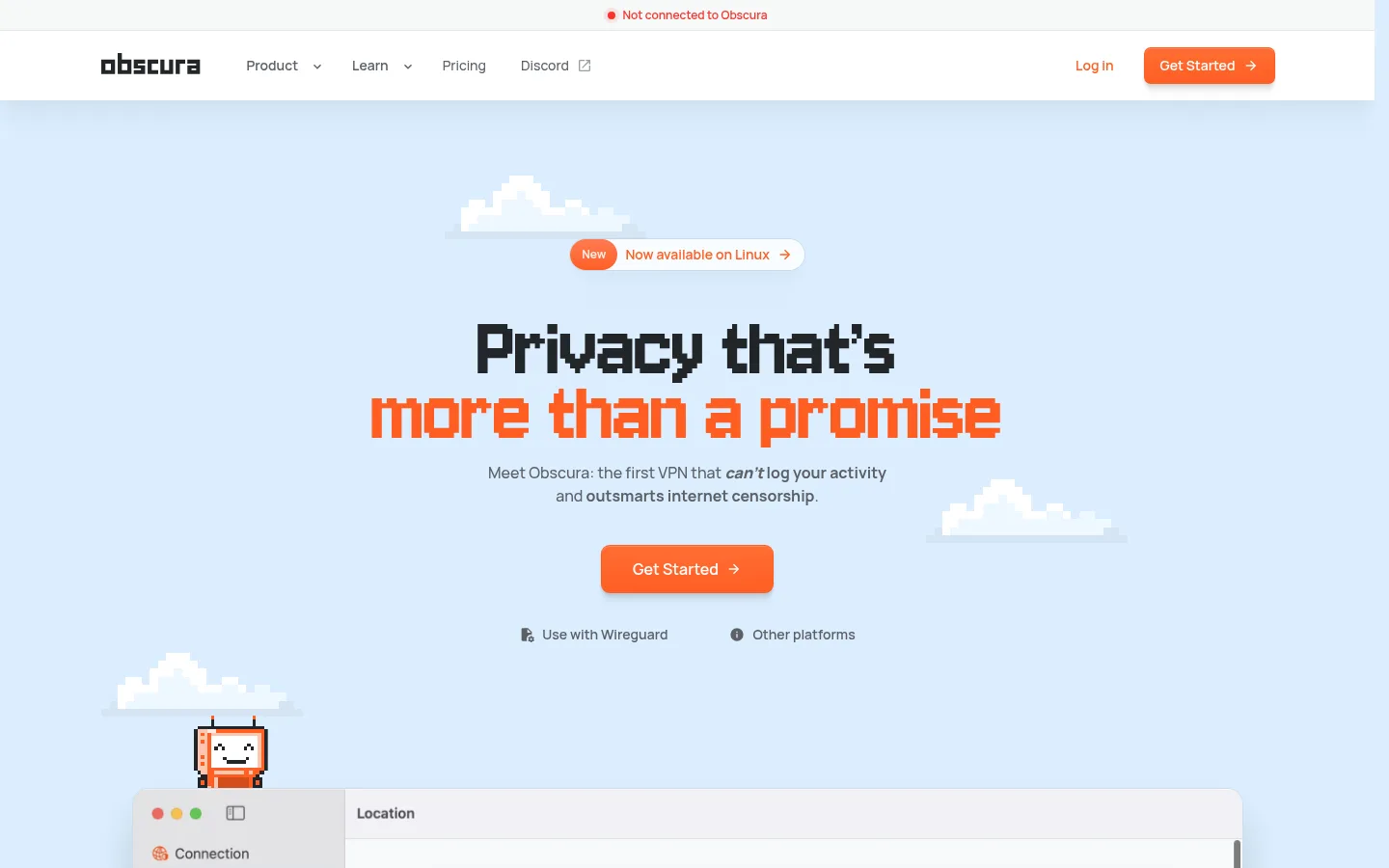
White horizontal header with the Obscura wordmark, compact dark links, a status pill above, and an orange Get Started button.
Hero announcement
Small pill-shaped Linux availability announcement, with an orange lead-in and a light surface above the centered display headline.
Primary CTA
Orange filled Get Started button with white Manrope text, a small corner radius, and restrained inset highlight and shadow.
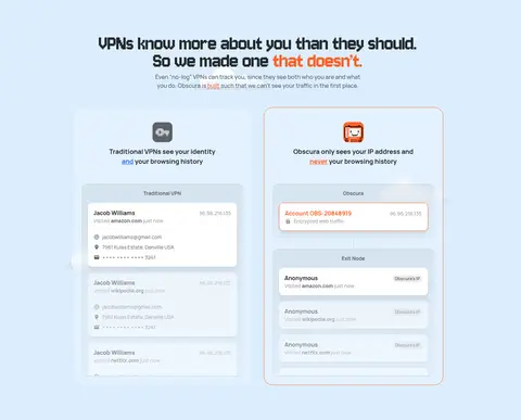
Privacy comparison
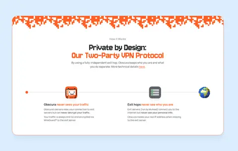
Two side-by-side VPN data examples contrasting traditional visibility with Obscura’s separation of identity and activity, housed in outlined interface panels.
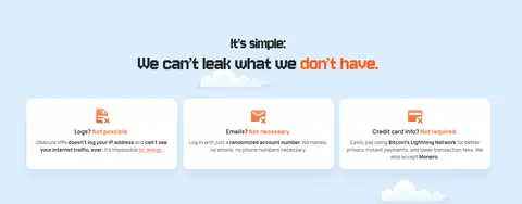
Feature cards
Three white cards explain logs, email, and credit-card information with compact orange iconography and short supporting copy.
FAQ accordion
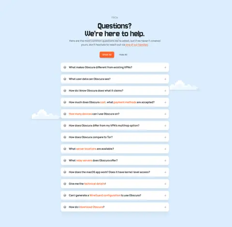
Centered stack of white rounded question rows with compact copy and controls, plus Show All and Hide All actions above.
Founder story
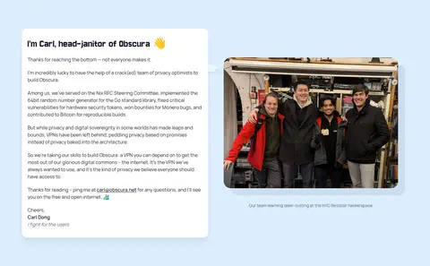
Split layout pairing a white text panel with a rounded team photograph and a small caption.
Footer
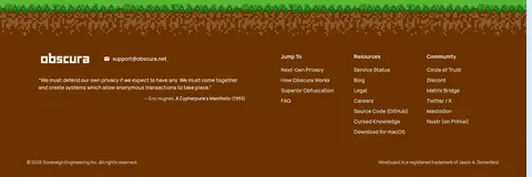
Three-column deep-brown footer with brand/contact information, a short quotation, and grouped resource and community links.
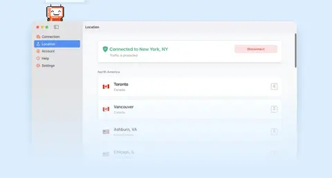
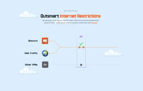
Imagery · Pixel-art clouds and a small character decorate the hero and lower CTA, reinforcing the retro display typography. Product screenshots and simplified network diagrams explain VPN behavior, while the founder section includes a real team photograph. Keep illustrations crisp and playful against the blue background; place interface imagery in light, framed panels and treat photography as a supporting editorial moment rather than the page’s visual anchor.
Set display headlines in a pixel-style face and keep paragraphs in a readable sans.
Reserve Signal Orange #ff5e24 for primary actions and selective emphasis.
Use white cards to organize dense product details and FAQ content.
Keep generous space between sections and clear centered introductions.
Use pixel-art details as supporting illustrations, not as decoration everywhere.
✕ 不该做
Do not replace the pale-blue canvas with a generic white background.
Do not set long paragraphs in the pixel display font.
Do not use orange for every heading, link, or interface element.
Do not crowd sections or flatten every layout into one column.
Do not add heavy shadows or dark outlines to every card.
Do not mistake illustration colors for the core page palette.
给 AI 的提示词
想快速出一个同风格的新页面,把这段话连同 DESIGN.md 一起发给 AI。
Build a new Obscura-style page with a spacious, friendly privacy-software aesthetic. Use Open Sky #dceefe as the continuous canvas, Charcoal Ink #232629 for primary text, and Soft Graphite #5c6066 for secondary copy. Set bold, retro display headlines in a pixel-style font and use Manrope-like sans-serif typography for body text, navigation, and controls. Apply Signal Orange #ff5e24 to primary CTAs and selective headline or link emphasis. Arrange content in broad, well-separated sections with centered introductions, varied feature columns, and inset Panel White #ffffff cards with subtle outlines and gentle elevation. Use crisp pixel-art accents and product-interface visuals sparingly. End with a distinct Cocoa Footer #6c3200 section. Keep the page readable, playful, and restrained; do not invent extra colors or rely on heavy shadows.