North star · Keep the interface quiet and near-black so authentic product imagery, clear typography, and a single violet action color do the storytelling.
The page is built on a near-black canvas, with most sections staying black so warm product photography and bright interface screenshots carry the visual emphasis. White headlines provide crisp contrast; softer grays handle supporting copy, while a vivid violet is reserved for primary purchase and exploration actions. A pale, full-bleed app-store section interrupts the dark sequence as a clear change of pace. Google Sans shapes the prominent display and heading hierarchy with medium-weight, unforced forms; Inter carries navigation, body copy, captions, and buttons. The layout alternates centered introductions with broad media panels, product-card grids, and feature compositions. Rounded cards and capsule controls soften the technical subject matter. Large section intervals preserve a spacious rhythm, while dark hairlines and subtle shadows define edges and layer imagery without adding ornamental clutter.
Navigation, body copy, captions, buttons, and compact interface text.
Aa 设计
googleSans
网络字体 · 字重 500 / 700 · 占比 23%
免费替代:Google Sans
Display headlines and primary section headings.
角色
示例
字号
字重
行高
字距
特大标题
Large centered hero and major campaign headlines.
Umbrel
61px
500
1.25
0
一级标题
Primary page and feature-section headings.
Umbrel
39px
500
1.25
0
二级标题
Major section headings and product category introductions.
Umbrel
31px
500
1.25
0
三级标题
Product and feature-card headings.
The quick brown fox 敏捷的狐狸
25px
500
1.38
0
四级标题
Smaller supporting headings within feature panels.
The quick brown fox 敏捷的狐狸
20px
400
1.4
-0.024em
正文
Explanatory product, feature, and introductory copy.
The quick brown fox 敏捷的狐狸
16px
400
1.63
-0.03em
辅助文字
Compact notes, labels, and media captions.
The quick brown fox 敏捷的狐狸
13.5px
400
1.8
-0.036em
按钮
Action labels for purchase, exploration, and downloads.
The quick brown fox 敏捷的狐狸
13.5px
600
1.45
-0.036em
导航
Header navigation links.
The quick brown fox 敏捷的狐狸
13.5px
500
1.45
-0.036em
间距与布局
基准单位 8px · 密度:宽松
112px版块间距
8px元素间距
—卡片内边距
1264px内容最大宽度
1px
2px
4px
6px
8px
10px
12px
14px
16px
20px
24px
28px
32px
The measured content max width is 1264px, with a spacious density and 112px section gap. A slim horizontal navigation sits above a centered hero; below it, the page alternates full-bleed media, centered product introductions, multi-column product cards, and feature panels. Several areas use a single-column presentation, while product and feature sections expand into two, four, or wider card arrangements. Headings are frequently centered, with left-aligned copy inside feature cards. The white app-store section is a deliberate full-width break in an otherwise black sequence.
圆角与层次
按钮 · 9999px
卡片 · 24px
图片 · 22px
导航 · 9999px
链接 · 24px
lg · media
xl · button
lg · media
md · other
The interface favors flat dark sections, with thin charcoal borders defining cards and controls. Rounded media panels and product cards sit clearly against the black canvas; selected media and floating testimonial elements use soft, deep shadows. Use layering for imagery and product previews, not ornamental interface chrome. Keep separators quiet and avoid heavy outlines.
组件
下面的预览按实测的按钮、输入框、徽标、卡片样式重建(字体用替代字体)。
Header navigation
Compact horizontal header on black, with white logo, subdued Inter links, and small utility icons.
Hero media panel
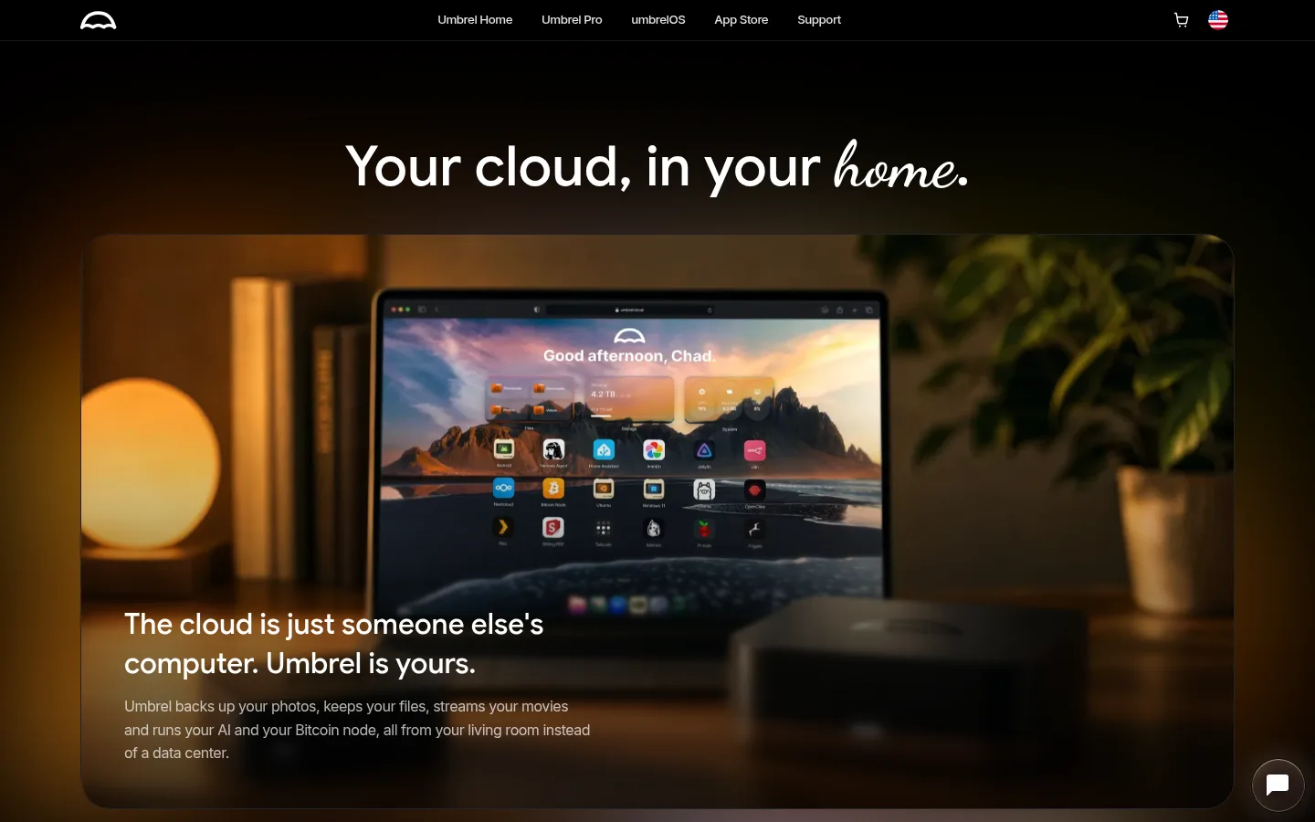
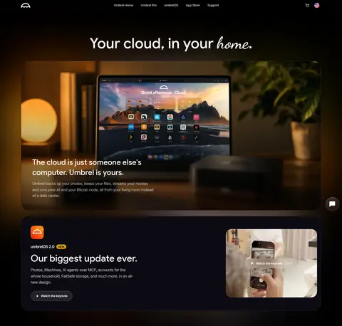
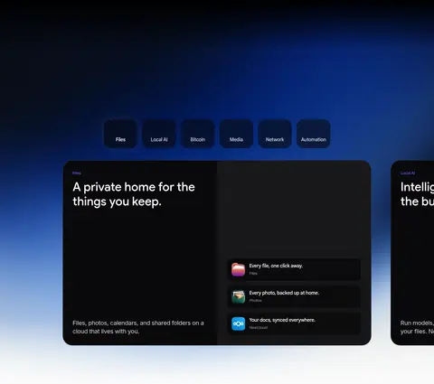
Centered display headline above a wide, rounded lifestyle video or image with darkened lower copy overlay.
Primary CTA
Capsule-shaped Umbrel Violet #5351f3 action with white Inter label; keep it reserved for key conversion actions.
Product cards
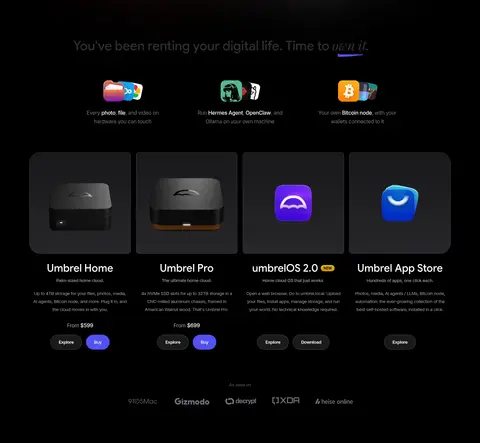
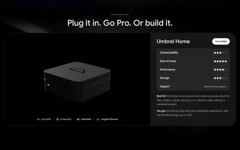
Dark cards with 24px or 32px measured radius, thin charcoal outlines, centered hardware or app imagery, and concise copy.
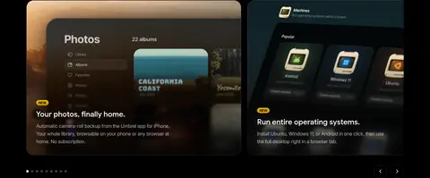
Feature carousel
Rounded image-led panels with feature heading and body copy, paired with small pagination or directional controls.
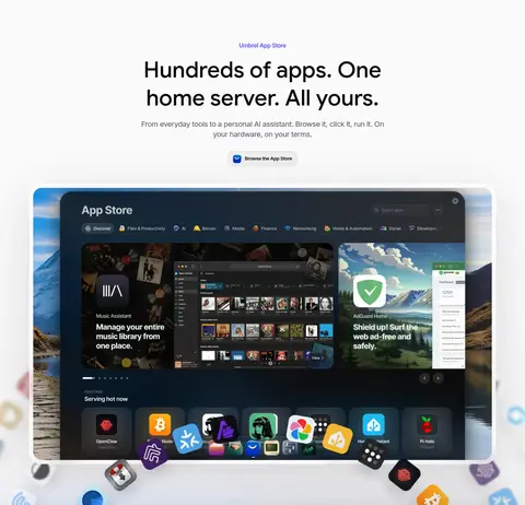
Light app-store band
Full-bleed pale section contrasting with the dark page, centered black heading, and a prominent app-store interface image.
Testimonial tiles
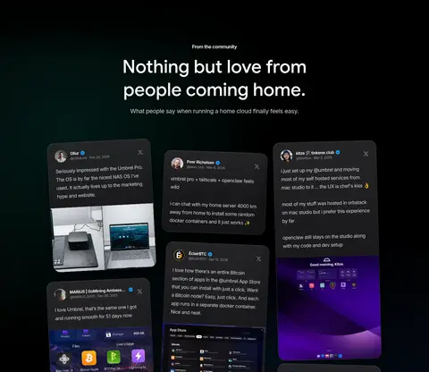
Dark social-proof cards with compact text, community identity details, and embedded screenshots or product media.
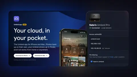
Imagery · Photography and video show home-server hardware in lived-in spaces, alongside product-interface screenshots and app-store views. Large landscape media panels use rounded corners and cinematic dark overlays; product cards combine device renders with interface imagery. The warm amber tones in the hero belong to its room photography, not the core interface palette. Screenshots and app icons supply localized color and detail within otherwise restrained compositions.
Keep the main canvas near-black and let imagery provide warmth.
Use Umbrel Violet only for primary actions.
Set display headings in Google Sans and supporting UI in Inter.
Give major sections generous measured breathing room.
Use rounded media panels and restrained dark borders.
Break up the dark sequence with the measured pale app-store band.
✕ 不该做
Do not turn warm photographic colors into interface accents.
Do not add bright colors beyond the restrained CTA treatment.
Do not fill dark space with decorative gradients or heavy chrome.
Do not make every panel a distinct elevated card.
Do not use all-caps headings or dense text blocks.
Do not invent spacing, sizes, or radii beyond the measured system.
给 AI 的提示词
想快速出一个同风格的新页面,把这段话连同 DESIGN.md 一起发给 AI。
Build a new Umbrel-style page with a quiet #000000 Night Canvas and a restrained palette. Use #ffffff Cloud White for clear headings and #cccccc Silver Copy for secondary text; reserve #5351f3 Umbrel Violet for the primary CTA. Use Google Sans for display and section headings, and Inter for body, navigation, captions, and controls. Create broad, rounded media panels that pair authentic home-server photography or interface screenshots with concise copy. Alternate centered introductions, product cards, and left-aligned feature panels, leaving generous whitespace between sections. Use #09090b Soft Charcoal and #0b0a12 Violet Night for subtle surface variation, with thin #1a1a1a Graphite Edge borders. Keep shadows quiet, prioritize readable contrast, and let product imagery—not decorative effects—supply visual richness.