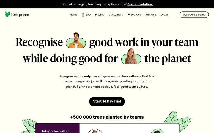
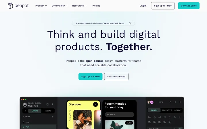
North star · Keep the page calm and spacious: lead with editorial serif headlines, explain in compact sans-serif content, and reserve green for decisive actions.
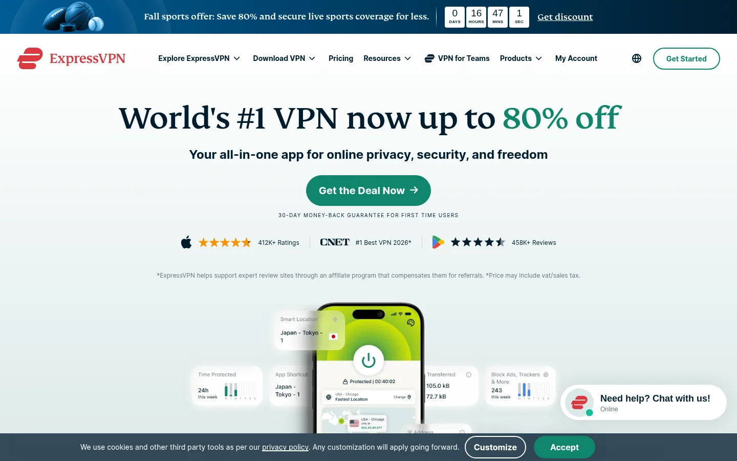
The page uses white as its continuous canvas, letting dark navy text and occasional pale section bands provide structure without making the long scroll feel segmented. A large FS Kim serif headline gives the campaign hero an editorial voice; Inter carries navigation, body copy, labels, and most headings in a practical, readable hierarchy. Emerald green is reserved for primary conversion moments and inline links, while navy gradients distinguish the business offer and certain promotional areas. Content alternates centered introductions, narrow explanatory copy, image-and-text splits, and three-column benefit or review cards. Generous whitespace separates these blocks, and soft card shadows give selected content a light physical presence. Product interface imagery and flat explanatory illustrations make abstract privacy concepts tangible; colorful mockup details remain supporting content rather than core brand colors.
Navigation, body copy, most section headings, buttons, links, captions, and uppercase eyebrows.
Aa 设计
FS Kim
网络字体 · 字重 500 / 400 · 占比 4%
免费替代:DM Serif Display
Display and hero or section H1 headlines, adding a distinctive editorial serif voice.
Aa 设计
Arial
系统字体 · 字重 700 / 400 / 500 · 占比 2%
免费替代:Arial
Measured secondary CTA button typography.
角色
示例
字号
字重
行高
字距
特大标题
Large campaign display headline, especially the hero offer.
ExpressVPN
64px
500
1
-0.016em
一级标题
Primary page or major section headline.
ExpressVPN
46px
500
1.09
0
二级标题
Feature, review, and explanatory section headings.
The quick brown fox 敏捷的狐狸
24px
700
1.33
0
三级标题
Benefit card and subsection titles.
The quick brown fox 敏捷的狐狸
20px
700
1.5
0
正文
Explanatory paragraphs and supporting feature copy.
The quick brown fox 敏捷的狐狸
16px
400
1.75
0
辅助文字
Guarantee notes, source notes, and compact metadata.
The quick brown fox 敏捷的狐狸
12px
400
1.83
0
按钮
Prominent action labels.
The quick brown fox 敏捷的狐狸
18px
700
1.45
0
导航
Header navigation and dropdown items.
The quick brown fox 敏捷的狐狸
14px
500
1.72
0
链接
Prominent inline or standalone text links.
The quick brown fox 敏捷的狐狸
20px
700
1.5
0
眉题
Small uppercase labels above or within content.
The quick brown fox 敏捷的狐狸
12px
600
1.5
0.133em
间距与布局
基准单位 4px · 密度:宽松
100px版块间距
10px元素间距
32px卡片内边距
830px内容最大宽度
2px
3px
10px
12px
14px
15px
16px
20px
21px
24px
30px
32px
40px
100px
A spacious long-form page moves through centered hero and section introductions, a narrow editorial reading column, alternating image-and-copy feature splits, and three-column card groups. The measured content max width is 830px, while major bands and backgrounds can extend across the viewport. Sections are separated by generous vertical pauses; the measured section gap is 100px. Use 4px-based spacing and 32px card padding as reference points. Keep alignment varied but controlled: centered for campaigns and grids, left aligned for detailed explanations.
圆角与层次
按钮 · 10px
卡片 · 24px
图片 · 10px
导航 · 4px
链接 · 9999px
lg · card
md · card
md · card
xl · media
Most sections sit flat on the white canvas, with borders used sparingly. Feature and review cards gain separation through soft, broad shadows rather than heavy outlines; measured card radii are 24px. Media and status mockups use subtler borders and elevation, while dark promotional bands create contrast through color instead of shadow.
组件
下面的预览按实测的按钮、输入框、徽标、卡片样式重建(字体用替代字体)。
Campaign hero
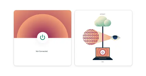
Centered serif offer headline, compact supporting line, green pill CTA, guarantee caption, rating marks, and a large VPN app mockup over a pale gradient.
Primary action
Green filled action with white bold label, generous horizontal padding, and a fully rounded pill silhouette; use for the main conversion.
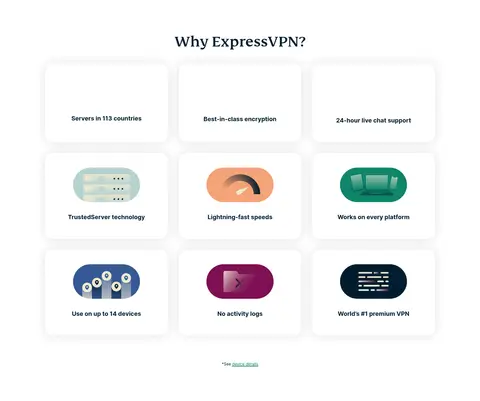
Feature card grid
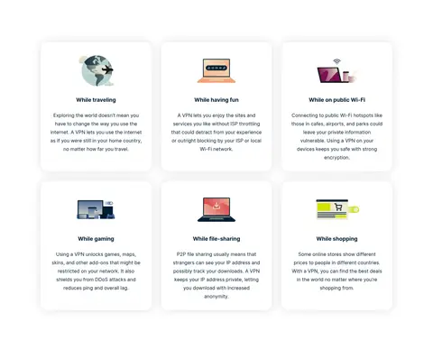
Three-column benefit cards with deep ink titles, generous internal padding, rounded corners, and soft broad shadows; artwork appears only on selected cards.
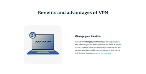
Feature split
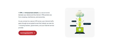
Alternating illustration and text blocks with a clear heading, compact explanatory copy, and substantial whitespace between rows.
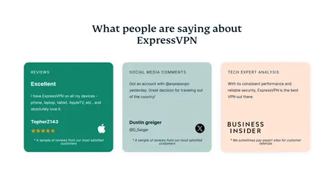
Review cards
Three editorial testimonial panels with differentiated pale or green-toned fills, small uppercase category labels, short review text, and trust marks.
Teams promotion
Dark navy gradient band pairing a left-aligned offer and red-toned CTA with a device illustration on the opposite side.
Navigation
White horizontal header with the brand mark, compact Inter links, dropdown indicators, account access, locale control, and outlined green Get Started action.
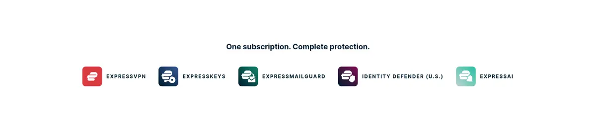
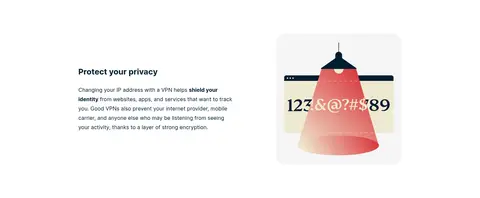
Imagery · The hero combines a realistic VPN app phone interface with floating feature panels, while later sections use flat explanatory illustrations to clarify networking and privacy. Cards use small product or concept artwork, and the Teams band adds a dimensional device illustration. Media is cleanly framed with generous white space and restrained rounding. Treat colorful device screens and illustration palettes as content, not brand color foundations.
Use white as the default canvas and preserve generous whitespace.
Set campaign headlines in an editorial serif and supporting UI in Inter.
Reserve Signal Green (#0f866c) for prominent actions and selected links.
Use Deep Ink (#001d2f) for primary text and navigation.
Alternate centered introductions with focused split-content sections.
Use soft shadows and rounded cards for key feature and review groups.
Keep illustration colors subordinate to the core interface palette.
✕ 不该做
Do not turn every section into a colored background band.
Do not use green as a large decorative fill across the page.
Do not crowd the hero with dense supporting copy.
Do not replace the editorial serif headlines with generic heavy sans-serif type.
Do not apply strong borders or dramatic shadows to every card.
Do not treat mockup and illustration colors as core brand colors.
Do not compress the vertical rhythm of the long-form content.
给 AI 的提示词
想快速出一个同风格的新页面,把这段话连同 DESIGN.md 一起发给 AI。
Build a new page in the ExpressVPN visual style: a calm, spacious white canvas with Deep Ink (#001d2f) text and an editorial serif display headline. Use Inter for navigation, body copy, cards, and captions; use Signal Green (#0f866c) selectively for primary CTAs and links. Keep the main content column restrained, while allowing occasional full-width bands, including a dark Ocean Slate (#0c3956) to Night Tide (#001827) promotional panel. Create a clear rhythm of centered introductions, explanatory split sections, and soft-shadow card grids. Use Mist Tint (#dae8e7) only for a gentle pale gradient backdrop. Pair product UI imagery with simple explanatory illustrations, generous whitespace, subtle borders, and rounded cards. Make trust signals visible but secondary to the main conversion action.