North star · Let generous warm negative space and alternating sculpture photography carry the catalogue, with typography acting as a quiet label.
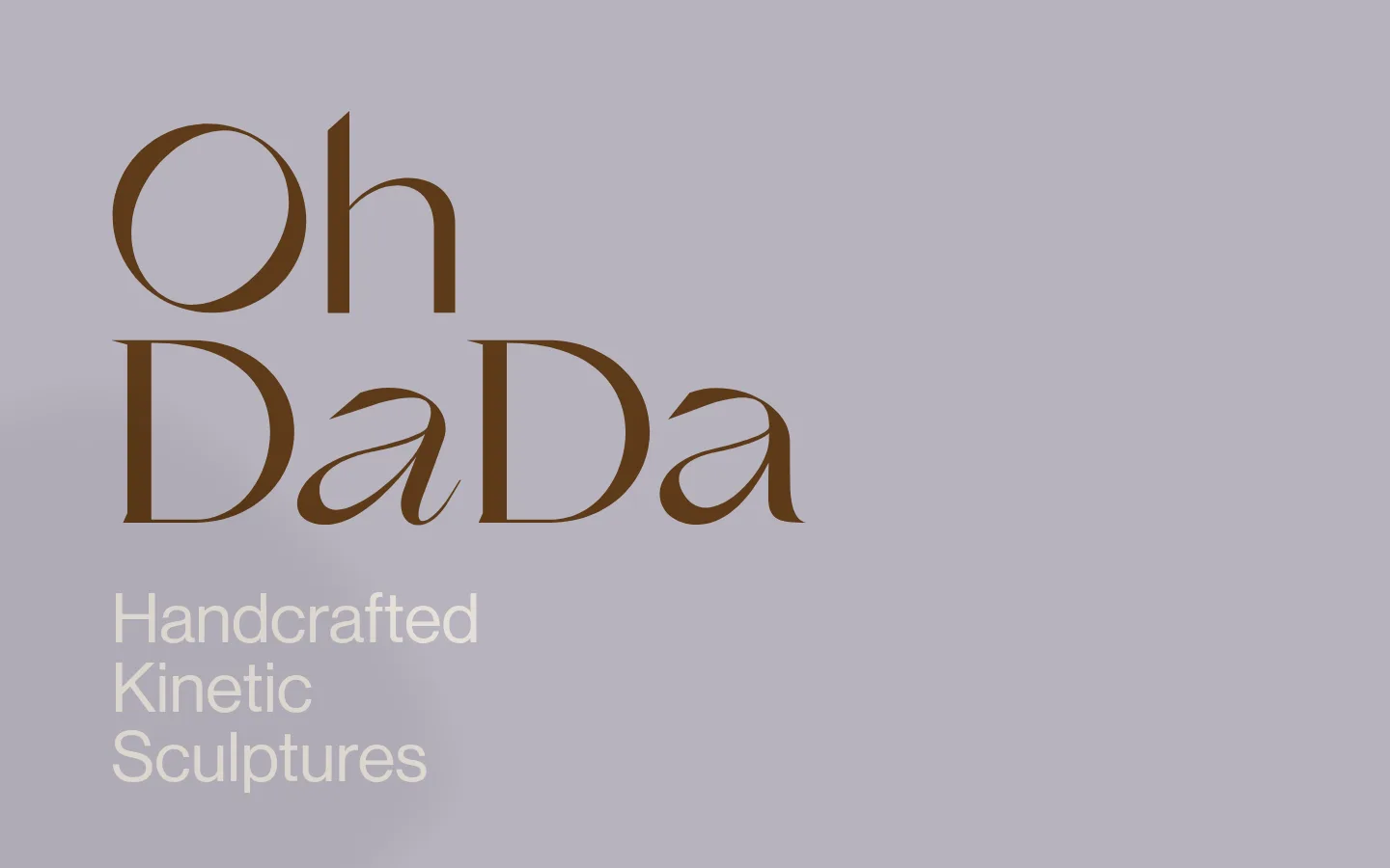
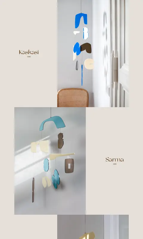
The page is built around a restrained three-colour system: a muted lavender-gray hero, a warm off-white product field, and a dark brown used for the brand mark and product names. In the hero, the oversized serif wordmark provides the main visual event; a light sans-serif descriptor sits beneath it in contrasting pale text. The product section shifts into a long, quiet editorial sequence, with large photographs alternating from side to side and small product labels occupying the open space opposite each image. The photos show handmade hanging sculptures in bright domestic interiors, while saturated object colours belong to the photographed products rather than the site chrome. Generous vertical breathing room and an asymmetric single-column flow replace conventional cards or a tight catalogue grid. Keep treatments flat and unboxed: image edges and the changes in background colour define structure, not shadows or decorative borders.
Sans-serif display descriptor and body copy, including the hero tagline.
Aa 设计
GrandSlang-Roman
网络字体 · 字重 100 · 占比 49%
免费替代:Bodoni Moda
Expressive serif brand wordmark and prominent display lettering.
角色
示例
字号
字重
行高
字距
特大标题
Large sans-serif hero descriptor, stacked beneath the oversized wordmark.
OhDada
72px
500
1
0
一级标题
Expressive serif brand lettering and primary display statement.
OhDada
57.5px
100
1
0
正文
Compact product and supporting copy in the clean sans-serif.
The quick brown fox 敏捷的狐狸
17px
500
1.18
0
间距与布局
基准单位 1px · 密度:宽松
115px版块间距
—元素间距
—卡片内边距
1152px内容最大宽度
2px
5px
58px
115px
144px
Use a spacious, single-column page flow with a measured maximum content width of 1152px. The hero is a full-width mauve-gray field with its branding anchored to the left. A warm light product canvas follows, continuing down the page as a long editorial catalogue. Alternate image placement left and right, pairing each large photograph with a product name in the opposing open area. Keep alignment deliberately asymmetric and let substantial vertical gaps separate entries; the overall measured density is spacious, with a section gap of 115.
圆角与层次
没有测到阴影:页面是扁平的,层次靠底色和描边区分。
The measured system has no shadows, gradients, or defined border colour. Keep the page visually flat: solid colour fields, clean image edges, and open whitespace create separation. Avoid raised cards, boxed labels, or decorative dividers; image placement and the hero-to-catalogue background transition provide the layering.
组件
下面的预览按实测的按钮、输入框、徽标、卡片样式重建(字体用替代字体)。
Hero wordmark
Oversized dark-brown serif brand lettering placed prominently on the lavender-gray opening field.
Hero descriptor
Pale sans-serif tagline stacked beneath the wordmark, broken across short lines.
Products introduction
Simple dark heading at the start of the warm product canvas, with no enclosing panel.
Alternating product entry
Large sculpture photograph sits on one side; a small brown serif product name and compact price occupy the opposing negative space.
Product image
Unframed rectangular lifestyle photography with natural light, interior context, and the sculpture as the focal point.
Imagery · Use large, natural-light photographs of handcrafted kinetic sculptures displayed in lived-in interiors. Frame each hanging object as the subject, allowing walls, furniture, and soft cast shadows to provide context. Alternate photo placement across the product sequence. Bright pinks, blues, greens, and other saturated hues appear within photographed objects; they are product details, not interface colour tokens.
Alternate product images and labels from side to side.
Give each product entry ample vertical breathing room.
Keep product photography natural and interior-focused.
✕ 不该做
Do not add card borders, shadows, or gradients.
Do not turn the catalogue into a dense uniform grid.
Do not use bright product colours as global interface accents.
Do not crowd product labels against photographs.
Do not replace the expressive serif display with generic sans-serif branding.
Do not add rounded UI treatments unsupported by the page.
给 AI 的提示词
想快速出一个同风格的新页面,把这段话连同 DESIGN.md 一起发给 AI。
Build a new page in OhDada’s quiet, art-catalogue style. Use Mauve Haze (#b7b3be) for a full-width opening field and Warm Parchment (#e6e0d9) for the main content canvas; use Walnut Ink (#5d3a19) for prominent brand and product text. Pair an expressive high-contrast serif, similar to Bodoni Moda, with a clean grotesk sans-serif such as Inter. Keep the structure spacious and editorial: a bold left-anchored hero statement, followed by a long single-column sequence of large lifestyle photographs and small opposing labels. Alternate image sides instead of building product cards. Preserve generous vertical intervals, natural-light interiors, and flat surfaces. Treat saturated colours as details in the photographed objects, not as interface chrome.