克制的黑白界面为 Runway 的 AI 平台提供清晰、编辑式的视觉框架。大幅电影感影像负责呈现视觉冲击,模块化产品区块与深色信息密集的页脚则梳理丰富的产品与服务。
North star · Keep the interface quiet and editorial so large, cinematic imagery—not decoration—sets the visual tone.
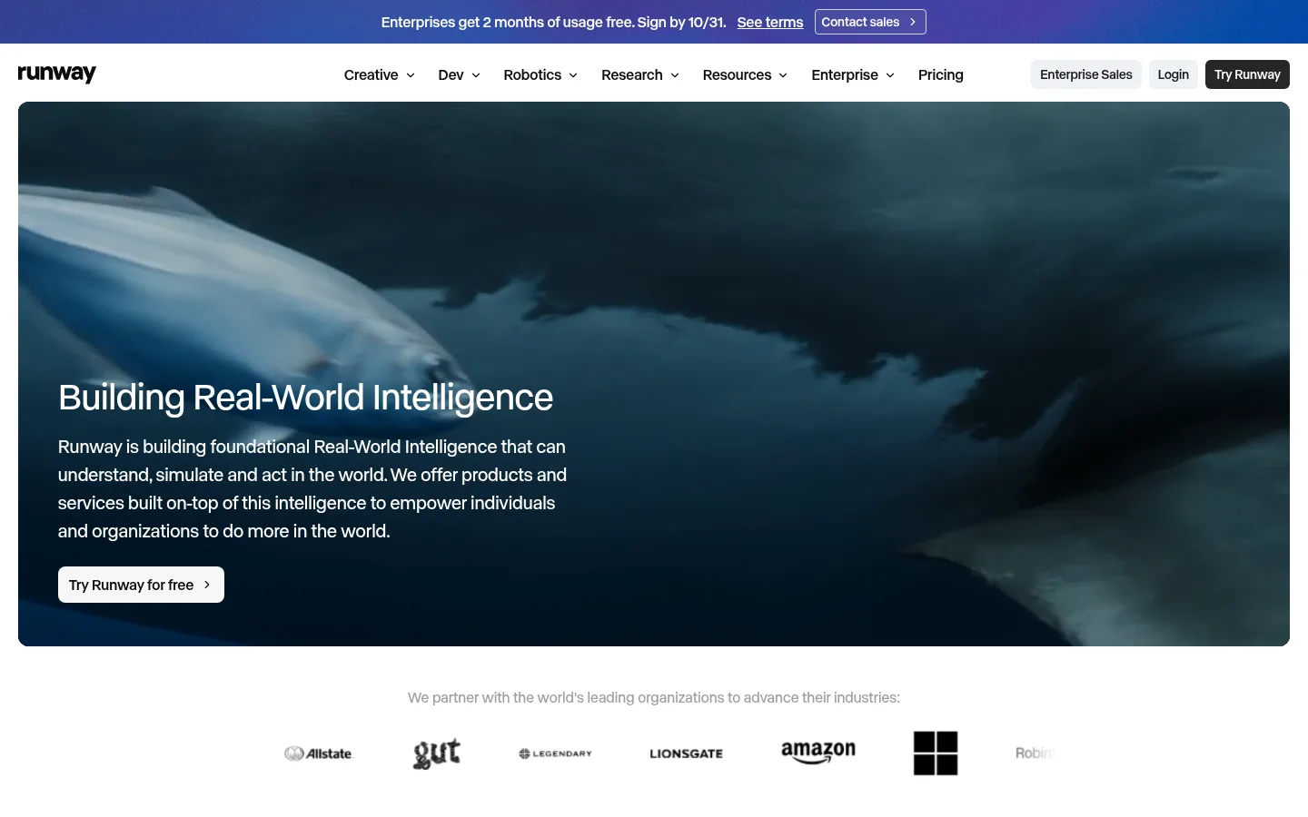
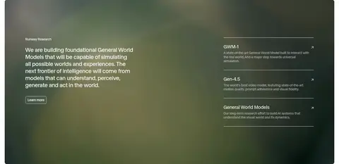
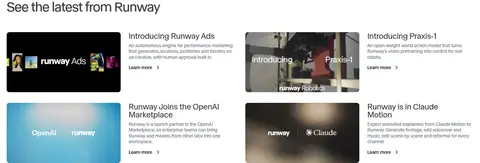
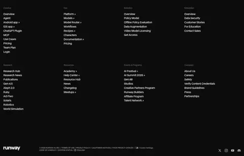
Runway’s homepage uses a near-monochrome interface as a quiet frame for vivid, cinematic product imagery. White is the main canvas; near-black defines navigation, text and the full-width footer, while fine pale-gray rules separate content without adding visual weight. A restrained blue-violet accent appears sparingly rather than driving the palette. The single abcNormal family keeps headings and body copy consistent, with regular-weight display text, compact uppercase captions and stronger button labels. The layout moves from a wide, image-led hero to centered platform messaging, three product cards, a tabbed product showcase, a dark research feature and a compact editorial feed. Spacious gaps give these different blocks room to breathe, while a four-column footer gathers extensive navigation. Rounded buttons and restrained borders are the main interface details; the page otherwise stays flat and lets imagery establish mood.
Site-wide display and interface type: hero and section headings, navigation, body copy, captions, links and buttons.
角色
示例
字号
字重
行高
字距
特大标题
Large hero or prominent campaign headlines.
Runway
56px
400
1.1
-0.015em
一级标题
Primary page and major section headings.
Runway
40px
400
1.15
-0.012em
二级标题
Platform and feature section headings.
The quick brown fox 敏捷的狐狸
24px
400
1.25
-0.007em
三级标题
Product titles and supporting feature headings.
The quick brown fox 敏捷的狐狸
20px
400
1.55
-0.005em
正文
Descriptions, explanatory copy, and supporting text.
The quick brown fox 敏捷的狐狸
14px
400
1.25
0
辅助文字
Compact uppercase labels and metadata.
The quick brown fox 敏捷的狐狸
11px
450
1.3
0
按钮
Prominent CTA and utility button labels.
The quick brown fox 敏捷的狐狸
14px
600
1.43
0
导航
Primary navigation links.
The quick brown fox 敏捷的狐狸
16px
500
1.5
0
链接
Text links and editorial feed actions.
The quick brown fox 敏捷的狐狸
14px
600
1.43
0
间距与布局
基准单位 4px · 密度:适中
56px版块间距
8px元素间距
—卡片内边距
1400px内容最大宽度
2px
4px
6px
8px
10px
12px
14px
16px
20px
23px
24px
28px
32px
40px
46px
56px
The measured page max width is 1400px, with the first viewport spanning nearly edge to edge. A compact announcement strip and navigation sit above the hero. Content alternates between centered headings, three-column platform cards, split feature panels, and a two-column content feed. The measured section gap is 56px and the overall density is comfortable; use generous whitespace to separate these varied blocks. A four-column footer gathers deep navigation into a dense dark field.
圆角与层次
按钮 · 6px
链接 · 4px
没有测到阴影:页面是扁平的,层次靠底色和描边区分。
The page is predominantly flat, with no measured shadow system. Thin #e5e5e5 separators and subtle image framing provide structure in place of layered cards. Buttons use compact fills and measured corner radii; the hero and feature media supply depth through photography, not UI elevation.
组件
下面的预览按实测的按钮、输入框、徽标、卡片样式重建(字体用替代字体)。
Announcement strip
A narrow blue-to-violet banner above the white navigation, containing centered promotional copy, a terms link and a contact action.
Primary navigation
Black Runway wordmark at left, compact product and resource links across the center, and pale Enterprise Sales, Login and dark Try Runway controls at right.
Hero panel
Wide cinematic image with white headline and supporting copy positioned over the lower-left area, plus a pale Try Runway for free CTA.
Platform card
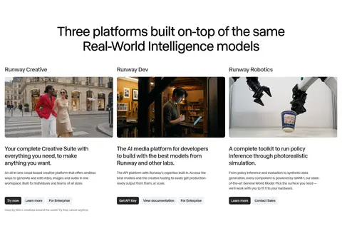
Three-column product overview with image, title, short description and compact actions on a white canvas.
Tabbed showcase
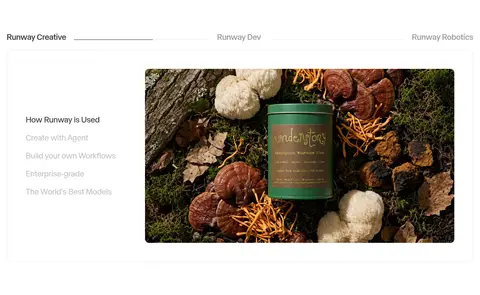
Horizontal product category tabs above a fine-bordered feature panel, pairing a short use-case list with a large image.
Research feature
Dark, full-width photographic panel with explanatory text on the left and stacked research links separated by thin rules on the right.
Editorial feed
Two-column list of recent updates pairing small landscape thumbnails with restrained titles, descriptions and Learn more links.
Footer
Near-black, four-column navigation directory with many small white and muted links, plus the Runway mark and legal details.
Imagery · Large photographic and video-like media lead the page: a cinematic underwater hero, product and use-case imagery, and a soft-focus research feature. Images are broad, often rounded at the corners, and sit directly within the page grid rather than inside heavily decorated frames. Treat the deep blue-green imagery visible in the screenshots as content-specific media color, not as a core interface palette. Product thumbnails in the feed are smaller and more editorial.
Use white canvas and near-black type as the default.
Reserve large image areas for cinematic product storytelling.
Keep headings clean, regular-weight and subtly tight-tracked.
Separate sections with generous whitespace and fine gray rules.
Use compact rounded controls with clear contrast.
Keep violet accents rare and subordinate.
✕ 不该做
Do not make the interface colorful by default.
Do not add shadows or layered card effects.
Do not use decorative gradients across ordinary content sections.
Do not crowd the hero with secondary interface elements.
Do not treat image-specific blue-green tones as brand UI colors.
Do not use oversized bold type for every section.
给 AI 的提示词
想快速出一个同风格的新页面,把这段话连同 DESIGN.md 一起发给 AI。
Build a new Runway-style page with a quiet, editorial interface and cinematic imagery. Use Gallery White (#ffffff) as the main canvas and Runway Ink (#0c0c0c) for primary text, navigation and inverse surfaces. Use Soft Rule (#e5e5e5) for delicate dividers and Slate Copy (#404040) or Cool Gray (#6b7280) for supporting copy; keep Signal Violet (#2b22fa) rare. Use a clean sans-serif close to Inter, with mostly regular headings and compact stronger-weight buttons. Structure content as spacious, clear modules, mixing centered headings, image-led splits and restrained product cards. Let broad photography establish mood; keep interface framing flat, without shadows. Use compact rounded CTAs, a simple top navigation, and a dark, well-organized footer. Treat image colors as content, not brand palette.