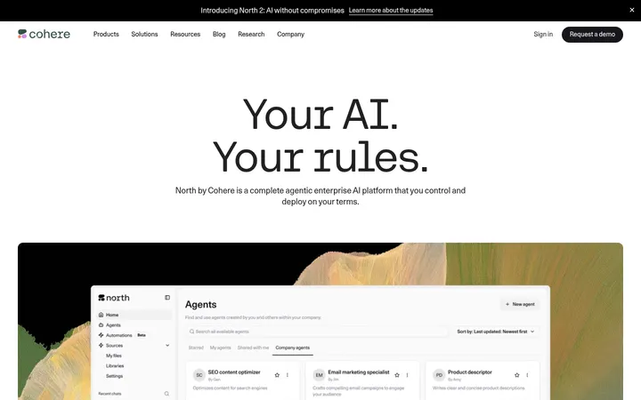
North star · Let clear editorial hierarchy and generous white space carry the story; use colour only to mark actions and section changes.
The visual strategy is built on a white canvas, generous breathing room, and alternating pale-gray and near-black bands rather than ornamental decoration. Apk Galeria carries the large, regular-weight headlines and compact body copy; Apkpraktikal appears in uppercase, widely tracked utility labels. Centered hero typography contrasts with later left-aligned feature and FAQ layouts, while a broad content frame and two-column modules keep the long page organized. Product UI captures and editorial artwork provide evidence of the offering; they sit within clean, mostly square-edged panels and are not a reason to expand the brand palette. Carbon text and muted gray copy maintain hierarchy without heavy rules. Lime is reserved for the primary action, pink highlights the newsletter action, and blue is most visible in the announcement strip and occasional links. The overall effect is measured and technical, softened by airy spacing and restrained colour.
Primary display, heading, body, navigation, and link typeface.
Aa 设计
Apkpraktikal
网络字体 · 字重 400 / 700 · 占比 9%
免费替代:Space Grotesk
Utility eyebrow and uppercase button-label typeface.
角色
示例
字号
字重
行高
字距
特大标题
Large hero or campaign statement.
Invisible Technologies
64px
400
1.1
-0.01em
一级标题
Main hero headline and primary page-level title.
Invisible Technologies
52px
400
1
0
二级标题
Major feature, editorial, and section headings.
Invisible Technologies
48px
400
1.2
-0.014em
三级标题
Feature titles and card or content-feed headings.
Invisible Technologies
36px
400
1.2
-0.018em
四级标题
Compact panel titles and supporting subheads.
The quick brown fox 敏捷的狐狸
24px
400
1.1
-0.03em
正文
Paragraphs, explanatory copy, and card descriptions.
The quick brown fox 敏捷的狐狸
16px
400
1.5
-0.011em
辅助文字
Small secondary notes and image or card details.
The quick brown fox 敏捷的狐狸
14px
400
1.4
0
导航
Header navigation links.
The quick brown fox 敏捷的狐狸
14px
400
1
0
链接
Inline links and compact text actions.
The quick brown fox 敏捷的狐狸
14px
400
1.5
0.023em
眉题
Uppercase section labels such as OUR PLATFORM.
The quick brown fox 敏捷的狐狸
12px
700
1.4
0.14em
间距与布局
基准单位 8px · 密度:宽松
120px版块间距
12px元素间距
24px卡片内边距
1206px内容最大宽度
4px
8px
10px
12px
16px
20px
24px
32px
40px
64px
72px
120px
Use a spacious, centered page frame capped at the measured 1206px maximum width. The hero is centered, while platform, solution, FAQ, and footer content shift to left-aligned or split layouts. The page alternates broad white and pale-gray bands, with dark blocks concentrated in FAQ and the closing footer/CTA region. Measured spacing uses an 8px base unit and a 120px section gap; keep the overall density open, letting product panels and editorial cards occupy room without crowding.
圆角与层次
按钮 · 9999px
lg · other
The page is predominantly flat: square-edged cards and panels rely on surface contrast, not prominent shadows. Pale-gray bands and thin gray hairlines organize content. The measured large shadow is subtle and appears as incidental depth, so avoid applying it broadly. Rounded full-pill buttons provide the main shape contrast.
组件
下面的预览按实测的按钮、输入框、徽标、卡片样式重建(字体用替代字体)。
Announcement strip
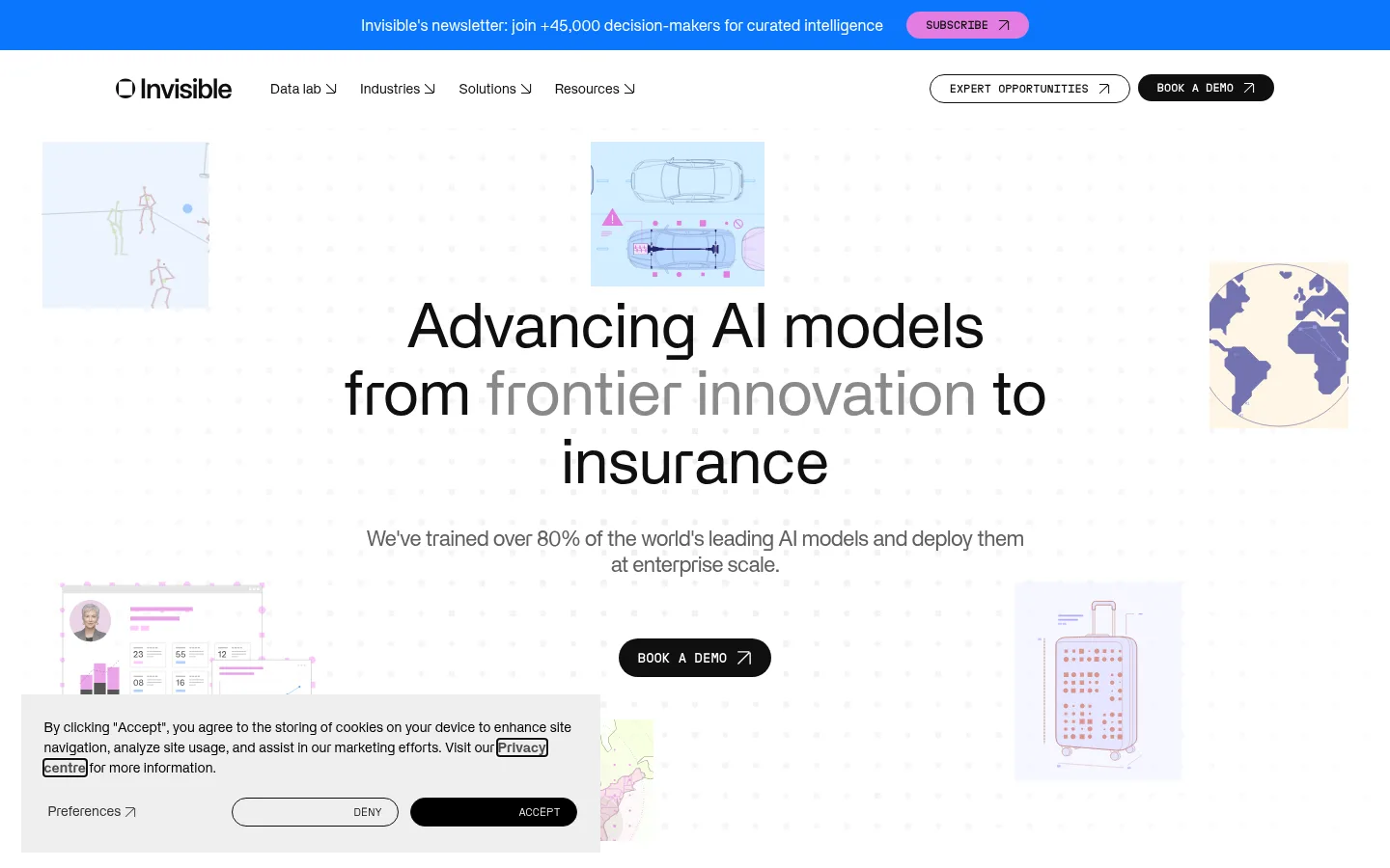
Bright blue newsletter bar across the top, with compact copy and a pink pill-shaped Subscribe action.
Header navigation
White navigation row with dark links, a restrained wordmark, and outlined or dark pill actions on the right.
Hero
Centered multi-line headline, muted supporting sentence, dark pill CTA, and small technical illustrations around the perimeter.
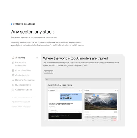
Platform showcase
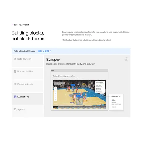
Introductory copy paired with a large product interface panel and a vertical list of platform areas.
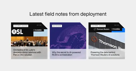
Editorial newsletter band
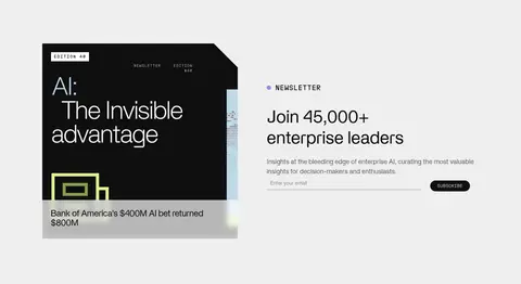
Pale-gray split section with publication cover artwork, signup heading, input, and compact Subscribe control.
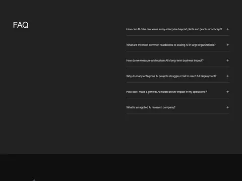
FAQ
Near-black section with a left-side heading and right-side question rows separated by understated hairlines.
Primary CTA
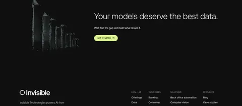
Dark closing region with a short data-focused statement and a lime full-pill Get Started button.
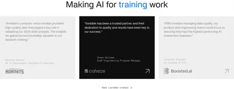
Imagery · The hero uses small, pale technical illustrations around a typographic center rather than a full-bleed photograph. Product sections feature interface screenshots and annotated workflow panels; editorial cards use cover-like artwork and customer imagery. Keep media cleanly framed, lightly integrated with the surrounding neutral canvas, and avoid treating incidental illustration colours as core brand colours.
Keep the main canvas white and section backgrounds restrained.
Use large, regular-weight sans headlines with clear line breaks.
Preserve generous vertical pauses between major content bands.
Use Carbon Ink for key headings and dark inverse panels.
Reserve Hyper Citrus for the most important CTA.
Treat product screenshots as evidence inside clean panels.
✕ 不该做
Don't turn the lime, pink, or blue accents into large background fields.
Don't add gradients or decorative shadows as a dominant visual motif.
Don't round cards that are measured as square-edged panels.
Don't crowd the hero with dense navigation or competing imagery.
Don't use illustration colours as the site's core palette.
Don't make every section centered; preserve the mix of centered and split layouts.
给 AI 的提示词
想快速出一个同风格的新页面,把这段话连同 DESIGN.md 一起发给 AI。
Build a new page in the Invisible Technologies visual style: editorial, spacious, and enterprise-focused. Use Gallery White (#ffffff) as the main canvas, Cloud Gray (#efefef) for selected section bands, Carbon Ink (#0f0f0f) for headings and dark areas, and Slate Copy (#606060) for supporting text. Keep Hyper Citrus (#dcf58f) for the primary CTA, Laser Pink (#e37de1) for a secondary newsletter action, and Signal Blue (#0c76fe) limited to a narrow announcement or small detail. Use a clean sans similar to Inter for headlines and body, with uppercase tracked utility labels. Center the hero; use left-aligned and split layouts below. Maintain generous measured spacing, square-edged content panels, pill buttons, and restrained hairlines. Use product UI and editorial artwork as supporting proof, not decoration.