North star · Let editorial serif headlines lead, while clean product imagery and restrained colour keep every section practical and readable.
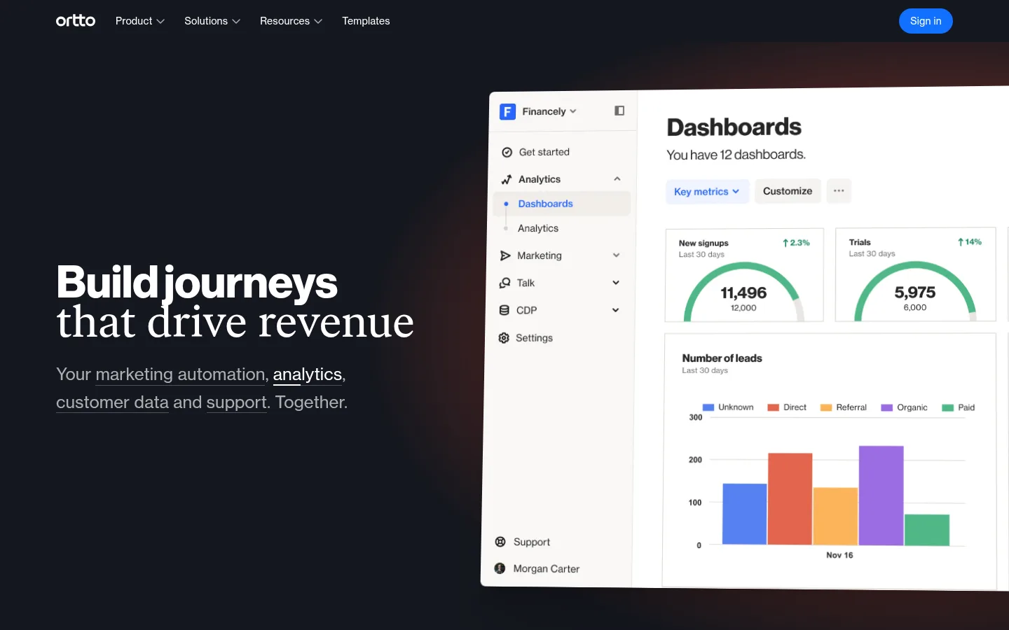
The homepage opens on a near-black canvas, with white navigation and a large editorial headline beside an oversized product dashboard. A restrained red radial glow warms the hero without becoming a dominant surface colour; vivid blue is reserved for small interface and navigation accents. The rest of the page returns to white, using generous breathing room to separate product stories, customer proof, security messaging and the footer. Typography does much of the brand work: Ivar Text gives display copy a literary, human tone, while Haas Grot provides a crisp, compact sans-serif for navigation, labels and supporting text. Product screenshots are the main imagery, framed as clean interface panels with subtle, layered shadows. Sections use asymmetrical media-and-copy compositions rather than dense card grids. Keep borders quiet, alignment deliberate and colour concentrated in the hero atmosphere and functional details.
配色
点色块复制色值。用途说明来自对页面的实测位置(背景、文字、描边、按钮)与截图判读。
品牌色
强调色
表层色
中性色
功能色
页面底色 · Gallery White表层 · Midnight Ink表层 2 · Warm Porcelain主文字 · Near Black次要文字 · Quiet Graphite弱文字 · Soft Charcoal强调 · Ember Glow强调 2 · Signal Blue
Primary sans-serif for body copy, navigation and links.
Aa 设计
Ivar Text Regular
网络字体 · 字重 400 · 占比 19%
免费替代:Cormorant Garamond
Display and large editorial headings.
Aa 设计
Haas Grot Text R Web 65 Medium
网络字体 · 字重 400 · 占比 10%
免费替代:Inter
Medium-emphasis sans-serif labels and interface text.
Aa 设计
Haas Grot Disp R Web 75 Bold
网络字体 · 字重 400 · 占比 4%
免费替代:Inter
Bold section headlines and compact display emphasis.
Aa 设计
Ivar Text Italic
网络字体 · 字重 400 · 占比 3%
免费替代:Cormorant Garamond
Editorial italic emphasis in testimonial or supporting copy.
Aa 设计
Haas Grot Text R Web 75 Bold
网络字体 · 字重 400 · 占比 3%
免费替代:Inter
Strong sans-serif emphasis within interface or supporting headings.
角色
示例
字号
字重
行高
字距
特大标题
Oversized editorial display copy, led by the hero headline.
Ortto
72px
400
1
0
一级标题
Primary hero heading and major page-level statement.
Ortto
64px
400
1
-0.004em
二级标题
Bold sans-serif section headings in product and proof sections.
Ortto
48px
400
1
-0.01em
三级标题
Secondary editorial headings within content blocks.
The quick brown fox 敏捷的狐狸
24px
400
1.33
0.003em
四级标题
Small subsection headings and supporting feature titles.
The quick brown fox 敏捷的狐狸
20px
400
1.4
0
正文
Paragraphs, product descriptions and customer-story details.
The quick brown fox 敏捷的狐狸
14px
400
1.43
0.011em
辅助文字
Eyebrows, attribution text and compact interface labels.
The quick brown fox 敏捷的狐狸
13px
400
1.38
0.015em
导航
Header navigation and compact menu labels.
The quick brown fox 敏捷的狐狸
14px
400
1.43
0.011em
链接
Inline actions and supporting navigation links.
The quick brown fox 敏捷的狐狸
16px
400
1.38
0.009em
间距与布局
基准单位 4px · 密度:适中
60px版块间距
10px元素间距
40px卡片内边距
1024px内容最大宽度
2px
4px
6px
8px
10px
12px
16px
28px
32px
40px
60px
64px
The hero is a full-width, dark composition with text on the left and an oversized dashboard image on the right. Below it, content sits in a narrower centered column, with product sections arranged as image-and-copy splits and generous blank space between stories. Measured content uses a 1024px maximum width, a comfortable density and a 60px section rhythm. Keep section headings left-aligned, let media occupy a broad column, and use smaller side columns for feature lists or proof. The footer shifts into a compact multi-column link layout.
圆角与层次
图片 · 16px
导航 · 4px
链接 · 9999px
xl · card
xl · other, card
sm · link
The page is mostly flat, with little emphasis on visible borders or decorative containers. Product screenshots and select cards use broad, soft, layered shadows to lift media from the white canvas. Keep surrounding sections open and avoid stacking cards or adding heavy outlines; the dark hero itself supplies the strongest depth and contrast.
组件
下面的预览按实测的按钮、输入框、徽标、卡片样式重建(字体用替代字体)。
Dark hero
Full-width Midnight Ink canvas with white editorial headline, muted supporting copy, subtle Ember Glow atmosphere and a large product dashboard.
Product story split
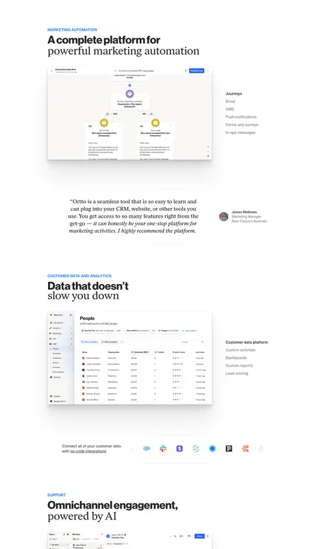
Left-aligned section heading above a broad product screenshot, paired with a compact feature list in an adjacent column.
Customer quote
Editorial testimonial copy with a small customer attribution and restrained portrait detail.
Proof cards
Light customer-result cards with prominent figures, brief quotes and compact attribution; keep the grid visually quiet.
Security media panel
Wide dark security image with concise proof points and small certification marks.
Multi-column footer
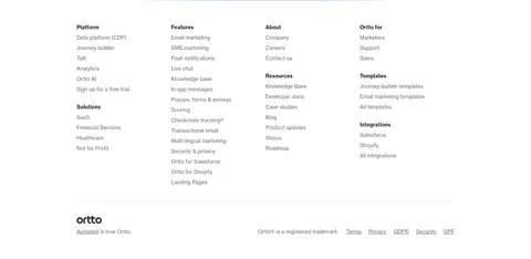
Compact groups of product, solution, feature and company links, followed by a restrained legal strip.
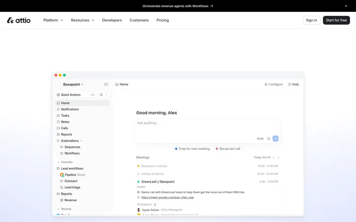
Imagery · Use product-interface screenshots as the primary visual material: dashboards, journey builders, contact data tables and support inboxes. Keep them crisp, bright and legible against the dark hero or white content canvas. The hero dashboard is oversized and partially cropped at the viewport edge; lower examples sit cleanly within the content grid. Customer proof includes restrained portrait/video imagery, while logos remain small supporting details.
Lead with a dark, full-width hero and clear product imagery.
Pair Ivar-style editorial headlines with clean Haas-style sans-serif copy.
Use white space to separate product stories and proof sections.
Keep blue accents small and functional.
Use soft shadows to lift screenshots from light backgrounds.
Align section headings and product media consistently.
✕ 不该做
Do not turn every section into a dark panel.
Do not use Ember Glow as a solid, repeated button colour.
Do not crowd product screenshots with decorative framing.
Do not replace editorial headlines with uniformly bold sans-serif type.
Do not introduce strong borders where the reference stays open and flat.
Do not use bright colours from interface charts as the overall brand palette.
给 AI 的提示词
想快速出一个同风格的新页面,把这段话连同 DESIGN.md 一起发给 AI。
Build a polished SaaS page in Ortto's visual language. Open with a full-width Midnight Ink (#14171f) hero, white editorial headline, muted supporting text and a large, crisp product screenshot; use Ember Glow (#bf432b) only as a subtle atmospheric background accent. On the content canvas, use Gallery White (#ffffff), generous section spacing and left-aligned editorial headings. Pair Ivar-like serif display type with an Inter-like sans-serif for navigation, labels and body copy. Use Warm Porcelain (#f9f8f7) sparingly for soft card surfaces, Near Black (#0d0d0d) for primary text and Signal Blue (#1070ff) for small functional accents. Compose product stories as image-and-copy splits, with broad screenshots, compact feature lists and restrained customer proof. Add gentle layered shadows to media, keep borders quiet, and finish with a clean multi-column footer.