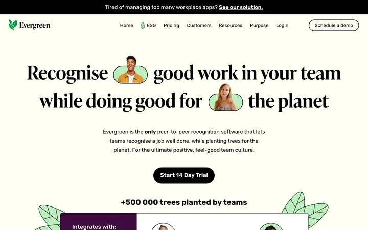
Ditto以编辑感衬线标题搭配浅绿底色和醒目的黄色行动按钮,呈现清晰亲和的品牌气质。长页面通过模块化内容展示CSR指导、平台界面、客户案例与色彩丰富的插画。
North star · Pair editorial serif storytelling and calm pale-green space with crisp indigo structure and selective, high-energy yellow.
The page is built around a calm, pale-green canvas, interrupted by a bright yellow announcement strip, hero panel, testimonial band, and selected interactive highlights. Deep indigo anchors text, outlines, and dark CTA buttons, while vivid yellow carries the main action and warmer accents appear in badges and product graphics. Large, regular-weight Hedvig Letters Serif headings give the content an editorial, human tone; compact Inter supports navigation, labels, body copy, and controls. Sections alternate subtle green-tinted surfaces rather than relying on strong separators. The layout uses broad, composed content areas, clear left alignment, and repeated card grids, with centered FAQ and closing CTA moments. Product UI and people photography sit alongside landscape-like, painterly illustrations. Rounded pills and generous card corners soften the dark hairlines; shadows remain restrained, so structure comes chiefly from color blocks, outlines, and spacing.
配色 点色块复制色值。用途说明来自对页面的实测位置(背景、文字、描边、按钮)与截图判读。
品牌色
Midnight Ink
#130e30
Primary text, headings, navigation, dark CTA fills, and many card outlines.
强调色
Signal Lemon
#ffe228
Announcement banner, hero panel, key CTA buttons, highlighted tabs, and testimonial backgrounds.
Orchid Tint
#e7b6ea
Rare badge detail; not a defining page surface.
Orchid Ink
#b54eb7
Small badge or text detail; not a core interface color.
Electric Orchid
#e261e5
Bright illustration and product-card accent, not a standard page background.
Fresh Chartreuse
#59e25d
Product mockup tiles and decorative illustration accents.
Clear Sky
#3a93ff
Blue accent inside product artwork and decorative media, not a core surface.
表层色
Sage Mist
#eff2e5
Main page canvas and dominant section background, including hero surroundings and footer.
Olive Haze
#e9ebd9
Alternating comparison and industry section bands, plus media surrounds.
Porcelain Sage
#f7f9f0
Light, low-contrast background for the how-it-works section.
中性色
Gallery White
#ffffff
Clean card faces, logo bands, and contrast areas around product media.
功能色
Muted Aubergine
#4a4660
Secondary copy and subdued heading or footer text.
Dusty Violet
#6b6880
Muted labels and small secondary text, including policy badges.
Sage Hairline
#d9ddbc
Subtle section, card, and footer separators.
Moss Gray
#8a8b70
Occasional muted text detail.
文字 背景 对比度 WCAG #130e30 Midnight Ink#ffffff Gallery White18.53:1 AAA #130e30 Midnight Ink#eff2e5 Sage Mist16.33:1 AAA #130e30 Midnight Ink#e9ebd9 Olive Haze15.31:1 AAA #130e30 Midnight Ink#f7f9f0 Porcelain Sage17.44:1 AAA #4a4660 Muted Aubergine#ffffff Gallery White8.99:1 AAA #4a4660 Muted Aubergine#eff2e5 Sage Mist7.92:1 AAA
字体 字号阶梯:Perfect Fourth(比例约 1.316,正文 16px)。示例用免费替代字体渲染,数值为实测。
Aa 设计
Inter 网络字体 · 字重 400 / 600 / 500 / 700 / 800 · 占比 83%
免费替代:Inter
Navigation, body copy, captions, buttons, links, and eyebrow labels.
Aa 设计
Hedvig Letters Serif 网络字体 · 字重 400 · 占比 17%
免费替代:Lora
Editorial page headings and prominent testimonial or story statements.
角色 示例 字号 字重 行高 字距 一级标题 Large serif headline in the hero.
Ditto
48px 400 1.14 -0.01em 二级标题 Serif titles for major content sections.
Ditto
46px 400 1.14 -0.01em 三级标题 Serif subheads for cards and supporting sections.
Ditto
34px 400 1.26 -0.01em 四级标题 Smaller serif headings within nested content.
The quick brown fox 敏捷的狐狸
25px 400 1.28 -0.01em 正文 Inter paragraphs for product and explanatory copy.
The quick brown fox 敏捷的狐狸
16px 400 1.45 -0.02em 辅助文字 Small supporting descriptions beneath cards and media.
The quick brown fox 敏捷的狐狸
15px 400 1.5 -0.01em 按钮 Inter text on pill-shaped calls to action.
The quick brown fox 敏捷的狐狸
16px 400 1.5 -0.02em 导航 Inter labels across the top navigation.
The quick brown fox 敏捷的狐狸
16px 400 1.25 -0.02em 链接 Inline and card links, generally indigo.
The quick brown fox 敏捷的狐狸
16px 400 1.5 -0.02em 眉题 Uppercase, tracked section labels above headings.
The quick brown fox 敏捷的狐狸
14px 600 1.5 0.1em
间距与布局 基准单位 2px · 密度:适中
80px 版块间距
8px 元素间距
— 卡片内边距
720px 内容最大宽度
2px
4px
5px
6px
8px
9px
10px
11px
12px
14px
15px
16px
17px
18px
20px
22px
A long, modular page alternates broad full-width color bands with contained content grids. The measured content max width is 720px, with comfortable density and a measured 80px section gap; the screenshot shows generous horizontal breathing room at desktop. Headings and most sections align left, while the FAQ and final CTA center their content. Cards form repeated three- and four-column grids, with occasional split layouts for stories and industry content. Keep sections visually distinct through background changes, not heavy dividers.
圆角与层次 sm · other, card, text
md · card
md · card, other
sm · other
The interface is mostly flat: colored section bands, thin indigo card outlines, and restrained hairlines define structure. Use rounded card corners and occasional soft, low-opacity shadows for separation around media or UI previews. Avoid pronounced depth, stacked floating panels, or dramatic gradients.
组件 下面的预览按实测的按钮、输入框、徽标、卡片样式重建(字体用替代字体)。
Announcement strip A full-width Signal Lemon banner above the navigation, with a small dark NEW pill and compact linked announcement copy.
Pill CTA Fully rounded Inter button; use Midnight Ink with light text for the primary dark variant or Signal Lemon with indigo text for emphasis.
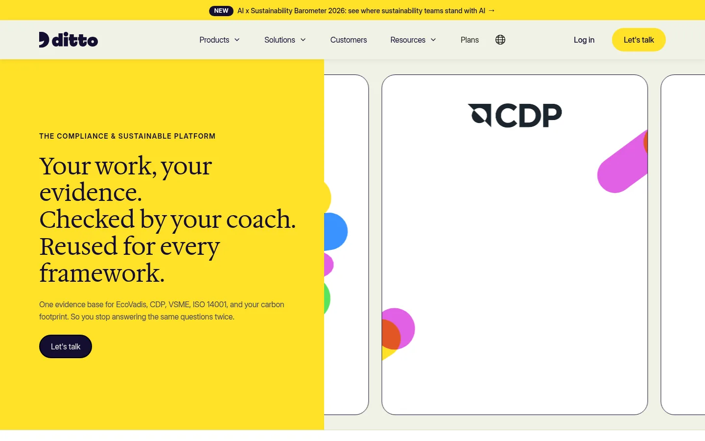
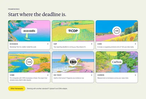
Framework card White, rounded card with thin Midnight Ink outline, illustrated media, framework mark, and compact explanatory copy.
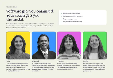
Coach portrait card Portrait-led profile with a vivid colored image backdrop, grayscale subject treatment, name, expertise, and brief biography.
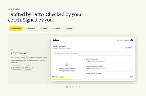
Process showcase Numbered horizontal step tabs above a pale panel pairing concise explanation with a large platform UI preview.
Industry selector Compact vertical category list beside a split customer-story card, with yellow highlighting for the selected industry.
FAQ row Centered section with stacked question rows, subtle separators, and a small disclosure control aligned to the right.
Imagery · Blend grayscale coach portraits, customer and industry photographs, and clear product-interface mockups. Framework cards and story media use painterly, colorful landscape illustrations; UI artwork also contains vivid accent colors. Frame content in rounded cards with thin dark outlines, keeping imagery contained and legible. The hero pairs a strong yellow text panel with oversized white framework cards; decorative circles and colors belong to media artwork rather than the core palette.
页面版块 共 14 个版块,按页面从上到下排列,每个都标了类型、布局和交互套路。
该做与不该做 ✓ 该做 Use Midnight Ink for readable text and structural outlines. Reserve Signal Lemon for prominent actions and selected highlights. Alternate pale sage surfaces to organize the long page. Use serif display headings and Inter for interface and body text. Keep cards rounded, clearly bounded, and content-led. Use colorful artwork as media, not as a replacement for the restrained base palette. ✕ 不该做 Do not use a dark page canvas. Do not make every section or card yellow. Do not replace the editorial serif headings with heavy geometric display type. Do not add strong gradients or dramatic drop shadows. Do not use vivid illustration colors as the default UI surface palette. Do not crowd the page with dense, uninterrupted text. 给 AI 的提示词 想快速出一个同风格的新页面,把这段话连同 DESIGN.md 一起发给 AI。
复制 Build a new Ditto-style CSR SaaS page with a calm Sage Mist (#eff2e5) canvas and alternating pale sections. Anchor text, navigation, and outlines in Midnight Ink (#130e30); use Signal Lemon (#ffe228) selectively for key CTAs, highlights, and occasional full-width bands. Set large editorial headings in Hedvig Letters Serif or a close serif substitute, with Inter for body copy, labels, and controls. Favor broad, clearly separated modules, rounded cards, thin outlines, and restrained shadows. Combine coach portraits, customer stories, framework illustrations, and realistic product UI previews; keep vivid orchid, green, and blue mostly inside artwork. Use pill-shaped actions, concise eyebrow labels, and clear grids. Preserve open whitespace and a warm, practical tone rather than making the interface feel corporate or heavily decorated.
DESIGN.md Tailwind v4 CSS 变量 Design Tokens
---
title: "Ditto — CSR Platform Homepage design system"
variant: extended
source: https://www.trustditto.com/en
captured_at: 2026-10-12
theme: light
industry: saas
generator: Design DNA (https://four.wiralomi.com/style/trustditto-com)
ai_generated: true
ai_label: "本文件由 AI 辅助生成:数值取自公开网页的实测样式,命名、用途说明与建议为模型解读。商标归原所有者。 / AI-assisted content"
---
# Ditto — CSR Platform Homepage · Design System
> Warm editorial clarity with a bright, practical edge
**Theme:** light · **Industry:** saas · **Source:** https://www.trustditto.com/en · **Captured:** 2026-10-12 (1440×900 desktop)
_AI-assisted content: values are measured from the public page at capture time; names, roles and guidance are model-written interpretations. Trademarks belong to their owners._
Ditto pairs an editorial serif voice with soft green-tinted surfaces and vivid yellow calls to action. The long, modular homepage balances practical CSR guidance, platform previews, customer proof, and colorful illustration.
## North star
Pair editorial serif storytelling and calm pale-green space with crisp indigo structure and selective, high-energy yellow.
## Overview
The page is built around a calm, pale-green canvas, interrupted by a bright yellow announcement strip, hero panel, testimonial band, and selected interactive highlights. Deep indigo anchors text, outlines, and dark CTA buttons, while vivid yellow carries the main action and warmer accents appear in badges and product graphics. Large, regular-weight Hedvig Letters Serif headings give the content an editorial, human tone; compact Inter supports navigation, labels, body copy, and controls. Sections alternate subtle green-tinted surfaces rather than relying on strong separators. The layout uses broad, composed content areas, clear left alignment, and repeated card grids, with centered FAQ and closing CTA moments. Product UI and people photography sit alongside landscape-like, painterly illustrations. Rounded pills and generous card corners soften the dark hairlines; shadows remain restrained, so structure comes chiefly from color blocks, outlines, and spacing.
## Colors
| Name | Hex | Token | Group | Role |
|---|---|---|---|---|
| Midnight Ink | ` | `--color-midnight-ink` | brand | Primary text, headings, navigation, dark CTA fills, and many card outlines. |
| Signal Lemon | ` | `--color-signal-lemon` | accent | Announcement banner, hero panel, key CTA buttons, highlighted tabs, and testimonial backgrounds. |
| Gallery White | ` | `--color-gallery-white` | neutral | Clean card faces, logo bands, and contrast areas around product media. |
| Sage Mist | ` | `--color-sage-mist` | surface | Main page canvas and dominant section background, including hero surroundings and footer. |
| Muted Aubergine | ` | `--color-muted-aubergine` | semantic | Secondary copy and subdued heading or footer text. |
| Orchid Tint | ` | `--color-orchid-tint` | accent | Rare badge detail; not a defining page surface. |
| Dusty Violet | ` | `--color-dusty-violet` | semantic | Muted labels and small secondary text, including policy badges. |
| Olive Haze | ` | `--color-olive-haze` | surface | Alternating comparison and industry section bands, plus media surrounds. |
| Porcelain Sage | ` | `--color-porcelain-sage` | surface | Light, low-contrast background for the how-it-works section. |
| Sage Hairline | ` | `--color-sage-hairline` | semantic | Subtle section, card, and footer separators. |
| Orchid Ink | ` | `--color-orchid-ink` | accent | Small badge or text detail; not a core interface color. |
| Electric Orchid | ` | `--color-electric-orchid` | accent | Bright illustration and product-card accent, not a standard page background. |
| Fresh Chartreuse | ` | `--color-fresh-chartreuse` | accent | Product mockup tiles and decorative illustration accents. |
| Moss Gray | ` | `--color-moss-gray` | semantic | Occasional muted text detail. |
| Clear Sky | ` | `--color-clear-sky` | accent | Blue accent inside product artwork and decorative media, not a core surface. |
### Semantic aliases
`--color-canvas` → ` (Gallery White) · `--color-surface` → ` (Sage Mist) · `--color-surface-2` → ` (Olive Haze) · `--color-surface-3` → ` (Porcelain Sage) · `--color-text` → ` (Midnight Ink) · `--color-text-muted` → ` (Muted Aubergine) · `--color-text-subtle` → ` (Dusty Violet) · `--color-border` → ` (Sage Hairline) · `--color-accent` → ` (Signal Lemon) · `--color-accent-2` → ` (Electric Orchid) · `--color-accent-3` → ` (Fresh Chartreuse)
### Contrast (WCAG 2.x)
| Text | Background | Ratio | Level |
|---|---|---|---|
| ` | ` | 18.53:1 | AAA |
| ` | ` | 16.33:1 | AAA |
| ` | ` | 15.31:1 | AAA |
| ` | ` | 17.44:1 | AAA |
| ` | ` | 8.99:1 | AAA |
| ` | ` | 7.92:1 | AAA |
| ` | ` | 7.43:1 | AAA |
| ` | ` | 8.46:1 | AAA |
| ` | ` | 5.36:1 | AA |
| ` | ` | 4.72:1 | AA |
## Typography
| Family | Token | Source | Weights | Role | Free substitute |
|---|---|---|---|---|---|
| Inter | `--font-body` | webfont | 400, 600, 500, 700, 800 | Navigation, body copy, captions, buttons, links, and eyebrow labels. | Inter |
| Hedvig Letters Serif | `--font-display` | webfont | 400 | Editorial page headings and prominent testimonial or story statements. | Lora |
- **Inter:** Regular text dominates; use semibold uppercase eyebrows and tighter tracking for compact interface copy.
- **Hedvig Letters Serif:** Regular-weight serif, sentence case, with subtly tight tracking and generous line breaks.
### Type scale — Perfect Fourth (ratio ≈ 1.316, base 16px)
| Role | Size | Weight | Line height | Letter spacing | Case | Family | Used for |
|---|---|---|---|---|---|---|---|
| h1 | 48px | 400 | 1.14 | -0.01em | — | Hedvig Letters Serif | Large serif headline in the hero. |
| h2 | 46px | 400 | 1.14 | -0.01em | — | Hedvig Letters Serif | Serif titles for major content sections. |
| h3 | 34px | 400 | 1.26 | -0.01em | — | Hedvig Letters Serif | Serif subheads for cards and supporting sections. |
| h4 | 25px | 400 | 1.28 | -0.01em | — | Hedvig Letters Serif | Smaller serif headings within nested content. |
| body | 16px | 400 | 1.45 | -0.02em | — | Inter | Inter paragraphs for product and explanatory copy. |
| caption | 15px | 400 | 1.5 | -0.01em | — | Inter | Small supporting descriptions beneath cards and media. |
| button | 16px | 400 | 1.5 | -0.02em | — | Inter | Inter text on pill-shaped calls to action. |
| nav | 16px | 400 | 1.25 | -0.02em | — | Inter | Inter labels across the top navigation. |
| link | 16px | 400 | 1.5 | -0.02em | — | Inter | Inline and card links, generally indigo. |
| eyebrow | 14px | 600 | 1.5 | 0.1em | uppercase | Inter | Uppercase, tracked section labels above headings. |
## Spacing & layout
- Base unit **2px**, density **comfortable**.
- Scale (most used values): 2, 4, 5, 6, 8, 9, 10, 11, 12, 14, 15, 16, 17, 18, 20, 22 px.
- Section rhythm 80px · element gap 8px · card padding — · max content width 720px.
A long, modular page alternates broad full-width color bands with contained content grids. The measured content max width is 720px, with comfortable density and a measured 80px section gap; the screenshot shows generous horizontal breathing room at desktop. Headings and most sections align left, while the FAQ and final CTA center their content. Cards form repeated three- and four-column grids, with occasional split layouts for stories and industry content. Keep sections visually distinct through background changes, not heavy dividers.
## Shape & elevation
- Radius: button `9999px` · card `28px` · media `50%` · badge `9999px` · nav `9999px` · link `16px` · xs `8px` · sm `10px` · md `12px` · lg `14px` · xl `16px` · 2xl `18px` · pill `9999px`
- Shadow `sm` (other, card, text): `rgba(27, 36, 44, 0.1) 0px 2px 6px 0px`
- Shadow `md` (card): `rgba(27, 36, 44, 0.1) 0px 4px 14px 0px`
- Shadow `md-2` (card, other): `rgba(27, 36, 44, 0.14) 0px 4px 14px 0px`
- Shadow `sm-2` (other): `rgba(27, 36, 44, 0.08) 0px 1px 3px 0px`
- Shadow `sm-3` (other): `rgba(64, 58, 45, 0.05) 0px 2px 6px 0px`
- Shadow `hairline` (media): `rgb(255, 255, 255) 0px 0px 0px 2px`
- Motion: standard transition `0.18s ease` on interactive elements.
The interface is mostly flat: colored section bands, thin indigo card outlines, and restrained hairlines define structure. Use rounded card corners and occasional soft, low-opacity shadows for separation around media or UI previews. Avoid pronounced depth, stacked floating panels, or dramatic gradients.
## Imagery
Blend grayscale coach portraits, customer and industry photographs, and clear product-interface mockups. Framework cards and story media use painterly, colorful landscape illustrations; UI artwork also contains vivid accent colors. Frame content in rounded cards with thin dark outlines, keeping imagery contained and legible. The hero pairs a strong yellow text panel with oversized white framework cards; decorative circles and colors belong to media artwork rather than the core palette.
## Components
### Announcement strip
A full-width Signal Lemon banner above the navigation, with a small dark NEW pill and compact linked announcement copy.
### Pill CTA
Fully rounded Inter button; use Midnight Ink with light text for the primary dark variant or Signal Lemon with indigo text for emphasis.
### Framework card
White, rounded card with thin Midnight Ink outline, illustrated media, framework mark, and compact explanatory copy.
### Coach portrait card
Portrait-led profile with a vivid colored image backdrop, grayscale subject treatment, name, expertise, and brief biography.
### Process showcase
Numbered horizontal step tabs above a pale panel pairing concise explanation with a large platform UI preview.
### Industry selector
Compact vertical category list beside a split customer-story card, with yellow highlighting for the selected industry.
### FAQ row
Centered section with stacked question rows, subtle separators, and a small disclosure control aligned to the right.
### Measured component styles
- **Primary button** (“Let's talk”): background ## Do
- Use Midnight Ink for readable text and structural outlines.
- Reserve Signal Lemon for prominent actions and selected highlights.
- Alternate pale sage surfaces to organize the long page.
- Use serif display headings and Inter for interface and body text.
- Keep cards rounded, clearly bounded, and content-led.
- Use colorful artwork as media, not as a replacement for the restrained base palette.
## Don't
- Do not use a dark page canvas.
- Do not make every section or card yellow.
- Do not replace the editorial serif headings with heavy geometric display type.
- Do not add strong gradients or dramatic drop shadows.
- Do not use vivid illustration colors as the default UI surface palette.
- Do not crowd the page with dense, uninterrupted text.
## Agent prompt
Build a new Ditto-style CSR SaaS page with a calm Sage Mist (## Page sections (top to bottom)
| # | Type | Layout | UX patterns | UI patterns |
|---|---|---|---|---|
| 1 | hero | Split hero: yellow text panel beside large framework-media cards. | primary talk CTA, framework value proposition | yellow hero panel, serif headline, outlined media cards |
| 2 | logo-cloud | Compact white logo and rating band beneath the hero. | trust proof, customer stories link | customer logos, rating figures, white band |
| 3 | team | Section heading and benefits above a row of four portrait profiles. | coach reassurance, expert profile discovery | sage surface, benefit list, portrait cards |
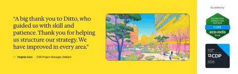
| 4 | testimonials | Yellow testimonial band with quote, illustration, and accreditation marks. | customer endorsement, credibility badges | large quote, bright band, media panel |
| 5 | how-it-works | Heading and step tabs above a split explainer and software preview. | five-step navigation, previous and next controls | pale surface, numbered tabs, dashboard mockup |
| 6 | integrations | Three-column grid of illustrated framework cards with a follow-up link. | framework exploration, other frameworks link | illustrated cards, white card faces, compact captions |
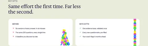
| 7 | comparison | Single-column section with two comparison panels side by side. | before-and-after scan, benefit comparison | olive-tinted band, white panels, colored token artwork |
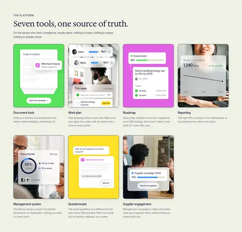
| 8 | feature-grid | Introductory heading followed by a multi-row grid of seven feature cards. | feature scanning, product capability exploration | product screenshots, rounded cards, short captions |
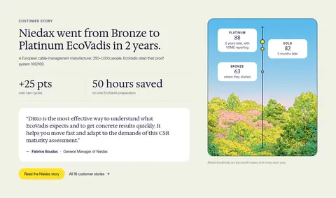
| 9 | feature-split | Story and outcome metrics at left, illustrated progress card at right. | case study link, outcome proof | large serif title, metrics, quote card, illustration |
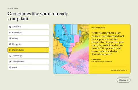
| 10 | category-nav | Industry selector beside a large selected-sector testimonial card. | industry switching, sector story link | vertical category list, yellow selected row, split image and quote |
| 11 | faq | Centered single-column FAQ with stacked disclosure rows. | expandable questions, quick answer discovery | centered serif heading, thin separators, right-aligned chevrons |
| 12 | cta | Centered closing message, primary button, and secondary story link. | contact conversion, secondary customer stories | large serif heading, pill CTA, centered alignment |
| 13 | gallery | Full-width, shallow horizontal strip of overlapping colorful shapes. | decorative transition | repeating circles and pills, bright media colors |
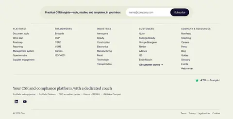
| 14 | footer | Newsletter form above multi-column link groups, trust note, and legal footer. | email signup, site navigation, legal links | sage canvas, thin separators, compact link columns |
## Source CSS custom properties (selected)
```css
--font-family--paragraph: Inter, Arial, sans-serif;
--font-family--headings: "Hedvig Letters Serif", "Times New Roman", sans-serif;
--_colors-•-semantic---surface-primary: