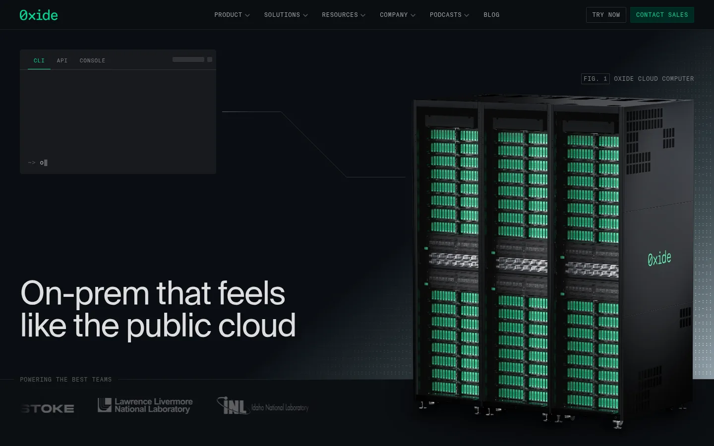
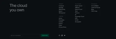
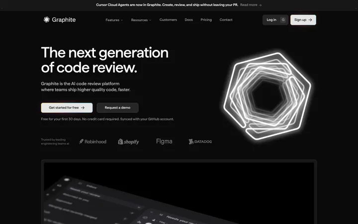
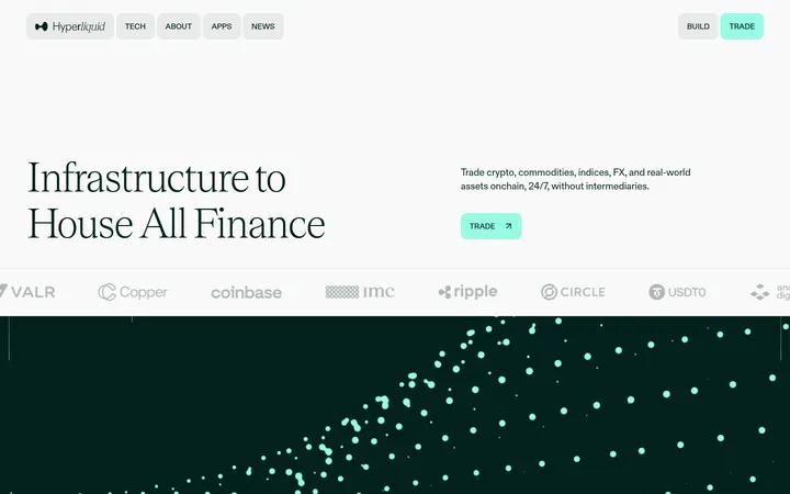
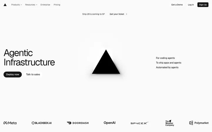
Oxide 首页以近黑色画布、克制的绿色界面强调色、大幅简洁标题和基础设施产品画面,呈现专业而精密的工程气质。长页面穿插产品演示、紧凑的技术功能网格、对比图示,并在适当位置设置联系与订阅入口。
North star · Treat every green detail as a deliberate signal on a continuous dark technical canvas, and let real product evidence carry the story.
Build the page around a persistent near-black canvas (#0b0e12), letting green accents identify interactive controls, active states, and select details rather than tinting whole sections. Use SuisseIntl for spacious, regular-weight headlines and readable explanatory copy; reserve GT America Mono for compact uppercase navigation, eyebrows, figure labels, and buttons. Keep headings bright and supporting text in measured gray levels, with strong contrast between primary statements and technical captions. The long homepage uses a centered, constrained content area, alternating two- and three-column compositions, and occasional full-width product imagery. Hardware renders and console screenshots carry the visual storytelling: frame them like evidence in a technical presentation, not decorative lifestyle photography. Sections remain visually connected by the same dark ground; fine hairlines and subtle surface shifts mark boundaries. Favor compact informational modules and generous breathing room around major statements.
配色 点色块复制色值。用途说明来自对页面的实测位置(背景、文字、描边、按钮)与截图判读。
品牌色
Night Infrastructure
#0b0e12
The dominant page canvas and continuous background behind nearly every section.
强调色
Signal Mint
#00d892
Primary CTA text, active interface details, badges, and occasional brand marks.
Link Green
#00b77d
Sparse inline links and small interactive text accents.
Deep Signal
#006d4a
Secondary green emphasis in technical copy and interface details.
表层色
Panel Graphite
#181a1d
Raised product cards and dark console-like content panels.
Rack Steel
#303235
Secondary card and input surfaces, plus occasional component outlines.
中性色
Console Gray
#818284
Muted labels, figure markers, secondary headings, and subdued footer text.
Hairline Charcoal
#1f2124
Fine dividers and restrained outlines around cards, links, and controls.
Soft Alloy
#a3a4a5
Secondary navigation and supporting copy where more contrast than muted gray is needed.
Cloud Silver
#dedede
Primary headline and body text on the dark canvas.
Deep Slate
#434547
Low-emphasis text appearing in subdued product and technical content.
Muted Circuit
#5d5e61
Low-priority footer, button, and product detail text.
Hardware Mist
#b7babd
Gray text within cards and link-like feature modules.
功能色
Forest Badge
#005441
Dark green badge fill behind bright green compact technical labels.
Violet Trace
#c58aff
Rare secondary highlight within product UI imagery; not a core interface color.
Trace Plum
#563160
Isolated badge detail in product-related imagery, not a page-level color.
Blueprint Haze
#92a0a9
Subtle cool tone in a measured section gradient, rather than a broad brand surface.
文字 背景 对比度 WCAG #dedede Cloud Silver#0b0e12 Night Infrastructure14.38:1 AAA #dedede Cloud Silver#181a1d Panel Graphite12.96:1 AAA #dedede Cloud Silver#303235 Rack Steel9.56:1 AAA #818284 Console Gray#0b0e12 Night Infrastructure5.03:1 AA #818284 Console Gray#181a1d Panel Graphite4.53:1 AA #818284 Console Gray#303235 Rack Steel3.34:1 AA-large
字体 字号阶梯:Perfect Fourth(比例约 1.324,正文 16px)。示例用免费替代字体渲染,数值为实测。
Aa 设计
SuisseIntl 网络字体 · 字重 400 · 占比 73%
免费替代:Inter
Display and editorial sans for headings, body copy, and feature descriptions.
Aa 设计
GT America Mono 网络字体 · 字重 400 · 占比 27%
免费替代:IBM Plex Mono
Technical monospace for uppercase navigation, buttons, eyebrows, links, and figure labels.
角色 示例 字号 字重 行高 字距 特大标题 Large homepage statements and hero-scale brand messaging.
Oxide Computer Company
65px 400 1 -0.025em 一级标题 Primary page and major section headlines.
Oxide Computer Company
50px 400 1.1 -0.02em 二级标题 Feature, product, and comparison section headings.
Oxide Computer Company
36px 400 1.17 -0.013em 三级标题 Card titles and secondary feature headings.
The quick brown fox 敏捷的狐狸
25px 400 1.28 0 四级标题 Compact subheadings within product and information panels.
The quick brown fox 敏捷的狐狸
20px 400 1.3 0.009em 正文 Explanatory copy, feature descriptions, and card content.
The quick brown fox 敏捷的狐狸
16px 400 1.38 0.021em 辅助文字 Small supporting labels and image captions.
The quick brown fox 敏捷的狐狸
12px 400 1 0.028em 按钮 Uppercase CTA labels such as Contact Sales and Subscribe.
The quick brown fox 敏捷的狐狸
12px 400 1.33 0.053em 导航 Compact uppercase primary navigation labels.
The quick brown fox 敏捷的狐狸
12px 400 1.33 0.053em 链接 Uppercase technical links and compact navigational actions.
The quick brown fox 敏捷的狐狸
12px 400 1.33 0.053em 眉题 Figure numbers, section labels, and small technical identifiers.
The quick brown fox 敏捷的狐狸
12px 400 1.33 0.053em 代码 Terminal prompts and code-like interface samples.
const style = 1;
12px 400 1 0
间距与布局 基准单位 4px · 密度:紧凑
40px 版块间距
4px 元素间距
— 卡片内边距
1200px 内容最大宽度
1px
2px
4px
6px
8px
10px
12px
16px
20px
24px
32px
40px
A long, vertically flowing homepage stays on a continuous dark canvas and uses a constrained content width measured at 1200px. The hero combines a large left-aligned statement with prominent hardware imagery; later sections alternate two-column explanations, product demonstrations, and multi-column feature or audience grids. Major headings anchor each block, while compact technical modules sit below. Keep alignment predominantly flush left, preserve open space around headline moments, and use fine rules to organize dense information without turning each section into a separate color band.
圆角与层次 inset · other
inset · other
lg · other
The design is mostly flat: dark surfaces sit close to the canvas, with fine charcoal borders doing more work than shadows. Use subtle inset outlines or restrained separation for console panels and cards. Reserve layering for overlapping product UI captures or hardware visuals; avoid prominent floating shadows, glossy effects, and rounded consumer-style cards.
组件 下面的预览按实测的按钮、输入框、徽标、卡片样式重建(字体用替代字体)。
Primary navigation A compact top bar on the dark canvas, with uppercase monospace links and separate Try Now and green Contact Sales actions.
Primary CTA Use a dark green fill (#002923) with Signal Mint (#00d892) uppercase GT America Mono text and the measured 2px corner radius.
Figure label Small uppercase monospace figure identifier, muted gray text, and a fine outline using the dark secondary surface.
Console card Graphite product panel showing command-line, API, or console content with subdued neutral text and minimal rounding.
Feature grid Compact multi-column technical features with short titles, product UI snippets, and thin hairline separators.
Newsletter form A restrained footer email input with a fine border and adjacent dark-green Subscribe CTA.
Imagery · Use realistic server-rack renders, product interface captures, console windows, and technical diagrams as the primary visual evidence. Hardware imagery is dark and high contrast, with green-lit components echoing the interface accent. Frame screenshots and diagrams in restrained panels and align them to the content grid. Avoid lifestyle photography or decorative illustrations; preserve a precise, engineering-oriented presentation.
页面版块 共 15 个版块,按页面从上到下排列,每个都标了类型、布局和交互套路。
该做与不该做 ✓ 该做 Keep the near-black canvas continuous across section boundaries. Use green for actions, active states, and selective product details. Pair large regular-weight sans headlines with concise explanatory copy. Set navigation, eyebrows, and CTA labels in uppercase monospace. Use fine dark hairlines to structure cards and technical comparisons. Let hardware renders and real-looking console UI supply visual interest. ✕ 不该做 Do not introduce bright, full-width color bands. Do not use green as a large background wash. Do not add decorative gradients where the page uses a flat dark field. Do not turn technical content into generic rounded marketing cards. Do not use oversized shadows or glossy elevation. Do not use lifestyle photography to replace product evidence. 给 AI 的提示词 想快速出一个同风格的新页面,把这段话连同 DESIGN.md 一起发给 AI。
复制 Create a new infrastructure-company page in Oxide’s restrained technical style. Use Night Infrastructure (#0b0e12) as the continuous canvas, Cloud Silver (#dedede) for primary statements, and measured grays for secondary copy. Reserve Signal Mint (#00d892), Link Green (#00b77d), and Deep Signal (#006d4a) for purposeful actions, active states, and small system details. Set editorial headings and body in SuisseIntl or Inter; use GT America Mono or IBM Plex Mono for compact uppercase navigation, labels, and buttons. Build a constrained grid with left-aligned section headings, alternating product demonstrations and feature columns, and generous space around major statements. Show hardware renders, console interfaces, and technical diagrams as evidence. Prefer flat surfaces, fine hairlines, and subtle panel separation over shadows or decorative effects.
DESIGN.md Tailwind v4 CSS 变量 Design Tokens
---
title: "Oxide Computer Company design system"
variant: extended
source: https://oxide.computer/
captured_at: 2026-10-12
theme: dark
industry: other
generator: Design DNA (https://four.wiralomi.com/style/oxide-computer)
ai_generated: true
ai_label: "本文件由 AI 辅助生成:数值取自公开网页的实测样式,命名、用途说明与建议为模型解读。商标归原所有者。 / AI-assisted content"
---
# Oxide Computer Company · Design System
> Cloud infrastructure, rendered as precise dark-field engineering.
**Theme:** dark · **Industry:** other · **Source:** https://oxide.computer/ · **Captured:** 2026-10-12 (1440×900 desktop)
_AI-assisted content: values are measured from the public page at capture time; names, roles and guidance are model-written interpretations. Trademarks belong to their owners._
Oxide’s homepage pairs an almost-black canvas and restrained green interface accents with large, calm headlines and detailed infrastructure imagery. The long page alternates product demonstrations, compact technical feature grids, comparison diagrams, and clear contact or newsletter actions.
## North star
Treat every green detail as a deliberate signal on a continuous dark technical canvas, and let real product evidence carry the story.
## Overview
Build the page around a persistent near-black canvas (## Colors
| Name | Hex | Token | Group | Role |
|---|---|---|---|---|
| Night Infrastructure | ` | `--color-night-infrastructure` | brand | The dominant page canvas and continuous background behind nearly every section. |
| Signal Mint | ` | `--color-signal-mint` | accent | Primary CTA text, active interface details, badges, and occasional brand marks. |
| Console Gray | ` | `--color-console-gray` | neutral | Muted labels, figure markers, secondary headings, and subdued footer text. |
| Panel Graphite | ` | `--color-panel-graphite` | surface | Raised product cards and dark console-like content panels. |
| Hairline Charcoal | ` | `--color-hairline-charcoal` | neutral | Fine dividers and restrained outlines around cards, links, and controls. |
| Soft Alloy | ` | `--color-soft-alloy` | neutral | Secondary navigation and supporting copy where more contrast than muted gray is needed. |
| Cloud Silver | ` | `--color-cloud-silver` | neutral | Primary headline and body text on the dark canvas. |
| Deep Slate | ` | `--color-deep-slate` | neutral | Low-emphasis text appearing in subdued product and technical content. |
| Rack Steel | ` | `--color-rack-steel` | surface | Secondary card and input surfaces, plus occasional component outlines. |
| Forest Badge | ` | `--color-forest-badge` | semantic | Dark green badge fill behind bright green compact technical labels. |
| Muted Circuit | ` | `--color-muted-circuit` | neutral | Low-priority footer, button, and product detail text. |
| Link Green | ` | `--color-link-green` | accent | Sparse inline links and small interactive text accents. |
| Violet Trace | ` | `--color-violet-trace` | semantic | Rare secondary highlight within product UI imagery; not a core interface color. |
| Trace Plum | ` | `--color-trace-plum` | semantic | Isolated badge detail in product-related imagery, not a page-level color. |
| Hardware Mist | ` | `--color-hardware-mist` | neutral | Gray text within cards and link-like feature modules. |
| Blueprint Haze | ` | `--color-blueprint-haze` | semantic | Subtle cool tone in a measured section gradient, rather than a broad brand surface. |
| Deep Signal | ` | `--color-deep-signal` | accent | Secondary green emphasis in technical copy and interface details. |
### Semantic aliases
`--color-canvas` → ` (Night Infrastructure) · `--color-surface` → ` (Panel Graphite) · `--color-surface-2` → ` (Rack Steel) · `--color-text` → ` (Cloud Silver) · `--color-text-muted` → ` (Console Gray) · `--color-text-subtle` → ` (Soft Alloy) · `--color-border` → ` (Hairline Charcoal) · `--color-accent` → ` (Signal Mint) · `--color-accent-2` → ` (Deep Signal) · `--color-accent-3` → ` (Link Green)
### Contrast (WCAG 2.x)
| Text | Background | Ratio | Level |
|---|---|---|---|
| ` | ` | 14.38:1 | AAA |
| ` | ` | 12.96:1 | AAA |
| ` | ` | 9.56:1 | AAA |
| ` | ` | 5.03:1 | AA |
| ` | ` | 4.53:1 | AA |
| ` | ` | 3.34:1 | AA-large |
| ` | ` | 7.75:1 | AAA |
| ` | ` | 6.98:1 | AA |
| ` | ` | 5.15:1 | AA |
| ` | ` | 10.35:1 | AAA |
### Gradients
- `linear-gradient(320deg, color(display-p3 0.584 0.627 0.659) 0.45%, color(display-p3 0.267 0.306 0.325) 18%, color(display-p3 0.043 0.055 0.071) 42%, color(display-p3 0.043 0.055 0.071) 55%)`
- `linear-gradient(0deg, oklch(0.162 0.01 260) 0%, rgba(11, 14, 18, 0) 100%)`
- `radial-gradient(153.66% 69.56% at 50% 69.56%, oklch(0.483 0.0041 260) 0%, oklch(0.247 0.007 260) 100%)`
- `radial-gradient(circle, rgba(255, 255, 255, 0.1) 1px, rgba(0, 0, 0, 0) 1px)`
## Typography
| Family | Token | Source | Weights | Role | Free substitute |
|---|---|---|---|---|---|
| SuisseIntl | `--font-body` | webfont | 400 | Display and editorial sans for headings, body copy, and feature descriptions. | Inter |
| GT America Mono | `--font-mono` | webfont | 400 | Technical monospace for uppercase navigation, buttons, eyebrows, links, and figure labels. | IBM Plex Mono |
- **SuisseIntl:** Regular weight throughout; large headings use tight tracking, while body text is calm and legible.
- **GT America Mono:** Regular weight; compact uppercase labels use visibly expanded tracking, while code-like text stays neutral.
### Type scale — Perfect Fourth (ratio ≈ 1.324, base 16px)
| Role | Size | Weight | Line height | Letter spacing | Case | Family | Used for |
|---|---|---|---|---|---|---|---|
| display | 65px | 400 | 1 | -0.025em | — | SuisseIntl | Large homepage statements and hero-scale brand messaging. |
| h1 | 50px | 400 | 1.1 | -0.02em | — | SuisseIntl | Primary page and major section headlines. |
| h2 | 36px | 400 | 1.17 | -0.013em | — | SuisseIntl | Feature, product, and comparison section headings. |
| h3 | 25px | 400 | 1.28 | 0 | — | SuisseIntl | Card titles and secondary feature headings. |
| h4 | 20px | 400 | 1.3 | 0.009em | — | SuisseIntl | Compact subheadings within product and information panels. |
| body | 16px | 400 | 1.38 | 0.021em | — | SuisseIntl | Explanatory copy, feature descriptions, and card content. |
| caption | 12px | 400 | 1 | 0.028em | — | SuisseIntl | Small supporting labels and image captions. |
| button | 12px | 400 | 1.33 | 0.053em | uppercase | GT America Mono | Uppercase CTA labels such as Contact Sales and Subscribe. |
| nav | 12px | 400 | 1.33 | 0.053em | uppercase | GT America Mono | Compact uppercase primary navigation labels. |
| link | 12px | 400 | 1.33 | 0.053em | uppercase | GT America Mono | Uppercase technical links and compact navigational actions. |
| eyebrow | 12px | 400 | 1.33 | 0.053em | uppercase | GT America Mono | Figure numbers, section labels, and small technical identifiers. |
| code | 12px | 400 | 1 | 0 | — | GT America Mono | Terminal prompts and code-like interface samples. |
OpenType features in use: `"calt" 0, "ss06"` , `"calt" 0, "ss02", "ss03", "ss06", "ss07", "ss08", "ss09"` .
## Spacing & layout
- Base unit **4px**, density **compact**.
- Scale (most used values): 1, 2, 4, 6, 8, 10, 12, 16, 20, 24, 32, 40 px.
- Section rhythm 40px · element gap 4px · card padding — · max content width 1200px.
A long, vertically flowing homepage stays on a continuous dark canvas and uses a constrained content width measured at 1200px. The hero combines a large left-aligned statement with prominent hardware imagery; later sections alternate two-column explanations, product demonstrations, and multi-column feature or audience grids. Major headings anchor each block, while compact technical modules sit below. Keep alignment predominantly flush left, preserve open space around headline moments, and use fine rules to organize dense information without turning each section into a separate color band.
## Shape & elevation
- Radius: button `2px` · input `1px` · card `4px` · badge `1px` · nav `1px` · link `4px` · xs `1px` · sm `2px` · md `4px`
- Shadow `inset` (other): `rgba(0, 0, 0, 0) 0px 0px 0px 0px, rgba(0, 0, 0, 0) 0px 0px 0px 0px, rgba(0, 0, 0, 0) 0px 0px 0px 0px, oklab(0.77 -0.184187 0.05386 / 0.15) 0px 0px 0px 1px inset, rgba(0, 0, 0, 0) 0px 0px 0px 0px`
- Shadow `inset-2` (other): `rgba(0, 0, 0, 0) 0px 0px 0px 0px, rgba(0, 0, 0, 0) 0px 0px 0px 0px, rgba(0, 0, 0, 0) 0px 0px 0px 0px, oklab(0.79 -0.000191013 -0.00108329 / 0.15) 0px 0px 0px 1px inset, rgba(0, 0, 0, 0) 0px 0px 0px 0p`
- Shadow `lg` (other): `rgba(0, 0, 0, 0.02) 0px 1px 1px 0px, rgba(0, 0, 0, 0.04) 0px 4px 8px -4px, rgba(0, 0, 0, 0.06) 0px 16px 24px -8px`
The design is mostly flat: dark surfaces sit close to the canvas, with fine charcoal borders doing more work than shadows. Use subtle inset outlines or restrained separation for console panels and cards. Reserve layering for overlapping product UI captures or hardware visuals; avoid prominent floating shadows, glossy effects, and rounded consumer-style cards.
## Imagery
Use realistic server-rack renders, product interface captures, console windows, and technical diagrams as the primary visual evidence. Hardware imagery is dark and high contrast, with green-lit components echoing the interface accent. Frame screenshots and diagrams in restrained panels and align them to the content grid. Avoid lifestyle photography or decorative illustrations; preserve a precise, engineering-oriented presentation.
## Components
### Primary navigation
A compact top bar on the dark canvas, with uppercase monospace links and separate Try Now and green Contact Sales actions.
### Primary CTA
Use a dark green fill (### Figure label
Small uppercase monospace figure identifier, muted gray text, and a fine outline using the dark secondary surface.
### Console card
Graphite product panel showing command-line, API, or console content with subdued neutral text and minimal rounding.
### Feature grid
Compact multi-column technical features with short titles, product UI snippets, and thin hairline separators.
### Newsletter form
A restrained footer email input with a fine border and adjacent dark-green Subscribe CTA.
### Measured component styles
- **Primary button** (“CONTACT SALES”): background ## Do
- Keep the near-black canvas continuous across section boundaries.
- Use green for actions, active states, and selective product details.
- Pair large regular-weight sans headlines with concise explanatory copy.
- Set navigation, eyebrows, and CTA labels in uppercase monospace.
- Use fine dark hairlines to structure cards and technical comparisons.
- Let hardware renders and real-looking console UI supply visual interest.
## Don't
- Do not introduce bright, full-width color bands.
- Do not use green as a large background wash.
- Do not add decorative gradients where the page uses a flat dark field.
- Do not turn technical content into generic rounded marketing cards.
- Do not use oversized shadows or glossy elevation.
- Do not use lifestyle photography to replace product evidence.
## Agent prompt
Create a new infrastructure-company page in Oxide’s restrained technical style. Use Night Infrastructure (## Page sections (top to bottom)
| # | Type | Layout | UX patterns | UI patterns |
|---|---|---|---|---|
| 1 | hero | Full-width dark hero; headline on the left, server hardware visual on the right, compact navigation above. | Primary sales action, Secondary try-now action | Dark canvas, Technical console panel, Green-lit rack image |
| 2 | logo-cloud | Single horizontal band of customer marks below the hero. | Credibility through customer logos | Muted logo row, Small uppercase eyebrow |
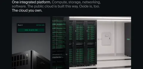
| 3 | feature-split | Two-column section with statement text and a large product environment visual. | Product demonstration, Console sign-in cue | Editorial heading, Wide hardware imagery, Dark UI panel |
| 4 | other | Single-column supporting statement with generous dark negative space. | Value proposition | Compact body copy, Hairline separation |
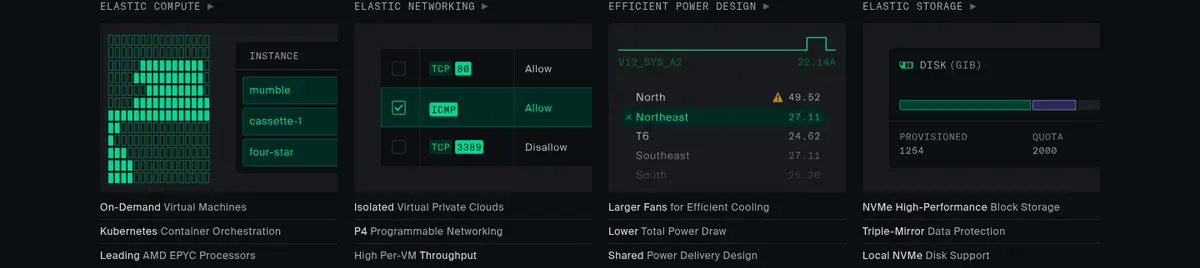
| 5 | feature-grid | Four-column technical capability grid with small product visuals and concise text. | Explore capability links | Technical labels, Interface thumbnails, Fine dividers |
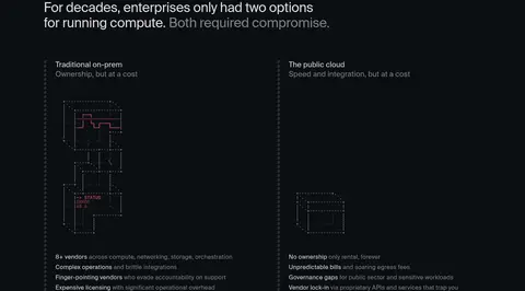
| 6 | comparison | Two-column comparison with a shared heading and diagrams beneath each option. | Compare deployment tradeoffs | Side-by-side columns, Diagram-led explanation, Muted labels |
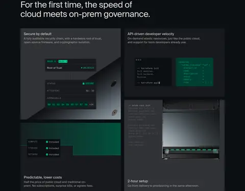
| 7 | feature-grid | Two-column feature composition with headline above panels and product imagery within. | Feature evaluation, Security and cost details | Dark cards, Hardware and console captures, Green system highlights |
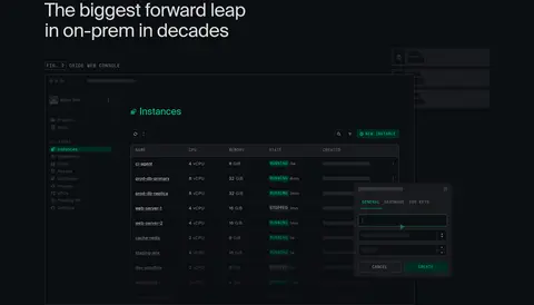
| 8 | product-showcase | Two-column product showcase with heading and a large overlapping console screenshot. | Inspect product interface | Figure caption, Console screenshot, Layered modal detail |
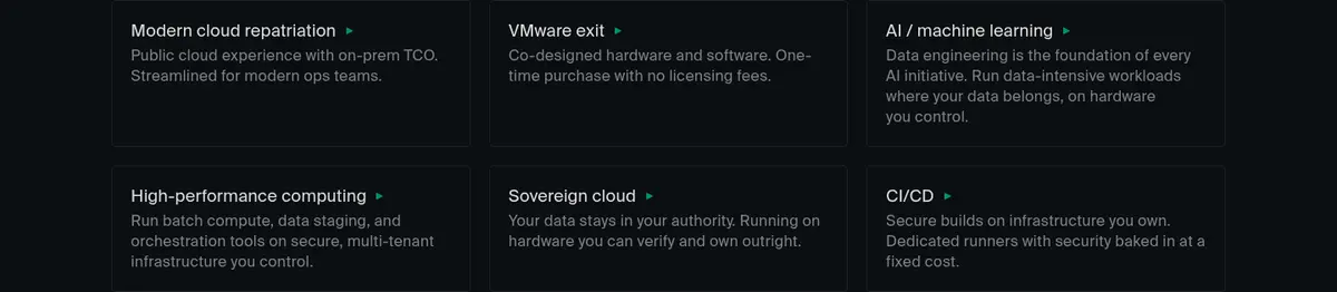
| 9 | feature-grid | Three-column audience or solution grid with six compact linked items. | Browse use cases | Text-led cards, Small green link cues, Hairline separators |
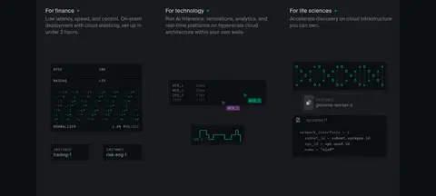
| 10 | feature-grid | Three-column sector grid followed by a broad technical illustration panel. | Explore industry applications | Industry headings, Dark illustration field, Technical diagrams |
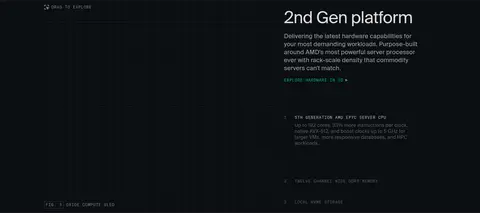
| 11 | product-showcase | Two-column hardware feature with an interactive-style visual area and right-side explanatory copy. | Drag to explore, Technical detail disclosure | Product diagram, Figure label, Green inline action |
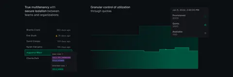
| 12 | feature-split | Two-column management features with interface visualizations beneath short headings. | Explain tenant isolation, Explain quota control | Console-style visualizations, Green usage indicators, Dark panels |
| 13 | feature-grid | Three-column benefit row with concise heading and supporting copy in each column. | Reassure on setup and support | Small green icons, Compact text, Open dark background |
| 14 | cta | Two-column closing action with headline and buttons on the left, small graphic on the right. | Contact sales, Try the product | Large editorial headline, Green primary CTA, Technical accent graphic |
| 15 | footer | Three-column footer with brand statement, grouped site links, and a newsletter row. | Browse site sections, Subscribe by email | Muted link lists, Fine dividers, Compact email form |
## Source CSS custom properties (selected)
```css
--shadow-border-base: 0 0 0 1px #ffffff0d;
--shadow-border-bg: 0 0 0 1px oklch(21.6% .008 260);
--shadow-border: 0 0 0 1px #ffffff0d, 0 0 0 1px oklch(21.6% .008 260);
--shadow-small: 0px 1px 2px #00000029;
--shadow-border-small: 0 0 0 1px #ffffff0d, 0px 1px 2px #00000029, 0 0 0 1px oklch(21.6% .008 260);
--shadow-medium: 0px 2px 2px #00000052, 0px 8px 8px -8px #00000029;
--shadow-border-medium: 0 0 0 1px #ffffff0d, 0px 2px 2px #00000052, 0px 8px 8px -8px #00000029, 0 0 0 1px oklch(21.6% .008 260);
--shadow-large: 0px 2px 2px #0000000a, 0px 8px 16px -4px #0000000a;
--shadow-border-large: 0 0 0 1px #ffffff0d, 0px 2px 2px #0000000a, 0px 8px 16px -4px #0000000a, 0 0 0 1px oklch(21.6% .008 260);
--shadow-menu-inset: 0px 1px 1px #00000005, 0px 4px 8px -4px #0000000a, 0px 16px 24px -8px #0000000f;
--shadow-toast: 0px 1px 1px #00000005, 0px 4px 8px -4px #0000000a, 0px 16px 24px -8px #0000000f;
--shadow-tooltip: 0 0 0 1px #ffffff0d, 0px 1px 1px #00000005, 0px 4px 8px #0000000a, 0 0 0 1px oklch(21.6% .008 260);
--surface-default: oklch(16.2% .01 260);
--surface-hover: oklch(24.7% .007 260);
--surface-raise: oklch(19.5% .009 260);
--surface-secondary: oklch(21.6% .008 260);
--surface-tertiary: oklch(31.6% .006 260);
--surface-disabled: oklch(21.6% .008 260);
--surface-scrim: oklch(16.2% .01 260/.4);
--surface-accent-alt-inverse: oklch(74% .175 305.4);
--surface-accent-alt: oklch(24% .0559 325.4);
--surface-accent-alt-hover: oklch(30.8% .0727 322.1);
--surface-accent-alt-secondary: oklch(37.9% .0906 318.7);
--surface-destructive-inverse: oklch(71.2% .185 11.3);
--surface-destructive: oklch(24% .0626 31.3);
--surface-destructive-hover: oklch(30.8% .0814 28);
--surface-destructive-secondary: oklch(37.9% .1014 24.7);
--surface-notice-inverse: oklch(83.7% .14 75);
--surface-notice: oklch(24% .0526 95);
--surface-notice-hover: oklch(30.8% .0685 91.7);
--surface-notice-secondary: oklch(37.9% .0853 88.3);
--surface-error-inverse: oklch(71.2% .185 11.3);
--surface-error: oklch(24% .0626 31.3);
--surface-error-hover: oklch(30.8% .0814 28);
--surface-error-secondary: oklch(37.9% .1014 24.7);
--surface-inverse-raise: oklch(90% .0001 260);
--surface-inverse-primary: oklch(79% .0011 260);
--surface-inverse-secondary: oklch(71.7% .0021 260);
--surface-info-inverse: oklch(71% .15 272);
--surface-info: oklch(24% .0479 292);
```
---
本文件由 AI 辅助生成:数值取自公开网页的实测样式,命名、用途说明与建议为模型解读。商标归原所有者。
Generated by Design DNA · https://four.wiralomi.com/style/oxide-computer