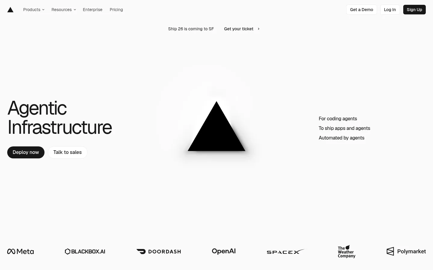
Vercel 首页以克制的黑白灰配色和醒目的大字,呈现面向 AI 应用的基础设施。产品界面与客户标识作为可信证据,融入留白充足、视觉干扰较少的页面布局。
North star · Let typography, a near-white canvas, and deliberate negative space carry the page; keep product evidence secondary and crisp.
The page is built on a near-white canvas with a tightly controlled palette: dark text, softer gray navigation and supporting copy, and only a faint gray tone for occasional secondary details. The hero establishes the system through a large two-line heading at left, a stark black triangular brand mark in the center, and a short audience statement at right. Geist Sans carries navigation, headings, body copy, and buttons; compact Geist Mono is reserved for code-like or caption details. Broad empty areas give the hero and customer logos room to breathe, while later sections use alternating two-column feature compositions with product screenshots and concise explanatory text. The screenshots retain their own interface details, but the surrounding page stays neutral and quiet. Rounded dark CTAs create clear action points without adding a new accent colour. Hairline-level outlines and barely perceptible shadows define controls and cards without turning the page into a heavily layered interface.
Display and heading typography, navigation, body copy, and interface controls.
Aa 设计
Geist Mono
网络字体 · 字重 400 / 500 · 占比 11%
免费替代:IBM Plex Mono
Compact captions and code-like interface details.
角色
示例
字号
字重
行高
字距
特大标题
Large hero display text or prominent brand statements.
Vercel
64px
400
1
-0.06em
一级标题
Primary hero and feature-section headlines.
Vercel
56px
450
1
-0.06em
二级标题
Secondary headings within product and feature content.
The quick brown fox 敏捷的狐狸
24px
450
1.33
-0.04em
正文
Feature descriptions, explanatory copy, and interface text.
The quick brown fox 敏捷的狐狸
14px
500
1.43
0
辅助文字
Compact technical labels and metadata.
The quick brown fox 敏捷的狐狸
12px
400
1.33
0
导航
Top-level navigation links.
The quick brown fox 敏捷的狐狸
14px
400
1.43
0
代码
Code-like snippets or technical interface details.
const style = 1;
12px
400
1.33
0
间距与布局
基准单位 2px · 密度:紧凑
40px版块间距
6px元素间距
—卡片内边距
1392px内容最大宽度
2px
4px
6px
8px
12px
16px
20px
40px
Use a wide, centered content frame capped at the measured 1392px maximum, with compact global navigation and a highly open hero. The hero’s main content is distributed across left, center, and right zones rather than stacked into a conventional text block. Customer logos sit in a horizontal row below it. Feature sections use two-column compositions with left/right emphasis shifting between blocks. Maintain a compact interface density inside generous page-level whitespace, and use consistent section gaps without introducing coloured bands.
圆角与层次
按钮 · 9999px
卡片 · 6px
链接 · 6px
hairline · link, card, footer
hairline · button
inset · other
The page is predominantly flat, with no strong card shadows or coloured surfaces. Use subtle hairline outlines to separate controls and selected cards, and reserve soft shadowing for the hero mark or restrained interface depth. Keep borders low contrast against the light canvas and avoid stacked, elevated panels.
组件
下面的预览按实测的按钮、输入框、徽标、卡片样式重建(字体用替代字体)。
Global navigation
A compact top row with the Vercel mark, product and resource links, and right-aligned demo, login, and signup actions.
Announcement link
A small, centered event message and ticket link positioned beneath the navigation.
Hero
An oversized two-line title at left, black triangular mark in the center, short audience statement at right, and paired actions below the title.
Primary CTA
Dark pill-shaped Deploy now button with white medium-weight text; use a lighter secondary action beside it.
Customer logo row
A horizontally distributed band of monochrome customer logos below the hero.
Feature split
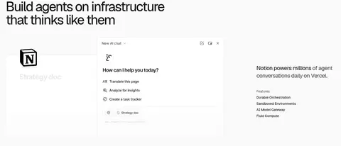
Two-column customer story block combining a concise heading, explanatory text, feature list, and product-interface imagery.
Footer navigation
A dense multi-column link area that remains on the same light canvas and uses restrained typography.
Imagery · The hero uses a simple black triangular brand mark with a soft shadow, not lifestyle photography. Customer logos form a monochrome credibility strip. Below, product screenshots and interface visuals are placed as evidence beside feature copy; keep them rectangular and legible, and allow their internal UI colours to remain contained within the imagery. No video treatment is indicated.
Use #fafafa as the dominant canvas across page sections.
Set primary copy and headings in #171717.
Use #4d4d4d for subdued navigation and supporting text.
Give hero and feature headlines strong scale and tight tracking.
Use broad negative space around major content groups.
Pair feature explanations with crisp product-interface imagery.
✕ 不该做
Do not introduce bright brand accents or coloured section bands.
Do not fill the hero with decorative photography.
Do not turn every feature into a raised card.
Do not make supporting copy compete with the headline.
Do not use dense, crowded layouts to fill empty space.
Do not apply monospaced type to general body copy.
给 AI 的提示词
想快速出一个同风格的新页面,把这段话连同 DESIGN.md 一起发给 AI。
Build a new Vercel-style page with a near-white #fafafa canvas and a strictly restrained palette. Use #171717 for headings, primary text, and filled CTAs; use #4d4d4d for muted navigation and supporting copy; reserve #c9c9c9 for rare, low-emphasis details. Set large, tightly tracked headings in Geist Sans or a close sans substitute, and use Geist Mono only for technical captions. Keep the header compact, the hero spacious and asymmetrical, and supporting customer proof in a horizontal logo row. Organize feature content as alternating two-column text-and-product-interface compositions. Prefer flat surfaces and hairline outlines over prominent shadows. Make actions clear with dark rounded buttons, and preserve generous negative space instead of adding decoration.