North star · Let warm, full-width home photography carry the emotion while a quiet white-and-charcoal interface keeps shopping effortless.
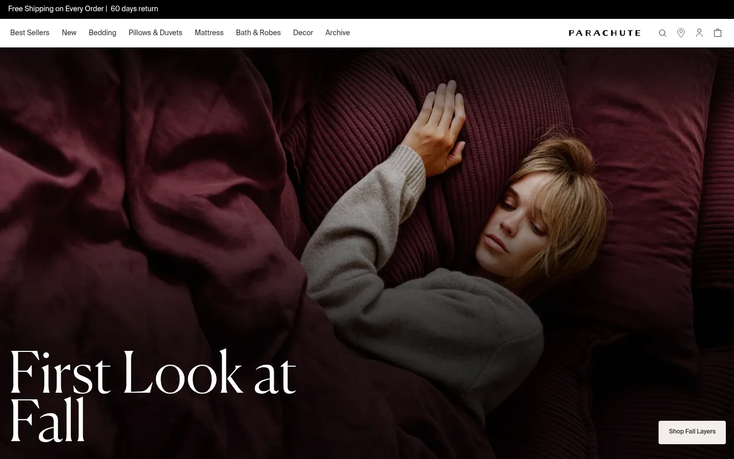
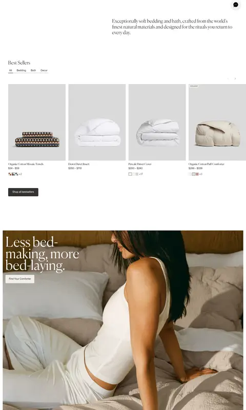
The visual system is built on a white canvas, dark charcoal text, and the contrast between fine Canela headlines and practical Suisse Intl interface copy. The opening hero uses a full-bleed lifestyle photograph, with large white serif text anchored at the lower left and a small pale CTA at the lower right. Below it, the page alternates generous white intervals with image-led product stories, curated product cards, and category imagery. Neutral merchandise photography supplies most of the page’s warmer hues; these are photographic tones, not a separate interface palette. Product grids and navigation remain restrained, with small labels and understated dividers. Buttons use pale warm-gray fills and compact corners, while most content sits flat rather than in elevated cards. The result feels tactile and editorial without sacrificing straightforward shopping paths.
Subsection headings within collections and editorial blocks.
Parachute Home
28px
300
1.2
0
四级标题
Compact product-story and category headings.
The quick brown fox 敏捷的狐狸
24px
400
1.12
0
正文
Product descriptions, editorial paragraphs, and supporting copy.
The quick brown fox 敏捷的狐狸
16px
400
1.8
0
辅助文字
Small product metadata, badges, and image-related labels.
The quick brown fox 敏捷的狐狸
14px
400
1.4
0
按钮
Compact shopping actions and calls to action.
The quick brown fox 敏捷的狐狸
14px
400
1.8
0
导航
Top-level category and utility navigation.
The quick brown fox 敏捷的狐狸
14px
400
1.4
0
链接
Editorial-style linked text and selected product titles.
The quick brown fox 敏捷的狐狸
16px
400
1.1
0
间距与布局
基准单位 4px · 密度:适中
64px版块间距
8px元素间距
—卡片内边距
1344px内容最大宽度
1px
2px
4px
6px
8px
12px
16px
24px
32px
48px
64px
Use a broad, centered content frame with the measured maximum width of 1344px, while allowing campaign photography to span edge to edge. The page pairs a compact two-tier header with a large hero, then moves through product grids, editorial image blocks, and category bands. Align text and card content cleanly, but vary image compositions to avoid a rigid catalog feel. Keep the overall density comfortable: broad white intervals separate content, with a measured 64px section rhythm and 8px element gap.
圆角与层次
按钮 · 4px
徽标 · 2px
导航 · 2px
没有测到阴影:页面是扁平的,层次靠底色和描边区分。
Keep the interface mostly flat: measured data reports no shadows, and product cards sit directly on the white canvas rather than in raised containers. Separate the header and footer with understated hairlines where needed. Use image overlays for text contrast, not card-like elevation. Buttons have compact rounded corners, while badges remain subtly rounded.
组件
下面的预览按实测的按钮、输入框、徽标、卡片样式重建(字体用替代字体)。
Announcement and navigation
A slim dark announcement strip sits above a white navigation row with category links, centered wordmark, and compact utility icons.
Campaign hero
Full-bleed bedroom photography with a large lower-left Canela headline and a small warm-pale CTA near the lower-right edge.
Product card
Show a clean product image, small Suisse Intl title and price, optional color swatches, and a compact uppercase badge on a flat surface.
Shop button
Use a measured 4px radius and Suisse Intl label; pale #f1eee9 fills suit secondary actions, with dark charcoal for stronger actions.
Editorial image block
Pair lifestyle photography with a restrained Canela headline and short link or CTA, keeping text directly over or beside the image.
Product badge
Small uppercase Suisse Intl label on #f1eee9 with muted #696663 text and a measured 2px radius.
Imagery · Use authentic lifestyle and product photography of bedding, towels, bedrooms, and people at home. Favor tactile fabric detail, natural light, warm interiors, and varied wide or portrait crops. Hero images fill the viewport width, often with a dark gradient at the bottom so white serif copy stays readable. Product cards use simple, clean cutouts or quiet studio settings; illustrations and 3D are not the defining visual language.
Use Canela-style serif headlines for campaign moments.
Keep navigation and product details in a clean sans serif.
Let real textile and bedroom photography dominate large sections.
Use white and charcoal as the primary interface colors.
Reserve warm pale fills for compact calls to action and badges.
Separate sections with generous white space rather than decorative containers.
✕ 不该做
Do not turn the interface into a colorful palette; warm hues belong mainly in photography.
Do not add heavy shadows or raised-card styling.
Do not use bold geometric display type in place of the editorial serif.
Do not cover every image with labels, badges, or controls.
Do not make the page feel like a dense marketplace catalog.
Do not treat measured utility blue or gradient gray as defining brand colors.
给 AI 的提示词
想快速出一个同风格的新页面,把这段话连同 DESIGN.md 一起发给 AI。
Build a new Parachute-style home-goods page with an editorial, understated shopping experience. Use Gallery White (#ffffff) as the main canvas and Soft Charcoal (#353331) for navigation and primary text; apply Warm Porcelain (#f1eee9) sparingly to compact buttons or badges. Set campaign headlines in a light Canela-like serif and interface copy in a Suisse Intl-like sans serif. Lead with a full-bleed, tactile bedroom photograph and a large lower-left headline, using a subtle dark image overlay only where white text needs contrast. Organize the rest into spacious product grids, editorial image stories, and category photography within a broad content frame. Keep product metadata small and clear, use thin Quiet Divider (#cccccb) rules where useful, and avoid shadows, bright interface colors, or dense card chrome.