Paste 以简洁、宽松的落地页介绍 Mac 和 iOS 剪贴板管理工具。明亮的产品画面、克制的蓝色操作按钮与交替出现的深色功能区,营造清晰且贴近 Apple 平台的观感。
North star · Keep the page quiet and spacious so clear typography, blue actions, and vivid product screens do the explaining.
The page uses Gallery White (#ffffff) as its dominant canvas, punctuated by pale-gray feature and conversion bands and near-black sections for AI integrations, work modes, and the footer. Signal Blue (#0a84ff) is reserved for primary actions and links, keeping the call to action unmistakable without competing with the product imagery. System UI sans-serif type carries the full experience: large, centered headings introduce sections, while muted gray supporting copy stays visually secondary. Layout is spacious and largely centered, with a narrow content measure for copy and broad product media beneath it. Alternating light and dark sections create a steady long-page rhythm. Rounded pill buttons, soft-cornered cards, and device mockups provide the main shape language. The vivid orange and warm brown tones visible in screenshots belong primarily to device wallpapers and clipboard content, not the site’s core interface palette.
配色 点色块复制色值。用途说明来自对页面的实测位置(背景、文字、描边、按钮)与截图判读。
品牌色
Soft Ink
#101010
Primary text and navigation, plus inverse backgrounds for AI, work-mode, and footer sections.
强调色
Signal Blue
#0a84ff
Primary Try for free buttons and prominent text links such as See plans.
Clipboard Amber
#feb85c
Warm accent appearing on feature cards and selected interface details; secondary to blue actions.
Warm Umber
#70542f
Small warm-toned text accent; keep limited rather than treating it as a large page surface.
表层色
Gallery White
#ffffff
Primary page canvas, light hero and testimonial areas, and white product cards.
Cloud Gray
#f5f5f7
Pale section bands, feature-card backgrounds, and the closing trial call to action.
中性色
Slate Copy
#707070
Muted explanatory copy beneath headlines and in supporting feature text.
Silver Copy
#cfcfcf
Secondary muted text, including subdued footer and supporting copy.
Footer Gray
#9f9f9f
Low-emphasis footer text and minor subdued interface details.
功能色
Deep Cocoa
#231d15
Minor dark tone detected in visual details, not a defining background or interface color.
文字 背景 对比度 WCAG #101010 Soft Ink#ffffff Gallery White19.03:1 AAA #101010 Soft Ink#f5f5f7 Cloud Gray17.48:1 AAA #707070 Slate Copy#ffffff Gallery White4.95:1 AA #707070 Slate Copy#101010 Soft Ink3.84:1 AA-large #707070 Slate Copy#f5f5f7 Cloud Gray4.55:1 AA #cfcfcf Silver Copy#ffffff Gallery White1.56:1 不达标
字体 字号阶梯:Major Third(比例约 1.272,正文 18px)。示例用免费替代字体渲染,数值为实测。
Aa 设计
system-ui 系统字体 · 字重 400 / 500 / 700 / 590 / 600 · 占比 100%
免费替代:Inter
All page typography, from navigation and body copy to large centered headings and buttons.
角色 示例 字号 字重 行高 字距 特大标题 Large promotional headings introducing key product messages.
Paste
60px 700 1.03 0.01em 一级标题 Primary hero headline and top-level page title.
Paste
54px 700 0.96 0.011em 二级标题 Centered headings for major feature and testimonial sections.
Paste
40px 700 1.05 0.015em 三级标题 Supporting feature headings and secondary content titles.
The quick brown fox 敏捷的狐狸
24px 400 1.25 0.012em 四级标题 Smaller feature titles and tertiary headings.
The quick brown fox 敏捷的狐狸
22px 400 1.27 -0.018em 正文 Main explanatory copy and descriptive feature text.
The quick brown fox 敏捷的狐狸
18px 400 1.44 -0.028em 辅助文字 Compact labels, testimonials attribution, and supporting metadata.
The quick brown fox 敏捷的狐狸
15px 500 1.33 -0.04em 按钮 Short action labels on rounded calls to action.
The quick brown fox 敏捷的狐狸
15px 500 1.33 -0.04em 导航 Header navigation and compact menu items.
The quick brown fox 敏捷的狐狸
15px 500 1.33 -0.04em 链接 Prominent inline calls to action and text links.
The quick brown fox 敏捷的狐狸
20px 590 0.8 -0.01em
间距与布局 基准单位 8px · 密度:宽松
144px 版块间距
24px 元素间距
20px 卡片内边距
840px 内容最大宽度
4px
6px
8px
16px
20px
24px
32px
48px
64px
96px
144px
Use a centered, spacious long-form page with an 840px measured content max width for text-led content. Keep headings centered in most sections, then place product media directly below or beside the copy. The page alternates white, pale-gray, and near-black bands to establish section rhythm, with especially generous separation between major features. Use two-column arrangements where the hero or final CTA needs a paired element, and multi-column layouts for feature cards. Keep density low and let media span wider than copy.
圆角与层次 The interface is mostly flat, with section backgrounds doing more work than shadows or borders. Cards use soft corners and pale-gray fills rather than strong outlines. Device renders and overlapping clipboard items create the sense of depth inside product media; reserve inset outlines for interactive focus or link states rather than adding decorative shadow layers.
组件 下面的预览按实测的按钮、输入框、徽标、卡片样式重建(字体用替代字体)。
Primary action Blue pill-shaped Try for free button with white system text; use the measured #0a84ff fill and #ffffff label.
Secondary text action Prominent blue See plans link, sometimes presented as an outlined pill beside the main action.
Feature card Pale #f5f5f7 card with a 20px measured radius, 20px padding, and concise copy or clipboard imagery.
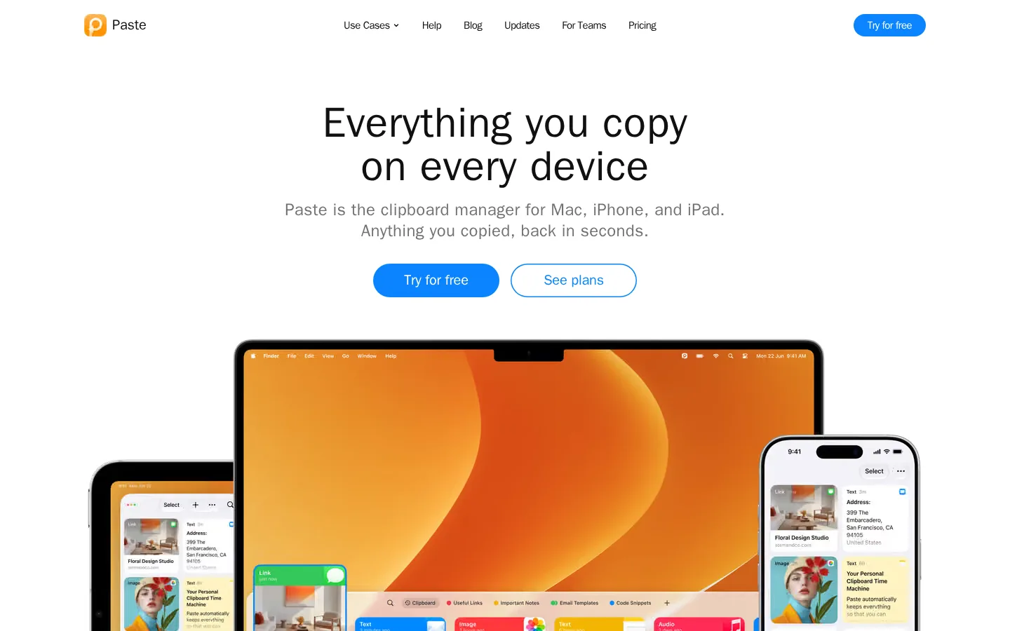
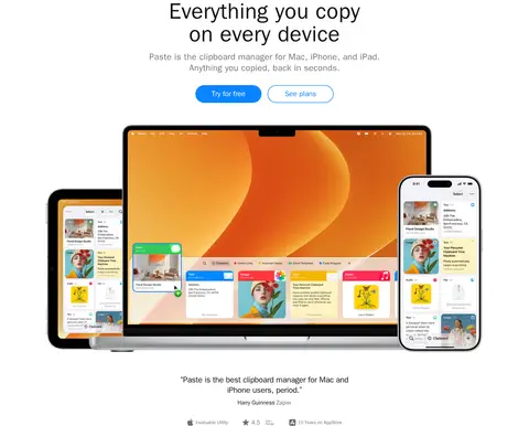
Hero product composition Large, layered Apple-device mockups below the centered headline, showing the clipboard interface in context.
Dark feature band Full-width #101010 section with centered light heading and copy, integration imagery, or a device showcase.
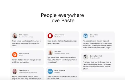
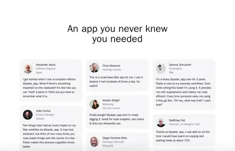
Testimonial card Soft gray rounded card with reviewer identity, attribution, and a short quote; arrange multiple cards as a spacious grid.
Imagery · Treat product imagery as the main visual event: layered Mac, iPhone, and iPad mockups, with clipboard cards shown clearly on their screens. Use crisp, bright product renders against uncluttered white or dark backgrounds, and allow broad device compositions to extend beyond the narrow text column. Feature sections also use screen captures and small integration icons. Orange and amber visual fields mainly come from device wallpapers and clipboard examples, not the brand’s core interface palette.
页面版块 共 16 个版块,按页面从上到下排列,每个都标了类型、布局和交互套路。
首页
首屏 多设备剪贴板
Centered headline and supporting copy above paired actions and a wide, layered device showcase.
产品展示 剪贴板功能
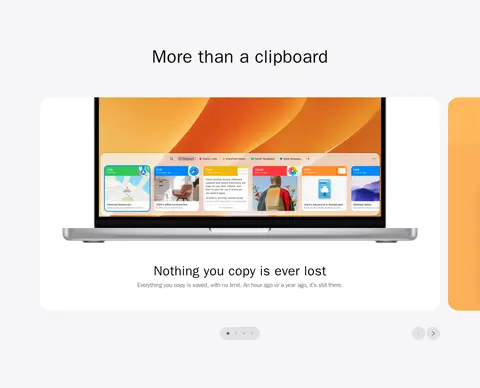
Pale-gray feature band with a centered heading and horizontally browsable product cards.
图文交替 智能剪贴建议
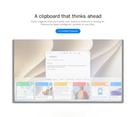
Centered headline, short copy, and action above a broad product video or screen visual.
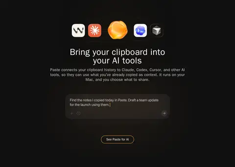
集成生态 连接 AI 工具
Full-width dark band with centered integration icons, heading, copy, and product preview.
图文交替 隐私保护
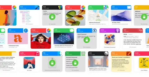
Centered privacy icon and copy above a wide, full-bleed strip of clipboard cards.
图集 剪贴内容展示
Full-bleed horizontal media composition spanning the page.
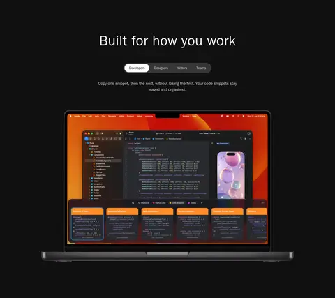
功能网格 适配不同工作
Dark centered section with category tabs, brief copy, and a large product screen.
用户评价 用户评价
White section with centered heading and a multi-column grid of compact review cards.
行动号召 免费试用
Centered heading and supporting line on a pale-gray band, with two side-by-side actions.
页脚 页脚导航
Near-black footer with grouped navigation columns, social links, and a low-contrast legal row.
该做与不该做 ✓ 该做 Use white as the default canvas. Reserve blue for primary actions and key links. Center major headings and keep copy concise. Alternate light bands with deliberate dark feature sections. Show real product screens inside device mockups. Use soft, rounded cards and pill-shaped actions. ✕ 不该做 Do not use screenshot wallpaper colors as core brand colors. Do not crowd the hero with extra controls or copy. Do not add heavy borders or layered shadows to flat cards. Do not make every section dark or brightly colored. Do not use decorative display fonts or all-caps headings. Do not let text columns compete with broad product imagery. 给 AI 的提示词 想快速出一个同风格的新页面,把这段话连同 DESIGN.md 一起发给 AI。
复制 Build a new page in Paste’s restrained productivity-product style. Use Gallery White (#ffffff) for the main canvas, Cloud Gray (#f5f5f7) for occasional section bands and cards, and Soft Ink (#101010) for text and selected inverse sections. Apply Signal Blue (#0a84ff) sparingly to primary pill-shaped actions and important links. Use system-ui sans-serif throughout, with bold, centered headings, readable regular-weight copy, and compact navigation. Keep the content centered and spacious; let device mockups and product screens occupy more width than explanatory text. Alternate light sections with a few purposeful dark showcases. Favor soft-cornered cards and flat surfaces over borders and shadows. Any warm orange imagery should live within product screenshots or device displays, not become the interface palette.
DESIGN.md Tailwind v4 CSS 变量 Design Tokens
---
title: "Paste design system"
variant: extended
source: https://pasteapp.io/
captured_at: 2026-10-12
theme: light
industry: productivity
generator: Design DNA (https://four.wiralomi.com/style/pasteapp-io)
ai_generated: true
ai_label: "本文件由 AI 辅助生成:数值取自公开网页的实测样式,命名、用途说明与建议为模型解读。商标归原所有者。 / AI-assisted content"
---
# Paste · Design System
> A calm canvas for everything you copy.
**Theme:** light · **Industry:** productivity · **Source:** https://pasteapp.io/ · **Captured:** 2026-10-12 (1440×900 desktop)
_AI-assisted content: values are measured from the public page at capture time; names, roles and guidance are model-written interpretations. Trademarks belong to their owners._
Paste presents a Mac and iOS clipboard manager through a clean, spacious landing page. Bright product imagery, restrained blue actions, and alternating dark feature sections make the interface feel clear and distinctly native to Apple platforms.
## North star
Keep the page quiet and spacious so clear typography, blue actions, and vivid product screens do the explaining.
## Overview
The page uses Gallery White (## Colors
| Name | Hex | Token | Group | Role |
|---|---|---|---|---|
| Gallery White | ` | `--color-gallery-white` | surface | Primary page canvas, light hero and testimonial areas, and white product cards. |
| Soft Ink | ` | `--color-soft-ink` | brand | Primary text and navigation, plus inverse backgrounds for AI, work-mode, and footer sections. |
| Signal Blue | ` | `--color-signal-blue` | accent | Primary Try for free buttons and prominent text links such as See plans. |
| Cloud Gray | ` | `--color-cloud-gray` | surface | Pale section bands, feature-card backgrounds, and the closing trial call to action. |
| Slate Copy | ` | `--color-slate-copy` | neutral | Muted explanatory copy beneath headlines and in supporting feature text. |
| Silver Copy | ` | `--color-silver-copy` | neutral | Secondary muted text, including subdued footer and supporting copy. |
| Clipboard Amber | ` | `--color-clipboard-amber` | accent | Warm accent appearing on feature cards and selected interface details; secondary to blue actions. |
| Footer Gray | ` | `--color-footer-gray` | neutral | Low-emphasis footer text and minor subdued interface details. |
| Warm Umber | ` | `--color-warm-umber` | accent | Small warm-toned text accent; keep limited rather than treating it as a large page surface. |
| Deep Cocoa | ` | `--color-deep-cocoa` | semantic | Minor dark tone detected in visual details, not a defining background or interface color. |
### Semantic aliases
`--color-canvas` → ` (Gallery White) · `--color-surface` → ` (Soft Ink) · `--color-surface-2` → ` (Cloud Gray) · `--color-text` → ` (Soft Ink) · `--color-text-muted` → ` (Slate Copy) · `--color-text-subtle` → ` (Silver Copy) · `--color-accent` → ` (Signal Blue) · `--color-accent-2` → ` (Clipboard Amber) · `--color-accent-3` → ` (Warm Umber) · `--color-on-accent` → ` (Gallery White)
### Contrast (WCAG 2.x)
| Text | Background | Ratio | Level |
|---|---|---|---|
| ` | ` | 19.03:1 | AAA |
| ` | ` | 17.48:1 | AAA |
| ` | ` | 4.95:1 | AA |
| ` | ` | 3.84:1 | AA-large |
| ` | ` | 4.55:1 | AA |
| ` | ` | 1.56:1 | fail |
| ` | ` | 12.21:1 | AAA |
| ` | ` | 1.43:1 | fail |
| ` | ` | 3.65:1 | AA-large |
| ` | ` | 5.22:1 | AA |
### Gradients
- `linear-gradient(oklab(0 0 0 / 0.08) 0%, rgba(0, 0, 0, 0) 100%)`
- `linear-gradient(rgba(0, 0, 0, 0) 0%, oklab(0 0 0 / 0.05) 100%)`
## Typography
| Family | Token | Source | Weights | Role | Free substitute |
|---|---|---|---|---|---|
| system-ui | `--font-body` | system | 400, 500, 700, 590, 600 | All page typography, from navigation and body copy to large centered headings and buttons. | Inter |
- **system-ui:** Use native system sans-serif styling, bold display headings, regular body copy, and compact tracking on navigation and controls; avoid all-caps styling.
### Type scale — Major Third (ratio ≈ 1.272, base 18px)
| Role | Size | Weight | Line height | Letter spacing | Case | Family | Used for |
|---|---|---|---|---|---|---|---|
| display | 60px | 700 | 1.03 | 0.01em | — | system-ui | Large promotional headings introducing key product messages. |
| h1 | 54px | 700 | 0.96 | 0.011em | — | system-ui | Primary hero headline and top-level page title. |
| h2 | 40px | 700 | 1.05 | 0.015em | — | system-ui | Centered headings for major feature and testimonial sections. |
| h3 | 24px | 400 | 1.25 | 0.012em | — | system-ui | Supporting feature headings and secondary content titles. |
| h4 | 22px | 400 | 1.27 | -0.018em | — | system-ui | Smaller feature titles and tertiary headings. |
| body | 18px | 400 | 1.44 | -0.028em | — | system-ui | Main explanatory copy and descriptive feature text. |
| caption | 15px | 500 | 1.33 | -0.04em | — | system-ui | Compact labels, testimonials attribution, and supporting metadata. |
| button | 15px | 500 | 1.33 | -0.04em | — | system-ui | Short action labels on rounded calls to action. |
| nav | 15px | 500 | 1.33 | -0.04em | — | system-ui | Header navigation and compact menu items. |
| link | 20px | 590 | 0.8 | -0.01em | — | system-ui | Prominent inline calls to action and text links. |
## Spacing & layout
- Base unit **8px**, density **spacious**.
- Scale (most used values): 4, 6, 8, 16, 20, 24, 32, 48, 64, 96, 144 px.
- Section rhythm 144px · element gap 24px · card padding 20px · max content width 840px.
Use a centered, spacious long-form page with an 840px measured content max width for text-led content. Keep headings centered in most sections, then place product media directly below or beside the copy. The page alternates white, pale-gray, and near-black bands to establish section rhythm, with especially generous separation between major features. Use two-column arrangements where the hero or final CTA needs a paired element, and multi-column layouts for feature cards. Keep density low and let media span wider than copy.
## Shape & elevation
- Radius: button `9999px` · card `20px` · media `50%` · link `9999px` · xs `20px` · sm `32px` · pill `9999px`
- Shadow `inset` (link): `rgba(0, 0, 0, 0) 0px 0px 0px 0px, rgba(0, 0, 0, 0) 0px 0px 0px 0px, rgba(0, 0, 0, 0) 0px 0px 0px 0px, rgb(10, 132, 255) 0px 0px 0px 1.5px inset, rgba(0, 0, 0, 0) 0px 0px 0px 0px`
- Shadow `inset-2` (link): `rgba(0, 0, 0, 0) 0px 0px 0px 0px, rgba(0, 0, 0, 0) 0px 0px 0px 0px, rgba(0, 0, 0, 0) 0px 0px 0px 0px, rgb(255, 178, 80) 0px 0px 0px 1.5px inset, rgba(0, 0, 0, 0) 0px 0px 0px 0px`
- Motion: standard transition `0.15s cubic-bezier(0.4, 0, 0.2, 1)` on interactive elements.
The interface is mostly flat, with section backgrounds doing more work than shadows or borders. Cards use soft corners and pale-gray fills rather than strong outlines. Device renders and overlapping clipboard items create the sense of depth inside product media; reserve inset outlines for interactive focus or link states rather than adding decorative shadow layers.
## Imagery
Treat product imagery as the main visual event: layered Mac, iPhone, and iPad mockups, with clipboard cards shown clearly on their screens. Use crisp, bright product renders against uncluttered white or dark backgrounds, and allow broad device compositions to extend beyond the narrow text column. Feature sections also use screen captures and small integration icons. Orange and amber visual fields mainly come from device wallpapers and clipboard examples, not the brand’s core interface palette.
## Components
### Primary action
Blue pill-shaped Try for free button with white system text; use the measured ### Secondary text action
Prominent blue See plans link, sometimes presented as an outlined pill beside the main action.
### Feature card
Pale ### Hero product composition
Large, layered Apple-device mockups below the centered headline, showing the clipboard interface in context.
### Dark feature band
Full-width ### Testimonial card
Soft gray rounded card with reviewer identity, attribution, and a short quote; arrange multiple cards as a spacious grid.
### Measured component styles
- **Primary button** (“Try for free”): background ## Do
- Use white as the default canvas.
- Reserve blue for primary actions and key links.
- Center major headings and keep copy concise.
- Alternate light bands with deliberate dark feature sections.
- Show real product screens inside device mockups.
- Use soft, rounded cards and pill-shaped actions.
## Don't
- Do not use screenshot wallpaper colors as core brand colors.
- Do not crowd the hero with extra controls or copy.
- Do not add heavy borders or layered shadows to flat cards.
- Do not make every section dark or brightly colored.
- Do not use decorative display fonts or all-caps headings.
- Do not let text columns compete with broad product imagery.
## Agent prompt
Build a new page in Paste’s restrained productivity-product style. Use Gallery White (## Page sections (top to bottom)
| # | Type | Layout | UX patterns | UI patterns |
|---|---|---|---|---|
| 1 | hero | Centered headline and supporting copy above paired actions and a wide, layered device showcase. | primary and secondary actions, cross-device product proof, testimonial snippet | white canvas, centered typography, blue pill button, device mockups |
| 2 | product-showcase | Pale-gray feature band with a centered heading and horizontally browsable product cards. | feature carousel, pagination indicators, next and previous controls | ## Source CSS custom properties (selected)
```css
--blue-primary: