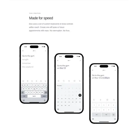
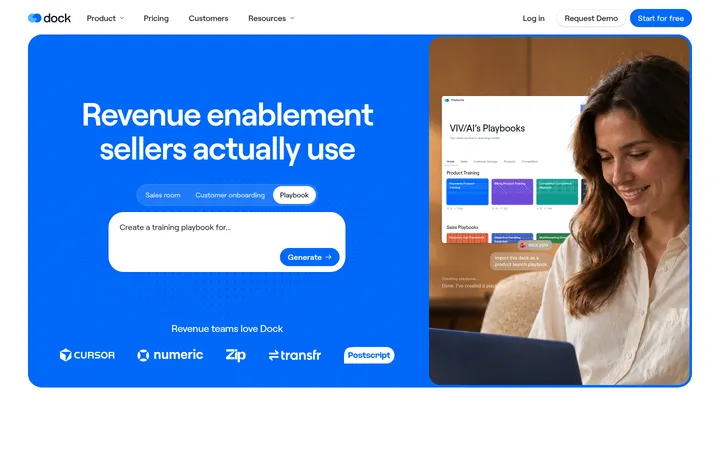
North star · Keep the page quiet and spacious so real product screens—not decorative UI—carry the visual interest.
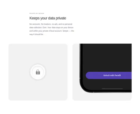
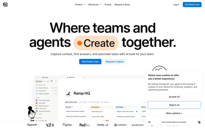
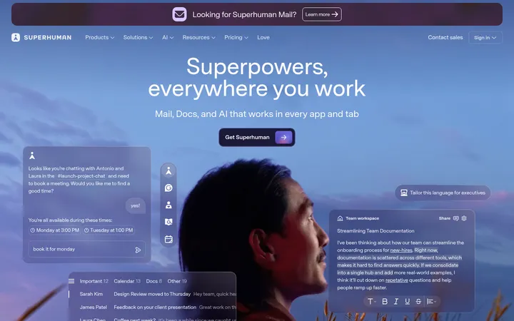
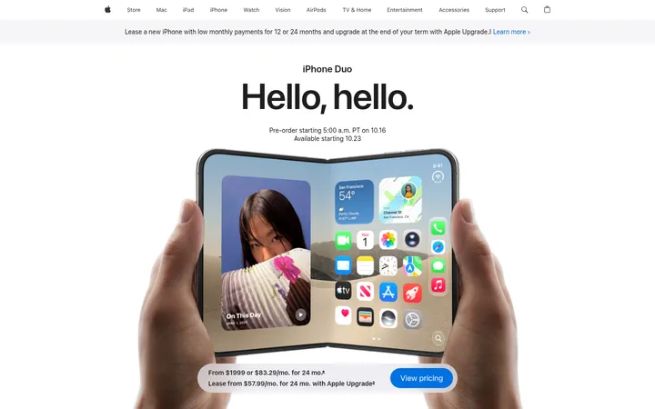
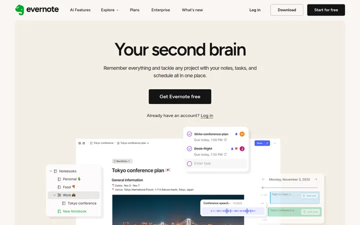
The visual strategy is deliberately quiet: a white canvas dominates, with charcoal headings and muted gray navigation and body copy doing most of the work. Pale blue and soft gray appear sparingly on rounded task cards, while stronger colors are largely contained in app screenshots and device imagery rather than used as site-wide brand accents. Avenir Next gives the page a clean, humanist sans-serif voice; large, regular-weight headings use tight negative tracking, while small uppercase labels distinguish feature categories. The centered hero leads into a product image, then a long sequence of editorial feature explanations and device demonstrations. Generous vertical gaps keep each story distinct. Content generally sits within a centered, constrained column, with occasional wider media and multi-column feature layouts. The overall effect is product-led and calm, not promotional through color or decoration.
All page typography: display and section headings, body copy, navigation, and uppercase feature labels.
角色
示例
字号
字重
行高
字距
特大标题
Large hero-style display heading when an oversized statement is needed.
Doo
65px
400
1.2
-0.04em
一级标题
Main hero headline and prominent page-level title.
Doo
39px
400
1.2
-0.04em
二级标题
Feature-section headings such as “Made for speed.”
Doo
29.5px
400
1
0
正文
Supporting feature descriptions and longer explanatory copy.
The quick brown fox 敏捷的狐狸
19.5px
400
1.8
0
辅助文字
Small descriptive text accompanying imagery or cards.
The quick brown fox 敏捷的狐狸
16.5px
400
1.8
0
导航
Header links and compact navigation labels.
The quick brown fox 敏捷的狐狸
13px
400
1.8
0
眉题
Small uppercase feature category above a section heading.
The quick brown fox 敏捷的狐狸
13px
400
1
0.1em
间距与布局
基准单位 2px · 密度:宽松
130px版块间距
—元素间距
—卡片内边距
1267px内容最大宽度
3px
20px
26px
30px
33px
39px
49px
52px
78px
104px
108px
130px
Use a centered content area capped at the measured 1267px page width, with text often aligned to the start of a narrower editorial column. The first viewport has a minimal top navigation, a centered hero, and a large product image below. Continue with widely separated feature stories, alternating text and device imagery; use occasional multi-column groups for workflow cards or privacy content. The measured section gap is 130px, and the page density is spacious. Avoid adding decorative bands: sections share the white canvas.
圆角与层次
卡片 · 30px
链接 · 9999px
没有测到阴影:页面是扁平的,层次靠底色和描边区分。
The page is predominantly flat, with no measured shadows. Separate content through white space rather than raised panels or colored section bands. Card examples use rounded corners—measured at 30px—with pale fills and no visible borders. Keep hairlines subtle and reserve layered depth for the supplied device mockups.
组件
下面的预览按实测的按钮、输入框、徽标、卡片样式重建(字体用替代字体)。
Top navigation
Compact header with the Doo mark at left and Overview, Features, Support, and Download links aligned at right; navigation uses muted slate.
Centered hero
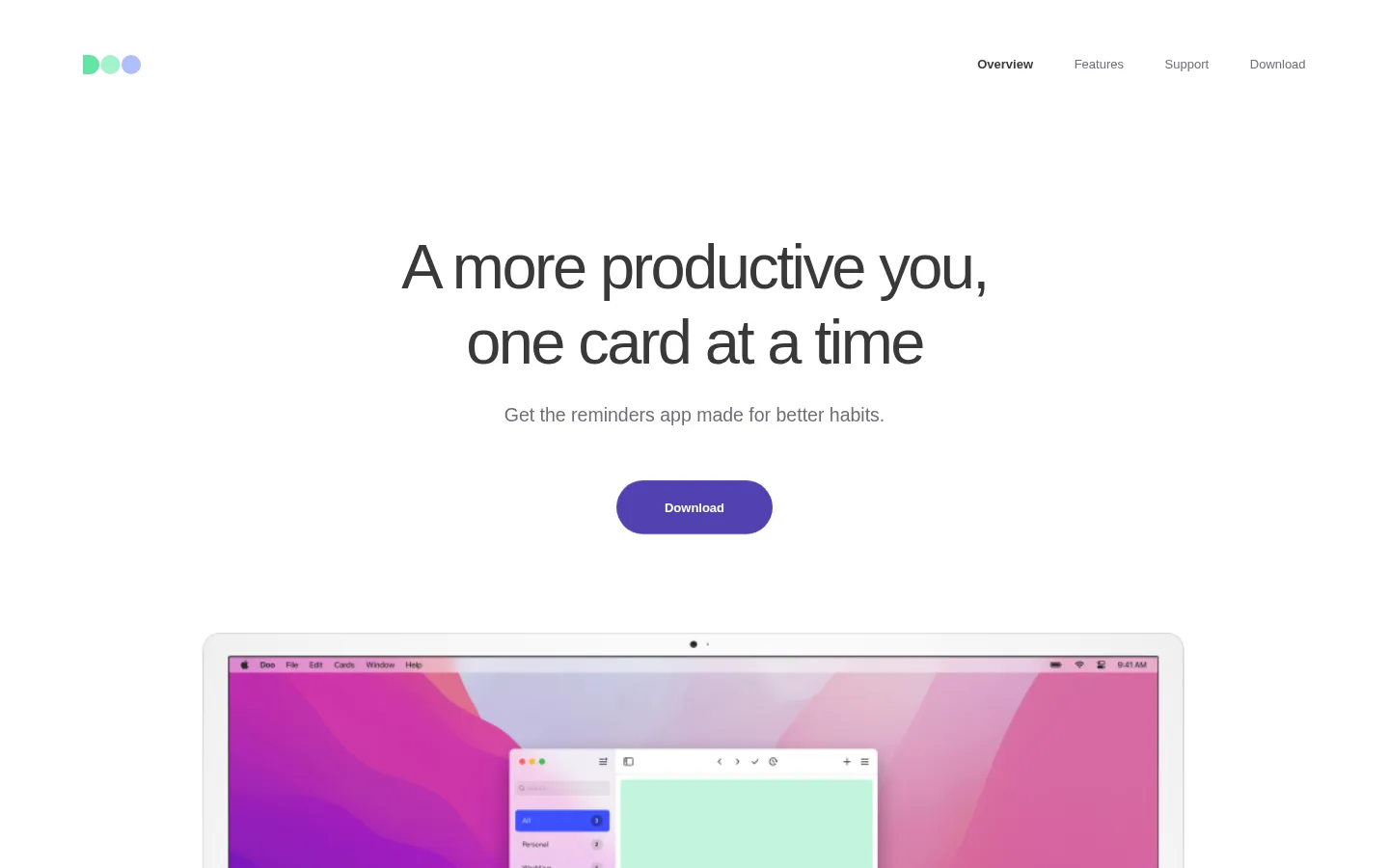
Centered headline, short supporting line, and a purple pill-shaped Download CTA, followed by a large device composition.
Feature story
Small uppercase eyebrow, regular-weight heading, and concise muted description, paired with product imagery and ample surrounding white space.
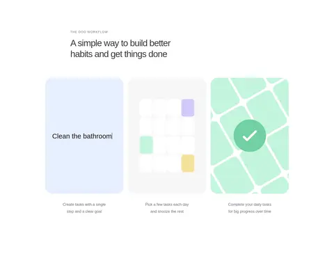
Workflow cards
Three visual task steps, including a pale blue task card (#e7efff) and light gray card (#f7f7f7); measured card radius is 30px.
Device showcase
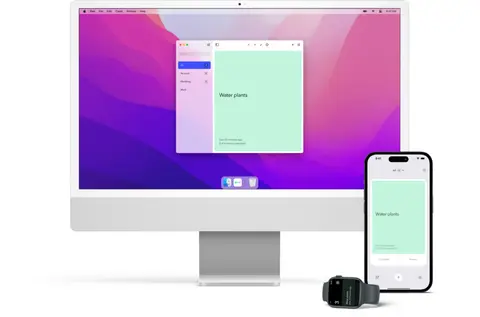
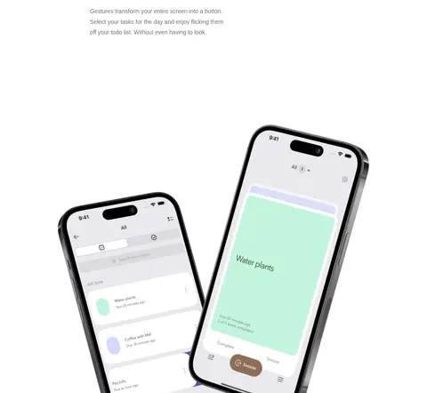
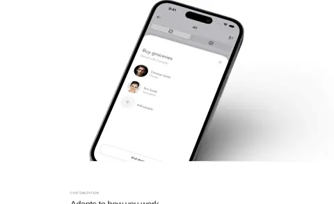
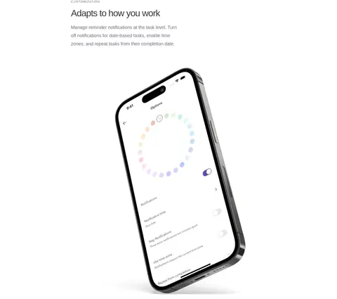
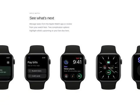
Large isolated Mac, iPhone, or watch screens demonstrate actual app interactions; media can span wider than its accompanying copy.
Feature list
Closing feature overview uses a clear heading, compact link, and concise feature descriptions in a two-column arrangement.
Imagery · Product imagery is the main visual feature: large, carefully isolated Mac, iPhone, and Apple Watch mockups demonstrate real app screens. Keep device frames and screen content legible, with generous white space around them and occasional wide, full-bleed device arrangements. Workflow examples use simple pastel task cards. Treat vivid colors seen in the hero screenshot as imagery content, not as a general site palette.
Use Avenir Next or a close humanist sans-serif substitute.
Reserve the strongest color for genuine product imagery and the CTA.
Give feature stories generous vertical separation.
Use short uppercase eyebrows above feature headings.
Show real app screens inside device mockups.
✕ 不该做
Do not introduce broad colored section backgrounds.
Do not use heavy shadows or thick decorative borders.
Do not make every feature card look like a raised panel.
Do not use saturated illustration colors as global brand accents.
Do not crowd the hero with supporting details.
Do not use bold, all-caps styling for large headings.
给 AI 的提示词
想快速出一个同风格的新页面,把这段话连同 DESIGN.md 一起发给 AI。
Build a new Doo-style page with a quiet, product-first visual system. Use Gallery White (#ffffff) as the canvas and Soft Charcoal (#383938) for primary headings; use Quiet Slate (#6e6d7a) for navigation and secondary copy. Keep Mist Hairline (#edeef3) subtle, and reserve Task Blue (#e7efff) and Cloud Gray (#f7f7f7) for small UI or card surfaces. Set type in Avenir Next or a close humanist sans-serif, with regular-weight, tightly tracked headings and small uppercase feature eyebrows. Center the page in a constrained content area, leave generous gaps between feature stories, and alternate concise copy with large, authentic device mockups. Keep the hero simple: headline, supporting sentence, Download pill, then product imagery. Avoid gradients, heavy shadows, decorative bands, and unnecessary UI chrome.