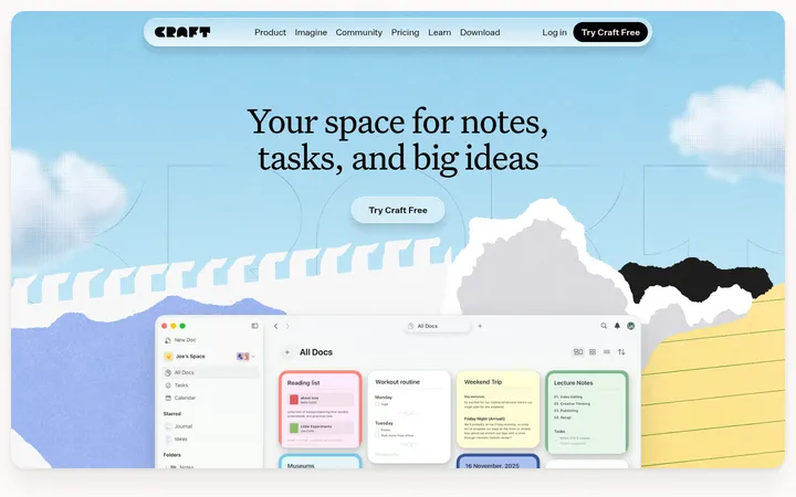
North star · Keep the page predominantly white and calm, letting crisp product imagery and small red accents provide the emphasis.
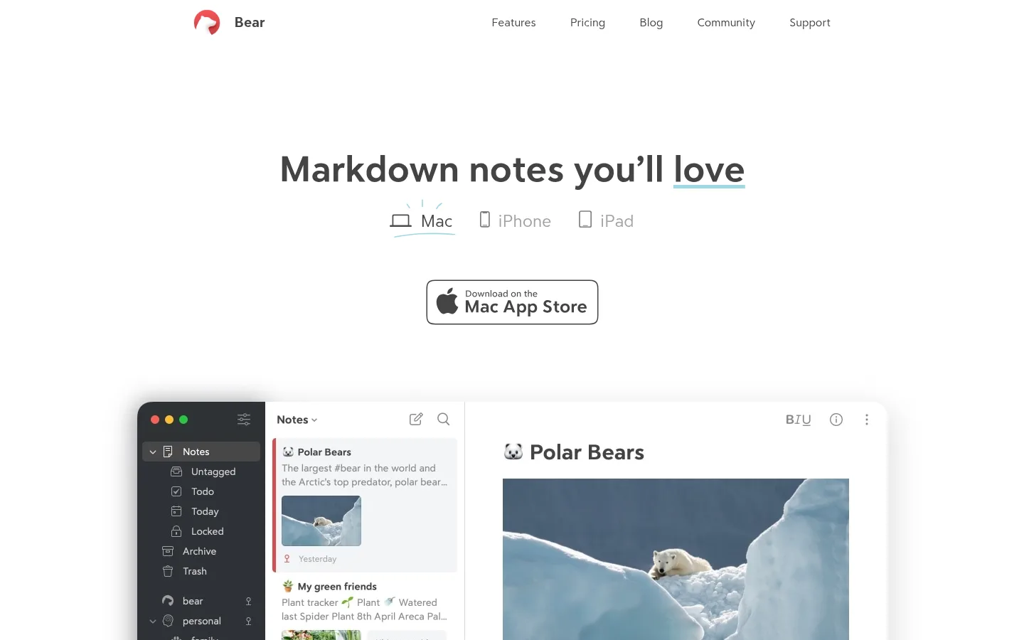
The page is built on a nearly uninterrupted white canvas, with charcoal text carrying most of the visual structure. The Bear red is reserved for links, small PRO labels, and testimonial rules rather than large fields of color; pale cool gray supports feature cards and subtle divisions. Headings use the distinct Bear headline face, while Bear Sans handles navigation, paragraphs, and interface copy in a restrained, readable voice. The hero centers a concise headline, platform selectors, and a store badge above a large screenshot of the app. Below, generous vertical pauses separate feature storytelling, softly colored illustrative shapes, product demonstrations, pricing, community reviews, and the footer. Screenshots and interface mockups provide product proof; hand-drawn bear details and pastel shapes add a gentle, approachable counterpoint. Keep those illustration colors localized to artwork rather than treating them as core brand colors.
Navigation, body copy, interface labels, captions, links, and some feature headings.
Aa 设计
bearsansheadline
网络字体 · 字重 400 · 占比 8%
免费替代:Nunito Sans
Primary display headings and section headings.
角色
示例
字号
字重
行高
字距
一级标题
Centered hero headline introducing the app.
Bear
51px
400
1.1
0
二级标题
Major centered section headings, including pricing and community.
Bear
41.5px
400
1.1
0
三级标题
Feature titles and prominent subheadings.
Bear
40px
400
0.68
0
四级标题
Smaller feature or content section headings.
Bear
30.5px
400
1.1
0
正文
Explanatory paragraphs, feature descriptions, and review copy.
The quick brown fox 敏捷的狐狸
16px
400
1.7
0
辅助文字
Compact labels, badges, and small supporting notes.
The quick brown fox 敏捷的狐狸
13px
700
1.4
0
导航
Header navigation links and brand label.
The quick brown fox 敏捷的狐狸
16px
400
1.7
0
链接
Prominent text links, including social links and calls to explore.
The quick brown fox 敏捷的狐狸
22.5px
400
1.4
0
间距与布局
基准单位 2px · 密度:宽松
32px版块间距
32px元素间距
—卡片内边距
896px内容最大宽度
4px
5px
6px
8px
11px
13px
16px
18px
19px
21px
24px
32px
40px
42px
48px
64px
Use a centered, spacious page with measured maximum content width of 896px. Keep the header compact, then give the hero a large field of white space and centered alignment. Alternate centered introductions with left-aligned feature copy and split product demonstrations; allow illustrations and app screenshots to extend beyond their text columns. Maintain generous section pauses, with the measured section and element gaps at 32px. Keep dense information, such as pricing and reviews, organized in clear columns rather than broad bands.
圆角与层次
输入框 · 9px
卡片 · 40px
徽标 · 4px
lg · card
Most sections are flat and white, with pale gray cards providing gentle separation. Product mockups and selected pricing content can sit above the canvas with a soft, diffuse shadow. Use fine gray outlines for inputs and controls; avoid heavy borders or layered panels competing with screenshots.
组件
下面的预览按实测的按钮、输入框、徽标、卡片样式重建(字体用替代字体)。
Header navigation
Small Bear mark and wordmark sit at the left; understated charcoal links span the right side on a white canvas.
Hero product showcase
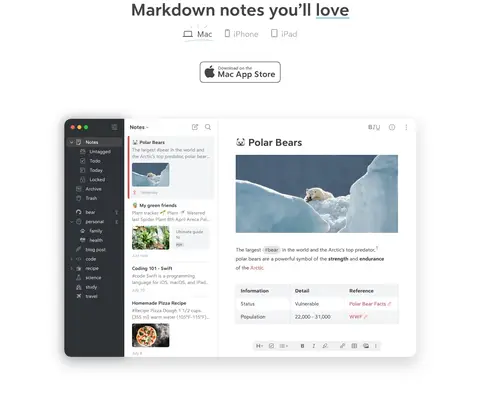
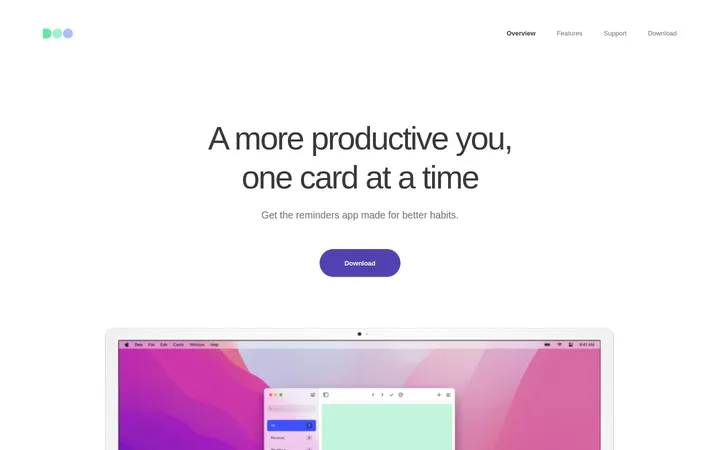
Centered display headline and platform choices lead to a store badge, followed by a large app screenshot with soft elevation.
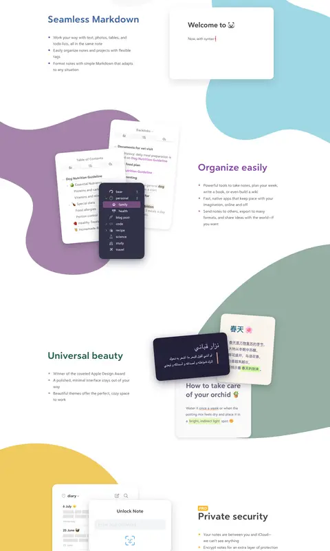
Feature storytelling
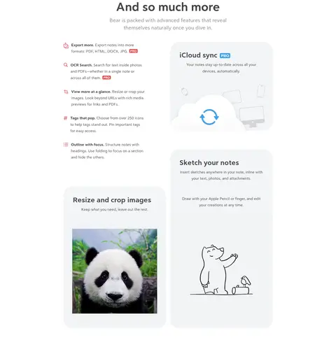
Pair concise headings and short lists with product-interface imagery, using asymmetric split layouts and localized pastel artwork.
Feature cards
Pale #f3f5f7 surfaces hold short feature explanations and demonstrations; large rounded corners soften the presentation.
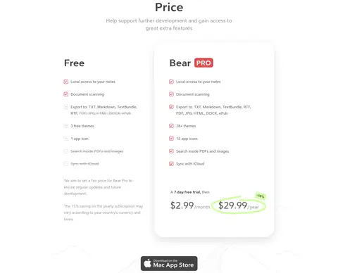
Pricing comparison
Present Free and Bear PRO in side-by-side columns, using checklists, muted exclusions, red PRO labeling, and restrained card elevation.
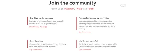
Testimonials
Arrange review excerpts in two columns, with a narrow Bear Red rule, compact copy, and red attribution links.
Newsletter form
Use a subtle outlined email field and a red Subscribe control, centered beneath a short heading and muted explanatory copy.
Footer
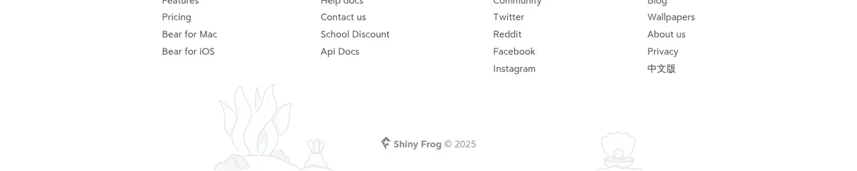
Group small links into compact labeled columns, with muted supporting details and delicate illustration near the bottom.
Imagery · Use crisp app screenshots and device or interface mockups as the main evidence of the product. Frame them prominently against white, with soft shadows where the mockup floats. Mix in sparse hand-drawn bear illustrations and large pastel organic shapes in feature storytelling; these colors belong to the artwork, not the core palette. Keep imagery uncrowded and readable.
Alternate centered section introductions with split feature layouts.
Use Bear Sans for readable supporting text.
Reserve pastel colors for feature artwork and mockups.
✕ 不该做
Do not turn the page into a sequence of saturated color bands.
Do not use the red accent as a dominant background.
Do not crowd screenshots with decorative UI.
Do not use heavy borders around every section.
Do not style all copy as display typography.
Do not treat illustration colors as the core brand palette.
给 AI 的提示词
想快速出一个同风格的新页面,把这段话连同 DESIGN.md 一起发给 AI。
Build a new Bear-style productivity page with a calm white canvas (#ffffff), Soft Charcoal text (#444444), and Bear Red accents (#dd4c4f) used only for links, badges, or small controls. Use Cool Mist (#f3f5f7) for soft card surfaces, Quiet Gray (#888888) for secondary copy, and Fine Silver (#d9d9d9) for subtle form outlines. Set display headings in a rounded headline-style face and supporting text in a clean sans serif. Center the hero and section introductions; alternate them with spacious split feature layouts. Make app screenshots the primary visual proof, with soft elevation and carefully localized pastel illustration. Keep pricing, testimonials, newsletter, and footer compact and clearly grouped. Preserve generous white space and avoid loud backgrounds, heavy borders, or overdecorated layouts.