North star · Keep the surrounding page calm and neutral so product evidence, customer proof, and blue actions remain immediately legible.
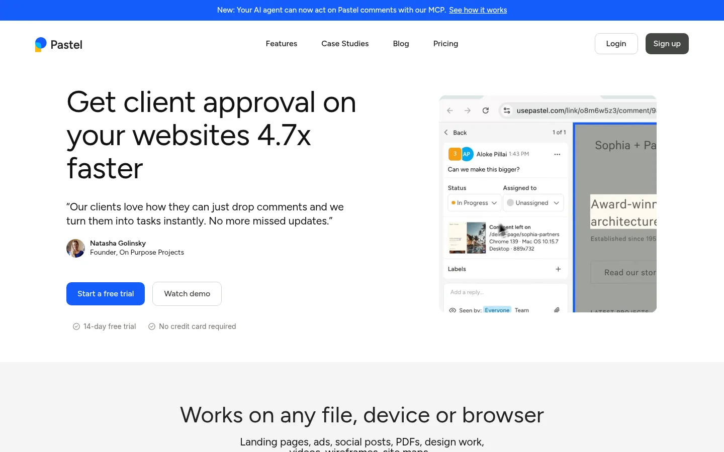
The visual strategy is deliberately restrained: white is the main canvas, with broad #f5f5f4 section bands separating content and giving the product imagery room to read. Near-black headings provide strong hierarchy, while muted dark text carries supporting copy; bright blue is reserved for the announcement strip, primary actions, and selected interface details. Figtree shapes the experience throughout, using regular-weight, generously sized headlines and denser supporting text rather than decorative typography. The hero pairs a left-aligned promise, testimonial, and paired actions with a cropped product-browser preview. Farther down, centered headings introduce capability galleries, feature cards, comparisons, and a long testimonial feed. Product screenshots and customer visuals supply the page’s varied color, so the surrounding UI remains quiet. Comfortable spacing, rounded controls, subtle borders, and soft media shadows keep the long page approachable without making it feel heavy.
配色
点色块复制色值。用途说明来自对页面的实测位置(背景、文字、描边、按钮)与截图判读。
强调色
表层色
中性色
功能色
页面底色 · Gallery White表层 · Paper Mist主文字 · Deep Charcoal次要文字 · Soft Ink弱文字 · Muted Umber描边 · Warm Hairline强调 · Signal Blue
Primary typeface for headings, body copy, navigation, buttons, and captions.
Aa 设计
Inter
网络字体 · 字重 400 · 占比 1%
免费替代:Inter
Minor measured fallback use, not a defining page typeface.
角色
示例
字号
字重
行高
字距
特大标题
Large hero or promotional headline.
Pastel
60px
400
1.1
-0.013em
一级标题
Primary page headline and prominent statement.
Pastel
45px
400
1.25
-0.016em
二级标题
Section titles introducing capabilities and proof.
Pastel
35px
400
1
0
正文
Main explanatory copy and testimonial text.
The quick brown fox 敏捷的狐狸
18px
500
1.7
0
辅助文字
Compact labels, attribution, and supporting details.
The quick brown fox 敏捷的狐狸
16px
400
1.37
0
按钮
Primary and secondary action labels.
The quick brown fox 敏捷的狐狸
16px
500
1.5
0
链接
Navigation links and inline destinations.
The quick brown fox 敏捷的狐狸
16px
400
2
0
间距与布局
基准单位 2px · 密度:适中
60px版块间距
30px元素间距
—卡片内边距
1400px内容最大宽度
4px
6px
7px
10px
11px
12px
18px
20px
22px
30px
34px
35px
40px
45px
48px
50px
The page uses a centered content frame with a measured maximum width of 1400px, while its hero and long-form sections vary between single-column, split, and multi-column arrangements. The hero is left-aligned copy beside a product preview; later sections alternate centered headings, image galleries, two-column comparisons, and card grids. Generous vertical breathing room makes the unusually long page feel sectioned rather than dense. Pale full-width bands distinguish selected content groups, while smaller cards keep copy and product details easy to scan.
圆角与层次
按钮 · 10px
卡片 · 8px
图片 · 9px
链接 · 4px
md · media
lg · media
sm · media
lg · media
Most sections and cards are flat, relying on white space and pale surfaces for separation. Fine warm-gray borders define secondary controls and subtle edges. Soft, layered shadows appear mainly around product media and floating interface previews, not as a general card treatment.
组件
下面的预览按实测的按钮、输入框、徽标、卡片样式重建(字体用替代字体)。
Announcement strip
A narrow Signal Blue (#165dfb) band sits above the white navigation, with centered white announcement text and an underlined destination link.
Primary trial button
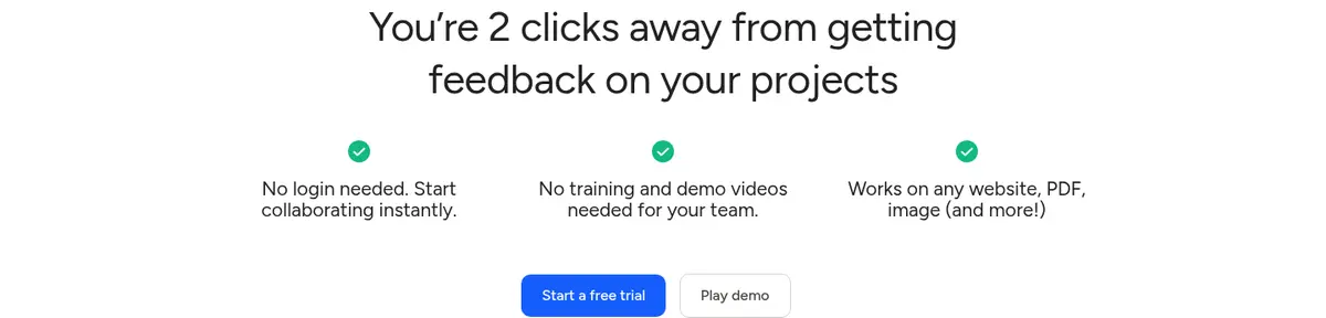
Signal Blue (#165dfb) fill, white Figtree medium text, measured 10px radius, and measured 11px 22px vertical and horizontal padding.
Secondary demo button
White or transparent-looking fill with a 1px #d7d3d1 outline, warm dark label, matching 10px radius, and 11px 22px padding.
Hero split
Large left-aligned headline and testimonial sit opposite a cropped product-browser preview, followed by paired actions and concise reassurance labels.
Capability card
Pale #f5f5f4 surface with an interface detail or illustration above a concise title and supporting explanation; corners vary by card.
Customer review tile
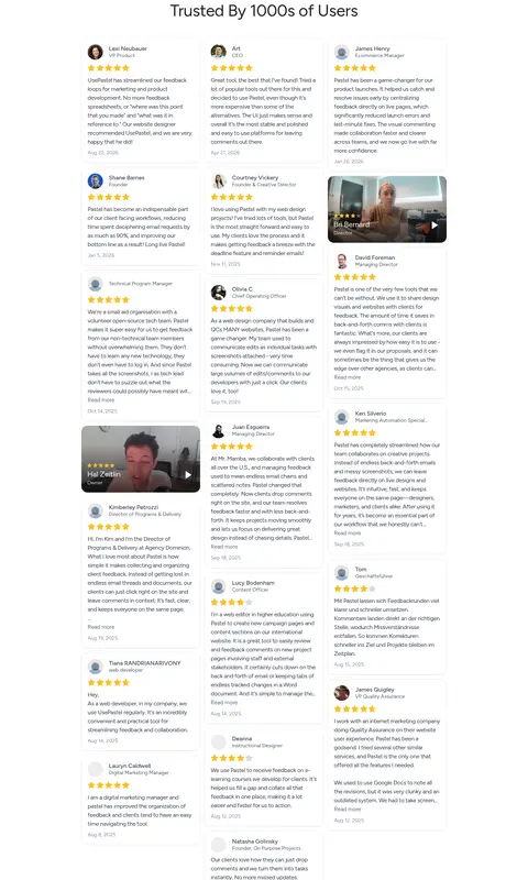
Compact review content combines a customer identity, rating, short text, and sometimes a portrait or video thumbnail in a restrained card.
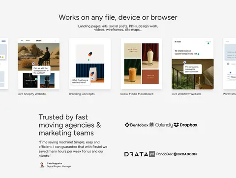
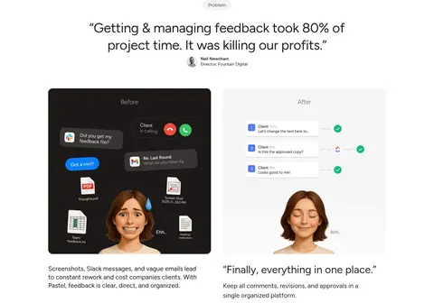
Imagery · Product UI screenshots, browser previews, annotated website examples, and customer portraits do most of the visual work. They are framed as cropped media or small gallery tiles, often inside pale cards, with occasional video-style previews. The product interface is allowed to retain its own colors and detail; the surrounding page stays neutral. Customer imagery and review thumbnails add human evidence among the interface-focused visuals.
Reserve blue for primary actions and key announcements.
Set large headlines in Figtree with regular weight.
Separate major content groups with pale-gray bands where appropriate.
Show product UI as concrete evidence, not decoration.
Use subtle outlines and soft media shadows sparingly.
✕ 不该做
Do not introduce unmeasured brand colors.
Do not make every card look elevated.
Do not fill the page with decorative gradients.
Do not let product screenshots overwhelm surrounding copy.
Do not use heavy display typography or all-caps navigation.
Do not crowd sections together on the long homepage.
给 AI 的提示词
想快速出一个同风格的新页面,把这段话连同 DESIGN.md 一起发给 AI。
Build a new Pastel-style SaaS page with a quiet white canvas (#ffffff), pale section surfaces (#f5f5f4), and Deep Charcoal text (#111111). Use Figtree throughout: large, regular-weight headlines, readable supporting copy, and medium-weight controls. Keep Signal Blue (#165dfb) for the main CTA and selective announcement or link emphasis; use Warm Hairline (#d7d3d1) for understated control borders. Create a clear hierarchy with a split hero, concrete product UI previews, concise testimonials, and pale capability cards. Favor generous section breathing room, centered section introductions, and varied split or grid layouts. Keep imagery realistic to the product, let screenshots retain their own interface colors, and use soft shadows only on media. Make the primary action obvious without turning every element into a button.