North star · Let oversized, tightly set headlines and colorful hand-drawn payment imagery lead, while navy and cream section bands keep the page legible.
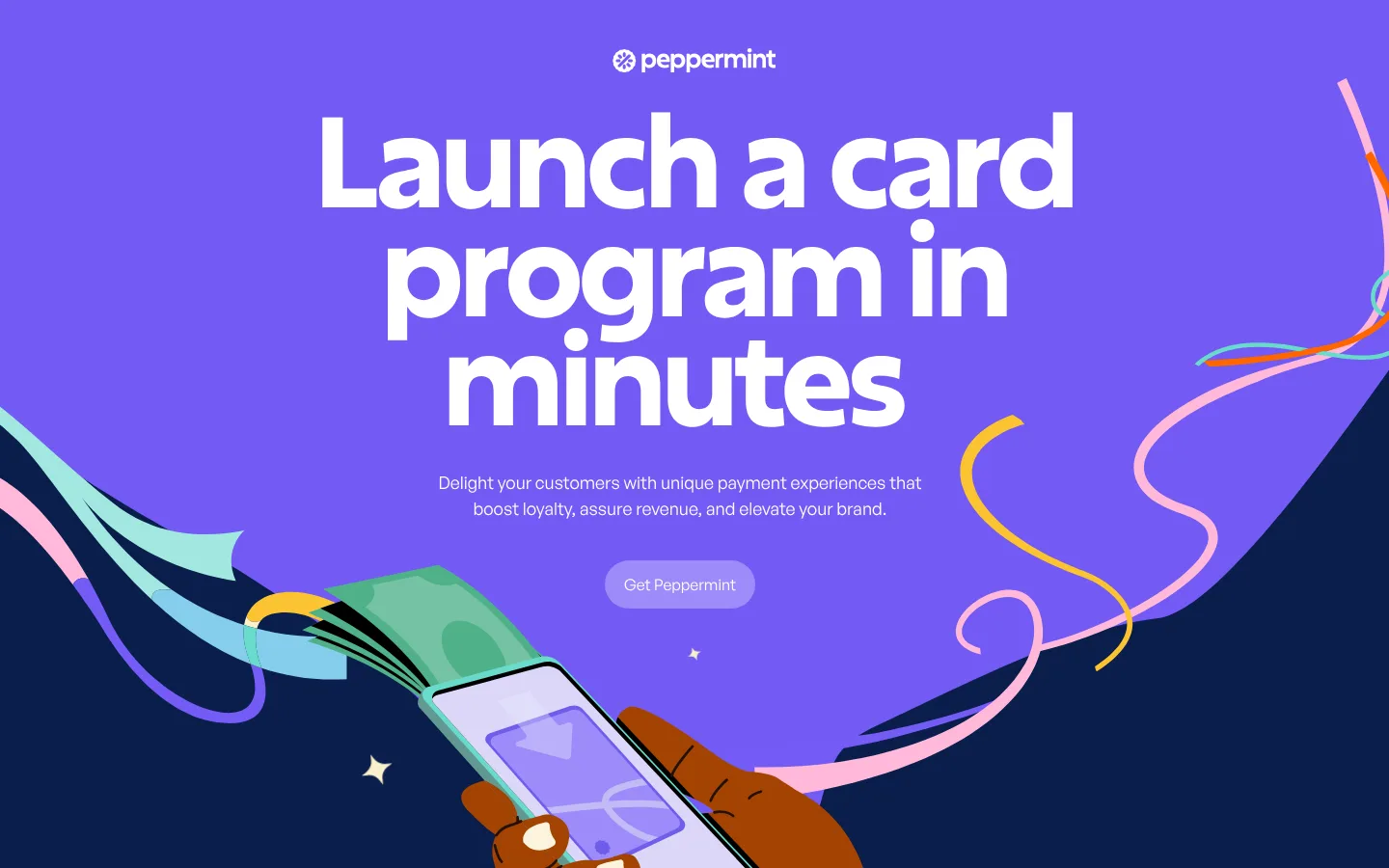
The page uses a deep navy canvas (#0a1d4b) as its visual anchor, with vivid violet hero artwork and dark-blue section bands carrying the illustrated storytelling. Warm cream surfaces (#fcf6ea, #fff6dd, #faedd2) distinguish the audience showcase, FAQ, and footer from the darker stretches. White is reserved for high-contrast hero text and selected labels; violet, mint, and pink accents appear in CTAs, cards, and prominent illustrations rather than as a uniform interface palette. Excon’s heavy display typography is tightly tracked and dramatically oversized, while General Sans handles supporting copy and utility text. The layout alternates centered headline-led scenes, tilted benefit cards, a category image carousel, and a card-product showcase. Generous open space lets the artwork and type dominate; rounded cards and pill-shaped actions soften the bold, graphic composition.
Display headlines and prominent CTA-style link text
角色
示例
字号
字重
行高
字距
特大标题
Oversized hero and campaign-style display headlines.
Peppermint
273.5px
700
0.87
-0.051em
一级标题
Primary hero headline, centered over the opening illustration.
Peppermint
151px
700
0.87
-0.046em
二级标题
Major section headings such as the benefits headline.
Peppermint
129.5px
700
0.87
-0.039em
三级标题
Large feature or section headline treatments.
Peppermint
128px
700
0.87
-0.055em
四级标题
Smaller display headings and emphatic labels.
Peppermint
90px
700
0.87
-0.044em
正文
Supporting paragraphs, FAQ answers, and interface copy.
The quick brown fox 敏捷的狐狸
16px
500
1.22
0
间距与布局
基准单位 4px · 密度:适中
50px版块间距
20px元素间距
33px卡片内边距
952px内容最大宽度
10px
16px
20px
24px
26px
28px
30px
36px
38px
40px
42px
50px
100px
120px
The page is a long, single-column narrative with full-width color bands and occasional embedded multi-column content. The measured page maximum width is 952px, while the opening hero and illustrated sections read as full-bleed compositions. Headlines are centered in the hero; the benefits cards form a compact row, and the audience showcase uses a five-column category structure around a large image. Section changes create the main rhythm, with comfortable density and clear breathing room around artwork and calls to action.
圆角与层次
按钮 · 9999px
卡片 · 24px
链接 · 9999px
没有测到阴影:页面是扁平的,层次靠底色和描边区分。
The measured component data reports no shadows or borders, so the interface reads as mostly flat. Rounded surfaces create separation through color and shape rather than elevation. Artwork overlaps section edges and cards, providing the layering and depth. Use the measured card radius of 24px and pill-shaped actions without adding prominent shadow effects.
组件
下面的预览按实测的按钮、输入框、徽标、卡片样式重建(字体用替代字体)。
Hero CTA
Centered pill action labeled “Get Peppermint,” measured with a #9c8bf9 fill, white text, and a 48px radius.
Benefit cards
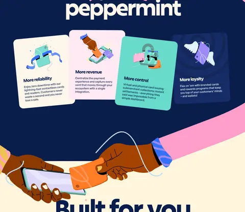
Four compact, rounded cards arranged in a row, with short benefit titles, supporting copy, and distinct pale or illustrated surfaces.
Audience carousel
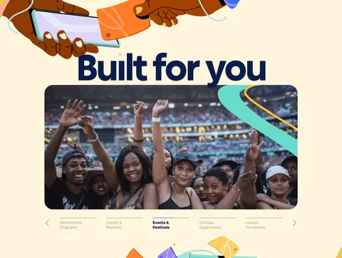
Large rounded crowd photograph with a row of audience categories and subtle previous/next controls beneath.
Card showcase
Full-bleed dark section with prominently floating, colorful Peppermint card artwork and surrounding illustration.
FAQ accordion
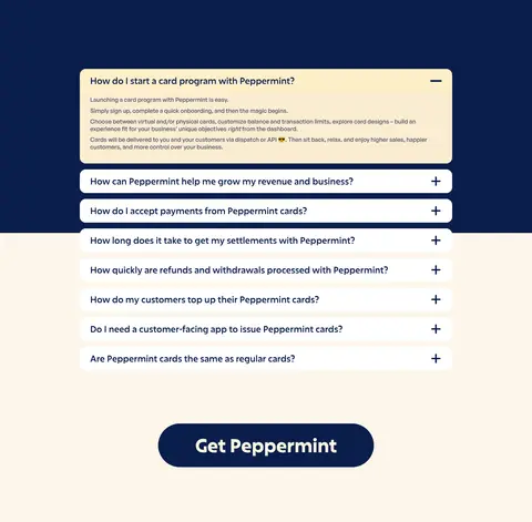
Stacked rounded question rows on a warm cream surface, with plus/minus indicators and one expanded answer.
Footer CTA
Prominent dark-blue pill action above compact legal links and an oversized, pale brand wordmark.
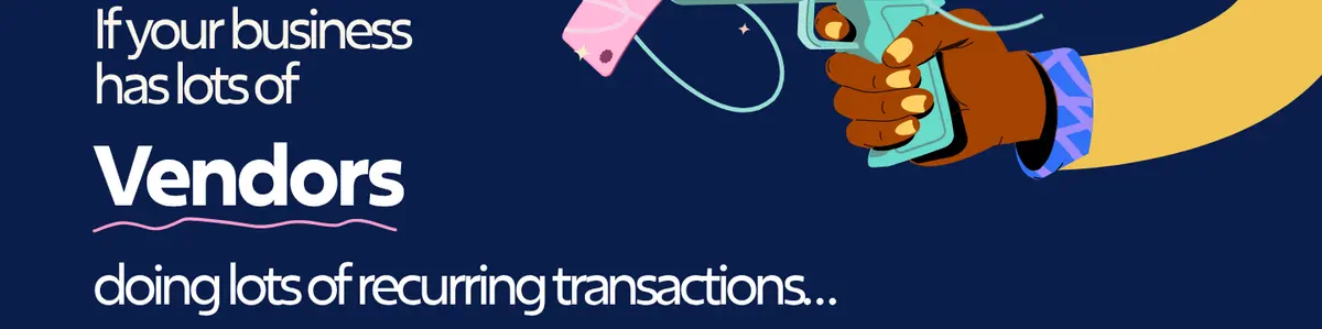
Imagery · Illustration is the defining visual device: expressive hands, payment cards, phones, ribbons, and playful abstract trails cross section boundaries. The hero pairs a large violet field with a hand holding a phone, while later scenes use card artwork and illustrated transactions. A photographic crowd image appears in the audience carousel, framed as a wide rounded panel. Keep illustrations vivid and integrated into the composition; treat photography as a contained supporting moment.
Use warm cream bands to distinguish content-heavy sections.
Set display headlines in bold, tightly tracked Excon-style type.
Center the hero message and give its illustration room to breathe.
Use vivid hand-drawn payment imagery as the main decorative layer.
Keep cards rounded and visually flat, with color doing the separating.
✕ 不该做
Don't replace the navy-and-cream rhythm with a generic white SaaS layout.
Don't use shadows as the main way to distinguish cards.
Don't make supporting paragraphs compete with display headlines.
Don't spread accent colors evenly across every UI element.
Don't confine illustrations to small, isolated thumbnails.
Don't introduce dense navigation or excessive interface chrome.
给 AI 的提示词
想快速出一个同风格的新页面,把这段话连同 DESIGN.md 一起发给 AI。
Build a new page in Peppermint’s playful fintech visual style. Use Midnight Navy (#0a1d4b) for the dominant canvas and section bands, alternating with Vanilla Cream (#fcf6ea) and Butter Paper (#fff6dd) for content pauses. Set large, tightly tracked headings in an Excon-like bold display face and supporting copy in a clean General Sans-style sans serif. Make the composition feel editorial and spacious, with full-width illustrated scenes, colorful payment-card or phone motifs, and occasional rounded content cards. Use Peppermint Violet (#9c8bf9) for the primary pill CTA; reserve Mint Pop (#68dacb), Blueberry Ink (#162d67), and Petal Pink (#ffe9f4) for small accents or artwork. Favor flat color separation and layered illustrations over shadows. Keep text legible and the CTA clear.