North star · Keep the page as a spacious white gallery: let expressive artist imagery and oversized black typography lead, with color reserved for clear actions and small illustrative details.
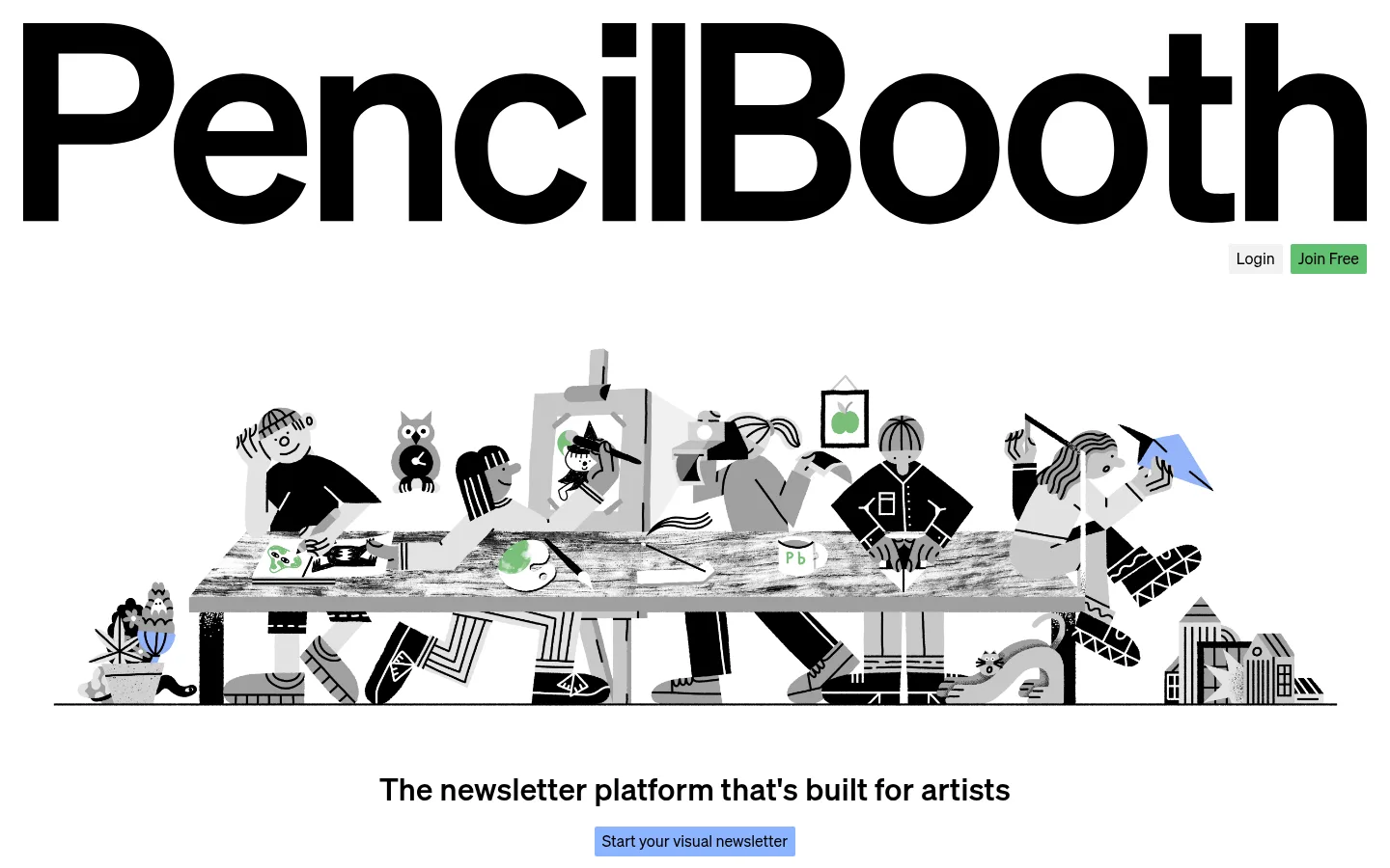
The visual strategy starts with white as an uninterrupted page canvas, letting a very large, heavy black PencilBooth wordmark dominate the opening view. Soehne carries the identity throughout: bold, clear headings and smaller regular-weight body copy keep the page editorial without feeling formal. The hero illustration is a wide, monochrome drawing of artists gathered around a worktable; small green and blue details add personality without displacing the neutral palette. Pale gray surfaces organize interface previews, comparison rows, and content cards, while fine light-gray rules quietly separate long sections. A soft blue CTA is the main recurring action color, with green reserved for the smaller Join Free button. The layout favors broad single-column passages, generous whitespace, and occasional dense modules such as a comparison table or four-item creator gallery. Artwork supplies the texture; surrounding UI stays flat and restrained.
配色
点色块复制色值。用途说明来自对页面的实测位置(背景、文字、描边、按钮)与截图判读。
品牌色
强调色
表层色
中性色
功能色
页面底色 · Gallery White表层 · Paper Gray主文字 · Studio Ink次要文字 · Soft Graphite描边 · Quiet Rule强调 · Booth Blue强调 2 · Join Green强调 3 · Illustration Blue
文字
背景
对比度
WCAG
#000000 Studio Ink
#ffffff Gallery White
21:1
AAA
#000000 Studio Ink
#f2f2f2 Paper Gray
18.76:1
AAA
#b2b2b2 Soft Graphite
#ffffff Gallery White
2.12:1
不达标
#b2b2b2 Soft Graphite
#f2f2f2 Paper Gray
1.89:1
不达标
#8cb4ff Booth Blue
#ffffff Gallery White
2.08:1
不达标
#8cb4ff Booth Blue
#f2f2f2 Paper Gray
1.86:1
不达标
字体
字号阶梯:Custom(比例约 2.449,正文 16px)。示例用免费替代字体渲染,数值为实测。
Aa 设计
Soehne
网络字体 · 字重 400 / 700 · 占比 100%
免费替代:Inter
Sole measured typeface for the wordmark, headings, body copy, buttons, and captions.
角色
示例
字号
字重
行高
字距
特大标题
Oversized PencilBooth wordmark and opening brand statement.
PencilBooth
96px
700
1
0.01em
一级标题
Hero and major section headings, including the closing CTA.
PencilBooth
32px
700
1.2
0.01em
正文
Explanatory paragraphs, feature descriptions, and FAQ copy.
The quick brown fox 敏捷的狐狸
16px
400
1.2
0
辅助文字
Compact labels and secondary details around content and comparisons.
The quick brown fox 敏捷的狐狸
14px
400
1.2
0.01em
按钮
Signup CTA and small navigation actions.
The quick brown fox 敏捷的狐狸
16px
400
1.2
0
间距与布局
基准单位 2px · 密度:适中
48px版块间距
12px元素间距
—卡片内边距
1392px内容最大宽度
6px
8px
10px
12px
20px
24px
28px
48px
The measured page maximum width is 1392px, with a comfortable density and a 48px section rhythm. The hero uses a centered, nearly full-width illustration beneath an oversized wordmark; later sections alternate spacious text-led areas with denser comparison, creator, and FAQ modules. Align the main hero and CTA centrally, but let long-form copy and utility content use practical left alignment. Preserve conspicuous white space between major blocks.
圆角与层次
按钮 · 2px
卡片 · 10px
图片 · 50%
没有测到阴影:页面是扁平的,层次靠底色和描边区分。
The interface reads as flat, with no measured shadows. Separate sections primarily through white space and occasional fine gray rules; use pale gray fills for cards and table rows. Cards are softly rounded, while buttons remain nearly square. Avoid layered, floating-panel effects.
组件
下面的预览按实测的按钮、输入框、徽标、卡片样式重建(字体用替代字体)。
Hero wordmark
An oversized, heavy black PencilBooth wordmark spans the opening canvas, with small Login and green Join Free actions tucked below its right side.
Signup CTA
A compact, nearly square-cornered #8cb4ff button with black regular-weight Soehne text; repeat it beneath the hero statement and in the closing CTA.
Join Free button
A small #62c071 filled button with black text, used as the secondary signup action in the header.
Feature preview
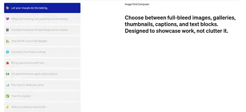
A pale gray composer or feature interface preview sits alongside a short heading and descriptive copy, with the page canvas remaining white.
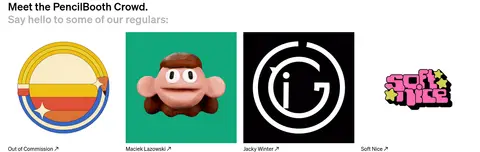
Creator gallery
A four-column row of creator artwork and names, with image-forward cards and restrained black labels.
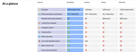
Comparison table
A compact multi-column feature comparison uses pale gray row fills and blue highlights to distinguish PencilBooth values.
FAQ list
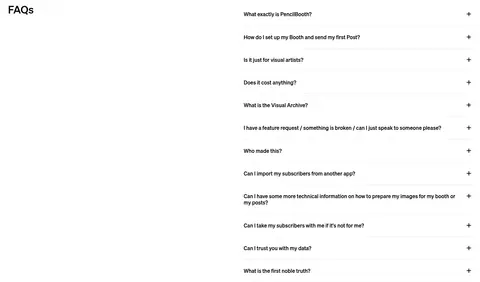
A long, white FAQ area uses thin dividers, concise question text, and simple plus icons to signal expandable rows.
Recent posts grid
A content feed of varied creator thumbnails and short captions, arranged as an image-led grid near the bottom of the page.
Imagery · A wide hand-drawn scene of artists working around a shared table anchors the hero. It is predominantly black, white, and gray, with a few tiny green and blue details. Later creator examples and recent-post previews bring in colorful artwork, thumbnails, and varied media; keep those images as content rather than extending their colors across the interface.
Use Soehne or a close neutral sans-serif substitute.
Reserve blue for the main signup action.
Keep green accents limited to secondary signup cues.
Let illustrations and creator artwork supply color and texture.
Use whitespace and fine rules to pace long sections.
✕ 不该做
Do not introduce large colored background bands.
Do not add shadows or layered card effects.
Do not turn every section into a card grid.
Do not use colorful gradients as a page-wide treatment.
Do not let small illustration accents become interface colors.
Do not crowd the hero or section transitions.
Do not style buttons with pill-shaped corners.
给 AI 的提示词
想快速出一个同风格的新页面,把这段话连同 DESIGN.md 一起发给 AI。
Build a new page in the PencilBooth visual style as a bright, spacious gallery for creative work. Use Gallery White (#ffffff) as the canvas and Studio Ink (#000000) for the wordmark, headings, and primary text. Set typography in Soehne or Inter, with bold oversized display type and calm regular-weight body copy. Use a wide, hand-drawn or image-led creative-work scene as the visual anchor, preserving its own colors rather than recoloring the whole interface. Apply Booth Blue (#8cb4ff) to the main signup CTA and Join Green (#62c071) only to a secondary signup action. Use Paper Gray (#f2f2f2) for previews and comparison surfaces, and Quiet Rule (#e7e7e7) for delicate dividers. Keep sections roomy, layouts mostly simple, cards flat, and corners restrained. Prioritize clarity and visual breathing room over decorative effects.