North star · Keep the pale canvas and ink typography calm, letting product previews and teal actions provide the page’s strongest visual emphasis.
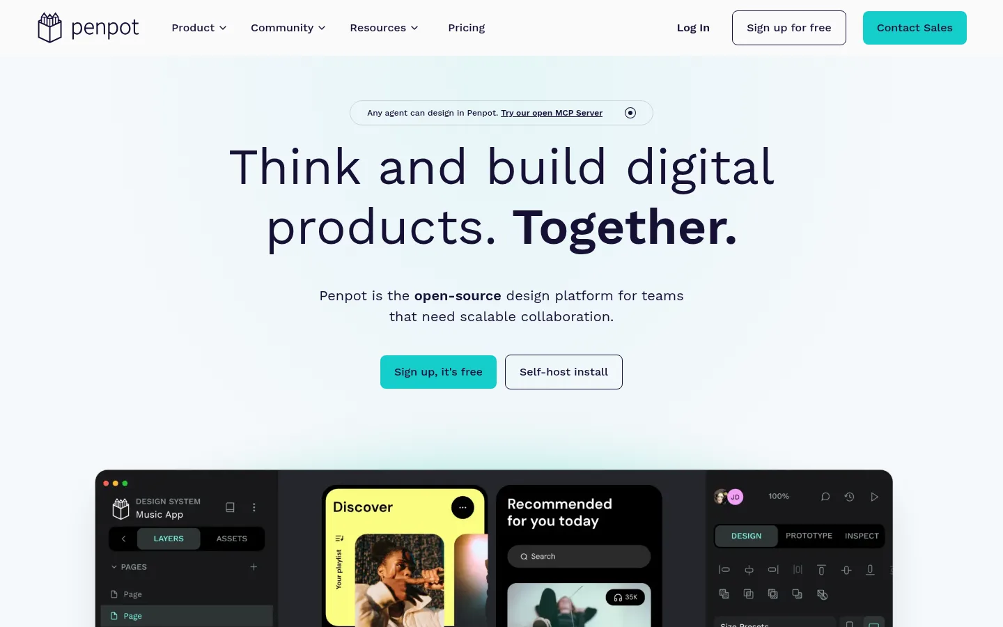
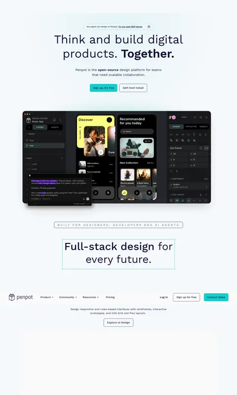
The visual strategy is built around a very pale blue-white canvas (#f5f8fb) and deep indigo ink (#151035), creating a quiet, legible stage for product imagery. Teal (#14ceca) is reserved for high-intent actions, while outlined secondary buttons keep the interface restrained. A centered hero uses an oversized, lightweight Work Sans headline, compact supporting copy, and paired calls to action above a broad product screenshot. The page continues as a long, centered sequence of capability sections, with generous breathing room and subtle gradient washes rather than heavy background blocks. Product previews are large, framed interface compositions that carry most of the visual complexity; section titles and small labels remain simple and clear. Thin gray dividers separate later sections, while a deep indigo footer provides a strong closing contrast and organizes many links into columns. Overall, the page balances open-source product credibility with approachable, contemporary SaaS polish.
All page typography, including navigation, hero and section headings, body copy, buttons, and footer links.
角色
示例
字号
字重
行高
字距
特大标题
Oversized hero statement and other prominent page messaging.
Penpot
72px
400
1.2
0
一级标题
Primary hero heading and top-level page message.
Penpot
65px
400
1.2
0
二级标题
Capability-section headings such as design, AI, systems, and code.
Penpot
48px
400
1.2
0
三级标题
Supporting feature or subsection headings.
The quick brown fox 敏捷的狐狸
20px
400
1.5
0
正文
Hero support copy, section descriptions, and standard interface text.
The quick brown fox 敏捷的狐狸
16px
500
1.5
0
辅助文字
Compact labels and small supporting metadata.
The quick brown fox 敏捷的狐狸
12px
500
1.5
0
导航
Main navigation links and menu labels.
The quick brown fox 敏捷的狐狸
16px
500
1.5
0
间距与布局
基准单位 8px · 密度:适中
64px版块间距
8px元素间距
—卡片内边距
1200px内容最大宽度
4px
8px
10px
12px
16px
20px
24px
32px
48px
A centered, single-page sequence sits within a measured 1200px maximum-width framework. The hero aligns its announcement, heading, copy, and CTAs on the center axis, then gives a wide product preview substantial room. Capability sections follow one another vertically with generous section rhythm, centered titles, concise copy, and broad media. Thin dividers distinguish later content without breaking the light canvas. The footer switches to a dense multi-column link layout.
圆角与层次
按钮 · 8px
导航 · 8px
没有测到阴影:页面是扁平的,层次靠底色和描边区分。
The page is mostly flat: pale canvas, minimal borders, and no prominent shadows in the measured styles. Use thin gray rules to separate sections and rounded outlines for secondary actions. Product screenshots create their own depth through layered interface panels and in-product contrast; avoid adding heavy cards or decorative elevation around them.
组件
下面的预览按实测的按钮、输入框、徽标、卡片样式重建(字体用替代字体)。
Top navigation
Brand mark and product, community, resources, and pricing links sit opposite login and signup actions on a light canvas.
Announcement pill
A compact outlined, rounded message above the hero links to the open MCP Server.
Hero
Centered oversized headline, short supporting paragraph, two adjacent CTAs, and a wide product preview below.
Primary CTA
Filled Action Teal (#14ceca) button with Penpot Ink (#151035) text and a rounded rectangle shape.
Secondary CTA
Light or transparent button with a thin Penpot Ink (#151035) outline and rounded corners.
Capability section
Centered section heading and concise description above a large product image; subtle rules divide later sections.
Footer
Deep Penpot Ink (#151035) surface with light text, compact multi-column navigation, and a lower utility row.
Imagery · Large, full-color product-interface compositions are the main visual assets. They show Penpot’s editor alongside detailed design or code examples, with dark tool panels contrasting against colorful in-product artwork. Keep previews wide and prominent, with clean edges and restrained framing. Supporting illustrations and interface details should feel like authentic product material, not decorative stock photography.
Use Cloud Canvas (#f5f8fb) as the primary page background.
Set important text in Penpot Ink (#151035).
Reserve Action Teal (#14ceca) for prominent primary actions.
Center hero and capability-section introductions.
Let product-interface imagery carry visual complexity.
Use dividers and whitespace instead of heavy card treatments.
✕ 不该做
Do not make teal a large background color.
Do not use a dark canvas across the main page.
Do not crowd the hero with extra copy or controls.
Do not wrap every section in a raised card.
Do not substitute generic stock photos for product previews.
Do not make headings bold and heavy throughout.
给 AI 的提示词
想快速出一个同风格的新页面,把这段话连同 DESIGN.md 一起发给 AI。
Build a new Penpot-style page on a Cloud Canvas (#f5f8fb), using Penpot Ink (#151035) for navigation and headlines. Use Work Sans or a close sans-serif substitute, with regular-weight large headings, medium-weight supporting text, and selective bold emphasis. Center the hero introduction and pair a filled Action Teal (#14ceca) primary button with a lightly outlined secondary button. Place a wide, detailed product-interface preview beneath the hero, then continue through clearly separated capability sections with short centered introductions and generous breathing room. Use Lilac Haze (#e5d3fd) and Frosted Aqua (#e0f5f6) only as subtle gradient atmosphere. Keep borders thin, avoid heavy shadows and card framing, and finish with a deep ink footer and organized link columns.