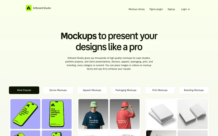
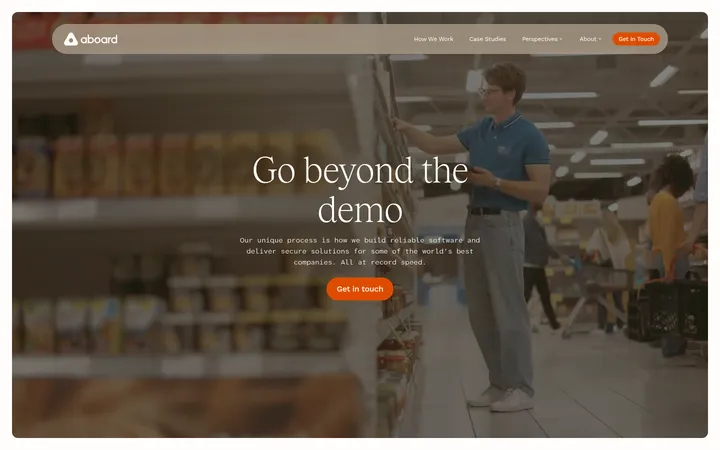
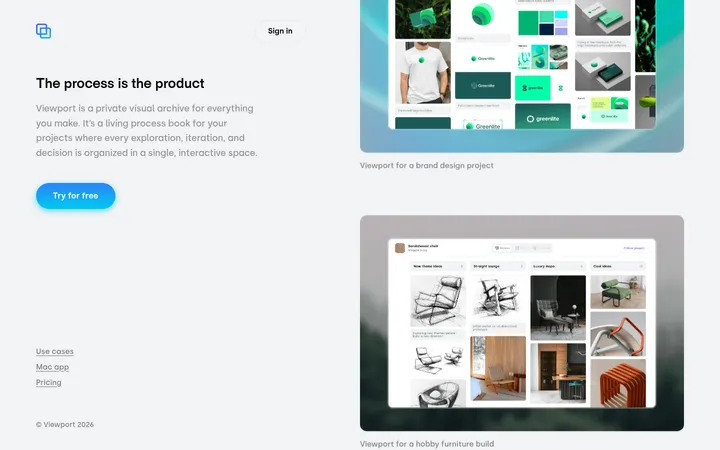
North star · Let warm paper-like surfaces, clear editorial hierarchy, and real product UI explain the workflow before decoration does.
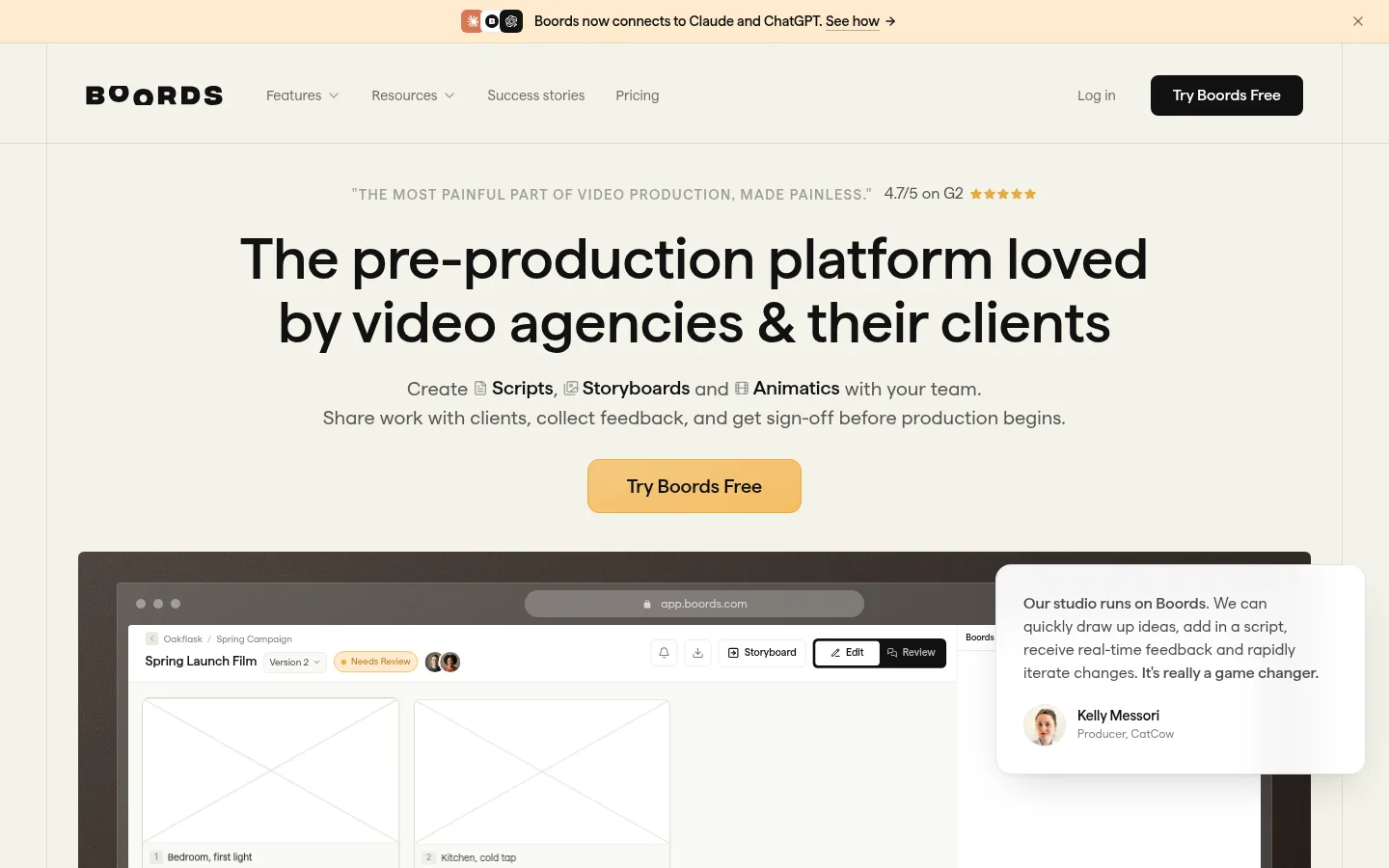
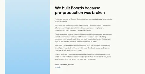
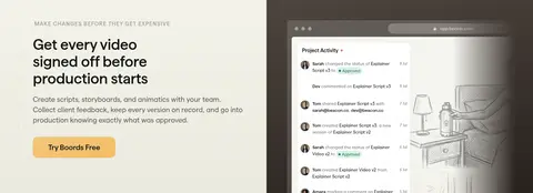
The page is built around a warm off-white canvas (#fafaf5) and alternating pale cream bands (#f3f3e9), giving long-form content a quiet, editorial rhythm. Near-black (#121212) carries headings and primary interface contrast, while muted grays keep supporting copy understated. Golden amber (#e8aa42) is reserved for the prominent hero action and small emphasis details rather than used as a broad background. Matter is the dominant typeface: large, confident headings sit above readable body copy, with restrained uppercase eyebrow labels and occasional monospace captions. The composition moves between centered hero content, logo and testimonial rows, and left-aligned two-column feature stories. Product screenshots are framed as large, dark-edged canvases and provide the main visual weight; supporting cards and tables stay clean and lightly structured. Generous section breathing room balances the dense product evidence. Fine borders, limited shadow, and rounded controls keep the experience tactile without adding visual noise.
Display and headings, navigation, body copy, links, and buttons throughout the page.
Aa 设计
ui-monospace
系统字体 · 字重 500 / 600 · 占比 11%
免费替代:Roboto Mono
Compact captions and code-like labels.
角色
示例
字号
字重
行高
字距
特大标题
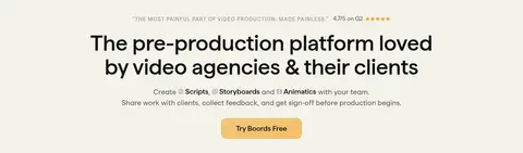
Large centered hero headline and prominent section statements.
Boords
60px
600
1.1
0
一级标题
Primary feature and founder-story headings.
Boords
40px
600
1.15
0
二级标题
Section titles across workflow, integrations, and CTA content.
Boords
32px
600
1.15
0
三级标题
Supporting subheads and card-level headings.
The quick brown fox 敏捷的狐狸
24px
400
1.2
0
四级标题
Smaller subsection labels and compact content headings.
The quick brown fox 敏捷的狐狸
20px
400
1.5
0
正文
Feature explanations, testimonials, and standard descriptive copy.
The quick brown fox 敏捷的狐狸
16px
400
1.5
0
辅助文字
Small metadata, product labels, and compact technical annotations.
The quick brown fox 敏捷的狐狸
11px
500
1.5
0
按钮
Primary and secondary action labels.
The quick brown fox 敏捷的狐狸
16px
600
1.5
0
导航
Header navigation and compact menu items.
The quick brown fox 敏捷的狐狸
14.5px
400
1.25
0
链接
Inline links and text-based calls to action.
The quick brown fox 敏捷的狐狸
16px
400
1.5
0
眉题
Uppercase section prefaces and compact category labels.
The quick brown fox 敏捷的狐狸
14.5px
600
1.25
0.1em
代码
Small monospace technical or integration labels.
const style = 1;
11px
500
1.5
0
间距与布局
基准单位 4px · 密度:紧凑
40px版块间距
8px元素间距
38px卡片内边距
1344px内容最大宽度
2px
4px
6px
8px
10px
12px
14px
16px
20px
24px
32px
36px
40px
48px
80px
Use a centered content frame with a measured maximum width of 1344px. The homepage alternates full-width cream and paper-toned section bands, with a compact navigation and centered hero followed by broad product demonstrations. Later sections use two-column feature layouts, three-column testimonial or stats rows, and a multi-column footer. Headings are often left-aligned beside copy in feature sections; hero and logo-cloud content are centered. Spacing is compact in controls and cards but generous between major stories.
圆角与层次
按钮 · 9999px
卡片 · 8px
图片 · 50%
徽标 · 4px
导航 · 9999px
链接 · 12px
md · other
hairline · card, button, other
hairline · other
inset · card
The page is mostly flat, using fine borders and section color changes to separate content rather than heavy shadows. Product screens gain depth from dark frames and occasional overlapping testimonial cards. Cards remain light and clean; use only a restrained hairline shadow where separation is needed.
组件
下面的预览按实测的按钮、输入框、徽标、卡片样式重建(字体用替代字体)。
Announcement bar
Slim warm-toned strip above the header with a small integration message, inline link, and close control.
Primary CTA
Rounded amber hero action with dark text; other measured CTA instances use dark fill or amber outline.
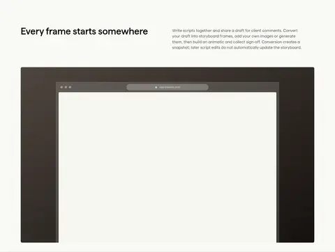
Product showcase frame
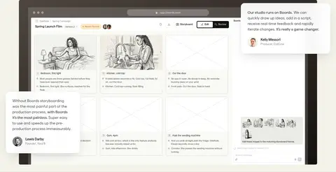
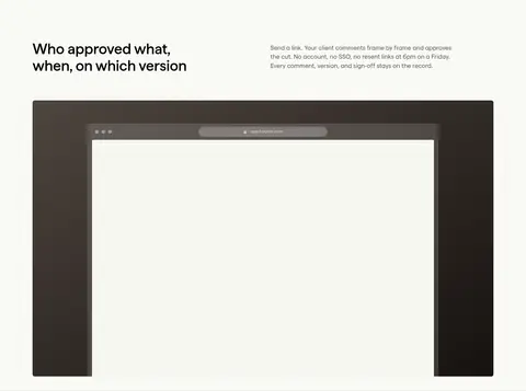
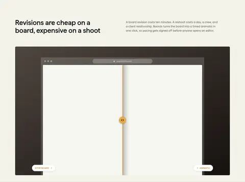
Large storyboard or activity interface set inside a dark charcoal frame, with interface details kept legible.
Comparison table
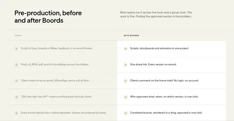
Two-column 'today' versus 'with Boords' checklist, separated into compact rows with light dividers.
Logo and studio cards
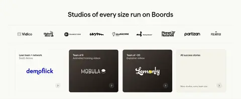
Centered customer logos above a row of studio cards, including both pale and dark card treatments.
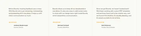
Testimonial panels
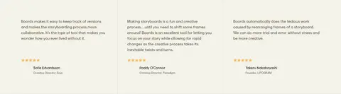
Compact proof cards with short quotes, star ratings, and small contributor details.
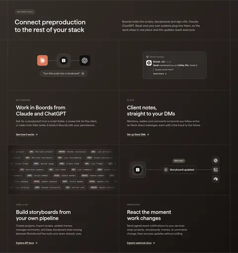
Integration tiles
Dark multi-column feature area with fine dividers, integration illustrations, and concise link-led descriptions.
Imagery · Prioritize product screenshots of storyboard boards, version review, comments, and project activity. Place the UI inside large dark-framed display areas, often with floating testimonial or interface details. Supporting brand marks and small portraits add evidence, while illustrations remain secondary. Keep screenshots crisp and neutral; avoid adding decorative imagery that competes with the product.
Use Paper Canvas and Oat Section as the dominant alternating surfaces.
Reserve amber for primary actions and small emphasis details.
Give product screenshots a strong, dark frame.
Pair concise headings with explanatory copy in feature sections.
Use thin dividers to structure tables, cards, and dark integration panels.
Keep body text calm and readable against warm light surfaces.
✕ 不该做
Do not flood large areas with amber.
Do not replace product evidence with decorative stock photography.
Do not use heavy shadows as the main way to separate sections.
Do not center every feature heading; preserve left-aligned editorial sections.
Do not introduce saturated colors beyond small interface or semantic details.
Do not crowd the page with dense, unbroken text.
给 AI 的提示词
想快速出一个同风格的新页面,把这段话连同 DESIGN.md 一起发给 AI。
Build a new Boords-style SaaS page with a warm editorial feel and practical product focus. Use Paper Canvas (#fafaf5) as the main background, alternating Oat Section (#f3f3e9) bands, and Carbon Ink (#121212) for headings and high-contrast controls. Apply Storyboard Amber (#e8aa42) sparingly to key actions and small emphasis states. Use Matter-like sans typography, large confident headings, readable regular body text, and restrained uppercase eyebrow labels. Keep the content within a centered wide frame; alternate centered intro sections with left-aligned two-column feature stories. Show realistic storyboard or review UI in large dark-framed product panels. Separate content with fine borders, not heavy shadows, and use rounded controls and cards. Include concise proof points, testimonials, and integration details without adding decorative clutter.