Artboard Studio 以浅色、疏朗的页面展示样机素材库和创作工具,并用醒目的深色文字衬托丰富的作品示例。页面先呈现分类清晰的样机网格,再交替展示工具功能,最后以简洁 FAQ 和密集链接页脚收尾。
North star · Keep the interface quiet and spacious so the richly colored mockup imagery, not decorative UI, carries the visual impact.
The page’s visual identity is a quiet, pale-green-tinted canvas paired with near-black typography and colorful mockup imagery. The measured base canvas is white, while the first viewport and feature bands read as a very light green-to-warm-gray wash; reserve the measured gradient colors for those atmospheric bands rather than treating them as new brand accents. Vend Sans gives headings a confident, compact editorial voice, while system-ui keeps navigation and supporting copy neutral and legible. A centered hero leads into a dense six-column category gallery, after which generous alternating feature sections pair concise copy with large interface or mockup visuals. Product examples supply most of the saturated color, including blue, green, peach, and other image-specific tones. Borders are subtle and shadows are absent, so rounded cards and buttons remain crisp and flat.
Navigation, body copy, links, and standard button labels.
Aa 设计
Vend Sans
网络字体 · 字重 500 / 700 / 600 · 占比 11%
免费替代:Manrope
Display and page headings.
角色
示例
字号
字重
行高
字距
特大标题
Large hero or promotional display heading.
Artboard Studio
61px
600
1.2
-0.033em
一级标题
Primary page heading in the centered hero.
Artboard Studio
48px
700
1.2
0
二级标题
Major feature-section and FAQ headings.
Artboard Studio
43px
700
1.2
-0.023em
三级标题
Mockup category and subsection headings.
Artboard Studio
32px
700
1.3
0
四级标题
Smaller feature or supporting headings.
The quick brown fox 敏捷的狐狸
24px
500
1.2
0
正文
Descriptive paragraphs and explanatory copy.
The quick brown fox 敏捷的狐狸
16px
400
1.5
0
导航
Header navigation labels.
The quick brown fox 敏捷的狐狸
16px
400
1
0
链接
Category links, footer links, and inline actions.
The quick brown fox 敏捷的狐狸
16px
400
1
0
间距与布局
基准单位 4px · 密度:适中
48px版块间距
24px元素间距
3px卡片内边距
1346px内容最大宽度
4px
8px
10px
12px
20px
24px
48px
Use a centered content frame with a measured maximum width of 1346px. The hero is single-column and centered; the mockup library becomes a dense six-column grid, while later feature bands alternate image and copy alignment in one- or two-column compositions. Keep the header compact, then allow generous vertical breathing room between major sections. The page moves from busy product browsing into spacious feature storytelling, followed by a two-column FAQ and four-column footer. Maintain comfortable density, aligned content edges, and consistent measured spacing rhythm.
圆角与层次
按钮 · 8px
卡片 · 8px
导航 · 8px
链接 · 8px
没有测到阴影:页面是扁平的,层次靠底色和描边区分。
The interface is predominantly flat: measured data reports no shadows. Use thin pale borders to define cards and secondary buttons, with rounded corners providing the main edge treatment. Keep imagery visually layered inside its own frames, but avoid floating UI effects or heavy elevation.
组件
下面的预览按实测的按钮、输入框、徽标、卡片样式重建(字体用替代字体)。
Header navigation
Compact horizontal brand mark and text links on the light canvas; keep labels in system-ui and avoid strong container styling.
Hero
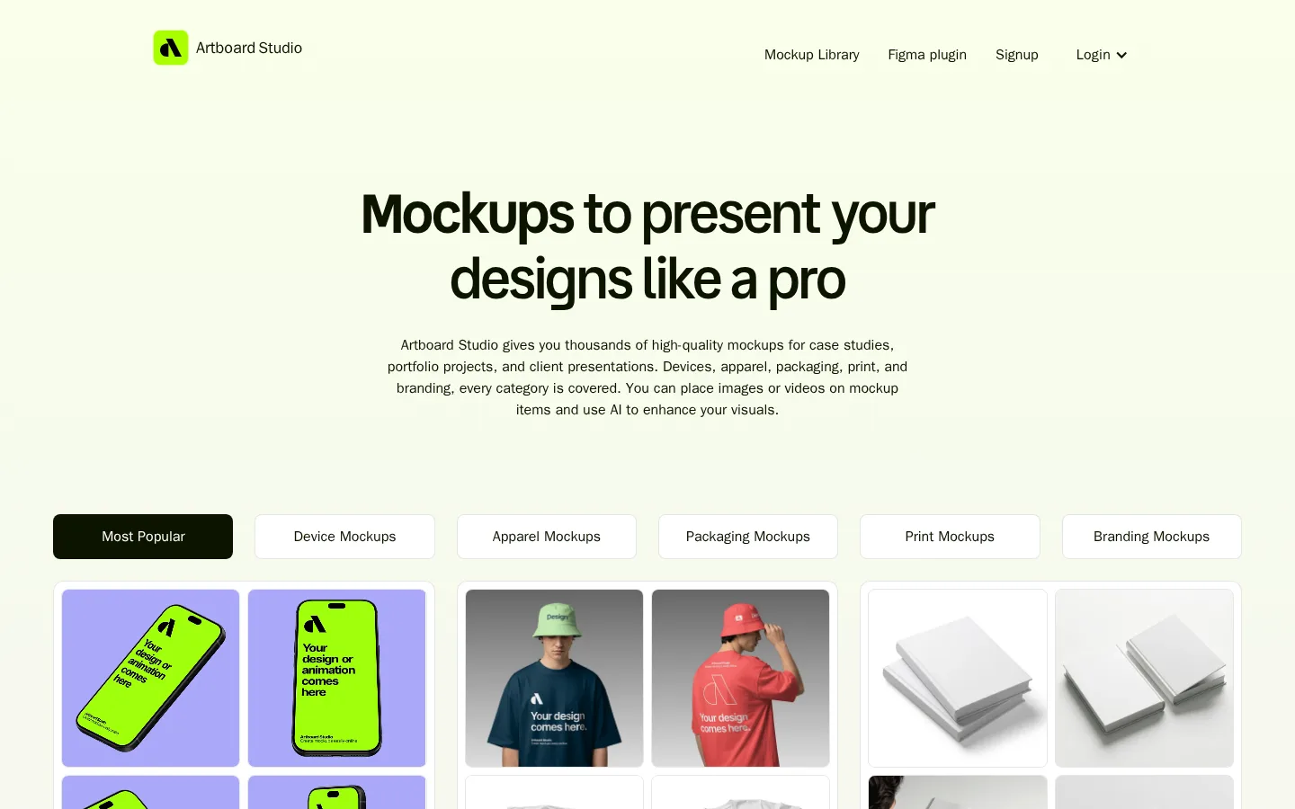
Centered Vend Sans headline with a restrained supporting paragraph and substantial open space before category browsing.
Category selector
Six horizontally aligned rounded controls; the active option uses #0d1400 with white text, while inactive options use a pale outline.
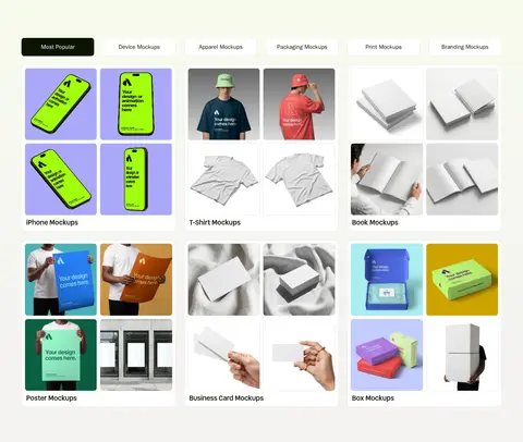
Mockup gallery cards
Dense multi-column groups of paired product previews with thin #e6e7e5 borders, rounded card corners, and category labels.
Feature showcase
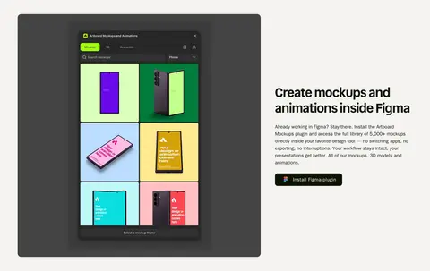
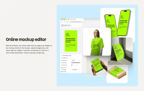
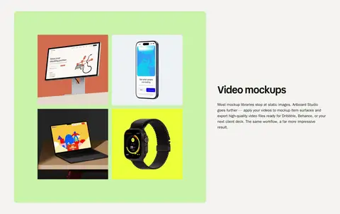
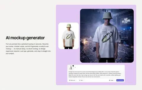
Alternating image-and-copy sections featuring editor screenshots, mockup collages, or video samples against pale section bands.
Primary action
Compact dark button with white system-ui text and rounded corners; use for actions such as installing the Figma plugin.
FAQ and footer
Two-column question list with simple chevrons, followed by a clean multi-column footer of small, text-led links.
Imagery · Realistic mockup photography and rendered product scenes dominate the gallery: phones, apparel, books, packaging, and print examples are shown in grouped cards. Feature sections use large editor screenshots and composed product collages, with video and AI examples presented as colorful visual panels. Keep image frames clean and rounded; let artwork retain its own saturated backgrounds rather than adding decorative overlays.
Use #0d1400 for high-contrast text and active actions.
Keep the hero centered and typographically prominent.
Let mockup artwork provide most saturated color.
Use thin #e6e7e5 outlines instead of shadows.
Alternate feature copy and visuals across roomy bands.
Keep navigation and supporting copy in system-ui.
✕ 不该做
Do not turn image-only colors into global UI accents.
Do not add heavy shadows or layered elevation.
Do not crowd the hero with extra controls.
Do not replace the airy feature rhythm with dense uniform sections.
Do not use decorative gradients beyond the measured pale wash.
Do not make inactive category controls visually compete with the active one.
给 AI 的提示词
想快速出一个同风格的新页面,把这段话连同 DESIGN.md 一起发给 AI。
Build a new Artboard Studio page with a quiet, editorial SaaS aesthetic. Use Gallery White (#ffffff) and the measured pale Lime Haze (#f9ffeb) to Warm Mist (#f4f3f2) wash for spacious section backgrounds; use Deep Olive Ink (#0d1400) for typography and primary actions, and Soft Divider (#e6e7e5) for card outlines. Set headings in Vend Sans or a close geometric sans substitute, with system-ui for body text and navigation. Create a centered hero, then a dense category-led mockup gallery; follow with generous alternating feature bands that showcase realistic product imagery and editor screens. Keep cards and buttons softly rounded, borders subtle, and shadows absent. Reserve Sky Panel (#cbedff), Fresh Lime (#caf3aa), and Apricot Panel (#ffe4c3) for artwork or visual examples rather than broad interface fills.