North star · Let one authentic, full-bleed workspace image carry the page, while keeping the overlaid message crisp, centered, and easy to act on.
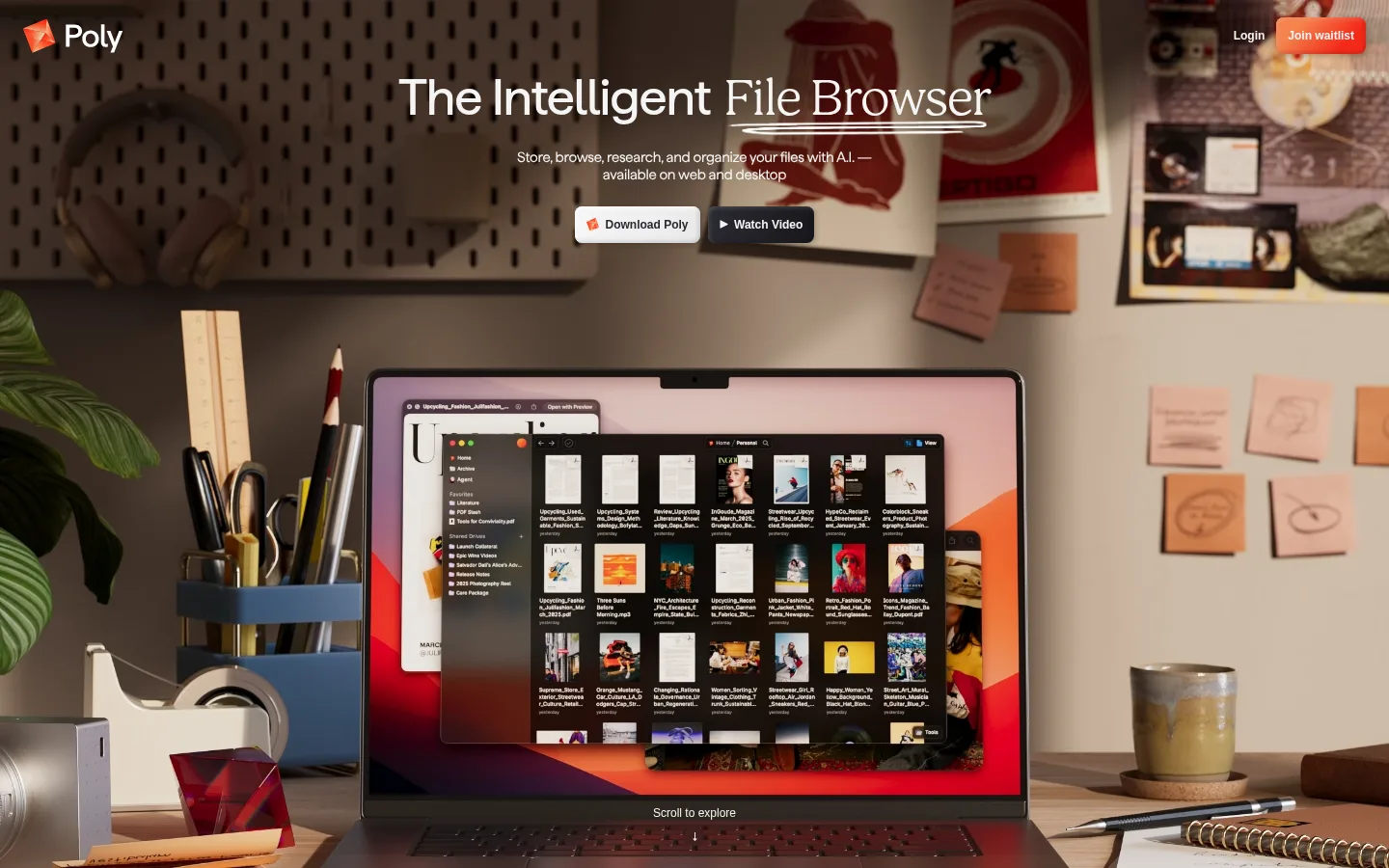
The first viewport uses a full-bleed photograph as its defining canvas: warm wood, paper, plants, and a laptop create a lived-in workspace rather than a sterile software backdrop. The measured palette identifies black, white, and pale gray as interface colors, but the screenshot’s dominant brown tones come from the photograph, not brand surfaces. White hero text sits over a darkened portion of the image for legibility. A centered headline and short supporting copy form a compact stack near the top, while two contrasting buttons sit directly below. The logo and small account actions occupy opposite ends of the top edge. Haffer Variable gives the headline a clean, contemporary shape; the page’s restrained typography leaves the product image to carry much of the visual detail. The composition is spacious in the upper area and dense around the large laptop near the bottom, with a small scroll cue inviting exploration.
配色
点色块复制色值。用途说明来自对页面的实测位置(背景、文字、描边、按钮)与截图判读。
强调色
表层色
中性色
页面底色 · Canvas Black表层 · Studio White主文字 · Soft Chalk次要文字 · Canvas Black弱文字 · Graphite Muted描边 · Quiet Silver强调 · Ember Orange强调 2 · Signal Vermilion
文字
背景
对比度
WCAG
#f4f4f4 Soft Chalk
#000000 Canvas Black
19.09:1
AAA
#f4f4f4 Soft Chalk
#ffffff Studio White
1.1:1
不达标
#000000 Canvas Black
#ffffff Studio White
21:1
AAA
#292930 Graphite Muted
#000000 Canvas Black
1.45:1
不达标
#292930 Graphite Muted
#ffffff Studio White
14.44:1
AAA
#f4824d Ember Orange
#000000 Canvas Black
8.15:1
AAA
字体
字号阶梯:Custom(比例约 1.871,正文 15px)。示例用免费替代字体渲染,数值为实测。
Aa 设计
Inter
系统字体 · 字重 400 / 600 · 占比 34%
免费替代:Inter
Compact utility text and small account or action labels
Aa 设计
Haffer
网络字体 · 字重 400 · 占比 31%
免费替代:Inter
Supporting body copy and concise explanatory text
Aa 设计
Haffer Variable
网络字体 · 字重 450 · 占比 26%
免费替代:Inter
Large hero headline and display messaging
Aa 设计
Bogue
网络字体 · 字重 400 · 占比 9%
免费替代:Cormorant Garamond
Secondary expressive serif accent, if needed for editorial emphasis
角色
示例
字号
字重
行高
字距
一级标题
Main centered hero headline over the workspace photograph.
Poly
52.5px
450
1.1
-0.02em
二级标题
Large secondary section heading below the opening viewport.
Poly
45px
450
1.1
-0.02em
正文
Short hero explanation and supporting product copy.
The quick brown fox 敏捷的狐狸
15px
400
1.2
-0.02em
辅助文字
Compact utility labels, button text, and scroll cue.
The quick brown fox 敏捷的狐狸
12px
400
1.5
0
间距与布局
基准单位 2px · 密度:适中
72px版块间距
6px元素间距
—卡片内边距
1428px内容最大宽度
2px
3px
5px
6px
9px
12px
18px
24px
72px
168px
The opening section fills the viewport with edge-to-edge photography, without a visible card grid. A small brand mark anchors the upper left while login and waitlist actions align to the upper right. The headline, explanatory copy, and paired actions form a centered stack in the upper portion; the laptop dominates the lower half. Measured page max width is 1428px, section gap 72px, and density is comfortable. Keep these relationships rather than adding arbitrary spacing values.
圆角与层次
链接 · 8px
inset · link
inset · link
sm · section
The composition is led by photography rather than raised cards. Keep interface elements visually light; the measured small section shadow is subtle, while the link treatment includes an inset-style shadow. Use borders sparingly, with the measured silver reserved for quiet separation rather than prominent outlines.
组件
下面的预览按实测的按钮、输入框、徽标、卡片样式重建(字体用替代字体)。
Brand mark
Small Poly logo at the upper-left edge, visible over the photograph without a separate solid header band.
Account actions
Compact Login text and Join waitlist action sit together at the top right; utility typography is measured in Inter at 12px and 600 weight.
Hero headline
Centered display line in Haffer Variable, measured at 52.5px with 450 weight, 1.1 line height, and tight tracking.
Hero copy
Short centered explanation beneath the title, set in measured 15px Haffer body text.
Primary and secondary actions
Download Poly uses a light button treatment; Watch Video contrasts with a dark treatment. Keep both compact and adjacent beneath the copy.
Scroll cue
Small centered 'Scroll to explore' label near the bottom of the hero image signals continuation.
Imagery · Use cinematic, realistic workspace photography as the primary visual: a laptop showing the product sits among desk tools, paper, plants, and wall references. Frame the scene wide and close enough for the screen interface to read as a product cue. Natural warm browns belong to the image, not the interface palette. The measured section also reports substantial video and image media.
Use one immersive workspace photo as the opening canvas.
Keep hero copy centered and concise.
Place the logo left and utility actions right.
Maintain strong text contrast over busy photography.
Let warm color come from the photograph, not added panels.
Keep the paired calls to action compact and adjacent.
✕ 不该做
Do not replace the hero photograph with a flat dark canvas.
Do not treat photographic browns as brand palette colors.
Do not add decorative cards around the hero copy.
Do not crowd the headline with secondary content.
Do not use large saturated accent fills across the page.
Do not invent spacing, sizes, or radii beyond measured values.
给 AI 的提示词
想快速出一个同风格的新页面,把这段话连同 DESIGN.md 一起发给 AI。
Build a new Poly-style page around one full-bleed, realistic workspace photograph, with a laptop or product context integrated naturally into the scene. Treat the warm browns as imagery, not interface colors. Overlay the opening message in Soft Chalk (#f4f4f4), keeping a centered Haffer Variable-style headline and concise supporting copy legible against the photograph. Use Canvas Black (#000000) and Graphite Muted (#292930) only for restrained dark treatments; reserve Ember Orange (#f4824d) and Signal Vermilion (#f42919) for small accent details. Put the logo at upper left and compact account actions at upper right. Place a light primary action and dark secondary action together below the copy. Preserve generous image area, clear hierarchy, subtle borders, and a small bottom scroll cue. Avoid card-heavy layouts and invented measurements.