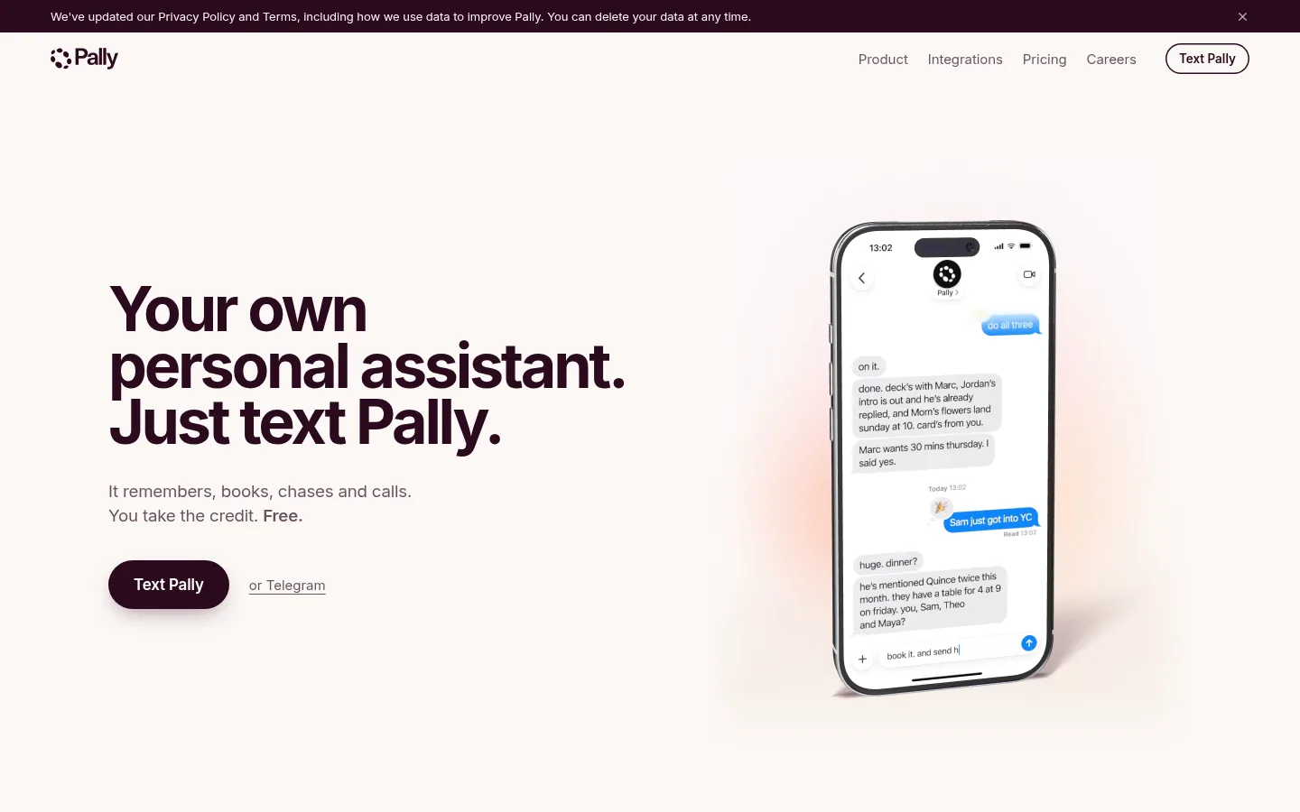
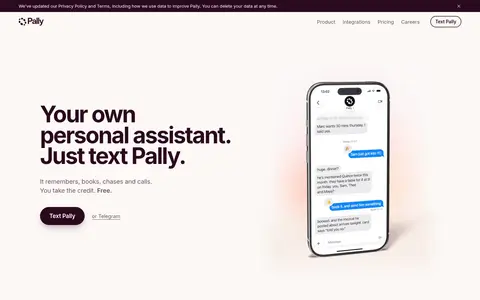
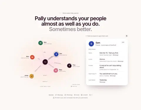
North star · Keep the page calm and spacious, using deep plum for hierarchy and blue only to spotlight real product interactions.
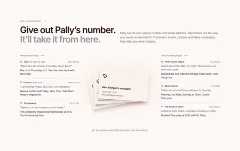
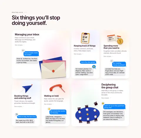
The page is built on a warm, nearly continuous canvas of #fcf8f6, with the pale #f8f0ec gradient appearing as a gentle backdrop rather than a strong section change. Deep plum #2a0a1e anchors the logo, large headlines, and main pill CTA; muted plum tones keep body copy and navigation quieter. Bright blue is reserved for message bubbles and occasional emphasis, making product interactions pop without turning the whole page into a bright interface. System sans-serif typography combines a very large, tightly tracked hero with compact, readable supporting copy. Sections unfold in a long, spacious editorial rhythm: left-aligned headlines, centered feature moments, split layouts, and modular rounded cards. Product imagery is mostly interface-focused, with phone mockups, message conversations, and small illustrative objects. Fine borders and restrained shadows define cards and controls while preserving the airy, soft-edged feel.
配色
点色块复制色值。用途说明来自对页面的实测位置(背景、文字、描边、按钮)与截图判读。
品牌色
强调色
表层色
中性色
功能色
页面底色 · Warm Canvas表层 · Card White表层 2 · Mist Surface主文字 · True Black次要文字 · Muted Plum弱文字 · Deep Plum描边 · Soft Divider强调 · Message Blue强调 2 · Signal Blue
文字
背景
对比度
WCAG
#000000 True Black
#fcf8f6 Warm Canvas
19.9:1
AAA
#000000 True Black
#ffffff Card White
21:1
AAA
#000000 True Black
#e9e6e8 Mist Surface
16.95:1
AAA
#68515e Muted Plum
#fcf8f6 Warm Canvas
6.8:1
AA
#68515e Muted Plum
#ffffff Card White
7.17:1
AAA
#68515e Muted Plum
#e9e6e8 Mist Surface
5.79:1
AA
字体
字号阶梯:Custom(比例约 1.897,正文 15px)。示例用免费替代字体渲染,数值为实测。
Aa 设计
-apple-system
系统字体 · 字重 400 / 600 / 500 / 700 · 占比 93%
免费替代:Inter
Primary site type for headings, navigation, body copy, links, and buttons.
Aa 设计
ui-monospace
系统字体 · 字重 400 / 700 · 占比 7%
免费替代:Roboto Mono
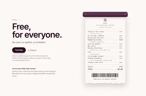
Code-like and receipt-style text inside product demonstrations.
角色
示例
字号
字重
行高
字距
一级标题
Oversized hero and major section headlines, including pricing and closing CTA.
Pally
54px
600
1.02
-0.04em
二级标题
Compact feature, card, and FAQ question headings.
The quick brown fox 敏捷的狐狸
21px
600
1.12
-0.028em
正文
Supporting descriptions, feature explanations, and longer copy.
The quick brown fox 敏捷的狐狸
15px
400
1.4
-0.01em
辅助文字
Small labels, annotations, and supporting interface details.
The quick brown fox 敏捷的狐狸
14.5px
400
1.3
-0.018em
按钮
CTA and interface-control labels.
The quick brown fox 敏捷的狐狸
13.5px
500
normal
-0.01em
导航
Header and footer navigation links.
The quick brown fox 敏捷的狐狸
15px
400
1.3
-0.008em
链接
Inline actions such as Telegram and recipe links.
The quick brown fox 敏捷的狐狸
15px
400
normal
0
代码
Monospaced receipt and product-demo text.
const style = 1;
13px
400
1.56
0
间距与布局
基准单位 2px · 密度:宽松
117px版块间距
8px元素间距
26px卡片内边距
1200px内容最大宽度
3px
4px
5px
6px
7px
8px
9px
10px
11px
12px
14px
16px
18px
20px
22px
24px
A spacious, long-form page sits within a measured maximum content width of 1200px. The hero uses a wide two-part composition, with left-aligned copy and a phone demonstration on the right. Later sections alternate between centered statements, split content, and modular feature cards; several use a multi-column layout. Section gaps are generous, and the measured element gap is 8px, giving small groups structure without crowding. Most sections keep the same canvas, so alignment, content grouping, and subtle rules create progression instead of strong color bands.
圆角与层次
按钮 · 9999px
卡片 · 28px
图片 · 14px
导航 · 50%
md · button
hairline · other
hairline · other
hairline · other
The page stays mostly flat, with fine pale borders marking card edges and section boundaries. White interface cards lift gently from the canvas using soft plum-tinted shadows; the main dark CTA has a stronger but still diffuse shadow. Rounded cards and message surfaces add depth through layering rather than heavy outlines or hard drop shadows.
组件
下面的预览按实测的按钮、输入框、徽标、卡片样式重建(字体用替代字体)。
Announcement strip
A narrow deep-plum notice band above the navigation, with small light text and a close control.
Pill navigation CTA
An outlined, rounded Text Pally control sits alongside understated navigation links.
Primary CTA
A deep-plum pill with white label, generous horizontal padding, and a soft plum-tinted shadow.
Message bubble
Rounded conversation bubbles use vivid blue for Pally or user messages and pale gray for replies.
Feature card
White, softly elevated card with a generous rounded shape, restrained copy, and an embedded product example.
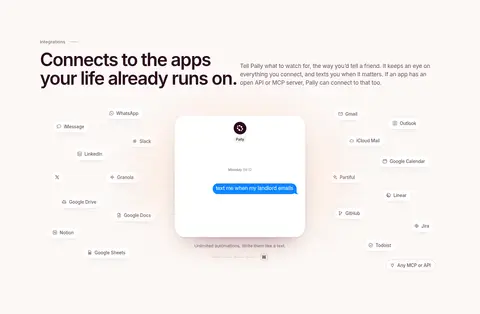
Integration orbit
A central product conversation is surrounded by small app labels, keeping integrations legible without a heavy logo wall.
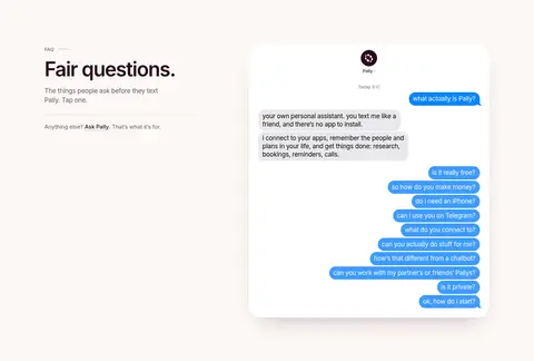
FAQ conversation demo
A large white messaging panel stacks compact questions and answers, with blue question bubbles providing clear interaction cues.
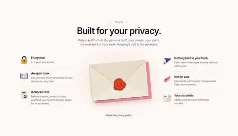
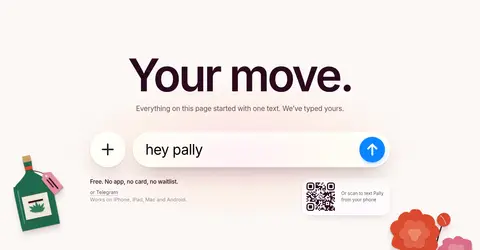
Imagery · The hero centers a realistic phone mockup showing a text conversation, while later sections use product-interface cards, message bubbles, relationship maps, app integrations, and a receipt-style pricing demo. Small decorative illustrations appear near the closing CTA and in feature cards. Imagery sits within the page's warm neutral palette, with blue reserved for message interactions; avoid introducing unrelated photography or strong visual filters.
Set key headlines and primary actions in deep plum.
Reserve vivid blue for message interactions and selective emphasis.
Use generous whitespace to separate the long-form sections.
Build feature content from rounded, softly elevated interface cards.
Use realistic product conversations as the main visual proof.
✕ 不该做
Do not replace the warm canvas with stark white or dark full-page bands.
Do not use blue as a broad background or dominant brand field.
Do not crowd sections or force every block into a dense grid.
Do not add harsh, high-contrast shadows or heavy borders.
Do not use decorative imagery that competes with product demonstrations.
Do not apply monospaced typography to general headings or body copy.
给 AI 的提示词
想快速出一个同风格的新页面,把这段话连同 DESIGN.md 一起发给 AI。
Build a new AI-assistant landing page in Pally’s warm, spacious visual language. Use Warm Canvas (#fcf8f6) as the main background, Deep Plum (#2a0a1e) for headlines and primary CTAs, and Card White (#ffffff) for elevated product panels. Keep Message Blue (#3e9bfe) focused on conversation bubbles and small interface accents; use Muted Plum (#68515e) for supporting copy and Soft Divider (#e2dbdc) for fine rules. Use a system sans-serif close to Inter, with a large tightly tracked headline and quiet readable body text. Structure the page as an editorial sequence of broad, well-separated sections, alternating split layouts, centered statements, and rounded feature cards. Show the product through phone and messaging-interface demonstrations, with restrained shadows and no visual clutter.