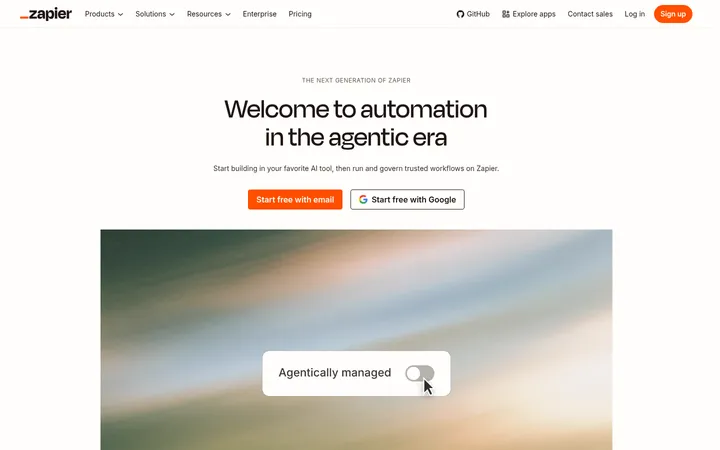
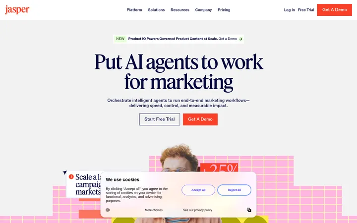
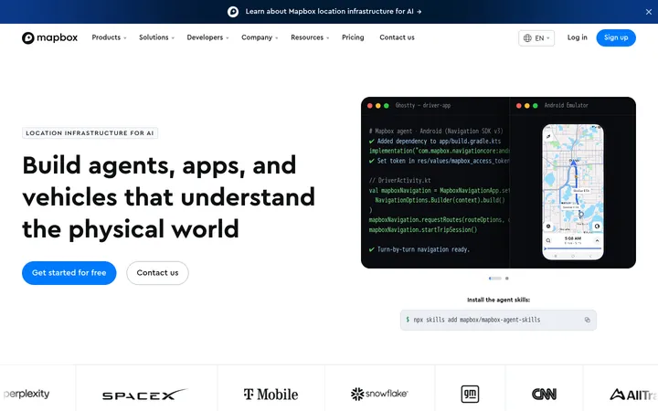
North star · Let generous white space and editorial serif headlines frame colorful map imagery, keeping interface color quiet and actions unmistakable.
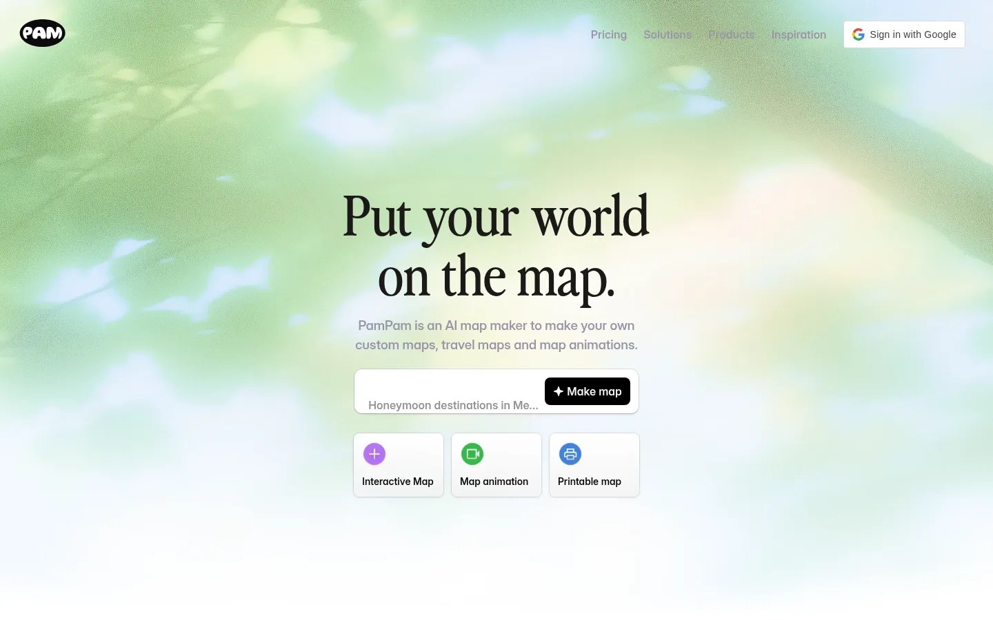
The homepage uses a white canvas and generous open space to make the map-making product feel calm and approachable. A large, high-contrast serif headline anchors the hero, while Inter provides legible supporting copy, navigation, controls, and template labels. The first screen layers its centered message and compact map-making input over a pale green, blue, and cream atmospheric image; that image supplies most of the vivid color, rather than the interface chrome. Across the rest of the page, product previews, template cards, editorial feature sections, FAQ rows, and a final CTA form a long, low-density sequence. Warm cream section and footer surfaces create gentle transitions without competing with map artwork. Blue is reserved for key actions, while muted lavender-gray handles much of the secondary text and navigation. Thin dividers, restrained card shadows, and soft corners keep controls distinct without making the page feel heavy.
Body copy, navigation, buttons, labels, and links.
Aa 设计
nineties
网络字体 · 字重 400 · 占比 16%
免费替代:Cormorant Garamond
Display, H1, H2, and H3 editorial headings.
Aa 设计
-apple-system
系统字体 · 字重 400 / 600 · 占比 8%
免费替代:Inter
Some navigation, product-card text, badges, and link labels.
角色
示例
字号
字重
行高
字距
特大标题
Oversized editorial display headings where present.
PamPam
80px
400
1.08
0
一级标题
Centered hero headline, “Put your world on the map.”
PamPam
48px
400
1.08
0
二级标题
Major section headings, such as templates and FAQ.
PamPam
28px
400
1.08
0
三级标题
Subsection and feature headings.
The quick brown fox 敏捷的狐狸
24px
400
1.08
0
正文
Supporting descriptions and explanatory section copy.
The quick brown fox 敏捷的狐狸
16px
550
1.5
0
辅助文字
Small template descriptions and media notes.
The quick brown fox 敏捷的狐狸
14px
550
1.43
0
按钮
Primary and secondary action labels.
The quick brown fox 敏捷的狐狸
16px
550
1.5
0
导航
Header and footer navigation links.
The quick brown fox 敏捷的狐狸
16px
550
1.5
0
链接
Text links within sections and product navigation.
The quick brown fox 敏捷的狐狸
16px
550
1.5
0
间距与布局
基准单位 8px · 密度:适中
64px版块间距
12px元素间距
12px卡片内边距
912px内容最大宽度
2px
4px
8px
10px
12px
16px
20px
24px
28px
32px
56px
64px
72px
A centered, single-page marketing layout uses a measured maximum content width of 912px, while the hero artwork runs full bleed. Center-align the hero and key conversion moments; use narrower editorial text blocks and orderly card grids for templates and examples. The measured spacing system is based on an 8px unit, with a 64px section gap and 12px element gap. Keep section density comfortable: long stretches of white canvas separate product imagery, category cards, FAQ rows, and the warm footer band.
圆角与层次
卡片 · 8px
图片 · 10px
徽标 · 9999px
链接 · 16px
sm · card
inset · text
sm · text
hairline · nav
The page is mostly flat, with section separation achieved through white space and occasional warm surface bands. Use subtle card shadows and thin gray borders to distinguish product previews and controls from the canvas. Keep layering restrained; rounded corners soften cards and media, while badges use pill-like forms.
组件
下面的预览按实测的按钮、输入框、徽标、卡片样式重建(字体用替代字体)。
Header navigation
Lightweight horizontal links sit over the hero image; muted lavender-gray navigation is balanced by a compact sign-in control.
Hero map prompt
Centered serif headline and muted explanatory copy sit above a bordered prompt field with a black Make map action.
Map format cards
Three compact cards introduce interactive, animated, and printable maps with small colored icons and concise labels.
Map preview
A rounded product screenshot presents the map editor and map artwork as the central visual proof of the tool.
Template gallery
A multi-column set of map-template previews uses restrained card framing, short titles, and muted descriptions.
FAQ list
A narrow stack of text questions uses fine horizontal dividers and plus indicators instead of heavy accordion cards.
Conversion CTA
Centered closing headline, supporting copy, and paired actions use blue for the primary action and a quiet secondary link.
Footer
A warm parchment band holds the brand mark and grouped link columns in small, subdued text.
Imagery · Use broad, atmospheric map-inspired imagery in the hero, with pale greens, blue, and cream fading into white. Product visuals should appear as framed map-editor previews and template thumbnails, preserving their varied cartographic colors rather than imposing a uniform tint. Keep image corners softly rounded and avoid decorative 3D embellishment. The measured screenshot’s vivid colors largely belong to artwork and product mockups, not the core interface palette.
Use a generous white canvas around each content block.
Set major headings in the distinctive editorial serif.
Keep navigation and supporting copy calm and muted.
Let map artwork carry most of the page’s color.
Use blue selectively for the primary conversion action.
Separate long sections with open space and warm surface bands.
✕ 不该做
Do not turn every section into a boxed card.
Do not apply the map artwork palette to interface chrome.
Do not use heavy shadows or thick borders.
Do not crowd the centered hero with extra content.
Do not replace the serif display voice with generic sans headings.
Do not invent additional brand colors or decorative gradients.
给 AI 的提示词
想快速出一个同风格的新页面,把这段话连同 DESIGN.md 一起发给 AI。
Build a new PamPam-style page with a calm, editorial SaaS feel. Use Gallery White (#ffffff) as the primary canvas, Warm Parchment (#faf2ec) for occasional section bands, and Ink Black (#000000) for strong text and dark actions. Use Lavender Haze (#9894a8) for secondary navigation and copy; reserve Signal Blue (#4b72f3) for the main CTA. Pair an expressive serif display face with Inter-style sans-serif UI text. Center the main message, keep content comfortably narrow, and allow generous breathing room between sections. Use map imagery as the colorful focal point, with rounded product previews and restrained borders or shadows. Favor clear text links, compact cards, and thinly divided FAQ rows; avoid dense layouts and ornamental UI.