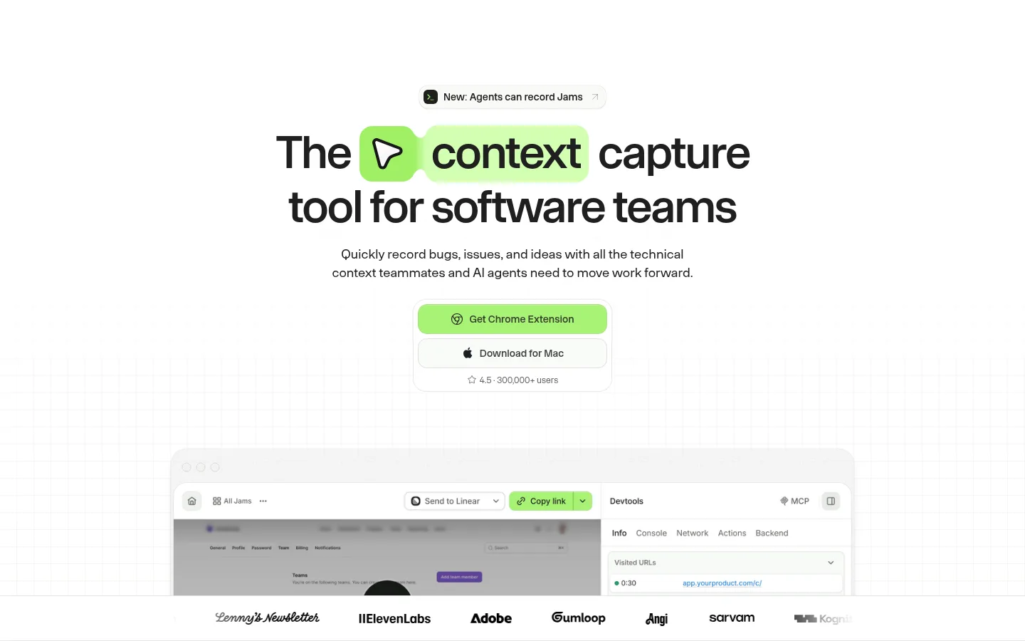
Jam 用宽敞明亮的首页介绍屏幕录制与调试产品,并以醒目的青柠绿操作按钮和深色开发者专区形成视觉对比。产品界面图、紧凑的功能卡片和清晰的行动入口,让技术能力显得直观易懂。
North star · Keep the page airy and product-led, using lime only to direct attention and dark sections to distinguish developer-focused content.
The page is built on a near-white canvas, with charcoal typography and pale, warm-gray panels keeping the main experience calm and legible. Lime green is reserved for high-priority actions and small product highlights; occasional violet and blue accents appear as supporting details rather than a competing palette. Onsite Standard’s clean sans-serif character supports large, tightly tracked headlines, while body copy stays moderate in size and muted in color. A centered hero introduces the product above a large recording-interface showcase, then broad content sections alternate between split introductions, pale product cards, and compact feature grids. Product screenshots are the primary imagery: framed as interface demonstrations rather than decorative illustrations. Lower on the page, nearly black developer sections reverse the palette and use dark cards to spotlight technical integrations. Rounded controls, restrained shadows, and fine grid-like backgrounds add depth without clutter.
配色
点色块复制色值。用途说明来自对页面的实测位置(背景、文字、描边、按钮)与截图判读。
强调色
表层色
中性色
功能色
页面底色 · Gallery White表层 · Pale Sage表层 2 · Soft Charcoal表层 3 · Night Ink表层 4 · Silver Ash主文字 · Soft Charcoal次要文字 · Quiet Graphite弱文字 · Silver Ash强调 · Jam Lime强调 2 · Fresh Leaf强调 3 · Orchid Signal
Oversized hero headline and high-impact section statements.
Jam
64px
500
1
-0.04em
一级标题
Primary section headings and page-level titles.
Jam
40px
500
1.2
-0.02em
二级标题
Compact secondary headings within content sections.
The quick brown fox 敏捷的狐狸
24px
500
normal
-0.03em
三级标题
Feature-card and product-panel titles.
The quick brown fox 敏捷的狐狸
20px
500
1.4
-0.02em
正文
Explanatory copy, descriptions, and supporting paragraphs.
The quick brown fox 敏捷的狐狸
16px
400
1.5
0
辅助文字
Small labels, metadata, and interface annotations.
The quick brown fox 敏捷的狐狸
14px
500
1.43
0
链接
Navigation links and secondary text actions.
The quick brown fox 敏捷的狐狸
14px
500
1.43
0
间距与布局
基准单位 8px · 密度:适中
64px版块间距
8px元素间距
—卡片内边距
1180px内容最大宽度
3px
4px
8px
12px
14px
16px
17px
20px
24px
25px
30px
32px
48px
64px
120px
Use a centered content column with a measured maximum width of 1180px. The hero is centered and generous, with its message, supporting copy, CTA stack, and product screenshot arranged vertically. Below it, alternate broad split-intro sections with feature grids and product showcases. Maintain a comfortable density and clear whitespace between sections; the measured section rhythm is 64px. Use a restrained three-column footer structure, and reserve full-width dark bands for developer-focused content.
圆角与层次
按钮 · 12px
卡片 · 16px
图片 · 18px
导航 · 18px
链接 · 12px
sm · card
inset · link
sm · card, button
md · card
Most surfaces feel flat, with pale card fills and subtle, measured shadows to separate product panels from the canvas. Buttons and links use restrained inset or fine shadow treatments rather than heavy outlines. Layer screenshots as overlapping interface windows, keeping elevation soft and focused on product demonstrations.
组件
下面的预览按实测的按钮、输入框、徽标、卡片样式重建(字体用替代字体)。
Primary CTA
Lime-filled button in #a7f374 with blue #0000ee text, rounded 12px corners, and a subtle inset edge; used for the extension download.
Secondary download link
Light or unfilled control with blue link text, rounded 12px corners, and a restrained inset shadow.
Announcement pill
Compact pale #f9faf7 announcement control with blue text, rounded corners, and a small icon.
Feature card
Pale sage #f9faf7 card with rounded 16px corners and a very soft shadow; pairs a product visual with concise copy.
Product showcase
Large interface screenshot displayed in a softly rounded frame, often layered over a faint grid or pale background.
Dark developer card
Charcoal panel within a near-black band, presenting technical interface imagery, a short heading, and supporting text.
Footer columns
Light footer with brand mark and grouped product, company, and contact links arranged in three columns.
Imagery · Use real-looking product interface captures as the main visual asset, framed inside clean, softly rounded panels. Show enough interface detail to communicate recording and debugging workflows, with layered windows where useful. Avoid decorative stock photography; small icons and colorful interface details should remain subordinate to the product UI. Dark sections use screen captures against near-black backdrops.
Use lime green for primary actions and selective emphasis.
Give product screenshots ample whitespace and clear framing.
Alternate feature cards with broader split-layout sections.
Use dark bands for developer and agent-focused stories.
Keep body copy muted, readable, and concise.
✕ 不该做
Do not fill the page with saturated accent colors.
Do not use heavy borders or dramatic shadows on every card.
Do not let decorative imagery overpower the product interface.
Do not compress the hero and section spacing.
Do not carry light-page styling unchanged into dark developer bands.
Do not introduce unsupported palette colors.
给 AI 的提示词
想快速出一个同风格的新页面,把这段话连同 DESIGN.md 一起发给 AI。
Build a new page in Jam’s clean, product-led style. Use Gallery White (#ffffff) as the main canvas, Soft Charcoal (#202020) for strong typography, and Quiet Graphite (#626461) for supporting copy. Reserve Jam Lime (#a7f374) for the primary action; use Pale Sage (#f9faf7) for quiet cards. Structure the page around a centered hero, a prominent product-interface showcase, and alternating feature grids or split sections. Keep generous whitespace and use the measured 1180px content maximum and 64px section rhythm. Use rounded controls and subtle shadows rather than thick borders. Add a near-black Night Ink (#050605) band only where technical or developer content benefits from a clear visual change. Product screenshots should explain workflows, not serve as decoration.