Raycast 以近黑色画布和克制的界面装饰,衬托鲜明的产品视觉,让效率启动器显得直接而有质感。页面先用宽松、居中的内容讲述产品,再逐步转向密集的功能演示与模块化卡片。
North star · Keep the interface nearly black and quiet so crisp white copy and luminous product demonstrations become the focal point.
The page is built on a near-black canvas (#07080a), with white headlines and soft gray supporting text carrying most of the interface. Dark charcoal surfaces and delicate borders define navigation, cards, and product UI without breaking the continuous background. A small, deep-blue accent appears in product artwork rather than acting as a broad interface color; the hero’s red and blue light is likewise atmospheric imagery, not a basis for recoloring controls. Inter is the dominant typeface: clean, contemporary, and mostly sentence case, with a measured hierarchy from centered hero copy to compact labels. The opening is deliberately sparse and centered, leaving substantial dark space around the statement and CTA. Lower sections alternate between wide product showcases, split layouts, and card grids. Generous section intervals contrast with information-rich interface mockups. Soft inset highlights and thin outlines add just enough depth to make the product imagery feel tangible.
配色 点色块复制色值。用途说明来自对页面的实测位置(背景、文字、描边、按钮)与截图判读。
品牌色
Midnight Canvas
#07080a
Dominant page canvas and continuous background across the homepage.
强调色
Deep Signal Blue
#052f6c
Accent within product card artwork; keep it localized rather than using as a general CTA color.
表层色
Graphite Edge
#161718
Subtle card surfaces, borders, and interface dividers against the canvas.
Blackened Ink
#040406
Deep card and mockup interiors, giving layered product surfaces near-black contrast.
Slate Gray
#434345
Raised dark controls, card details, and subdued text within interface samples.
Shadow Graphite
#202123
Fine outlines and borders around media and product cards.
Panel Charcoal
#1a1b1d
Dark badges and compact UI panels in product demonstrations.
Deep Smoke
#121212
Lower tonal area in a dark radial background treatment.
Carbon Shade
#0d0d0d
Near-black gradient endpoint and quiet background depth.
Blue Black
#070b11
Very dark blue-black shading inside card artwork, not a broad UI color.
Iron Gray
#262626
Occasional dark card and media detail, supporting subtle tonal separation.
Warm Charcoal
#2f3031
Muted button and interface text, plus restrained charcoal gradient detail.
中性色
Clean White
#ffffff
Primary headlines, body copy, UI mockup labels, and light CTA text.
Muted Steel
#6a6b6c
Quiet supporting copy, secondary labels, and subdued badge text.
Soft Silver
#9c9c9d
Secondary navigation and links, plus muted supporting interface copy.
Ash Gray
#555657
Subtle badge and secondary text within dense product UI.
文字 背景 对比度 WCAG #ffffff Clean White#07080a Midnight Canvas20.04:1 AAA #ffffff Clean White#161718 Graphite Edge17.95:1 AAA #ffffff Clean White#040406 Blackened Ink20.48:1 AAA #ffffff Clean White#434345 Slate Gray9.87:1 AAA #6a6b6c Muted Steel#07080a Midnight Canvas3.75:1 AA-large #6a6b6c Muted Steel#161718 Graphite Edge3.36:1 AA-large
字体 字号阶梯:Major Third(比例约 1.26,正文 16px)。示例用免费替代字体渲染,数值为实测。
Aa 设计
Inter 网络字体 · 字重 500 / 400 / 600 · 占比 86%
免费替代:Inter
Primary site typeface for headings, body copy, links, navigation, and buttons.
Aa 设计
Segoe UI Variable 系统字体 · 字重 400 / 500 · 占比 6%
免费替代:Inter
System-style text within select product interface controls and mockups.
Aa 设计
GeistMono 网络字体 · 字重 500 / 400 / 300 · 占比 5%
免费替代:JetBrains Mono
Code-like and technical interface labels.
Aa 设计
SF Pro Text 系统字体 · 字重 500 / 700 · 占比 3%
免费替代:Inter
Keyboard key labels and keycap-style product illustrations.
角色 示例 字号 字重 行高 字距 一级标题 Centered hero statement and primary page headlines.
Raycast
32px 400 1.15 0 二级标题 Section titles introducing feature stories and product areas.
The quick brown fox 敏捷的狐狸
24px 500 1.6 0.008em 三级标题 Feature-card titles and smaller subsections.
The quick brown fox 敏捷的狐狸
20px 500 normal 0.01em 正文 Supporting descriptions and explanatory product copy.
The quick brown fox 敏捷的狐狸
16px 500 1.6 0 辅助文字 Compact notes, labels, and metadata beneath controls or media.
The quick brown fox 敏捷的狐狸
13px 400 normal 0.008em 按钮 Prominent CTA text, with light download buttons as the clearest action.
The quick brown fox 敏捷的狐狸
24px 500 1.6 0.008em 链接 Navigation, inline actions, and secondary calls to action.
The quick brown fox 敏捷的狐狸
14px 500 1.6 0.014em 代码 Technical labels and code-like UI details in product mockups.
const style = 1;
14px 500 1.6 0.021em
间距与布局 基准单位 4px · 密度:宽松
224px 版块间距
8px 元素间距
— 卡片内边距
1204px 内容最大宽度
3px
4px
8px
10px
12px
15px
16px
20px
24px
Use a spacious, centered composition with content constrained to the measured 1204px maximum width. The hero is a single centered column with large breathing room, while later areas shift into wide media showcases, split feature stories, and multi-column card arrangements. The measured grid varies by section, from compact columns to broad twelve-column layouts, so let content determine structure instead of forcing one template. Keep section transitions generous and density low outside product mockups, where small interface details can cluster tightly.
圆角与层次 inset · other, card
inset · other, card, link
lg · link
sm · media
The page is mostly flat, relying on fine dark borders and inset highlights rather than strong drop shadows. Product cards and mockups sit slightly above the canvas through tonal contrast, subtle internal reflections, and restrained edge shadows. Reserve brighter glow for the white download CTA and select illustrative media.
组件 下面的预览按实测的按钮、输入框、徽标、卡片样式重建(字体用替代字体)。
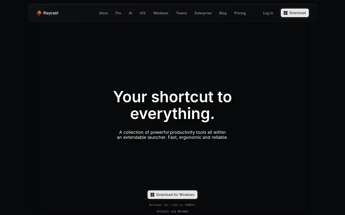
Top navigation A long, dark rounded navigation bar with the Raycast mark, understated links, and a light Download button at the right.
Hero CTA Centered white headline and muted supporting copy over atmospheric red-blue artwork, followed lower down by a light Windows download button and quiet platform notes.
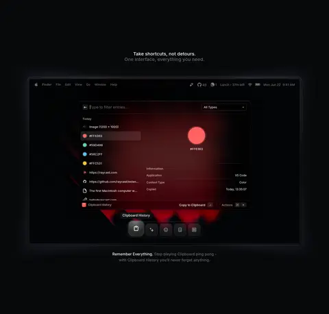
Product showcase Large dark product window framed with a fine edge and soft depth, with dense launcher UI and concise explanatory copy nearby.
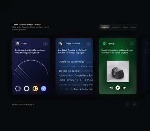
Extension cards Product-specific cards arranged in a horizontal browsing grid, combining dark surfaces, app identity, short descriptions, and vivid individual artwork.
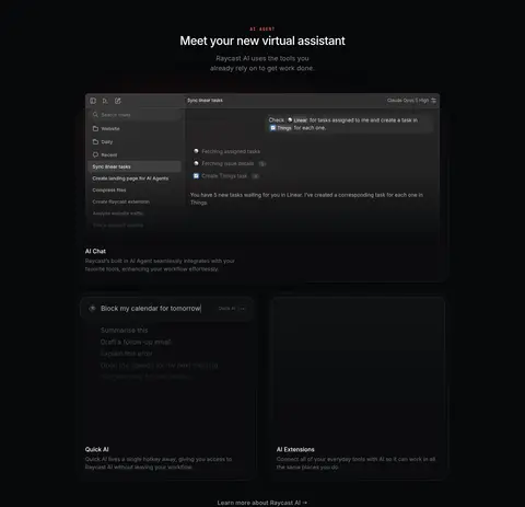
AI feature panels One wide assistant interface demonstration followed by smaller feature panels, using charcoal UI surfaces and compact labels.
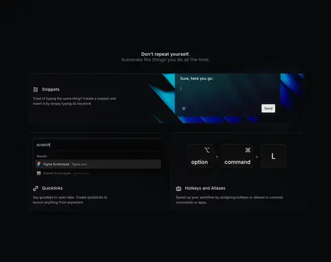
Feature tiles Split and grid-based tiles that combine short explanatory copy with focused screenshots, keycaps, or interface fragments.
Imagery · Use interface mockups, product screenshots, and abstract luminous artwork rather than conventional lifestyle photography. Frame launcher windows and feature cards as dark, dimensional objects against the black page, with restrained edge lighting and visible UI detail. Red and blue glow appears in selected hero and community artwork; blue also appears in some illustration details. Treat these colors as local imagery, not global brand fills.
页面版块 共 10 个版块,按页面从上到下排列,每个都标了类型、布局和交互套路。
该做与不该做 ✓ 该做 Use #07080a as the continuous page canvas. Make primary copy crisp white and supporting copy subdued gray. Use generous empty space around major section headings. Show the product through detailed, dark interface mockups. Keep bright red and blue glow confined to artwork. Use fine borders and inset highlights to define dark surfaces. ✕ 不该做 Do not introduce bright color bands across the full page. Do not turn every card into a strongly elevated panel. Do not crowd the hero with navigation, badges, or extra copy. Do not use heavy shadows that overpower product detail. Do not apply the illustration blue as a universal CTA color. Do not force all sections into a single repeated grid. 给 AI 的提示词 想快速出一个同风格的新页面,把这段话连同 DESIGN.md 一起发给 AI。
复制 Build a new Raycast-style productivity page on a continuous Midnight Canvas (#07080a). Use Clean White (#ffffff) for the main message, Soft Silver (#9c9c9d) and Muted Steel (#6a6b6c) for secondary navigation and supporting copy, and Graphite Edge (#161718) for subtle borders and surfaces. Set type in Inter with a clear, restrained hierarchy. Start with a spacious centered hero and a light download CTA; then vary the composition across product showcases, split feature areas, and modular cards. Use dark, detailed interface mockups as the main imagery. Keep red and blue glow confined to artwork, with Deep Signal Blue (#052f6c) used only as a localized illustration accent. Add depth through thin outlines and inset highlights, not heavy shadows.
DESIGN.md Tailwind v4 CSS 变量 Design Tokens
---
title: "Raycast design system"
variant: extended
source: https://www.raycast.com/
captured_at: 2026-10-12
theme: dark
industry: productivity
generator: Design DNA (https://four.wiralomi.com/style/raycast-com)
ai_generated: true
ai_label: "本文件由 AI 辅助生成:数值取自公开网页的实测样式,命名、用途说明与建议为模型解读。商标归原所有者。 / AI-assisted content"
---
# Raycast · Design System
> A cinematic dark canvas for tools that move at shortcut speed.
**Theme:** dark · **Industry:** productivity · **Source:** https://www.raycast.com/ · **Captured:** 2026-10-12 (1440×900 desktop)
_AI-assisted content: values are measured from the public page at capture time; names, roles and guidance are model-written interpretations. Trademarks belong to their owners._
Raycast pairs a near-black canvas and restrained interface chrome with vivid product visuals to make a productivity launcher feel immediate and tactile. Spacious, centered storytelling gives way to dense product demonstrations and modular feature cards as the page unfolds.
## North star
Keep the interface nearly black and quiet so crisp white copy and luminous product demonstrations become the focal point.
## Overview
The page is built on a near-black canvas (## Colors
| Name | Hex | Token | Group | Role |
|---|---|---|---|---|
| Midnight Canvas | ` | `--color-midnight-canvas` | brand | Dominant page canvas and continuous background across the homepage. |
| Clean White | ` | `--color-clean-white` | neutral | Primary headlines, body copy, UI mockup labels, and light CTA text. |
| Graphite Edge | ` | `--color-graphite-edge` | surface | Subtle card surfaces, borders, and interface dividers against the canvas. |
| Muted Steel | ` | `--color-muted-steel` | neutral | Quiet supporting copy, secondary labels, and subdued badge text. |
| Soft Silver | ` | `--color-soft-silver` | neutral | Secondary navigation and links, plus muted supporting interface copy. |
| Blackened Ink | ` | `--color-blackened-ink` | surface | Deep card and mockup interiors, giving layered product surfaces near-black contrast. |
| Slate Gray | ` | `--color-slate-gray` | surface | Raised dark controls, card details, and subdued text within interface samples. |
| Shadow Graphite | ` | `--color-shadow-graphite` | surface | Fine outlines and borders around media and product cards. |
| Panel Charcoal | ` | `--color-panel-charcoal` | surface | Dark badges and compact UI panels in product demonstrations. |
| Deep Smoke | ` | `--color-deep-smoke` | surface | Lower tonal area in a dark radial background treatment. |
| Carbon Shade | ` | `--color-carbon-shade` | surface | Near-black gradient endpoint and quiet background depth. |
| Blue Black | ` | `--color-blue-black` | surface | Very dark blue-black shading inside card artwork, not a broad UI color. |
| Iron Gray | ` | `--color-iron-gray` | surface | Occasional dark card and media detail, supporting subtle tonal separation. |
| Warm Charcoal | ` | `--color-warm-charcoal` | surface | Muted button and interface text, plus restrained charcoal gradient detail. |
| Deep Signal Blue | ` | `--color-deep-signal-blue` | accent | Accent within product card artwork; keep it localized rather than using as a general CTA color. |
| Ash Gray | ` | `--color-ash-gray` | neutral | Subtle badge and secondary text within dense product UI. |
### Semantic aliases
`--color-canvas` → ` (Midnight Canvas) · `--color-surface` → ` (Graphite Edge) · `--color-surface-2` → ` (Blackened Ink) · `--color-surface-3` → ` (Slate Gray) · `--color-text` → ` (Clean White) · `--color-text-muted` → ` (Muted Steel) · `--color-text-subtle` → ` (Soft Silver) · `--color-border` → ` (Graphite Edge) · `--color-accent` → ` (Deep Signal Blue)
### Contrast (WCAG 2.x)
| Text | Background | Ratio | Level |
|---|---|---|---|
| ` | ` | 20.04:1 | AAA |
| ` | ` | 17.95:1 | AAA |
| ` | ` | 20.48:1 | AAA |
| ` | ` | 9.87:1 | AAA |
| ` | ` | 3.75:1 | AA-large |
| ` | ` | 3.36:1 | AA-large |
| ` | ` | 3.84:1 | AA-large |
| ` | ` | 1.85:1 | fail |
| ` | ` | 7.3:1 | AAA |
| ` | ` | 6.54:1 | AA |
### Gradients
- `radial-gradient(75% 75% at 50% 91.9%, rgb(18, 18, 18) 0%, rgb(13, 13, 13) 100%)`
- `radial-gradient(85.77% 49.97% at 51% 5.12%, rgba(255, 150, 150, 0.11) 0%, rgba(222, 226, 255, 0.08) 45.83%, rgba(241, 242, 255, 0.02) 100%), none`
- `radial-gradient(rgb(47, 48, 49) 0.5px, rgba(0, 0, 0, 0) 0px)`
- `linear-gradient(45deg, rgb(12, 13, 15) 0%, rgb(7, 8, 10) 100.67%)`
## Typography
| Family | Token | Source | Weights | Role | Free substitute |
|---|---|---|---|---|---|
| Inter | `--font-body` | webfont | 500, 400, 600 | Primary site typeface for headings, body copy, links, navigation, and buttons. | Inter |
| Segoe UI Variable | `--font-segoe-ui-variable` | system | 400, 500 | System-style text within select product interface controls and mockups. | Inter |
| GeistMono | `--font-mono` | webfont | 500, 400, 300 | Code-like and technical interface labels. | JetBrains Mono |
| SF Pro Text | `--font-sf-pro-text` | system | 500, 700 | Keyboard key labels and keycap-style product illustrations. | Inter |
- **Inter:** Use clean sentence case, restrained tracking, and mostly regular-to-medium weights; let scale and whitespace establish hierarchy.
- **Segoe UI Variable:** Keep utility copy compact and neutral, matching the understated product UI.
- **GeistMono:** Reserve monospaced text for technical snippets and interface details; measured tracking is slightly open.
- **SF Pro Text:** Medium-weight labels appear inside tactile keycaps; retain title case or lowercase labels as shown.
### Type scale — Major Third (ratio ≈ 1.26, base 16px)
| Role | Size | Weight | Line height | Letter spacing | Case | Family | Used for |
|---|---|---|---|---|---|---|---|
| h1 | 32px | 400 | 1.15 | 0 | — | Inter | Centered hero statement and primary page headlines. |
| h2 | 24px | 500 | 1.6 | 0.008em | — | Inter | Section titles introducing feature stories and product areas. |
| h3 | 20px | 500 | normal | 0.01em | — | Inter | Feature-card titles and smaller subsections. |
| body | 16px | 500 | 1.6 | 0 | — | Inter | Supporting descriptions and explanatory product copy. |
| caption | 13px | 400 | normal | 0.008em | — | Inter | Compact notes, labels, and metadata beneath controls or media. |
| button | 24px | 500 | 1.6 | 0.008em | — | Inter | Prominent CTA text, with light download buttons as the clearest action. |
| link | 14px | 500 | 1.6 | 0.014em | — | Inter | Navigation, inline actions, and secondary calls to action. |
| code | 14px | 500 | 1.6 | 0.021em | — | GeistMono | Technical labels and code-like UI details in product mockups. |
OpenType features in use: `"calt", "kern", "liga", "ss03"` , `"liga" 0, "ss02", "ss08"` , `"ss09"` .
## Spacing & layout
- Base unit **4px**, density **spacious**.
- Scale (most used values): 3, 4, 8, 10, 12, 15, 16, 20, 24 px.
- Section rhythm 224px · element gap 8px · card padding — · max content width 1204px.
Use a spacious, centered composition with content constrained to the measured 1204px maximum width. The hero is a single centered column with large breathing room, while later areas shift into wide media showcases, split feature stories, and multi-column card arrangements. The measured grid varies by section, from compact columns to broad twelve-column layouts, so let content determine structure instead of forcing one template. Keep section transitions generous and density low outside product mockups, where small interface details can cluster tightly.
## Shape & elevation
- Radius: button `4px` · card `16px` · media `50%` · badge `6px` · link `12px` · xs `3px` · sm `4px` · md `5px` · lg `6px` · xl `8px` · 2xl `11px` · pill `9999px`
- Shadow `inset` (other, card): `rgba(0, 0, 0, 0.4) 0px 1.5px 0.5px 2.5px, rgb(0, 0, 0) 0px 0px 0.5px 1px, rgba(0, 0, 0, 0.25) 0px 2px 1px 1px inset, rgba(255, 255, 255, 0.2) 0px 1px 1px 1px inset, rgba(0, 0, 0, 0) 0px 0px 0px 0px in`
- Shadow `inset-2` (other, card, link): `rgb(27, 28, 30) 0px 0px 0px 1px, rgb(7, 8, 10) 0px 0px 0px 1px inset`
- Shadow `lg` (link): `rgba(215, 201, 175, 0.05) 0px 0px 20px 5px, rgba(215, 201, 175, 0.05) 0px 0px 16px -7px`
- Shadow `sm` (media): `rgba(0, 0, 0, 0.28) 0px 1.189px 2.377px 0px`
- Shadow `inset-3` (other): `rgba(255, 255, 255, 0.05) 0px 1px 0px 0px inset, rgba(255, 255, 255, 0.25) 0px 0px 0px 1px, rgba(0, 0, 0, 0.2) 0px -1px 0px 0px inset`
- Shadow `sm-2` (other, card, button): `rgba(0, 0, 0, 0.03) 0px 7px 3px 0px, rgba(0, 0, 0, 0.25) 0px 4px 4px 0px`
- Motion: standard transition `0.3s ease` on interactive elements.
The page is mostly flat, relying on fine dark borders and inset highlights rather than strong drop shadows. Product cards and mockups sit slightly above the canvas through tonal contrast, subtle internal reflections, and restrained edge shadows. Reserve brighter glow for the white download CTA and select illustrative media.
## Imagery
Use interface mockups, product screenshots, and abstract luminous artwork rather than conventional lifestyle photography. Frame launcher windows and feature cards as dark, dimensional objects against the black page, with restrained edge lighting and visible UI detail. Red and blue glow appears in selected hero and community artwork; blue also appears in some illustration details. Treat these colors as local imagery, not global brand fills.
## Components
### Top navigation
A long, dark rounded navigation bar with the Raycast mark, understated links, and a light Download button at the right.
### Hero CTA
Centered white headline and muted supporting copy over atmospheric red-blue artwork, followed lower down by a light Windows download button and quiet platform notes.
### Product showcase
Large dark product window framed with a fine edge and soft depth, with dense launcher UI and concise explanatory copy nearby.
### Extension cards
Product-specific cards arranged in a horizontal browsing grid, combining dark surfaces, app identity, short descriptions, and vivid individual artwork.
### AI feature panels
One wide assistant interface demonstration followed by smaller feature panels, using charcoal UI surfaces and compact labels.
### Feature tiles
Split and grid-based tiles that combine short explanatory copy with focused screenshots, keycaps, or interface fragments.
### Measured component styles
- **Primary button** (“Download”): background ## Do
- Use ## Don't
- Do not introduce bright color bands across the full page.
- Do not turn every card into a strongly elevated panel.
- Do not crowd the hero with navigation, badges, or extra copy.
- Do not use heavy shadows that overpower product detail.
- Do not apply the illustration blue as a universal CTA color.
- Do not force all sections into a single repeated grid.
## Agent prompt
Build a new Raycast-style productivity page on a continuous Midnight Canvas (## Page sections (top to bottom)
| # | Type | Layout | UX patterns | UI patterns |
|---|---|---|---|---|
| 1 | hero | Single-column centered hero with a compact navigation bar above and CTA below the message. | Download CTA, Platform note, Secondary install link | Large centered headline, Atmospheric glow artwork, Light button on dark canvas |
| 2 | product-showcase | Centered section heading above a wide launcher interface demonstration. | Product demonstration, Feature explanation | Wide dark mockup, Fine media outline, Compact interface details |
| 3 | feature-split | Wide split composition with left-aligned message and supporting product visuals. | Download link, Benefit-led copy | Sparse dark layout, Keyboard illustration, Low-contrast supporting details |
| 4 | integrations | Section intro followed by horizontally arranged extension cards and browsing controls. | Category browsing, Extension discovery, Browse-more link | Individual app artwork, Dark card surfaces, Compact card descriptions |
| 5 | feature-grid | Centered heading above one broad assistant panel and two smaller supporting panels. | AI feature exploration, Learn-more link | Dark UI mockups, Two-level panel layout, Compact labels and controls |
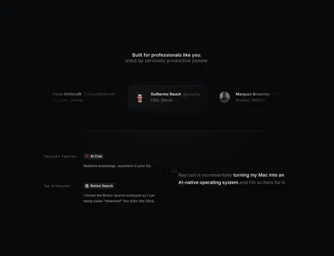
| 6 | testimonials | Centered social-proof heading followed by a compact, multi-column testimonial presentation. | Customer proof, Selectable featured content | Profile portraits, Short attribution lines, Dark testimonial surfaces |
| 7 | feature-grid | Centered section heading above one wide feature row and two smaller tiles. | Feature discovery, Keyboard shortcut examples | Snippet demonstration, Search-style interface, Large keycap labels |
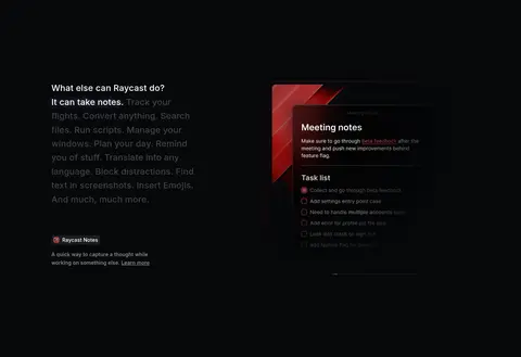
| 8 | feature-split | Text-led split layout with a feature list beside a focused note-taking mockup. | Expandable feature list, Learn-more link | Contrasting text emphasis, Dark app preview, Small product badge |
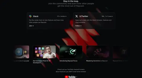
| 9 | other | Centered introduction, two community cards, then a horizontal row of video thumbnails. | Community links, Social follow actions, Video discovery | Dark social cards, Thumbnail gallery, Localized red-blue glow |
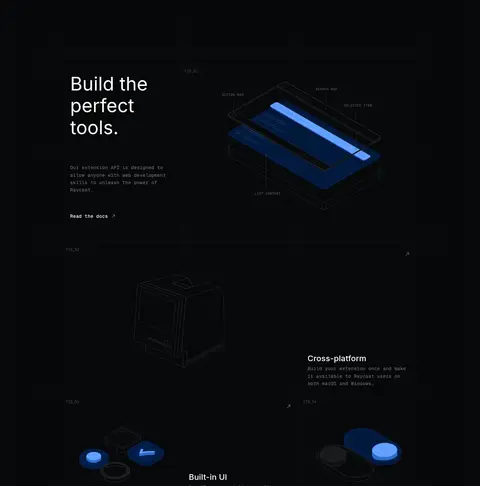
| 10 | other | A wide, multi-panel product story with asymmetric text and technical illustrations. | Documentation link, Platform feature exploration | Large editorial heading, Blueprint-like product art, Thin panel dividers |
## Source CSS custom properties (selected)
```css
--spacing-none: 0px;
--spacing-0-5: 4px;
--spacing-1: 8px;
--spacing-1-5: 12px;
--spacing-2: 16px;
--spacing-2-5: 20px;
--spacing-3: 24px;
--spacing-4: 32px;
--spacing-5: 40px;
--spacing-6: 48px;
--spacing-7: 56px;
--spacing-8: 64px;
--spacing-9: 80px;
--spacing-10: 96px;
--spacing-11: 112px;
--spacing-12: 168px;
--spacing-13: 224px;
--main-font: "Inter", "Inter Fallback", sans-serif;
--monospace-font: "jetBrainsMono", "jetBrainsMono Fallback", Menlo, Monaco, Courier, monospace;
--grid-gap: 32px;
--background: