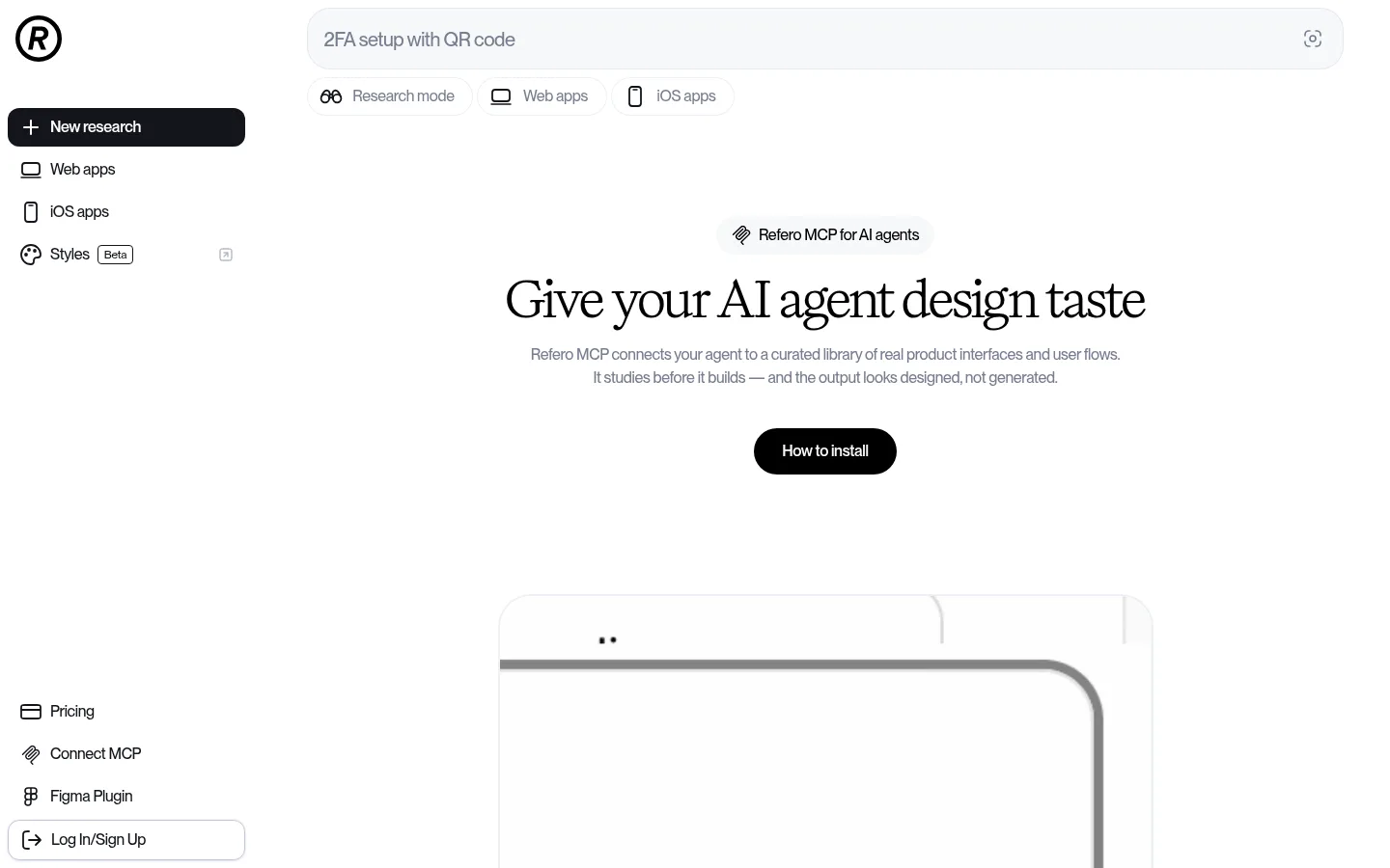
North star · Keep the shell monochrome and spacious; let the serif hero and real product-interface examples provide the visual character.
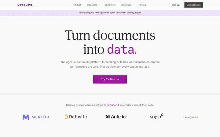
The page uses Gallery White (#ffffff) as its dominant canvas, keeping the interface bright and unhurried. Near-black (#13151b) anchors the selected navigation item, primary actions, and compact brand details; pure black (#000000) carries the most prominent text. Two muted text colours distinguish softer supporting copy from stronger secondary reading, while Pale Line (#eef0f6) and muted borders keep controls and content regions defined without heavy boxes. Typography creates the key contrast: a distinctive, regular-weight serif headline sits above compact sans-serif body copy and bold utility labels. A fixed-feeling vertical rail organizes navigation beside a broad central content column. Sections alternate open editorial text with softly tinted feature panels and product-interface imagery. The product demonstrations supply most of the page’s colour, so keep the surrounding UI neutral. Whitespace and subtle hairlines, rather than saturated backgrounds or dramatic shadows, establish hierarchy.
配色
点色块复制色值。用途说明来自对页面的实测位置(背景、文字、描边、按钮)与截图判读。
品牌色
表层色
中性色
页面底色 · Gallery White主文字 · Pure Ink次要文字 · Soft Slate弱文字 · Deep Slate描边 · Pale Line
Navigation, body copy, controls, section headings, and most interface text.
Aa 设计
Title
网络字体 · 字重 400 · 占比 2%
免费替代:DM Serif Display
Large hero headline and expressive display text.
Aa 设计
monospace
系统字体 · 字重 500 · 占比 1%
免费替代:Roboto Mono
Installation commands and code-like snippets.
角色
示例
字号
字重
行高
字距
一级标题
Centered hero headline introducing the MCP product.
Refero
50px
400
1.2
-0.02em
二级标题
Major explanatory, installation, and pricing section headings.
Refero
40px
500
1.2
-0.03em
三级标题
Feature-card and secondary content headings.
The quick brown fox 敏捷的狐狸
25px
500
1.28
-0.025em
四级标题
Compact subheadings within instructions and supporting content.
The quick brown fox 敏捷的狐狸
20px
600
1.4
-0.022em
正文
Explanatory paragraphs, descriptions, and navigation copy.
The quick brown fox 敏捷的狐狸
16px
500
1.5
-0.02em
辅助文字
Small labels, supporting notes, and compact metadata.
The quick brown fox 敏捷的狐狸
14px
500
1.43
-0.02em
按钮
Navigation actions and primary or secondary CTA labels.
The quick brown fox 敏捷的狐狸
16px
500
1.5
-0.02em
链接
Inline references and navigational text links.
The quick brown fox 敏捷的狐狸
16px
500
1.5
-0.02em
代码
Install command snippets and technical instructions.
const style = 1;
15px
500
1.6
-0.021em
间距与布局
基准单位 4px · 密度:适中
48px版块间距
8px元素间距
—卡片内边距
—内容最大宽度
4px
8px
12px
16px
22px
23px
24px
32px
48px
53px
57px
59px
96px
A slim vertical navigation rail sits left of a broad central content area, with a search-like bar and filter chips near the top. The hero is centered, while later editorial sections use a narrower reading column and feature content expands into paired cards. The measured page is comfortably spaced, with recurring section gaps and open white intervals. Keep content alignment deliberate: centered for the hero and mostly left-aligned for informational sections. Avoid inventing a fixed maximum width; preserve the screenshot’s generous side margins and responsive breathing room.
圆角与层次
按钮 · 12px
图片 · 32px
徽标 · 4px
链接 · 12px
sm · button, other
hairline · media
inset · text
inset · other
The page is predominantly flat: white canvas, subtle section panels, and thin pale borders do most of the separating. Controls may use a very restrained cool-tinted shadow, and media can carry a faint outline or inset edge. Keep layering quiet; reserve the near-black fill for selected navigation and key CTA emphasis.
组件
下面的预览按实测的按钮、输入框、徽标、卡片样式重建(字体用替代字体)。
Side navigation
Vertical icon-and-label rail; selected New research action uses #13151b with white text, while other links remain quiet.
Hero
Centered product label, large regular serif headline, muted explanatory copy, and a dark rounded How to install CTA.
Search and filters
Pale, rounded search field with prompt text and adjacent compact chips for research mode and app categories.
Feature cards
Paired pale panels combine interface imagery with concise headings and supporting copy; imagery carries any strong colour.
Installation timeline
Sequential setup steps use concise labels, small explanatory text, and compact action controls.
Pricing panel
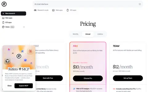
Soft-tinted wide panel pairs a plan-benefit list with billing selection, price display, and a dark sign-in CTA.
Outlined controls
Secondary account action and small status badge use quiet outlines, restrained radii, and near-black text.
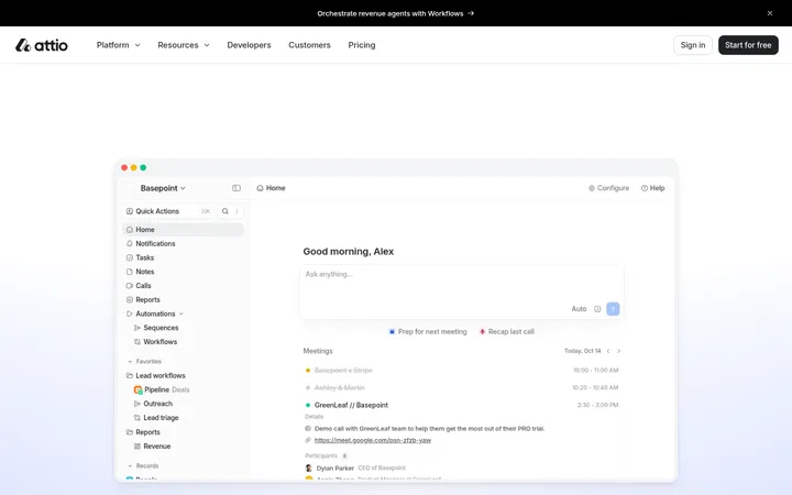
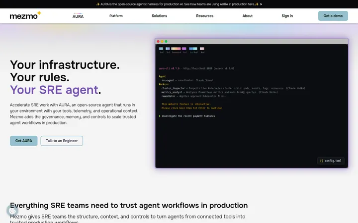
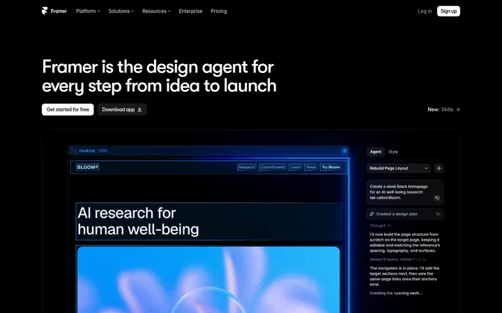
Imagery · Use product-interface demonstrations rather than generic lifestyle photography. The top media area presents a restrained, mostly white interface preview; later feature cards show design canvases, app examples, and AI research output. Some preview imagery is colorful and dense, but that colour belongs to product illustrations, not the surrounding brand palette. Frame previews in soft pale panels with rounded media corners and minimal decoration.
Keep the overall canvas white and the interface monochrome.
Use the editorial serif only for display moments.
Maintain clear contrast between hero headings and muted supporting copy.
Give informational sections generous whitespace.
Use pale borders instead of heavy card outlines.
Let product screenshots carry their own illustrative colour.
✕ 不该做
Do not introduce a bright brand accent that is absent from the measured palette.
Do not turn every section into a boxed card.
Do not use heavy shadows or dramatic gradients.
Do not set all headings in the display serif.
Do not let colorful mockups dictate the page chrome.
Do not crowd the hero or informational reading column.
给 AI 的提示词
想快速出一个同风格的新页面,把这段话连同 DESIGN.md 一起发给 AI。
Build a new Refero-style AI product page with a white Gallery White (#ffffff) canvas and a restrained, editorial interface. Anchor navigation in a narrow left rail; keep the main content broad, centered for the hero and comfortably narrow for long-form sections. Use a regular serif display face for the main headline, Base-Variable-style sans-serif for navigation, body, and controls, and monospace only for technical snippets. Set primary actions in Night Graphite (#13151b) with white labels. Use Soft Slate (#777d90) and Deep Slate (#525769) for supporting text, Pale Line (#eef0f6) for subtle separators, and Mist Panel (#f7f8fb) for quiet surfaces. Keep borders and shadows faint. Show authentic interface previews in softly framed panels; their internal colours must not become new page-brand accents. Preserve generous whitespace and crisp hierarchy.