North star · Let one cinematic, full-bleed product photograph lead; keep the warm ivory interface sparse and legible over it.
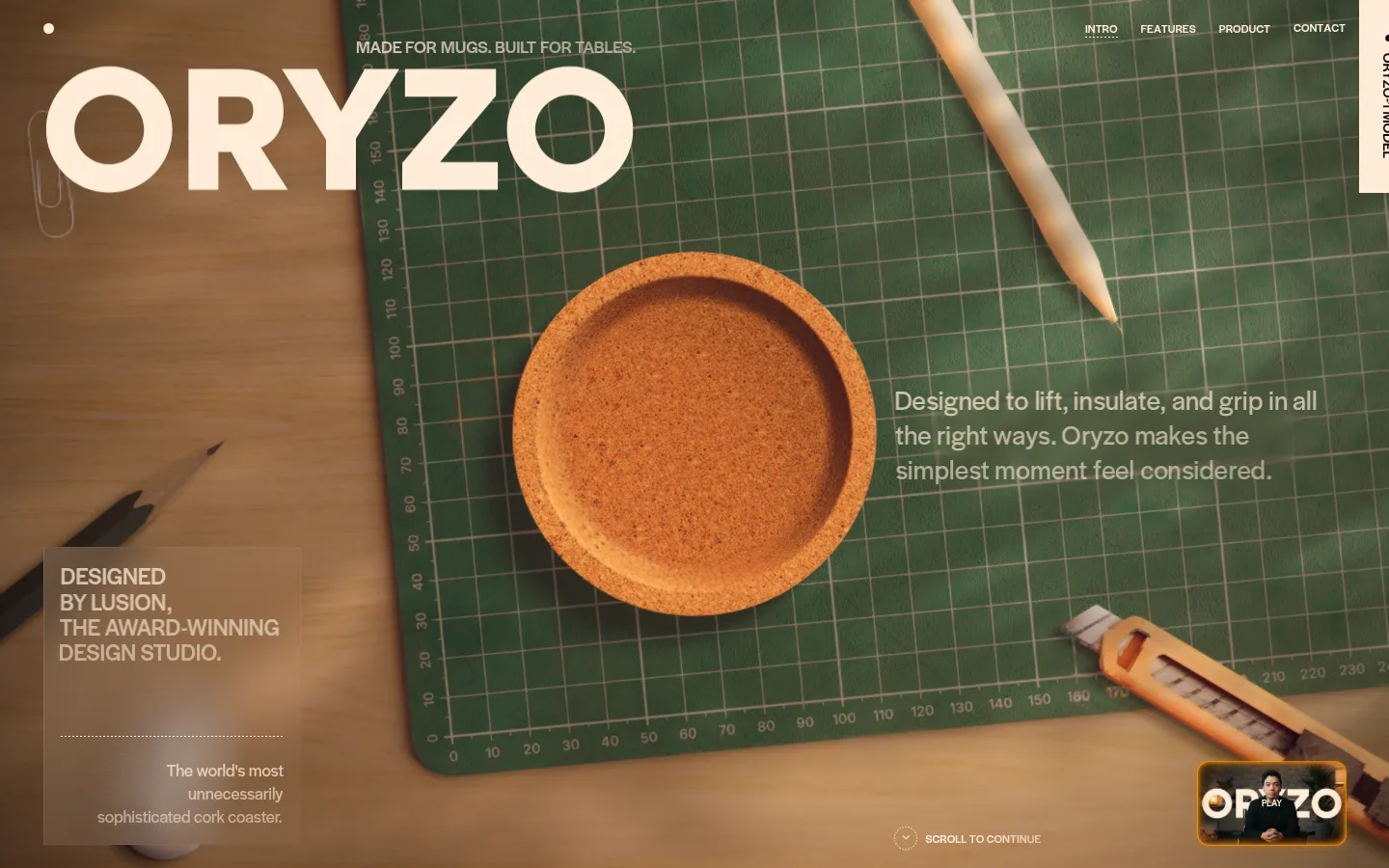
The visual identity is anchored by a near-black brown canvas (#100904) and warm, pale ivory text (#ffedd7). In the opening viewport, the ivory wordmark and navigation sit over a cinematic, edge-to-edge workshop photograph; the image’s green cutting mat, cork, wood, and tools supply the dominant earthy hues, rather than acting as additional interface palette colours. Halyard Display Variable carries the typography throughout, shifting from an oversized, regular-weight wordmark to small uppercase navigation and captions, with readable sentence-case supporting copy. The layout treats the viewport as a composed product still: branding occupies the upper left, navigation the upper right, product and copy share the central area, and a small studio note sits low on the left. Elements float directly over the image instead of occupying a conventional card grid. Dotted rules and subtle overlays add structure while leaving the photography in control.
Wordmark, navigation, headings, body copy, and uppercase captions.
角色
示例
字号
字重
行高
字距
一级标题
Large ORYZO wordmark over the upper-left hero image.
ORYZO AI
28.5px
400
1.26
0
二级标题
Uppercase section or product headings where present.
The quick brown fox 敏捷的狐狸
24px
500
1.09
0
正文
Sentence-case product description and supporting studio copy.
The quick brown fox 敏捷的狐狸
18px
400
1.33
0
辅助文字
Compact uppercase studio credit and editorial labels.
The quick brown fox 敏捷的狐狸
12px
500
1
0
导航
Small uppercase links aligned across the hero’s upper-right edge.
The quick brown fox 敏捷的狐狸
12px
500
1
0
间距与布局
基准单位 2px · 密度:适中
—版块间距
8px元素间距
—卡片内边距
—内容最大宽度
2px
8px
9px
10px
12px
18px
24px
45px
Treat the opening viewport as a full-bleed photographic canvas rather than a centered content container. Overlay the wordmark at upper left and a compact horizontal navigation at upper right; balance the product image with a short copy block toward the right. A small editorial credit anchors the lower-left area, with a scroll cue near the bottom. Keep content sparse and let large areas of dark canvas create a deliberate, quiet rhythm. Measurements do not establish a max-width or section-gap value.
圆角与层次
md · other
inset · other
The interface is mostly flat, relying on image contrast and placement rather than cards or borders. A subtle translucent dark backing helps the lower-left studio note read over the photograph; a dotted horizontal rule provides a quiet divider. Measured orange glows may come from product or media details, so do not turn them into general elevation styling.
组件
下面的预览按实测的按钮、输入框、徽标、卡片样式重建(字体用替代字体)。
Hero wordmark
Oversized, regular-weight warm ivory lettering over the upper-left area of the workshop photograph.
Hero navigation
Compact uppercase links in warm ivory, placed along the upper-right edge over the image.
Product description
Short, sentence-case copy over the right side of the hero, kept visually subordinate to the coaster.
Studio credit
Small uppercase editorial note in a subtly backed lower-left image overlay, followed by a dotted divider and brief supporting copy.
Scroll cue
Small low-contrast indicator and label near the bottom edge, inviting the visitor to continue.
Video thumbnail
Small media preview near the lower-right edge, framed as a detail rather than a primary CTA.
Imagery · Use tactile, carefully staged product photography: the hero shows a cork coaster on a gridded cutting mat among workshop tools. Frame it as an overhead tabletop scene, full bleed, with warm directional light and a restrained cinematic finish. Earthy greens, wood, and cork belong to the photograph, not the measured interface palette. A small video-style thumbnail appears near the bottom edge.
Make the product photograph the hero’s focal point.
Keep navigation uppercase, compact, and unobtrusive.
Layer text directly over imagery with careful contrast.
Use earthy image colours as photography, not extra UI tokens.
✕ 不该做
Do not invent extra interface palette hex values.
Do not replace the hero with a card-based layout.
Do not add bright gradients or decorative colour bands.
Do not crowd the hero with lengthy copy.
Do not mistake image-derived green and cork tones for measured brand colours.
Do not add heavy shadows or prominent borders.
给 AI 的提示词
想快速出一个同风格的新页面,把这段话连同 DESIGN.md 一起发给 AI。
Build a new page in ORYZO’s cinematic product-editorial style. Use Roasted Umber (#100904) for the measured dark canvas and Warm Parchment (#ffedd7) for interface text; do not promote colours found only in product photography into UI tokens. Lead with one large, full-bleed, tactile product photograph, then overlay a bold wordmark, discreet uppercase navigation, and a concise supporting copy block. Use Halyard Display Variable when available, with DM Sans as a free substitute; combine regular and medium weights and keep labels uppercase. Favor direct image overlays, sparse editorial captions, and subtle dotted separators over cards, grids, or decorative borders. Preserve generous visual breathing room, maintain readable contrast, and let the product remain the primary focus.