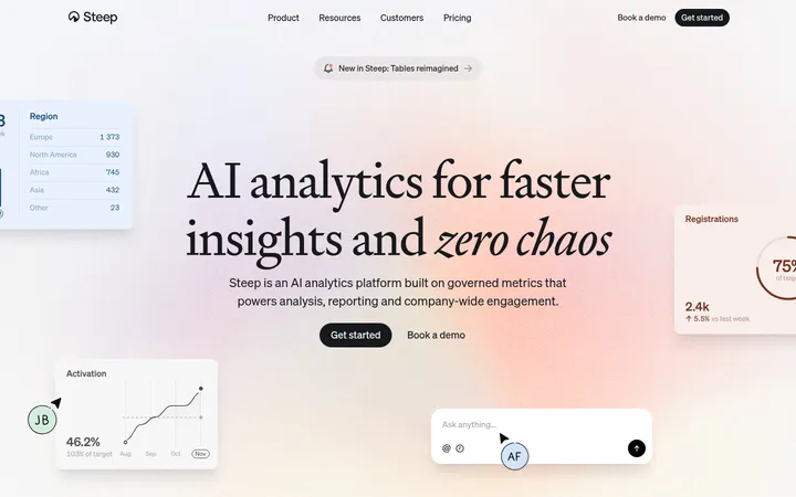
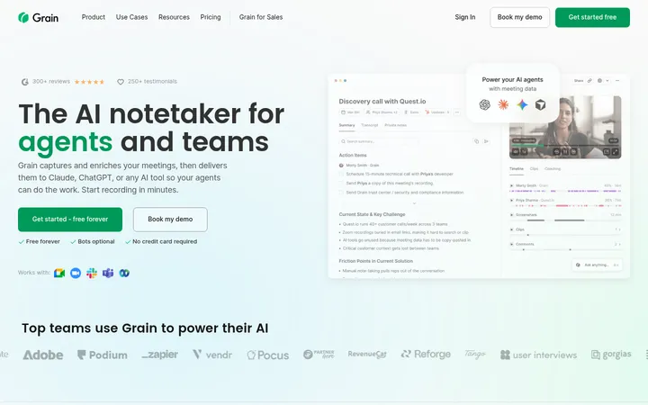
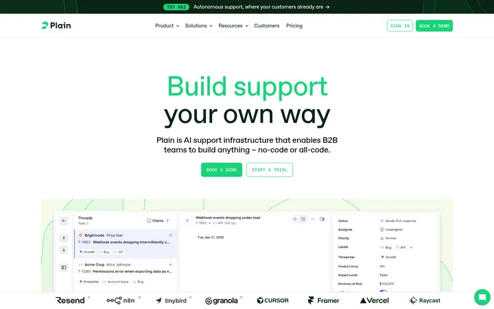
North star · Use spacious white and warm-neutral breathing room to frame bold indigo product bands, with gradients reserved for high-value emphasis.
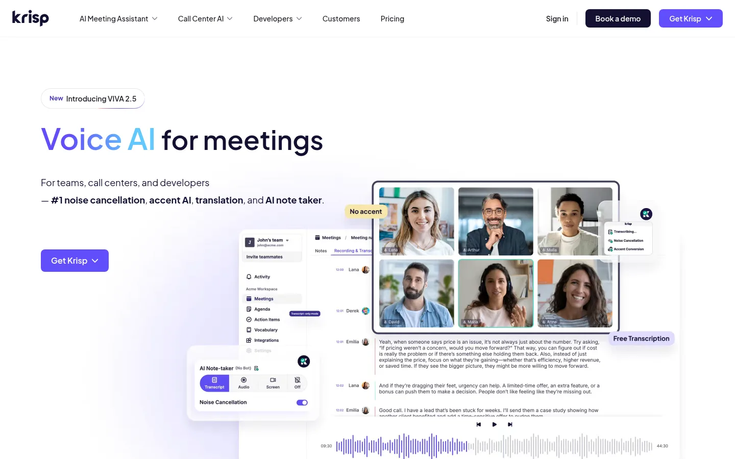
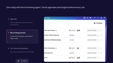
The page alternates a clean white canvas with large deep-indigo feature bands, then returns to warm beige and pale gray sections for testimonials, workflow cards, and security content. Vivid violet and blue gradients highlight select headline phrases, links, and primary actions rather than covering the whole interface. Plus Jakarta Sans carries the system throughout: headings are bold and sentence-case, while body copy remains readable and understated. A wide centered content frame supports the roomy hero, multi-column feature areas, and product demonstrations. Screenshots of the real interface provide the main visual evidence, with meeting-call imagery and integration logos adding context. Cards use pale fills, rounded corners, and restrained borders; sections rely more on strong color blocks and whitespace than decorative framing. The result balances a friendly, high-contrast technology brand with practical product clarity.
All headings, body copy, navigation, buttons, links, and captions.
角色
示例
字号
字重
行高
字距
一级标题
Hero headline and the main page-level statement.
Krisp
48px
600
normal
0
二级标题
Major section headings across features, security, and FAQs.
Krisp
42px
600
1.33
0
三级标题
Feature headings and nested product-content titles.
Krisp
36px
600
1.5
0
四级标题
Supporting subsection and card headings.
The quick brown fox 敏捷的狐狸
26px
400
1.62
0
正文
Paragraphs, product explanations, and testimonial copy.
The quick brown fox 敏捷的狐狸
16px
400
1.75
0
辅助文字
Compact labels, metadata, and small supporting text.
The quick brown fox 敏捷的狐狸
14px
600
1.86
0
按钮
Primary and secondary action labels.
The quick brown fox 敏捷的狐狸
16px
600
1.75
0
导航
Header navigation labels and menu items.
The quick brown fox 敏捷的狐狸
14px
500
1.43
0
链接
Inline links and supporting navigational actions.
The quick brown fox 敏捷的狐狸
16px
400
1.75
0
间距与布局
基准单位 8px · 密度:宽松
120px版块间距
16px元素间距
32px卡片内边距
1280px内容最大宽度
4px
6px
8px
12px
16px
18px
20px
24px
30px
32px
40px
75px
80px
100px
120px
Use a centered content frame capped at the measured 1280px, with generous page margins and a spacious section rhythm. The hero is a left-aligned text block paired with an overlapping product interface composition. Feature sections use dark full-width bands, often with text and product media in split layouts; later light sections use two- and four-column card arrangements. Keep alignment mostly left for product content, switching to centered for testimonials and FAQ. The measured spacing system is based on an 8px unit, with 120px section gaps and 16px element gaps.
圆角与层次
按钮 · 8px
卡片 · 16px
图片 · 20px
徽标 · 9999px
导航 · 8px
链接 · 9999px
md · other
lg · other
The page is mostly flat: section color and whitespace establish hierarchy more than shadows. Use pale, rounded cards with subtle separation and restrained hairlines. Product mockups may overlap or sit above dark backing panels, with measured violet-tinted shadows reserved for selective media emphasis rather than applied across every card.
组件
下面的预览按实测的按钮、输入框、徽标、卡片样式重建(字体用替代字体)。
Primary CTA
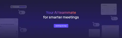
Violet fill (#614efa) with white Plus Jakarta Sans semibold text; use concise labels such as “Get Krisp” or “Get Krisp for free”.
Secondary CTA
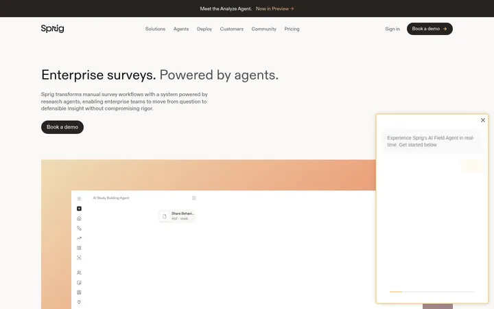
Deep indigo (#131032) fill with white text for actions such as “Book a demo,” contrasting with the brighter primary button.
Feature band
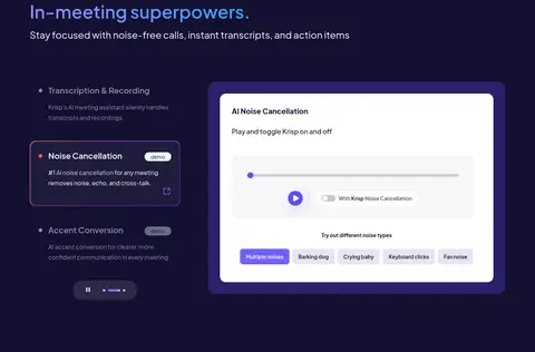
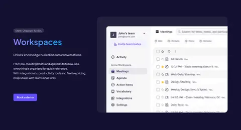
Full-width #131032 section with white or muted copy, gradient-highlighted heading fragments, and prominent product-interface media.
Feature card
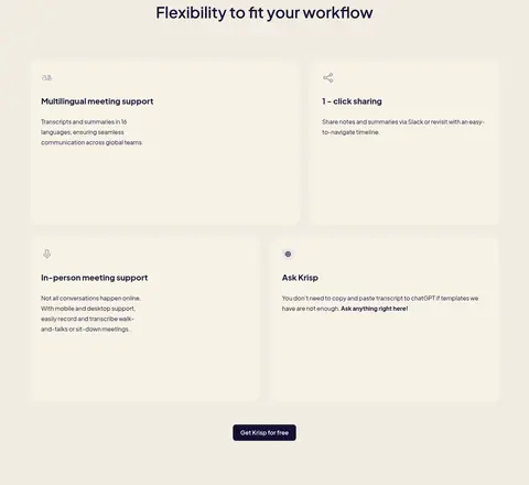
Rounded pale card with #f7f7f8 or warm #f7f2e7 fill, dark text, and ample internal breathing room.
Navigation
Compact horizontal header on white, with dark links, dropdown indicators, sign-in text, and contrasting demo and product CTAs.
Product showcase
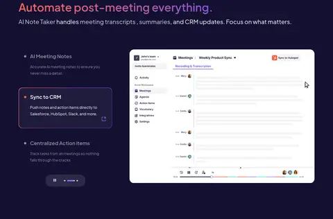
Large, detailed screenshot or interface mockup paired with explanatory text; allow related panels and badges to overlap selectively.
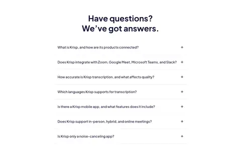
FAQ row
Centered FAQ block with clear question text, light separators, and a compact expand affordance.
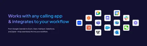
Imagery · Favor crisp product screenshots and interface mockups that show meeting participants, transcripts, audio controls, and workspace views. Place interface media beside descriptive copy or layer related panels to suggest a working product, while keeping edges and details legible. Use integration logos and small product illustrations as supporting evidence. Photography appears primarily inside meeting-call interfaces rather than as standalone lifestyle imagery; keep treatments bright and realistic.
Keep the main canvas white and alternate it with deep-indigo feature bands.
Reserve violet and blue gradients for headline emphasis and key actions.
Use Plus Jakarta Sans consistently across interface text.
Show real product interfaces as the primary visual proof.
Give sections and cards generous whitespace.
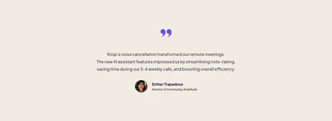
Use warm beige panels to distinguish testimonial and workflow content.
✕ 不该做
Do not turn the whole page into a dark interface.
Do not use gradients as large, dominant background fills.
Do not add decorative imagery that competes with product screenshots.
Do not crowd cards with dense copy or tight spacing.
Do not use heavy borders or shadows on every component.
Do not introduce unmeasured colors as core brand tokens.
给 AI 的提示词
想快速出一个同风格的新页面,把这段话连同 DESIGN.md 一起发给 AI。
Build a new Krisp-style AI SaaS page with a spacious white canvas, Plus Jakarta Sans, and a centered content frame capped at the measured 1280px. Use Midnight Indigo (#131032) for bold full-width product sections and primary dark text; use Signal Violet (#614efa) for primary actions, with white button text. Keep gradients, using Soft Violet (#9487fb), Clear Sky Blue (#16a9ff), and Warm Signal Coral (#fe6257), to short headline highlights rather than broad backgrounds. Alternate dark bands with Gallery White (#ffffff), Oat Canvas (#f2ece2), and Mist Panel (#f7f7f8) sections. Pair concise explanatory copy with realistic product-interface imagery. Use pale rounded cards, restrained Cloud Hairline (#e7e7ea) dividers, ample section breathing room, and clear action hierarchy. Keep the visual tone polished, calm, and product-led.