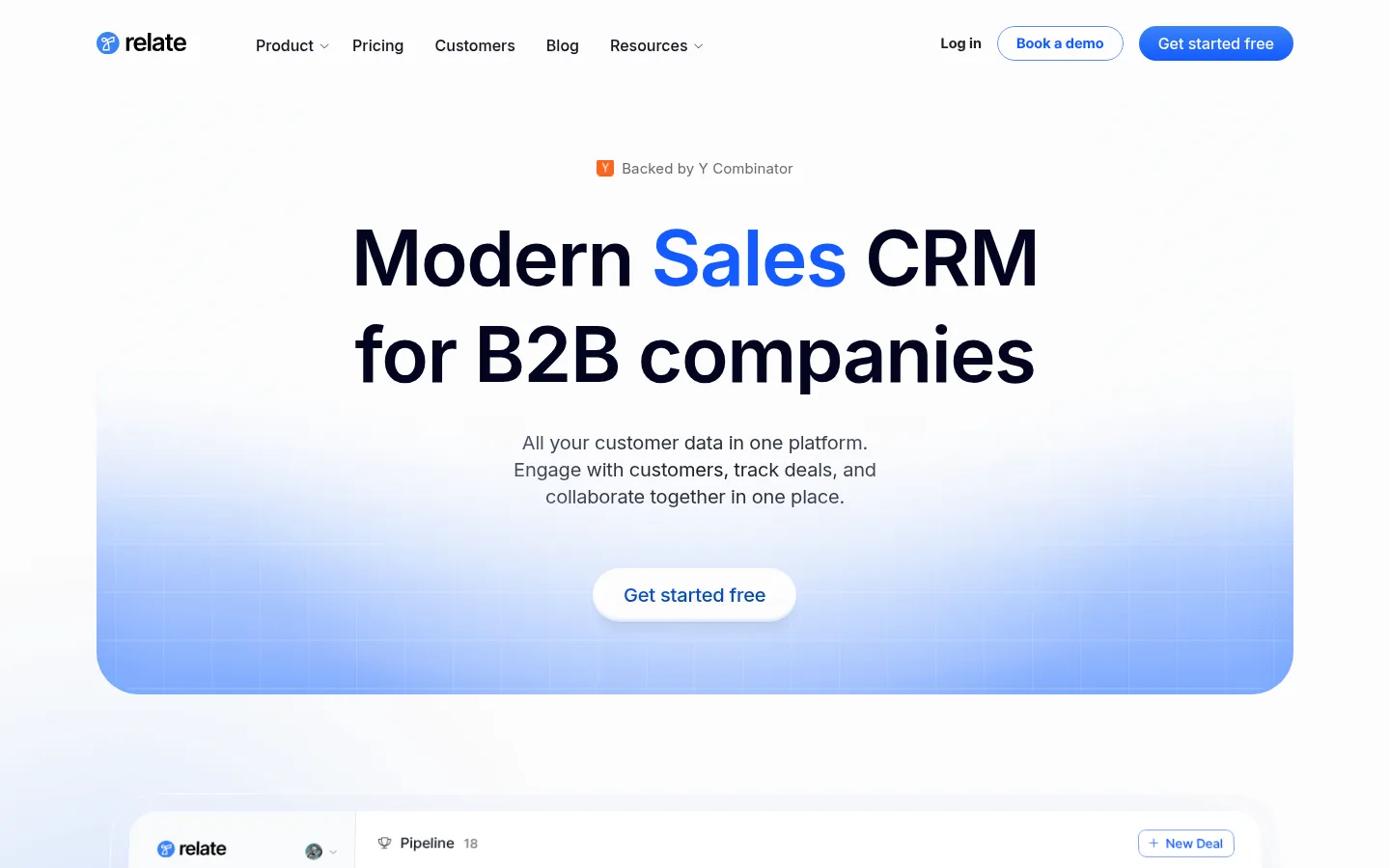
North star · Keep the page bright and spacious, using navy typography, selective blue emphasis, and real product UI as the primary visual proof.
The page is built on a near-white canvas (#fcfcfc), with the first impression coming from a centered headline in deep navy (#020520) and a vivid blue highlight (#145aff). Muted gray copy keeps supporting information quiet, while subtle blue atmospheric gradients sit behind the hero and product imagery rather than turning the page into a stack of colored panels. Inter handles headings and navigation with compact, confident weight; Pretendard Regular supplies readable body copy. A narrow, horizontally organized header gives way to centered hero content, then wide CRM screenshots and customer logos. Feature stories alternate text and interface views, while the feature and testimonial areas return to centered section introductions. Product mockups are crisp, pale, and information-dense, balanced by generous whitespace. Rounded buttons, cards, and media edges soften the otherwise precise B2B interface; shadows are restrained and borders remain visually quiet.
Headlines, navigation, captions, and interface labels.
Aa 设计
Pretendard Regular
网络字体 · 字重 400 · 占比 29%
免费替代:Noto Sans
Primary body and explanatory copy.
Aa 设计
Pretendard Medium
网络字体 · 字重 400 · 占比 8%
免费替代:Noto Sans
Medium-weight text within interface and supporting content.
Aa 设计
Font Awesome 6 Pro Solid
网络字体 · 字重 400 / 900 · 占比 2%
免费替代:Font Awesome Free
Solid interface icons and small decorative glyphs.
Aa 设计
Font Awesome 6 Pro Light
网络字体 · 字重 400 · 占比 2%
免费替代:Font Awesome Free
Lightweight interface icon details.
角色
示例
字号
字重
行高
字距
一级标题
Hero headline; dark navy with blue emphasis on the key sales term.
The quick brown fox 敏捷的狐狸
22px
500
1.4
-0.009em
二级标题
Section introductions and feature-story headings.
The quick brown fox 敏捷的狐狸
20px
400
1.4
-0.01em
三级标题
Subsection and product-feature titles.
The quick brown fox 敏捷的狐狸
18px
400
1.4
0
正文
Explanatory copy, customer quotes, and supporting descriptions.
The quick brown fox 敏捷的狐狸
14px
400
1.29
0.021em
辅助文字
Small labels, UI annotations, and customer attribution.
The quick brown fox 敏捷的狐狸
12px
500
1.33
0
导航
Header navigation labels and menu items.
The quick brown fox 敏捷的狐狸
16px
500
1
0
间距与布局
基准单位 4px · 密度:紧凑
40px版块间距
10px元素间距
13px卡片内边距
1236px内容最大宽度
2px
4px
6px
8px
9px
10px
12px
16px
20px
32px
36px
A compact top navigation aligns the Relate mark and main links on the left, with login and two actions on the right. The hero is centered above a wide product-preview panel. Subsequent blocks use broad, centered content areas: product screenshots, a compact logo cloud, feature narratives, feature cards, and testimonials. The measured page max width is 1236px; the overall spacing system is compact, but large gaps around section introductions preserve an airy rhythm. Product imagery can span wider than text blocks, while headings and descriptions stay centered or paired with their relevant UI.
圆角与层次
按钮 · 12px
输入框 · 12px
卡片 · 8px
图片 · 50%
导航 · 9999px
链接 · 9999px
sm · card
inset · other
lg · card
sm · other
Most sections sit directly on the white canvas, with little visible border treatment. Product cards and interface panels gain separation through subtle shadows and rounded corners rather than heavy outlines. Use clear layering for screenshots over soft blue glow, but keep shadows restrained; the dark footer is the strongest contrasting surface.
组件
下面的预览按实测的按钮、输入框、徽标、卡片样式重建(字体用替代字体)。
Header navigation
Compact horizontal header with the Relate mark, product and content links, login, an outlined demo action, and a filled blue signup action.
Hero CTA
Centered headline and supporting copy above a rounded blue-gradient product stage, with a pill-shaped white action.
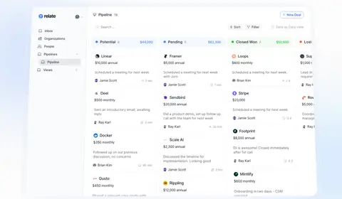
CRM product preview
Large, pale interface mockup showing pipeline columns and deal cards; use subtle shadow and rounded media framing.
Customer logo cloud
A centered customer-proof line followed by a compact multi-column collection of monochrome brand marks.
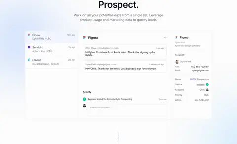
Feature narrative
Alternating feature headings, brief copy, and wide CRM screenshots that show prospecting, pipeline, retention, and churn workflows.
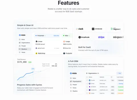
Feature cards
Quiet card-based feature area combining concise copy, CRM UI fragments, and recognizable integration logos.
Testimonials
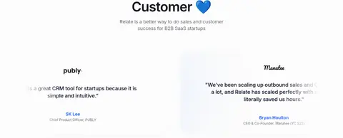
Centered customer section with a short introduction and spacious quote blocks, customer marks, and muted attribution.
Footer
Rounded dark navy footer panel with brand lockup, signup input, link columns, and subdued company details.
Imagery · The page relies on product screenshots rather than lifestyle photography, illustration, or 3D. CRM boards, inbox views, contact records, and tables are shown as pale, crisp interface mockups with fine text, colored status dots, and realistic column structure. Frame these as broad floating product views against the white canvas, with soft blue atmospheric gradients behind select screens. Customer logos and testimonial marks provide small supporting images; avoid adding unrelated decorative artwork.
Set primary headlines in #020520 and reserve #145aff for emphasis.
Keep the hero, section introductions, and customer proof centered.
Show real-looking CRM interface screens as the main visual content.
Use pale blue gradients behind selected product views, not as full-page decoration.
Keep card shadows subtle and corners softly rounded.
Preserve generous breathing room around headings and screenshots.
✕ 不该做
Do not introduce large saturated color bands between sections.
Do not use photography as a substitute for product-interface proof.
Do not make body copy compete with the headline hierarchy.
Do not turn status green or coral into dominant brand accents.
Do not add heavy outlines or deep shadows to every card.
Do not overcrowd the centered hero with extra navigation or badges.
Do not use decorative illustration that distracts from the CRM screens.
给 AI 的提示词
想快速出一个同风格的新页面,把这段话连同 DESIGN.md 一起发给 AI。
Build a new Relate-style B2B SaaS page on a predominantly #fcfcfc Canvas White background. Use #020520 Midnight Ink for strong headlines and #145aff Signal Blue for selective word emphasis, links, and primary actions; keep #696a72 Soft Graphite supporting text subdued. Use Inter for headings and navigation, with Pretendard or Noto Sans for body copy. Center a concise hero above a broad, realistic CRM interface preview. Carry the page into customer logos, alternating product-feature stories, and quiet testimonial blocks with ample whitespace. Use pale blue glow sparingly behind screenshots, rounded cards, and restrained shadows. Keep green and coral confined to interface status cues. Finish with a rounded dark navy footer rather than adding bright section bands.